6 Ways to Improve Product Findability in eCommerce Stores
Wouldn’t it be great if your customers always find the product they’re looking for on your website?
And wouldn’t it be excellent if your online store was so easy-to-navigate that your clients recommended it to everyone they know?
To achieve this, you have to improve the Product Findability and this article will help you do just that.

To improve Product Findability, you should focus on specific elements of visual sorting. There is a long list, but every aspect is important:
- Applicable product filters in the menu
- The search function
- Friendly URLs
- New arrivals, discounts, and featured products
- Related products
- Alternative Products
- Product comparison
Some of these may seem obvious, but many online retailer don’t know how to optimize them in order to improve product discovery experience.
Now, let’s take a closer look at all these features!
1. Applicable Product Filters in the Menu
Not all shoppers know what they want; many just browse an eCommerce website to find if a certain type of product is sold there.
So, why not help them narrow their search with product filtering according to what they’re searching for?
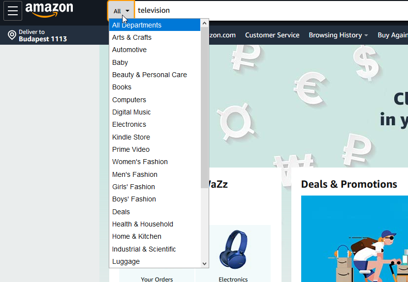
A faceted filtering system that offers specific options on the Search Engine Results Page will help your customers easily find what they want.
Another issue is category-specific filters. Most online retailers don’t use them and thus they end up restricting their customers’ choices.
Applying these search filters will show your customers that you know your product and think about what interests your clients, which results in a higher conversion rate.
Here’s another tip.
If you have thousands of products for sale, it can be a real pain for you to check how they display on your site.
2. The Search Function
Nearly a third of all online shoppers prefer to use direct search instead of just browsing. So, it is vital to create a well-functioning search bar with autocomplete to help users find what they want without the unnecessary surfing.
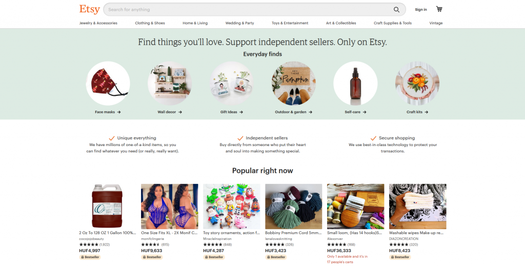
But just creating a smart search is not enough. The bar itself must be visible and easy-to-use; put it on the top of the page and highlight it, so users can easily find it!
3. Friendly URLs
Some visitors use URLs to understand their location, so if the product URLs on your site consist of masses of strange symbols, you will quickly confuse shoppers.
In order to make your web addresses friendly be sure to describe the essence of a page or product.
Break the URLs down into easily understandable sections so shoppers can use it to navigate.

4. New Arrivals, Discounts, and Featured Products
People don’t always search for a specific product, sometimes they want a special offer.
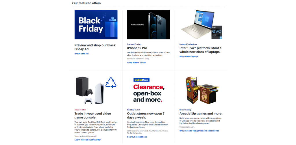
For example, “New Arrivals” and “Discounts” sections show your site’s visitors what is new in your store and what’s being sold at the best price.
A “Featured Products” section will drag the clients’ attention to various offers like the products on sale, “back-in-stock”, seasonal products, or just show the most popular goods. If you have an item with a large profit margin, that can be good candidate too as a featured product.
The number of possibilities is endless and you can create your own categories. When doing this, be sure to think about how to improve your customers’ experience.
For example, you may use a “Most Viewed” widget to display a page with the most popular items. Or you can create a “Most Wanted” widget where you display the products most frequently added to carts. You can choose what your customers see first and second.
5. Related Products
If your client is already interested in buying a product, why not offer something that goes well with the item they’ve chosen?
A Related Products feature will do just that!
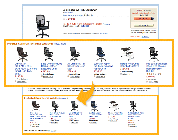
A client’s search history will tell you what they like, which you can use to offer them suitable complementary goods, supplementary or compatible products.
A Related Products section provides many opportunities for cross-selling, so products, based on personal preferences, listed here are more likely to be bought.
But don’t be too persistent – you should help shoppers make a decision, not choose for them.
6. Product Comparison
Shoppers love to compare products and prices because this helps them make an informed buying decision.
Having comparison tools will positively influence the user experience and help shoppers decide what to purchase, which increases your conversion rates!
Similar to the situation with the search box, simply implementing a comparison tool is not enough.
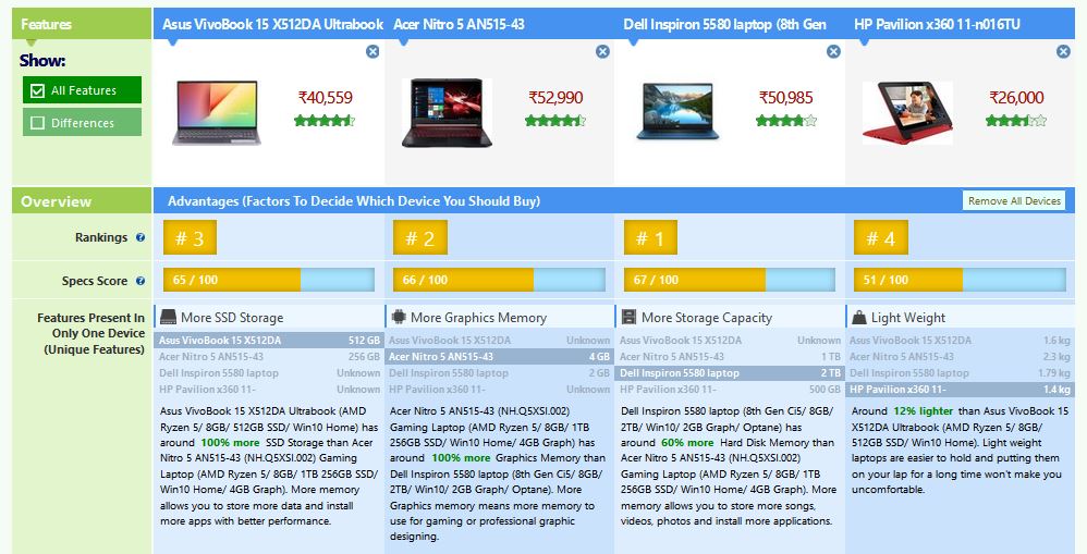
You need to make it easy to see and use. The following tips may help you:
- Make the compare button noticeable
- Display customer reviews and ratings
- Allow comparison on search pages
- Thumbnails should be clickable and large when they are being compared
- Make editing and removing products intuitive
Offer Shoppers Alternative Products
If a product is unavailable, some clients may leave before buying anything. Use tools that offer your customers alternate products to consider.
If you offer alternative products, your customers know that you care about their online shopping experience. Hopefully, they will keep shopping on your site instead of going elsewhere when an item is out-of-stock.
If your potential customer places items in their cart and then discovers what they intended to buy is out of stock, this can frustrate shoppers and lead to big revenue losses. While these shoppers might have a full cart, they may leave your site and try to find a competitor where they can buy all the desired list of products in one place.
In conclusion
Visual sorting plays a crucial role in eCommerce since products that are presented well have a higher selling rate.
Visual sorting helps you direct your clients’ attention and gives you the opportunity to show them products you think will satisfy their needs.
Just don’t be overly assertive and be sure to respect your clients!
Let them decide what to buy – your task is just to help them.


