What is Conversational Commerce?

What is Conversational Commerce?

Imagine communicating with your favorite brands anytime without needing to go to a physical store, wait in line, or spend hours on hold.

This is the future of Ecommerce, and it has a name: conversational commerce.

In this article, we discuss:

  • What conversational commerce is
  • Benefits
  • Best practices

The conversational commerce market is set to grow by $290 billion by 2025, which means the time to start developing your strategy is now.
What is Conversational Commerce?


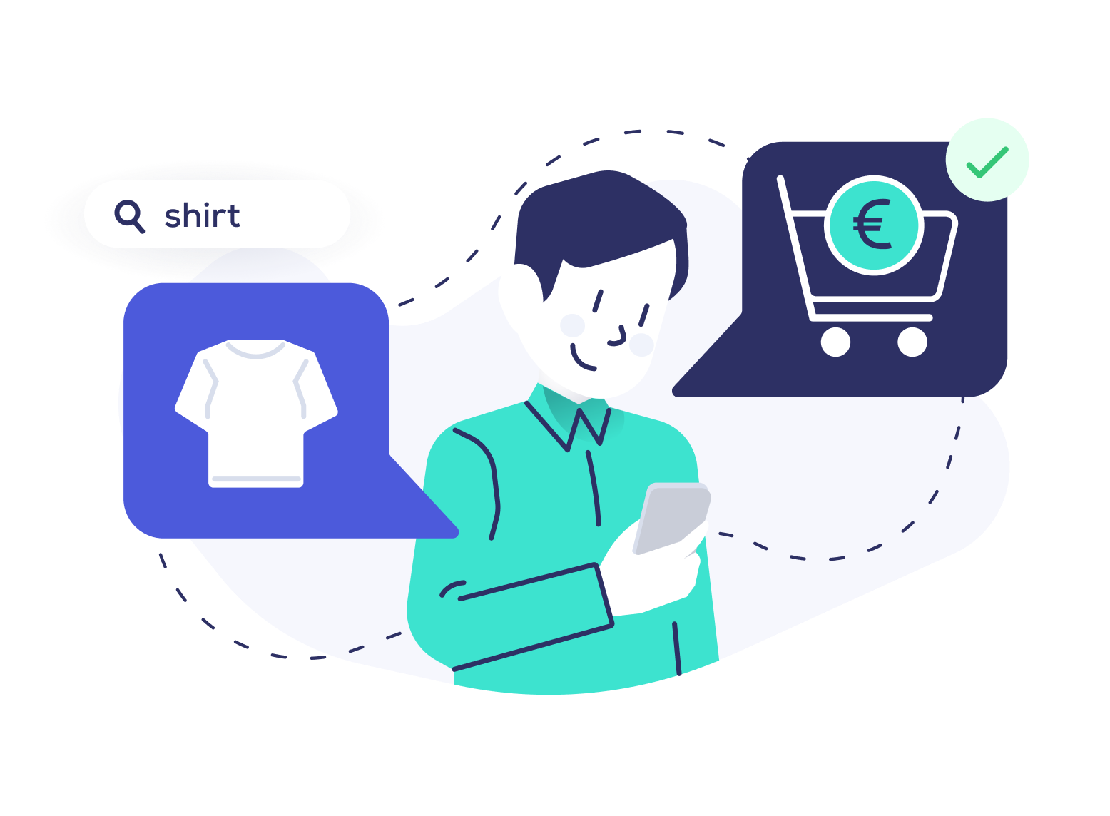
Conversational commerce is a new channel that enables retailers to interact with customers online, most commonly through messaging platforms, chatbots, and virtual assistants.

Instead of navigating to online retailers’ sites, shoppers can interact with businesses on their preferred social channels (think: Facebook Messenger) and get an immediate answer.

With conversational commerce, shoppers can ask questions, view product recommendations, request support, or purchase products with fast and personalized communication.

Users can open a mobile messaging app like WhatsApp or Facebook, ask an online retailer for wireless headphone recommendations, view relevant products, and immediately purchase what they’re looking for without navigating to the online store.

With advances in conversational AI, shoppers’ queries can be accurately understood, making communication more effective and authentic. 

The Evolution of Conversational Commerce


The modern evolution of technology shows that consumers have consistently opted for convenience. When Apple introduced the iPhone in 2007, mobile devices quickly outperformed sales of desktop computers for one simple reason: users could access whatever they needed, when, how, and where they wanted it.
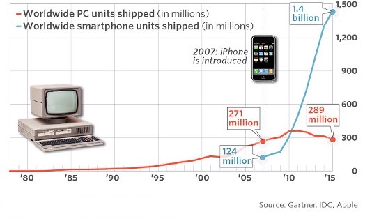
mobile and pc sales worldwide chart

Shortly after the iPhone was introduced, messaging apps like WhatsApp and Facebook Messenger gained popularity, and conversational commerce emerged. Online businesses used Facebook Messenger and other apps to interact with customers via chatbots, which sparked a new era of sales and customer care.

WeChat paved the way too, offering a wide array of Ecommerce services and customer support within their application’s ecosystem. The popular Chinese messaging app made it easy for users to make purchases, book taxis, and pay bills all within the app. WeChat’s success inspired other messaging platforms to develop and offer a multitude of features merging Ecommerce and customer communication.

It didn’t take long for businesses to see the lucrative potential of conversational commerce, with numerous companies exploring new ways to increase sales and the customer support experience. Many initial chatbots and virtual assistants were not intuitive enough to provide the support customers were looking for. However, as technology improved, things changed.

With the introduction of generative AI and advances in Natural Language Processing, chatbots can now understand and respond to complex requests authentically.

Amazon Alexa and Google Assistant are two key examples of success with conversational commerce – both devices help users engage with brands using voice commands and quickly make desired purchases.

Conversational commerce is improving and demand is growing, proving it’s here to stay. With the market set to grow by $290 billion by 2025, Ecommerce chat apps and conversational services will likely become an integral part of our lives before we know it.

Why is Conversational Commerce Important?


Conversational Commerce is a powerful tool that enables online retailers to interact with their customers exactly where they are.

By being present in the same channels their customers regularly use, brands can make themselves more accessible and develop a new sales channel: an online chat shop.

With 73% of shoppers saying the customer experience is a deciding factor in the purchase process, conversational commerce is more than important – it’s crucial.

Convenience


Customers can communicate with businesses via messaging platforms, chatbots, and virtual assistants 24/7. They can ask questions, purchase items, see personalized recommendations, or receive customer support when they want it – all within their preferred channel.

Personalization


Thanks to AI and machine learning for Ecommerce, businesses can provide personalized recommendations based on customers’ preferences, user history, and individual needs. Individualized messages, promotions, and support help create an engaging online experience that increases customer retention.

Efficiency


With chatbots, virtual assistants, and messaging apps, businesses can offer shoppers immediate assistance. Chatbots are adept at executing routine requests like processing orders or answering FAQs, which saves customers time and reduces costs by up to 30%. Nearly 80% of inquiries can be answered by a chatbot.

By reducing the need for human interaction, conversational commerce benefits shoppers and retailers. It allows retailers to meet customer expectations and build stronger relationships efficiently and effectively.

Popular Channels for Conversational Commerce


Businesses can engage in conversations with customers using several different messaging channels, chat platforms, and conversational technologies. Here are the most common types.

Social Messaging Apps


The key to a successful conversational commerce experience is convenience. Social messaging apps are one of the most convenient ways for shoppers to interact with your store because they are already an essential part of our daily lives.

Image by storyset on Freepik

Customers can use apps like WhatsApp or Facebook Messenger to get automatic answers to their questions. They can also receive customer support, explore relevant product recommendations, and navigate the shopping process from search to completed transaction.

If an avid runner needs new shoes, they can open their preferred social messaging app on their phone, message a store, explore personalized recommendations, and purchase a new pair of shoes in minutes.

Alternatively, if an item isn’t delivered on time, customers can quickly learn why on their messaging app of choice.

Statista estimates that 60% of global E-commerce sales are already happening on mobile in 2023, generating almost 2,200 billion USD.

Messaging apps generally consist of a combination of chatbots and live human agents. Chatbots handle most inquiries and can pass a customer on to receive more personalized human assistance when required. This approach to social shopping cuts customer service costs and ensures shoppers receive the stellar customer support they need.

Chatbots


Chatbots leverage natural language processing to understand user intent and stimulate authentic human conversation in an instant. Advances in generative AI have made it possible for chatbots to understand complex requests, provide answers to user queries, offer 24/7 customer care, and guide users through the shopping journey.

There are two main types of chatbots. Rule-based chatbots follow a set of predetermined rules to respond to customer questions. AI-powered chatbots are more complex, leveraging machine learning algorithms to understand user intent and improve replies over time.

In addition to handling the majority of user requests, chatbots can generate significant Ecommerce revenue for businesses. By seamlessly highlighting relevant promotions, offering personalized product recommendations, and collecting user feedback, chatbots successfully drive sales.

Voice Assistants


Voice chats are a powerful way to improve customer interactions. Apple’s Siri, Amazon Alexa, and Google Assistant are the most popular voice search assistants on the market.

Image by storyset on Freepik

Like other conversational commerce tools, voice assistants help with product discovery, provide information, assist with purchases, and offer customer support.

By integrating voice assistants with additional technology like NLP or sentiment analysis, E-commerce brands can create advanced customer conversations.

Modern voice technology can determine a user’s mood by analyzing their tone of voice and returning responses accordingly.

Digital voice assistants help E-commerce websites further create convenient, personalized shopping experiences by making it easy for users to navigate the purchase journey without needing to type or research what they’re looking for.

Conversational commerce is all about keeping customers’ best interests in mind. As technology continues to evolve, new platforms and channels are sure to surface.

Conversational Commerce Use Cases


The conversational commerce landscape is rapidly growing, evolving, and opening up an entirely new avenue for sales.

Chatbots function as “chat shops,” where shoppers can conveniently navigate the shopping journey through conversation.

Let’s explore two most common, beneficial, and lucrative use cases for conversational commerce: product discovery and customer support.

Improving Product Discovery


Most conversational commerce platforms leverage NLP (natural language processing) to understand user intent. Therefore, shoppers can ask for the products they want however feels natural to them and instantly see relevant results.

By collecting and analyzing user behavior data and interactions, Ecommerce retailers can better understand what shoppers are looking for and effectively tailor a wide range of product recommendations to meet their needs.

Let’s explore how data-driven product recommendations can improve the shopping experience and drive sales.

Showcase Relevant Products


With chatbots or other conversational support offerings, shoppers can state their preferences and quickly explore relevant products for any query.

If a user wants to buy a pair of running shoes but is undecided on brand or style, they can simply tell the chatbot what they’re looking for, their size and color preferences, and explore the most relevant items.

Even more impressive is that chatbots understand colloquial language and detailed queries that could never fit in a search box.

If a shopper types, “Show me a laptop good for gaming that” then specifies “that are easy to carry in my backpack,” chatbots can immediately present the most relevant options.

In addition to helping shoppers feel understood by intuitively responding with relevant products, chatbots can shorten the path to purchase by presenting products shoppers are most likely looking for.

Upsell and Cross-Sell with Product Recommendations


Chatbots are a valuable tool for upselling and cross-selling.

If a shopper is looking for a laptop, chatbots can be programmed with Ecommerce merchandizing capabilities to recommend specific brands or popular models.

Additionally, if a shopper purchases a laptop, chatbots can recommend complementary or additional products like a computer mouse or earphones to round out their purchase.

Provide Product Information


Shoppers often need product information before making a purchase. Users may be interested in sizing information, pricing, discounts, product reviews, or return status. Chatbots streamline the search experience by providing responses instantly.

Keep in mind, just like with Ecommerce search result page design, the product information must be presented in clear and easy-to-understand ways that guide customers through the purchase journey.

Customer Support


In the digital age, shoppers expect to have their needs met immediately. If they don’t find the products or information they’re looking for, they’ll leave your store and head to a competing site.

Chatbots and virtual assistants can improve customer relationships with people by understanding their concerns and providing real-time customer feedback. Let’s look at a few ways chatbots can assist with customer support.

According to a research by Facebook, two-third of users would prefer using a chat app than calling customer service.

1st Line Customer Support


Chatbots understand customers’ questions and immediately respond with answers from your knowledge base. In addition to alleviating frustration and creating a quick user experience in your store, automating support with chatbots saves Ecommerce businesses money and resources because it prevents the need for human interaction.

Connect to Live Support Agents


While chatbots can effectively handle a large number of inquiries, AI-driven conversations are not capable of doing everything.

When online or mobile users need additional support, they can be seamlessly connected to live chat agents on the customer service team.

Having company representatives provide personalized support for necessary requests will help shoppers feel cared for and resolve their issues more efficiently.

Track Deliveries


Chat commerce enables shoppers to communicate in real-time, making it easy for them to inquire about the delivery status of their purchase and receive an immediate answer.

By providing instant notifications, updates, and instant answers to customer concerns, conversational commerce is a powerful way to meet customer demands, reduce frustration, and improve the tracking experience.

How Ecommerce Retailers are Using Conversational Commerce


More and more retailers are adopting conversational commerce in the E-Commerce space. Companies like H&M, Burberry, and American Eagle Outfitters offer chatbots to help their user base find products, offer styling advice, and provide special care on different platforms.
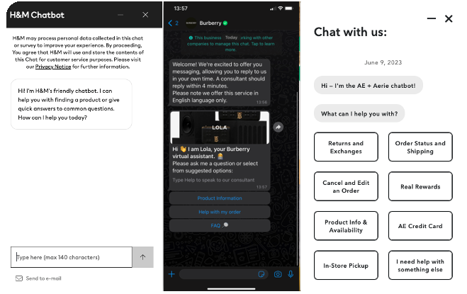
Retailers using conversational commerce illustration

While conversational commerce has been prevalent in the online retail industry, companies have only cracked the surface of what’s now possible with generative AI. Advances in technology have made it possible for online retailers to better understand customer support requests, provide more personalized interactions, improve customer engagement, and increase online sales.

Let’s take a closer look at some of these benefits.

Advantages of Conversational Commerce in Ecommerce


Conversational commerce benefits shoppers and online retailers by offering on-demand support without traditional overhead costs.

Businesses that utilize online messaging platforms, chatbots, and virtual assistants to interact with users improve the customer experience, drive sales, and create significant business impact.

Let’s take a look at a few key benefits.

Improved Customer Engagement


Conversational commerce enables businesses to interact with potential customers on demand. Providing personalized communication efforts to shoppers exactly when and where they want them can help businesses build trust and inspire loyalty.  Helpshift found that 83% of customers would contact a brand messaging service if the response there is immediate.

Chatbots can accurately respond to routine customer queries, suggest relevant products that shorten the path to purchase, and offer human-like correspondence that keeps users engaged, satisfied, and coming back for more.

Furthermore, chatbots can offer exclusive discounts and promotions. Targeting deals and offers to individual customers creates a sense of urgency, engages shoppers, and encourages them to purchase.

These interactive experiences help users seamlessly navigate the shopping journey from start to finish and inspire them to return for repeat purchases.

Higher Conversion Rates


By leveraging AI and machine learning algorithms, businesses can understand user intent and accurately provide shoppers with the products, information, and support they need to make confident purchases.

Offering data-based recommendations via conversational commerce effectively inspires catalog discovery, helps you hit key Ecommerce KPIs, and builds loyal customers.

If a shopper wants to buy a laptop on a budget, a virtual assistant can provide recommendations and answer questions about product specifications like size or hard drive space.

By ensuring easy conversation with customers and offering the information they need to make a confident purchase, Ecommerce businesses can achieve a rise in conversion rate, customer satisfaction, and online revenue.

Cost-Savings


Conversational commerce is conducted online, which reduces the need for overhead costs like physical storefronts and employees.

Conversational commerce leverages automation, enabling businesses to answer frequently asked questions and perform routine tasks without physical labor. Automating support and the sales process saves time and resources when handling orders or inquiries.

Additionally, chatbots and virtual assistants can handle high volumes of customer requests at once, making it easy for businesses to scale up or down depending on demand.

Personalized Experiences for Customers


Personalizing the shopping experience shows shoppers you understand them and can meet their needs.

Chatbots use data mining and machine learning to analyze patterns in user behavior and make tailored recommendations that align with their preferences.

Leveraging AI to predict what customers need is an effective way to help shoppers find what they’re looking for and help guide them through the purchase journey.

Chatbots can also send personalized messages and updates to customers. Welcome messages, order confirmations, and shipping updates via chatbots help shoppers stay up to date with previous purchases and engaged as they navigate your site.

As technology continues to evolve, chatbots are getting better at interacting with customers and understanding what they’re looking for. Nowadays, chatbots for Ecommerce fashion stores can ask shoppers about their style preferences, analyze thousands of products in a catalogue, and suggest clothing that aligns with their tastes.

Studies found that 80% of consumers were more likely to make purchases when getting personalized offers.

And it’s not just the E-commerce market. These advanced communication methods are transforming the hospitality industry, the banking industry, and so many more. 

Valuable User Behavior Data


Conversational commerce provides online retailers valuable insights into user behavior and preferences, which can improve personalization efforts, products, and other services.

Data can be collected in a variety of ways.

Machine learning algorithms collect and analyze user behavior data, which improves product recommendations and tailored customer service efforts.

Messaging platforms store chat logs of interactions between chatbots and customers, which offer insightful information about customer preferences, behavior, and common pain points.

Chatbots can be programmed to request feedback from users after an interaction. This information can help gauge customer satisfaction and address room for improvement for the chatbot.

Conversational commerce platforms track user demographics and shoppers’ purchase history, which is useful in offering data-driven recommendations and discounts.

By collecting data at all phases of the online shopping journey, Ecommerce businesses can identify room for improvement and make optimizations for increased customer satisfaction and sales.

Reduced Abandoned Carts


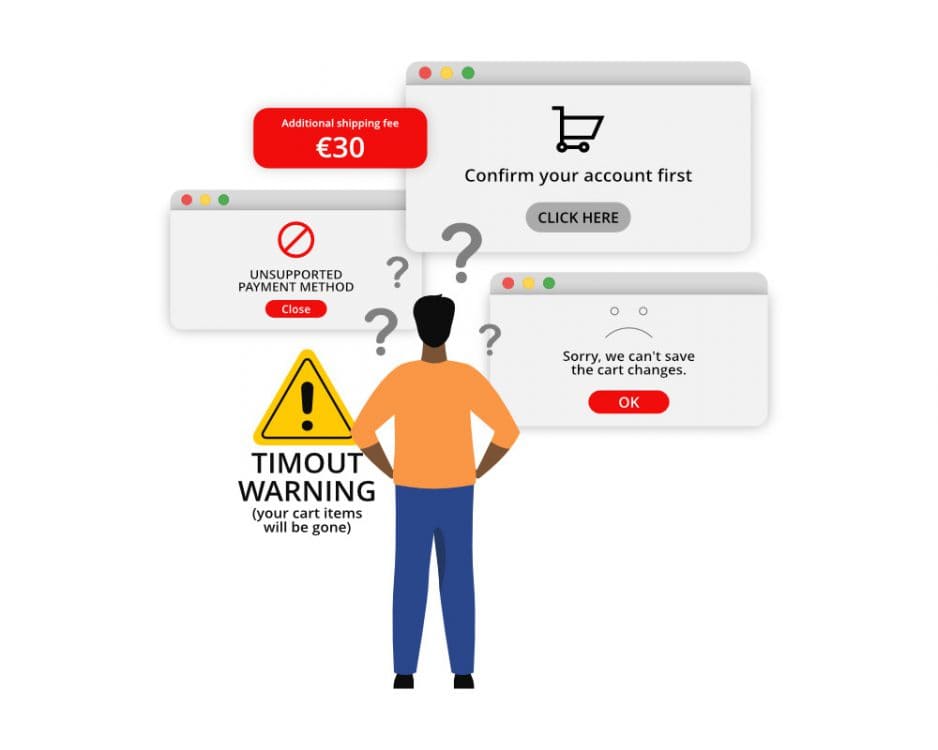
As the Ecommerce industry continues growing, so does the shopping cart abandonment rate. About 70% of online shoppers add products to their cart via autocomplete search or along the customer journey and leave the store without purchasing them. However, conversational commerce can help mitigate the problem.

If a shopper is on the verge of abandoning their cart, chatbots and virtual assistants can intervene.

Proactive customer engagement like reaching out to customers with carefully crafted messages can increase the chances of a customer completing their purchase.

Furthermore, AI-based conversational commerce chatbots enable shoppers to purchase their items directly in the conversation window. Streamlining the shopping journey to prevent shoppers visiting another page can help reduce the abandoned cart rate and keep businesses ahead of the curve.

5 Conversational Commerce Best Practices


While implementing conversational platforms into your Ecommerce strategy is crucial, it’s important to keep the following best practices in mind to maximize its potential.

1. Prioritize the Customer Experience


The goal of conversational commerce is to improve the customer experience. In addition to implementing site search best practices in your store, one of the most effective ways to prioritize customers is by creating convenient shopping experiences.

Make sure you put what customers need at their fingertips.

The best way to prioritize customers is by leveraging data like demographics, browsing behavior, and purchase history to inform targeted response algorithms and return relevant results.

Data-driven responses that improve over time to accurately address shoppers’ questions and help them explore relevant products will ensure your conversational commerce solution is convenient, engaging, and creating customer satisfaction.

2. Use a Conversational Approach


Simply integrating a chatbot into your online store and app messaging will not suffice. You must establish rules and guidelines for chatbot responses to create a consistent, reliable, and quality experience. The same applies to voice assistant interactions; communication must feel natural.

The best way to create authentic communication is to keep the customer in mind. Take advantage of key user touch points and offer personalized interactions throughout the most crucial stages of the purchasing journey. Carefully planning your conversational commerce strategy will help ensure you create an engaging experience with a personal touch.

A Forrester and Google joint research found that 68% of shoppers are more likely to buy from businesses that offer convenient communication ways.

3. Monitor, Test, and Refine Your Conversational Experience


AI-driven conversations are not a set-it-and-forget solution. You must consistently ensure your chatbots are responsive and effective. This will help you provide shoppers with the best possible experience.

To monitor performance, identify your specific goals and track the right metrics. A few insightful metrics are conversion rate, customer satisfaction ratings, and response time. These key metrics will help you identify room for improvement and make adjustments where necessary.

It’s also a good idea to test messaging strategies and tools to get an accurate idea of what keeps shoppers engaged and drives sales. Consistently monitor results and optimize your solution to get the most out of your conversational commerce efforts.

4. Provide Valuable and Relevant Information


Customers trust that information provided through conversational commerce channels is relevant and accurate. Therefore, all interactions, answers, and assistance must align with what shoppers want. If users ask for headphone recommendations and see suggestions for computer mice, they will likely grow frustrated, lose trust in your brand, and not return to your store.

Leverage user behavior data to provide relevant and accurate responses. When shoppers receive factual information that guides them seamlessly through the purchase process, this creates a positive impression of your store and inspires repeat business.

To ensure chatbots and virtual assistants return relevant results, track analytics and monitor performance data. This will show you what’s keeping shoppers engaged and where there’s room for improvement.

Furthermore, the conversational nature of chatbots makes it easy to ask for user feedback. Program your chatbot to ask users if their query was addressed properly with a simple thumbs-up or thumbs-down button. Directly asking for feedback will help you see if shoppers find their interactions valuable and relevant and help you discover room for improvement if necessary.

5. Maintain a Human Touch


While chatbot responses are automated, it is crucial that interactions feel authentic and personal. Even if shoppers ask general questions or perform routine actions, communication shouldn’t feel robotic or impersonal.

Create natural-feeling interactions by using a conversational tone. Refer to customers by name and incorporate personality and your brand identity into your messaging so your chatbot feels like a natural extension of your store.

Make sure your chatbots respond promptly, too. Answering inquiries in a timely matter will show you value customers’ time and help build trust.

Lastly, keep in mind that chatbots need an abundance of data to be most effective. When first implementing conversational chatbots into your conversational commerce strategy, it’s best to run a co-pilot scenario with a human that can review replies. Having humans monitor chatbot interactions during the learning phase will ensure replies accurately address users’ inquiries while feeling authentic and natural. 

Conclusion


Conversational commerce is a powerful tool that helps businesses improve the customer experience and drive sales. By providing personalized, accurate, and timely responses to customer requests, chatbots and other types of conversational commerce can keep shoppers engaged, inspire them to purchase more items, and create a positive impression of your brand.

The most prevalent forms of conversational commerce include chatbots, virtual assistants, voice assistants, and social media platforms. However, rapid advances in artificial intelligence will continue to make conversational commerce even more engaging and effective.

When implementing conversational commerce in your store, make sure to adhere to the best practices, consistently measure performance, and stay on top of growing trends to exceed your shoppers’ expectations and keep your Ecommerce store ahead of its competition.

For a comprehensive understanding of conversational commerce, check out our additional articles on this topic covering types of platforms, use cases and implementation strategies.

Paige TyrrellHead of Marketing – Prefixbox

Paige is the Head of Marketing at Prefixbox, a leading eCommerce site search solution. She’s an American who’s been living in Budapest since 2017 and loves giving #alwayslearning sessions to help people optimize their online stores.

The All-Inclusive Guide to AI-Driven Ecommerce Product Recommendations

The All-Inclusive Guide to AI-Driven Ecommerce Product Recommendations

AI-driven Ecommerce product recommendations are everywhere.

They can increase sales and improve the customer experience, which makes them essential to a thriving Ecommerce business.

In this article, we’ll uncover:

  • How AI-driven Product Recommendation Engines work
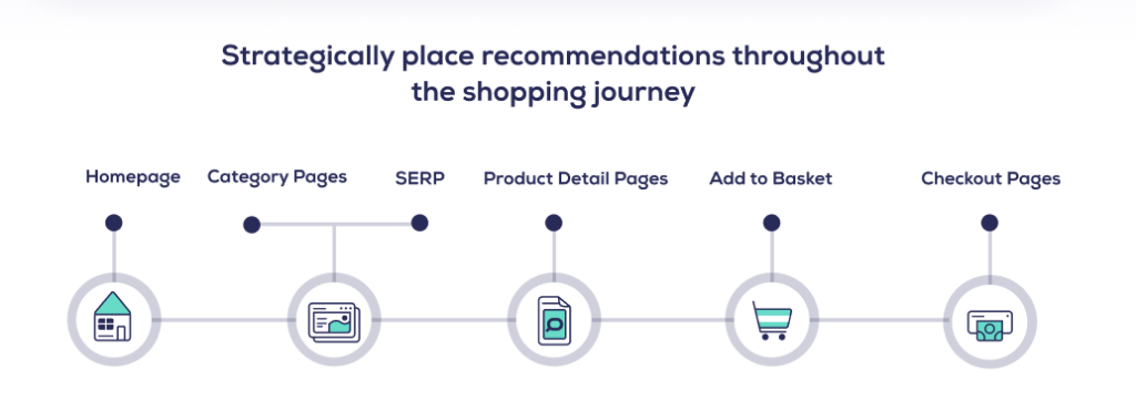
  • Where to place recommendations in your store
  • Best practices to maximize impact

Let’s jump in.

What are AI-Driven Ecommerce Product Recommendation Engines?


Ecommerce Product Recommendation Engines display relevant product recommendations to shoppers throughout their journey. To do this, AI algorithms identify patterns in customer behavior to place shoppers into groups and automatically recommend products that match their preferences or are similar to what they’re viewing.

Product Recommendation engines that leverage AI to return data-driven results are the best way to help shoppers discover relevant products. This increases engagement, strengthens customer loyalty, and boosts revenue.

Thanks to recent advances in AI and GPT technologies, recommendation engines are becoming faster, more accurate, and more effective. They are a crucial tool for anyone running an online business.

How do AI-Driven Ecommerce Product Recommendations Work?


Ecommerce Product Recommendation Engines use machine learning and advanced AI-based algorithms to collect data, analyze shoppers’ behavior, and return relevant product suggestions.

They recognize shoppers’ habits, preferences, and browsing history and effectively return personalized recommendations for products they want to buy.

We’ve outlined how AI-based recommendation engine technology works to help you use it to your advantage.

Collaborative Filtering


The most common way to personalize recommendations is with collaborative filtering.

Collaborative filtering is a recommendation system that analyzes customer tastes, preferences, and browsing history to predict what they might want to buy next. The logic is simple. If Shopper A and Shopper B like the same product, then Shopper A might be interested in a product Shopper B has previously purchased.

This system identifies meaningful associations between items and users to provide accurate product recommendations for products they may not have sought out.

You need an abundance of user data for this method to be effective. Without sufficient data and rich customer profiles, recommendations may miss the mark and create a poor perception of your Ecommerce business.

There are two types of collaborative filters you should implement in your store. Let’s take a look at them.

User-Based Collaborative Filtering


User-based collaborative filtering analyzes user behavior to identify similar groups of shoppers and recommend products to those with corresponding purchase habits.

As individual customers navigate your store and make purchases, an algorithm collects that data to calculate a similarity score. Customers with matching similarity scores are then grouped together and provided with similar recommendations.

This approach assumes past users with similar preferences can help determine what similar shoppers will want in the future.

By creating rich customer profiles and accounting for changing user behavior, user-based collaborative filtering effectively tailors recommendations that align with shoppers’ tastes and preferences.

Item-Based Collaborative Filtering


Item-based collaborative filtering analyzes the relationship between types of products rather than users. This method identifies products frequently purchased together and groups them accordingly to make recommendations.

For example, in a Consumer Electronics store, this filtering system will recognize that users often buy cell phones and cases together. The next time a shopper searches for a cell phone, they will see a recommendation for the highest-rated phone cases.

Item-based collaborative filtering is most effective in stores with large product catalogs. The more items there are, the easier it is to determine relationships between them to ensure recommendations are relevant and effective.

Content-Based Filtering


Content-based filtering makes recommendations by taking a product’s attributes, related keywords, and categories into consideration. This method uses keyword-based recommendation algorithms to determine which products best suit users based on their previous activity.

Tools like Prompt Vibes can assist in refining keyword-based recommendation algorithms by generating and optimizing relevant prompts tailored to enhance the accuracy of content-based filtering systems. This ensures that product recommendations resonate better with the shoppers’ preferences.

For example, in a Health and Beauty store, content-based filters will look at a shopper’s purchase history and identify products with similar ingredients, formulas, and certifications.

Content-based filtering is most effective in stores with rich product attributes listed in their catalogs. This filtering method is an effective way to recommend items that align with shoppers’ preferences while providing insights that help better target ads and promotions in your store.

Hybrid Recommendation Systems


Hybrid Recommendation Systems leverage two or more filtering methods to suggest products that encourage catalog discovery and inspire sales.

For example, online stores can implement both content-based and user-based filtering systems (or any other combination) to provide recommendations to shoppers.

Implementing more than one type of recommendation system in your store is the most effective way to improve recommendation accuracy and relevancy.

There are different ways to approach hybrid recommendation filtering. You can use one of these AI-based recommendation techniques to modify or enhance another or combine the outputs of both filtering systems into one long recommendation list.

Next, let’s take a look at how product recommendations can benefit your store.

Benefits of Ecommerce Product Recommendations


AI-driven product recommendations engines are a powerful tool that offer Ecommerce retailers countless benefits. Here are a few of them.

Better Understand Your Customers


Product Recommendation engines leverage AI and data mining to identify meaningful connections between shoppers and products.

Advanced algorithms collect purchase history, browsing habits, ratings, reviews, search activity, and more to create comprehensive profiles of shoppers and return accurate results.

This invaluable data helps you understand your customers’ preferences and interests, which is key to effectively tailoring store offerings to meet shoppers’ needs.

Improved User Experience


If shoppers can’t quickly find the products they’re looking for, chances are they’ll leave your site and go to a competitor’s.

Providing personalized recommendations that align with shopper intent improves the user experience and keeps visitors engaged. By using AI-based personalization techniques and strategically placing relevant product suggestions throughout your store, retailers can save shoppers time and energy, encourage product discovery, and prevent frustration.

Creating a positive personalized shopping experience that makes customers feel understood will help build trust and inspire them to return.

Higher Customer Engagement


Users have very short attention spans. Placing relevant recommendations at every phase of the shopping journey will catch their attention, keep them engaged, and encourage them to spend more time on your site.

When customers are offered personalized recommendations, they are more likely to return for follow-up visits and less likely to compare prices elsewhere – leading us to our next key benefit.

Increase Average Order Value and Online Revenue


Personalized recommendations have proven to play a significant role in boosting revenue. 

Data-driven recommendations that reflect changing user behavior can alert shoppers to relevant products, deals, and promotions and inspire them to explore your catalog.

When visitors see items tailored to their tastes and preferences, they are more likely to make a purchase.

As you can see, AI-driven product recommendations benefit shoppers and businesses alike.

Next, let’s look at where you should place them for maximum impact.

Strategically Placing Ecommerce Product Recommendations


Recommendations should appear seamlessly in your store to enhance the shopping experience, not overtake it. As shoppers search, browse, and add items to their baskets, recommendation types should meet shoppers where they are on their journey and help guide them through it.

Let’s look at how and where Ecommerce websites should place AI-driven product recommendations to increase engagement and shorten the path to purchase.

Search Engine Results Pages


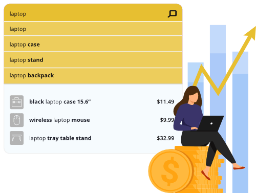
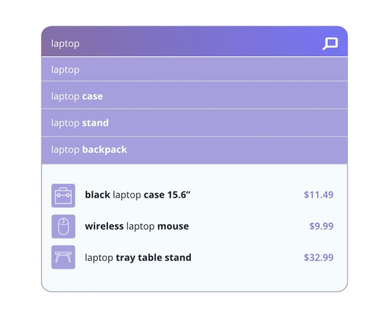
Over 30% of visitors go directly to the search box upon entering an online store. Therefore, encouraging product discovery via Autocomplete search and on Search Engine Results Pages is lucrative and essential.

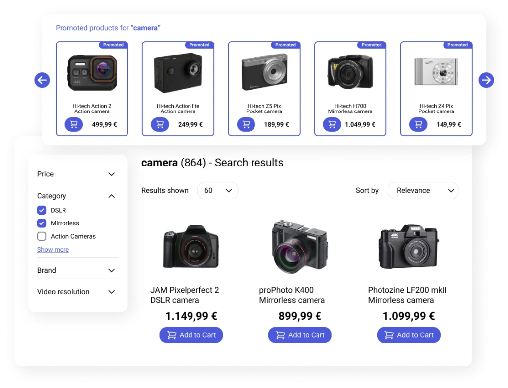
When a shopper navigates to a search results page, you can assist with their discovery by placing popular products, complementary products, or related product recommendations below the SERP results.

Keep in mind that good Ecommerce search result page design is crucial. Placing recommendations in a visible location on the search page is the most effective way to increase conversion rate.These items can help shoppers refine search intent, explore similar products, and stay in the purchase flow.

Homepages


Data-driven recommendations can help kick-start the shopping journey from the get-go.

For first-time shoppers, we suggest showcasing trending, seasonal, discounted, or new products from the biggest brands on your home page. These recommendations can entice first-time shoppers to explore the products you want to promote.

For repeat customers, personalized recommendations that align with their past preferences, browsing history, and purchase history can help them pick up where they left off. They will also show them you understand what they’re looking for.

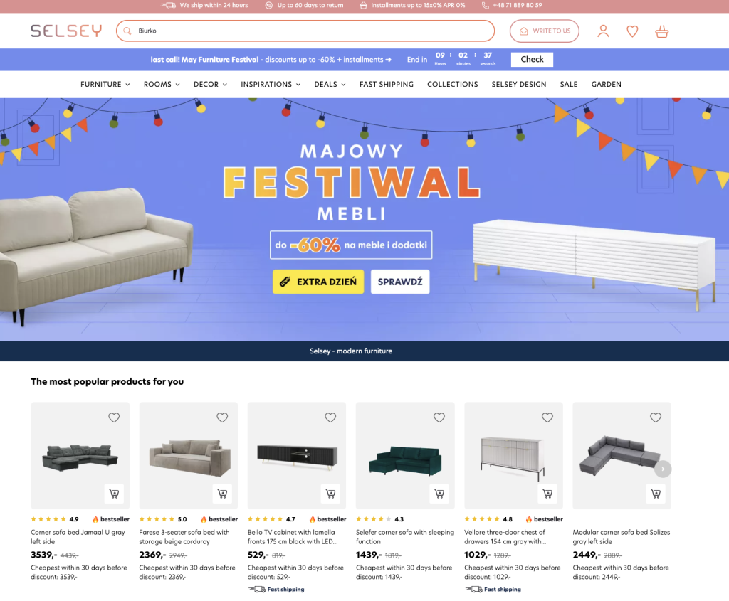
For example, products a shopper recently viewed or discounted items that match previous user behavior can work wonders. Take a look at how Selsey recommends personalized products on their homepage.

The homepage offers prime recommendation real estate to highlight products, improve the user experience, and boost sales. Be sure to implement some of the practices listed above to maximize your store’s potential.

Category Pages


Category pages showcase the most relevant items within a given product category. If a shopper searches for a microwave in Autocomplete, your recommendation engine should make it easy to navigate to a category page displaying the most popular options in stock.

Placing relevant products, such as a microwave with a grill or new models offered by a well-known brand on a specific category page can help shoppers quickly find items they want and may not have otherwise seen.

Product Detail Pages


Use the space at the bottom of the product page to your advantage.

If a shopper has decided the item they’re reviewing is not for them, you can keep them engaged by showing similar products in your catalog. Or, if they’ve added the item to their cart, you can encourage additional purchases to help them round out their order.

If a visitor is looking at a laptop, recommend other popular models at the bottom of the page. Once they add the laptop to their cart, suggest complementary items like a mouse or keyboard.

Product detail pages are a prime location to keep shoppers engaged, encourage further product discovery, and boost average order value.

Checkout Pages


If a shopper has decided to buy an item in your store, that’s great! But their purchase journey doesn’t have to end there. You can increase average order value by upselling or cross-selling relevant items on the checkout page.

Offering advanced models with a bigger profit margin or data-driven recommendations for frequently purchased together products can help with your bottom line.

Suggesting products you know a shopper will be interested in can inspire last-minute purchases at the most critical decision-making point.

Zero Result Search Pages


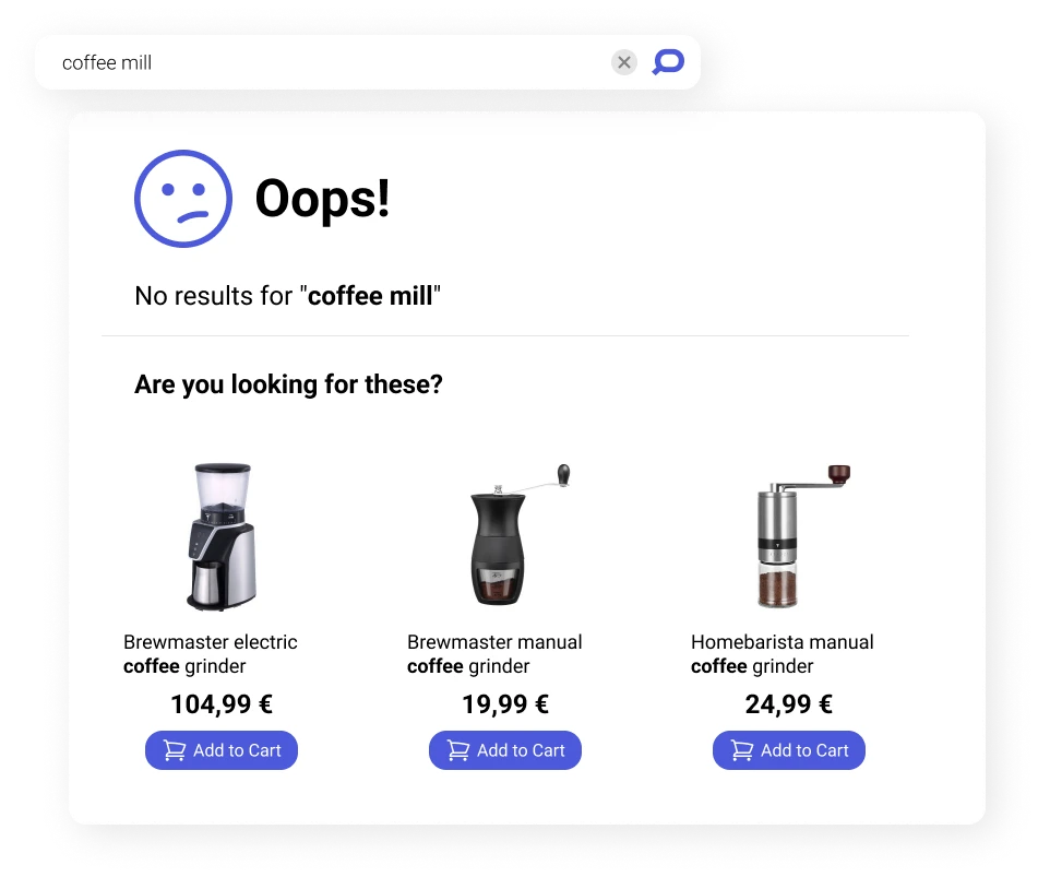
Shoppers expect to find desired products immediately. Therefore, unsuccessful product searches are one of the most frustrating experiences users can have in your store. If they land on a zero result research page, you risk losing them to a competitor.

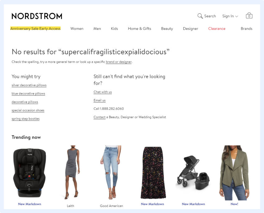
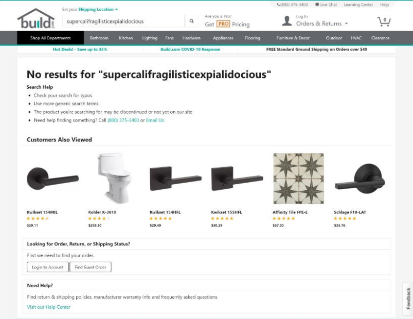
That said, placing recommendations on the zero result pages can help ease the pain. We recommend checking out these no result page examples for Ecommerce and implementing the best practices.

Suggesting products that align with a customer’s intent can show you understand them and make it easy for them to stay in the purchase flow.

404 Pages


404 pages, also known as “error pages” or “page not found” pages, are a bummer that can reflect poorly on your business. Conversely, you can use them to your advantage.

Placing recommendations for popular, discounted, or personalized products on 404 pages can intrigue shoppers and create additional viewing opportunities for a wide range of products.

This will create a seamless shopping experience instead of driving shoppers away.

How Can You Assess If Your Product Recommendation Strategy is Successful?


The best way to measure success is by setting recommendation-specific Ecommerce KPIs. Here are a few examples.

  • Number of product clicks
  • Add to basket actions
  • Product checkouts
  • Unique purchases
  • Product revenue

These metrics are more insightful than measuring conversion rate or average order value and can help you identify if your recommendations are effective. Customer feedback, return visits, and positive reviews can also indicate how shoppers feel about them too.

Keep in mind success is defined differently from company to company. So once you identify what you want to achieve with product recommendations, track the corresponding KPIs and measure them consistently to see if you’re achieving your goals.

6 Strategies to Maximize the Impact of Product Recommendations in Ecommerce


In the highly competitive Ecommerce industry, AI-driven product recommendations have become standard. Providing personalized suggestions enhances the experience in your store, increases the likelihood they’ll become paying customers, and drives customer retention.

However, not all product recommendations are equal.

The following tips and strategies will help you properly leverage recommendations to create a seamless shopping experience, inspire purchases, and boost revenue.

1. Leverage all paths to conversion, not just cross-selling and upselling


Using product recommendations for cross-selling related items and upselling products is an effective way to increase conversion rate, but there are other strategies too.

Offer personalized Ecommerce recommendations. Product suggestions that reflect customers’ browsing history, demographics, location, and previous purchases are more likely to drive clicks.

Don’t undermine the power of social proof. Shoppers are more likely to buy products when they see others have already purchased and liked them. Include social proof in your product recommendations by highlighting good reviews and showcasing trending products.

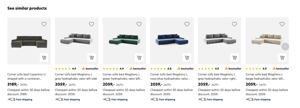
Recommend related products. If a shopper searches for a sofa bed, recommend the most popular items in stock that align with their initial purchase intent. For example, a u-shaped sofa bed or a corner sofa bed.

Show complementary products. If shoppers search for a video game console, recommend controllers or trending games. Encouraging shoppers to round out their purchases with related items is an effective way to drive conversions and increase average basket size.

Use scarcity. Highlighting limited-time promotions or items running out of stock with recommendations can create a sense of urgency and encourage shoppers to make faster purchase decisions.

Take advantage of E-commerce personalization and all other recommendation opportunities and use cases in your store. This will help you offer a positive customer experience that keeps shoppers coming back for more while improving your bottom line.

2. Ensure personalized product recommendations are data-driven


Recommending any old products to shoppers is not enough. Recommendations should help shoppers continue their journey effectively. One effective way to do this is by creating personalized experiences.

To create a personalized online experience, Ecommerce businesses must invest in the proper technology. AI and machine learning will analyze user behavior data to understand shoppers’ preferences and automatically return accurate product recommendations. 

Recommendations that reflect customer behavior, taste, and purchase patterns are more likely to resonate with shoppers. If you want to increase conversion rate, customer satisfaction, and sales, you need to leverage the right technology to maximize the potential of your personalization efforts.

3. Strategically place product recommendations throughout your store


Item recommendations must be visible to be effective, which means placement is paramount. Offering relevant product suggestions throughout every step of the shopping journey is important. However, you must ensure the right recommendations are in the right places.

Above, we discussed the different areas you can place recommendations in your store. We also highlighted which recommendation types most effectively assist shoppers at different stages in their purchase journey.

For example, related products help shoppers explore other options in your store. It’s best to offer them on the SERP, during the consideration stage where visitors browse products, rather than on a checkout page when they’ve already made a decision.

For checkout pages, complementary product recommendations are the most effective. These will allow shoppers to round out their purchases with items that align with what they’re about to buy.

Recommendations should streamline the shopping process. To create an efficient and enjoyable customer experience, you must place them strategically.

4. Create Category Pages for specific audiences


Category pages for specific audiences are unique landing pages designed for groups of users with similar tastes, interests, and shopping behavior. They help all kinds of customers navigate to the areas of your catalog most relevant to them.

You’re probably familiar with the category pages found in online fashion stores. These stores generally offer pages for men, women, and on-sale items to help shoppers quickly narrow down search intent based on their interests.

You can add more specific category pages too. For example, if someone clicks on the women’s category page in a fashion store, they can further narrow their search intent by clicking on a page for dresses. This page will show the most relevant products in the dress category and should give shoppers the ability to filter results per their desired attributes too.

In addition to being useful, category pages enable you to tailor recommendations, discounts, and promotions to the people most likely to be interested in them.

5. Use merchandizing to your advantage


Merchandizing tools allow you to promote the products you want to sell. For example, you can recommend products on sale, in high demand, or with a high-profit margin to help you improve your bottom line.

For these reasons, we recommend implementing a product recommendation solution with merchandizing capabilities that make it easy to create custom banners and campaigns. Leveraging Ecommerce merchandizing best practices in your recommendation strategy will increase product visibility and inspire shoppers to explore parts of your catalog they might not have been interested in.

Merchandizing and searchandising (search-specific merchandizing) are powerful tools for using product recommendations to your advantage. Just make sure to keep an eye on your inventory and monitor your profit margins to ensure your promotions are financially worth your time and energy.

6. Optimize your recommendations by running A/B tests


Optimization is essential to all recommendation practices. Continuously experimenting with placement, recommendation type, and visual appearance will help you identify what recommendations are engaging your audience and where there’s room for improvement.

Incorporating A/B testing into your recommendation strategy can be time-consuming, especially if you test new ideas frequently. But this optimal approach is worth it. Dedicating the proper time and resources will help ensure your recommendations drive desired business results.

What factors should you consider when choosing a product recommendation solution?


When considering Ecommerce product recommendation vendors, it is important to consider the following criteria.

Choose a data-driven solution


As we mentioned, product recommendations must effectively guide shoppers through your store. Your solution should leverage AI, machine learning, and robust automations capable of analyzing all facets of user behavior. This will best return accurate results that meet visitors’ needs and streamline their shopping journey.

While your Ecommerce product recommendation system project may focus solely on product discovery, the best-known approach is to find an all-in-one enterprise Ecommerce search provider. Finding an AI-driven product recommendation engine is a convenient way to optimize your search and discovery with data-driven results.

Make sure it’s easy to integrate


Before investing in a product recommendation engine for Ecommerce, make sure the solution you’re interested in will integrate with your platform easily. This will save you time and money, create the best possible customer experience, and allow you to scale down the road if necessary.

Ensure recommendation settings are customizable


Every business has different needs. Therefore, your solution should be user-friendly and offer easy-to-fine-tune recommendation settings. A customizable solution will help you tailor suggestions to your shoppers and give you more control.

This is crucial to targeting specific users and customer groups with personalized products or items you want to promote. It will also allow you to adapt to changes in your industry and ensure you’re always working toward your business goals.

Pick a solution that provides detailed analytics


Detailed analytics will show you how customers interact with your recommendations. These invaluable insights will help you identify where to optimize your algorithms to better meet visitors’ needs.

Recommendation engine providers offer different analytics.

Do your research to ensure your solution tracks the metrics you need to continuously improve your solution and stand out in a crowded market.

AI-driven E-commerce Product recommendations are an invaluable tool to optimize the user experience and increase sales. The right recommendation engine can set your store up for success, so be sure to choose one that adheres to the criteria above.

Conclusion


In the current Ecommerce landscape, AI-driven Ecommerce product recommendations are essential.

Product recommendations that leverage artificial intelligence most effectively catch shoppers’ attention and shorten the path to purchase. Therefore, enabling retailers to improve the customer journey, increase conversion rates, boost sales, and build customer loyalty.

The best recommendations are data-driven by a mix of filtering methods to best meet shoppers’ needs at every point in their search. So be sure to invest in the proper technology to provide relevant suggestions in your store.

Implementing a product recommendations solution and adhering to the best practices above will help you maximize your store’s potential and be a win-win for your customers and your business.

Rebecca Pacun
Rebecca PacunCopywriter – Prefixbox

Rebecca is the Copywriter at Prefixbox, a leading Search and Discovery solution for Enterprise Ecommerce retailers. Originally from California, Rebecca works at Prefixbox’s office in Madrid.

25 Essential Ecommerce KPIs to Improve Business Performance

25 Essential Ecommerce KPIs to Improve Business Performance

If you want to improve business performance but don’t know where to begin, Ecommerce KPIs are a great place to start.

Ecommerce KPIs help companies discover room for improvement and determine if they’re progressing toward their goals.

Many KPIs offer insight into different areas of your business, so it’s important to outline your specific objectives when choosing which ones to track.

In this article, we:

  • Explain what KPIs are
  • Discuss how to choose the right KPIs
  • List 25 useful KPIs to maximize business performance

Let’s jump in!

TABLE OF CONTENTS

What are Ecommerce KPIs?


Ecommerce KPIs are key performance indicators, quantifiable measurements that indicate business performance. KPIs help track progress in many aspects of your business: sales, marketing, customer service, and more.

Identifying areas for improvement and choosing relevant KPIs is the first step toward achieving your business goals.

Why are Ecommerce KPIs Important?


Ecommerce KPIs show how an online business progresses over time. KPIs are used to set goals, track customer behavior, monitor business performance, and determine progress.

If your online store isn’t performing how you’d like, tracking KPIs can help alert you to the heart of the problem (like these common online shopping problems), so you can take steps to address it.

Discovering pain points and creating KPIs can help your company formulate business strategies and make better decisions.

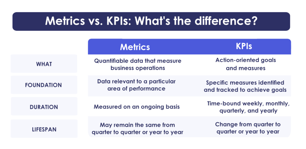
The Difference Between KPIs and Metrics


Metrics are units of measurement that show overall business health. KPIs are the most relevant metrics.

When a business chooses the right KPIs and tracks them correctly, they receive actionable insight that can inform effective strategies.
If you’re still struggling to differentiate metrics and KPIs, we’ve outlined some of the distinctions.

DIfferences between ecommerce KPIs and metrics

Now that you understand the differences between KPIs and metrics, let’s dive into how you can create them.

How to Create Impactful KPIs


When deciding which KPIs to track, you’ll want to choose metrics that:

  • Provide actionable insight
  • Offer accurate measurements
  • Deliver data instantaneously
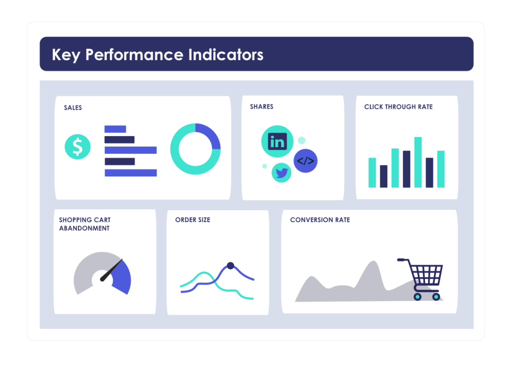
Ecommerce KPI examples

These attributes will show if your day-to-day decisions and operations are effectively helping achieve your objectives.

That said, numerous KPIs check these boxes.

So, how do you know which KPIs are best for your Ecommerce business? Follow these steps to identify the ones that work for you.

Pinpoint Room for Improvement


To find the right KPIs, you should first decide which part of your business you want to improve.

Here are some examples:

  • Sales
  • Marketing
  • Store Performance
  • Customer Service

If the suggestions above don’t align with your specific goals, don’t worry. Choose categories that best suit you.

Once you identify where you’d like to make the most impact, you’re ready to move on to the next step.

Identify Your Goals


Next, hone in on your specific goals. Your goals will dictate which part of your business you should monitor and which KPIs will be most beneficial.

Let’s take a look at how identifying specific goals can help you choose the right KPIs.

Ecommerce Goal #1

If your main goal for the year is to increase traffic to your Ecommerce store, you may want to track:

  • Ecommerce Site Traffic
  • Marketing Conversion
  • Social Media Engagement

Ecommerce Goal #2

If you want to increase overall revenue, KPIs that can help achieve this are:

  • Average Order Value
  • Conversion Rate
  • Zero Result Search Rate

As you can see, the right KPIs for your business will be determined by your unique objectives, so it is crucial to identify them first.

Once you’ve honed in on your area of interest and found a few suitable metrics, let’s see how you can narrow down the KPIs that work best for you.

Choose KPIs that Offer Meaningful Information


You’ll want to ensure your KPIs provide necessary and meaningful information for your business.

We recommend selecting KPIs that have the following attributes.

Based on Historical Data


Analytics based on historical data will help you discover areas you’d like to improve and help you track progress over time.

Historical data will alert your business to patterns and trends so you can set realistic goals, focus your attention on the right areas, create a baseline for comparison, and effectively monitor progress.

Use historical data to your advantage by creating KPIs relevant to your business, then map out an actionable plan to address them.

Collectively Measure Growth


There are many KPIs to track growth: overall revenue, average cart value, number of visitors, and more.

We recommend picking more than one to give you a complete picture of your business’s growth.

These KPIs will help you benchmark performance, focus on continuous improvement and make more informed decisions.

Establish Concrete Goals


Lastly, as we mentioned, when creating a KPI, you’ll want to make sure your goals are clear and concrete.

Concrete goals provide clarity and focus, and they allow progress to be tracked over time.

For example, let’s say you want to focus on marketing. Concrete marketing goals can vary depending on your business but may include increasing sales, boosting website traffic, or achieving ROI on Ad campaigns.

Key performance indicators provide a basis for setting targets and performance benchmarks, so ensuring they establish concrete goals is an effective way to drive improvement.

Choose the Right KPIs for Your Business


Now that you know how to assess your business goals and decide on a few target areas, you’re ready to choose the KPIs that best address them.

If you need some ideas, here are 25 different Ecommerce KPIs you can use to improve business performance.

25 Essential Ecommerce KPIs for Maximum Business Performance


To help you choose the right KPIs for your business, we’ve compiled a list of 25 useful metrics, discussed their impact, and explained how to track them.

Let’s get started!

1. Customer Acquisition Cost (CAC)


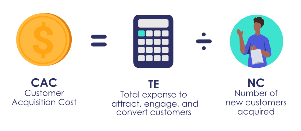
CAC is the average cost of acquiring a customer. This KPI shows how effective advertising campaigns and investments are.

To find CAC, track your marketing efforts by channel (advertisements, SEO, etc.) and divide the total spent in each category by the number of new customers acquired via that specific channel.

Customer Acquisition Cost illustration

Tracking CAC can highlight which marketing channels are most effectively generating sales.

That said, it’s important to keep in mind that customers may have been drawn to your business by the combined effort of many channels rather than one customer acquisition campaign.

2. Average Order Value (AOV)


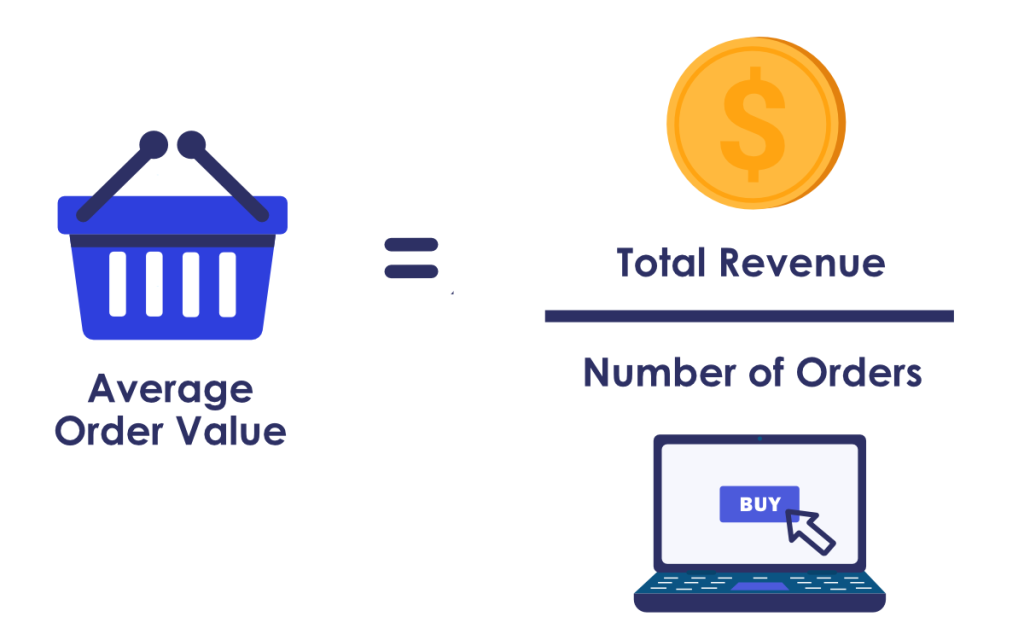
AOV is the average amount shoppers spend on a purchase at one time. You can find this retail performance metric by dividing your store’s total revenue by the number of shoppers who make purchases over a set period of time.

Average Order Value illustration

You may have considered trying to increase total orders rather than average order value. However, it is generally more lucrative to encourage shoppers already in your store to purchase additional items rather than to attract new business.

3. Conversion Rate


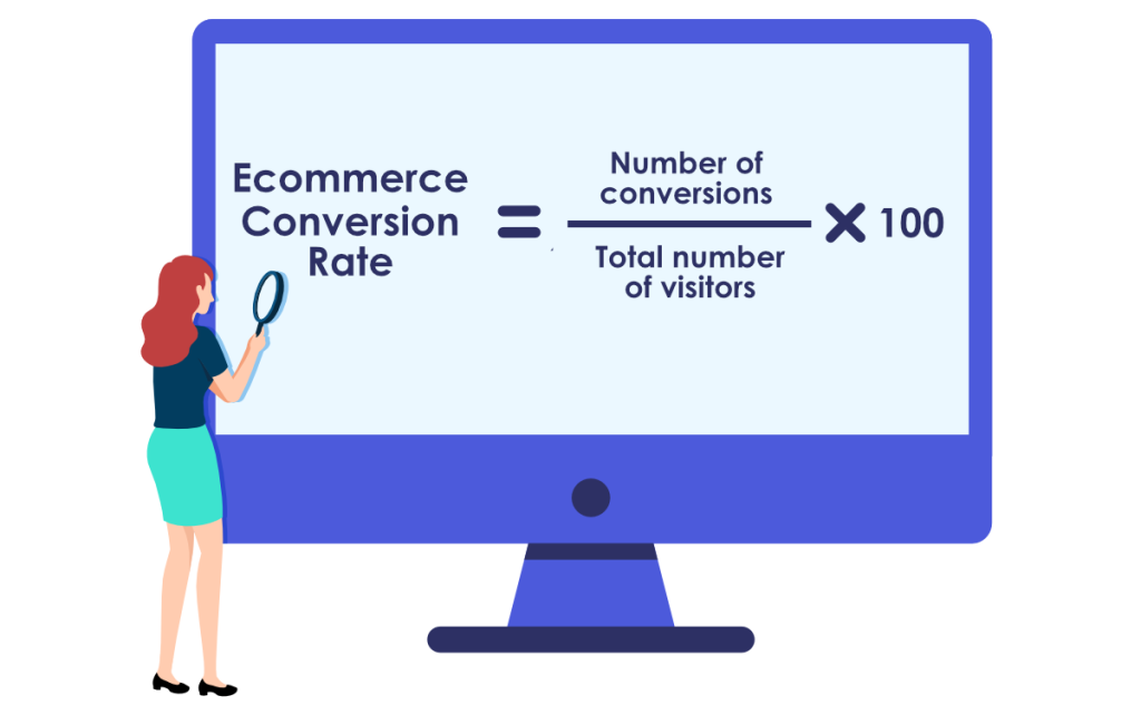
There are many conversion metrics you can track. Conversion or click-through rate is generally found by dividing the number of targeted shoppers by the number of them who took a desired action (i.e. clicked on a search result or added an item to their cart).

Conversion rate formula

4. Cost Per Acquisition (CPA)


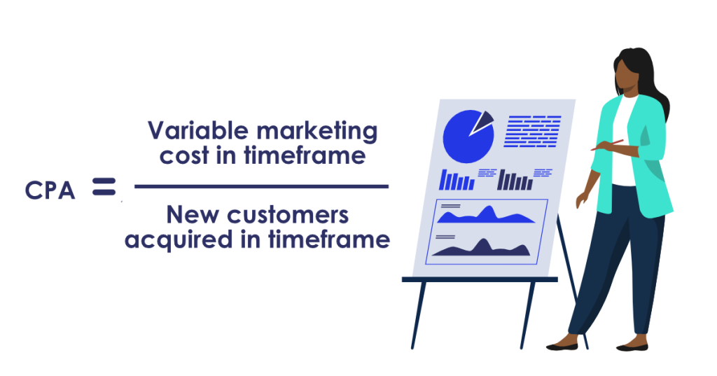
CPA is the cost of acquiring a non-paying visitor to your store. To find CPA, first calculate the cost of your marketing efforts (by channel, if desired). Then, divide it by the number of visitors to your store over a specific time period.

Cost per acquisition formula

5. Customer Lifetime Value (CLV)


Customer Lifetime Value is an estimate of how much money a customer will spend during their entire tenure in your store.

Increasing the number of new customers is more expensive than retaining return visitors. Additionally, return visitors spend over 60% more money than first-time buyers, so this is an important metric to track.

Customer lifetime value formula

If you want to increase CLV, you can start by creating customer loyalty programs and improving the user experience on your site. These optimizations may be time-consuming but can lead to significant increases in revenue.

6. Zero Result Rate (ZRR)


Zero Result Rate is the percentage of searches that lead to zero result search pages.

Zero result search pages often lead to frustration and cause shoppers to prematurely end their shopping journey. This is because shoppers think you don’t have what they’re looking for, even if you have the item in stock.

You can lower this number by implementing an effective search solution with a Rich Autocomplete that understands user intent and guides shoppers to desired results for every query.

While you can drastically lower ZRR with an optimized search solution, it is important to know that zero result search pages are inevitable. Check out this article to learn how to prevent frustration in your store and keep shoppers engaged.

7. Average Cart Abandonment Rate


Average Cart Abandonment Rate shows the percentage of shoppers who added items to their cart and left the store without making a purchase.

According to SaleCycle, Cart Abandonment Rate is much higher on mobile devices than on desktops, so it is important to pinpoint why shoppers aren’t completing their purchases to address this KPI.

A shopper may abandon their cart for many reasons:

  1. Shipping costs
  2. Item availability
  3. Difficult UI

Once you start tracking cart and checkout abandonment rates, you can target the specific causes and help alleviate shoppers’ pain points.

For example, you can acknowledge shoppers’ struggles during the add-to-cart process, address shipping costs, and take additional action you see fit.

8. Branded Online Search Impressions


Branded Online Search Impressions tell you how many people are searching for your brand online, organically, and across different channels.

This key performance indicator can be tracked via Google Ads (or another keyword tool like Wordstream or SEMRus) and used to show how effective marketing efforts are.

9. Customer Churn Rate


Customer Churn Rate is the percentage of customers who terminate their relationship with your business over a specific period.

You can calculate CCR with the following equation:

Customer Churn Rate formula

This KPI is important because customers with repeat visits to Ecommerce businesses generate more revenue over time than new shoppers who only make a single purchase in your store.

One way to lower your churn rate is to implement an advanced search solution. This will help shoppers find what they’re looking for more efficiently, create a positive brand image, and encourage repeat visits.

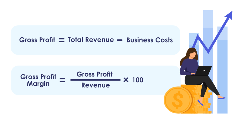
10. Gross Profit Margin


Gross Profit Margin is a strong indicator of your business’s health and performance.

To calculate Gross Profit Margin, use the following equations:

Gross Profit Margin formula

Generating a profit is one of the most important aspects of running a business, so this KPI is a very effective way to measure success.

11. Conversion Rate Per Traffic Channel


Tracking Conversion Rates Per Traffic Channel will help you discover which marketing efforts are most effectively bringing in business.

This KPI measures traffic volume and will help inform where your customers are coming from, which campaigns are most effective, and how to best allocate your budget.

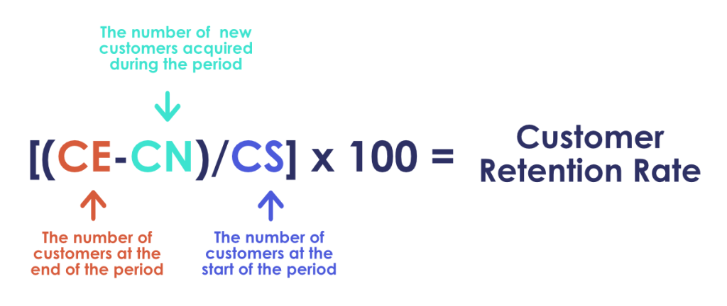
12. Customer Retention Rate (CRR)


CRR is the percentage of customers a business retains over time. Most revenue comes from repeat customers rather than first-time shoppers.

This KPI will help you understand what aspects of your Ecommerce store are encouraging repeat visits and what’s causing them to leave.

Customer Retention Rate formula

Pinpointing areas of your business that can be optimized for better retention rates can drastically increase revenue, so this KPI is crucial.

13. Add-to-Cart Rate


Add-to-Cart Rate tells you the percentage of shoppers that added an item to their cart.

This metric doesn’t track purchases. However, it can help you understand if the visitors in your store have come with a specific product in mind or if they’re browsing. It also shows how effectively your Ecommerce store was able to help shoppers find desired items.

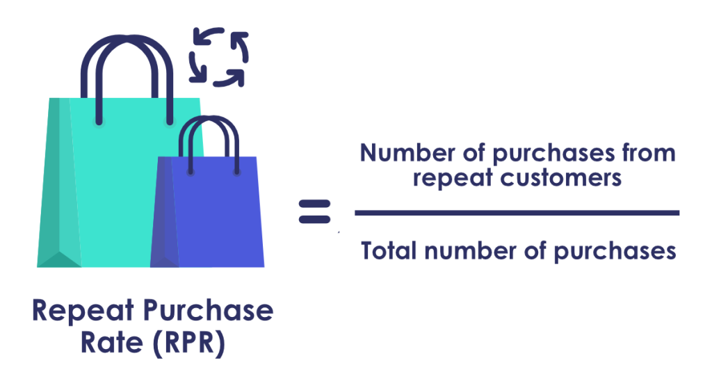
14. Repeat Purchase Rate (RPR)


Repeat Purchase Rate is the percentage of customers that return to your store to make a purchase.

This metric can help you discover how strong your customer loyalty is. This information can inform strategies that strengthen the impression of your brand.

Repeat Purchase Rate formula

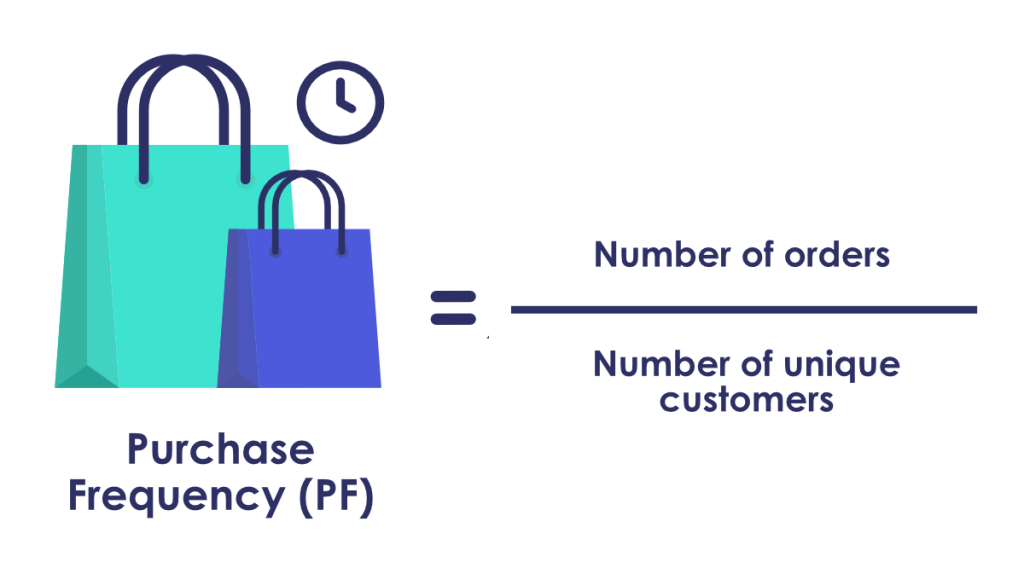
15. Purchase Frequency


Purchase Frequency measures the number of purchases shoppers make in your store over a specified period. This KPI can help you determine which products perform well and help you gauge customer loyalty.

Purchase Frequency formula

16. Average Purchase Revenue Per Visitor


This KPI tells you how much revenue your Ecommerce store is making per visitor on average.

You can find this number by dividing total revenue by the total number of visitors in a set period of time.

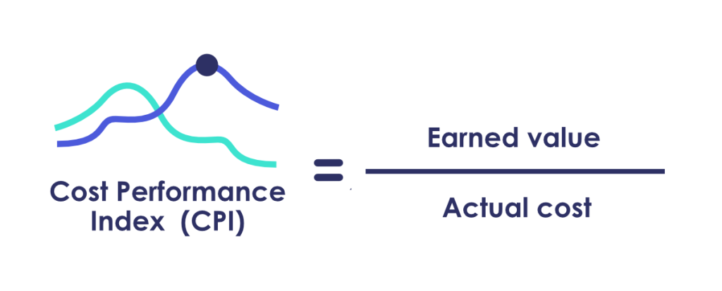
17. Cost Performance Index (CPI)


CPI measures the cost efficiency of specific projects. It also shows if a project is performing well relative to its budget.

Cost Performance Index formula

CPI is a great way to determine how effectively your spending is generating your desirable outcome.

18. Return on Investment (ROI)


ROI measures the efficiency and profitability of an investment.

Calculate ROI by dividing net profit by initial cost. This will help determine how quickly and effectively your investment generated a profitable outcome.

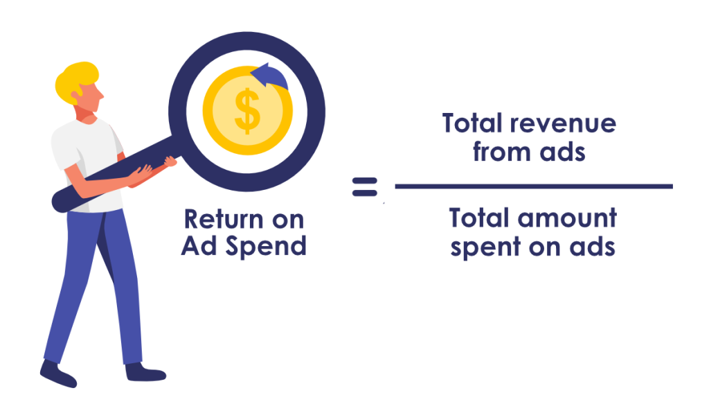
19. Return on Ad Spend (ROAS)


ROAS measures the amount of revenue generated from money spent on specific advertising efforts.

This KPI determines how your marketing spending efforts impact actual revenue.

Return on Ad Spend formula

Track ROAS to ensure you’re not wasting your budget on channels that are losing money.

20. Email Signup Conversion Rate


This KPI measures the percentage of subscribers that opt into your sales funnel as a direct result of your email outreach.

Email campaigns are an effective way to target new sales prospects. There are many ways to create engaging email outreach campaigns; we recommend:

  1. Personalizing your email to the target audience
  2. Demonstrating you understand the recipient’s pain points
  3. Optimizing the content with relevant CTAs 

When done correctly, tracking your email list growth rate and email click-through rate can be incredibly lucrative.

21. Website Traffic


Website traffic is one of the most important metrics to track. The number of people who visit your site directly impacts purchases and revenue.

Measuring the percentage of customers coming from social media posts, blog traffic, newsletter subscribers, or other channels can help you determine where visitors are coming from. Then you can use this information can to better target people who will most likely increase traffic to your store.

22. Time to Purchase


Time to Purchase tells you how long it takes a shopper to make a purchase. Depending on your industry, shoppers may visit your store many times before buying something. Or they may come once and purchase an item from your Ecommerce business immediately.

For example, in a Consumer Electronics store, shoppers often make repeat visits. They want to ensure they research a single product thoroughly before buying it. In this case, it may be best to make detailed product information easily accessible so shoppers can make confident purchases without leaving your store.

On the other hand, shoppers in online pharmacies often want to buy medicine quickly. Thus, it is best to provide them with reviews or pharmacy pick-up details to shorten the average purchase time.

Tracking this metric will help you understand your shoppers and make data-driven decisions to streamline their purchase journey.

23. Repeat Visits


Repeat visits include shoppers who continuously look at items when making a purchase decision and repeat customers looking to make another purchase.

If you notice many visitors coming to your store without buying anything, pinpoint where shoppers are terminating their journey. This will help you determine which part of your store to optimize.

And, if you have many repeat customers, that’s great! But don’t get complacent. Shoppers’ needs and habits change frequently, so it’s best to continuously enhance the customer experience to strengthen brand loyalty and encourage more repeat visits.

24. Bounce Rate


Bounce Rate shows the percentage of visitors who enter your store through a search engine or other referral source and leave without making a purchase. This metric indicates whether or not shoppers are finding the products they’re looking for in your store.

One way to lower your bounce rate is to focus on search engine optimization. An optimized search engine that leverages Machine Learning and AI is an effective way to help shoppers find items they want to buy.

Search engines that generate relevant recommendations, suggest popular products or product bundles, and provide accurate rankings will encourage repeat visits and decrease your store’s bounce rate.

25. Referral Traffic


By measuring Referral Traffic, your business can see which sources are sending the highest number of visitors to your site.

This metric can help you ensure you’re spending money on the most effective channels.

Now that we’ve gone outlined 25 useful Ecommerce KPIs, you probably have an idea of which ones you’re going to use. So let’s dive into our final question.

How often should you track your Ecommerce KPIs?


The frequency you check your KPIs depends on the specific metric you are tracking, as well as your individual business goals.

That said, we’ve outlined commonly used time frames that you can use as a guide.

Weekly Metrics


Ecommerce metrics that give insight into the day-to-day health of your business (impressions, social media networks engagement, website traffic, etc.) should be monitored weekly. 

For example:

  • Conversion Rate
  • Website Traffic
  • Sales

Bi-weekly Metrics


Metrics that require a larger sample size to offer an accurate picture are best checked bi-weekly.

  • Cart Abandonment Rate
  • Average Order Value
  • Ad Campaign Performance

Monthly Metrics


Many KPIs are best tracked on a monthly basis for the most accurate results.

A few monthly KPIs include:

  • Customer Churn Rate
  • Email Signup Conversion Rate
  • Conversion Rate per Traffic Channel

Quarterly Metrics


Metrics that determine business growth should be checked quarterly to ensure you have a clear sense of how your business is performing in relation to the goals you’ve set out to achieve.

For example:

  • Customer Acquisition Cost
  • ROI
  • Gross and Net Profit Margins

Conclusion


Choosing the right Ecommerce KPIs for your business will be determined by your company’s objectives.

No matter which facet of your business you want to improve, we recommend choosing KPIs that establish concrete goals, are based on historical data, and collectively measure growth.

Once you decide which aspects of your business you’d most like to target and optimize, you can effectively narrow down the right KPIs and take actionable steps to maximize business performance for long-term success.

Rebecca Pacun
Rebecca PacunCopywriter – Prefixbox

Rebecca is the Copywriter at Prefixbox, a leading Search and Discovery solution for Enterprise Ecommerce retailers. Originally from California, Rebecca works at Prefixbox’s office in Madrid.

Testing Shopware: An In-Depth Look at the Open-Source Platform’s Site Search  

Testing Shopware: An In-Depth Look at the Open-Source Platform’s Site Search

At Prefixbox, we want to ensure Ecommerce retailers offer the best possible online shopping experience, and this starts with search.  

Many Ecommerce businesses set up their stores on Shopware, so we looked at its search functionality and created a guide to help you optimize Shopware for maximum performance

In this guide, you’ll find: 

  • Insight into Shopware’s product import process 
  • A checklist of essential search features (and an in-depth look at them) 
  • Best practices to optimize your Shopware search solution 

Let’s get started.  

Shopware Site Search Test Results

Shopware’s Dockware PLAY platform is the free, community-based version they offer. It has a basic search solution that takes time to set up, but the community behind it makes it possible to enhance and improve if you take the time to implement best practices and additional features. 

Below, we shared our experience using Shopware and outlined the steps you can take to optimize your store

What is Shopware? A Quick Summary


Shopware is an open commerce platform that many businesses use to build their online stores. 

The technology is open-source and uses an MIT license. Like Magento and many other Ecommerce platforms, it can be shaped and formed by the community and developers that use it

Tens of thousands of online stores use Shopware, including big brands, and it is most prevalent in Germany. Most notably, Euronics, Jacques Lemans, Tigha, Discovery Channel EU, Lufthansa Cocktail, the Mercedes Benz Classic Store, and Oktoberfest use the platform.

Shopware was established as early as 2000 in Germany and has been open source since 2016. In its over 20-year history, Shopware has garnered a strong community behind it. 

But what we really want to know is…  

How Does Shopware’s On-site Search Work and Perform?


To answer this question, a Prefixbox developer set up an online store using the demo version of Shopware so we could get first-hand insight into its functionality. 

Preparing Shopware for Testing


We didn’t plan to include a section on the set-up process; however, we ran into a few issues while setting up our store and couldn’t find much documentation addressing them online. 

We’ve outlined our experience with the set-up process and shared ways we overcame the difficulties to help other stores save time. 

Before you set up your shop, it’s important to know… 

Importing a Large Number of Products Takes Time


For this test, we used an existing product feed from an online consumer electronics store. The feed was complete with about 100,000 products and included product attributes and images. 

For our purposes, we needed a Shopware environment that had already been set up. Shopware provides this environment via Docker, which has multiple versions. The most popular of these is the Dockware PLAY edition, which provides the easiest, fastest solution for testing. 

Building the Docker environment was simple: it’s a popular task among developers and many free resources are available. 

After installing the Dockware PLAY environment, we got three endpoints to access it via browser: 

  • {domain}/adminer.php – We can access the underlying relational database, write queries, edit tables, columns, and rows here. 
  • {domain}/admin – We can access the admin panel to set up the entire store, upload, manage and maintain it here. 
  • {domain} – We can access the front-end of the online store here. 

The default environment includes a basic theme, some dummy data, and products with the web shop. However, we got rid of most of this to monitor the few remaining modified products in the database through the admin panel. 

After a quick overview, we looked for a convenient way to import our database of about 100K products. By default, you can only upload products individually in the admin panel; however, we discovered there is also an option to import or export multiple products at once

Unfortunately, the bulk import/export process was not as straightforward as we’d hoped. Our first attempts to import products were unsuccessful, and we couldn’t find much documentation about why this was happening online. 

After a lengthy trial and error process, we discovered Shopware could not import our products because our product naming convention didn’t match what Shopware used in their product database. Upper and lowercase sensitivity was causing a problem in a GUID. 

So, we had to find a way to change the format of all our product names from DisplayText to display_text or displaytext. 

Eventually, we wrote a program that converted our product feed into a properly formatted CSV for categories and products. This resulted in several rounds of generation, code correction, uploading, and then waiting for potential errors. After resolving some inexplicable invalid format errors, we found a way for Shopware’s import function to process our products and were finally able to start uploading categories to the database. 

We wrote a program that converted our product feed into a properly formatted CSV for categories and products. After resolving some inexplicable invalid format errors, we found a way for Shopware’s import function to process our products and were finally able to start uploading categories to the database. 

There, we ran into a second round of problems, because… 

Batch Sizes Matter When Importing


We quickly realized that uploaded categories don’t automatically appear in the shop; you must index them first. This is possible through the admin panel and could be done relatively quickly for our roughly 1300 categories by uploading batches of 50. 

We initially tried uploading our 100,000 products in a 40 MB CSV file but kept getting an unexplained timeout notification. After another lengthy investigation, we found out the engine begins indexing the products during the import procedure, and after a few hundred items, it permanently times out. 

This is how we eventually realized we could only import batches of 50, and a developer later confirmed this is a known issue. That developer let us know the only way around this is to use a backend-facing API, which allows us to write directly in the database. 

We hoped there would be a little more documentation regarding the API; however, we eventually figured it out: all data imported this way must be againindexed manually, which wasn’t feasible with 100K+ products and 1300 categories. 

So, next up on our list of challenges was finding a proper batch size that could be indexed. We thought we could trigger indexing from the admin panel with the right queue message. However, without documentation available, we found this option to be a dead end. 

We decided to start importing different batch sizes until we found the right one. 

We started importing batches of 2000, which was a painstakingly slow process with its own set of challenges. Eventually we figured out products could be imported in batches of 50

Matching Images to Products


Once we uploaded our products, we had to match their respective images to them (we couldn’t assign IDs to existing images beforehand). 

Our images were linked to the products in multiple tables, so we had to test them one by one to find the minimum viable input. 

In doing so, we encountered inconsistent error messages. We eventually managed to upload and link images to products in tables where they weren’t previously displayed. Then we ran another indexing. We expected this to be slow, but it just didn’t run. 

We circled back to the beginning to experiment with batch sizes again; smaller batch sizes made indexing possible, but it was a very slow process. 

Once we finished uploading our products, we turned our attention to design. 

Modifying the Design


Finally, after weeks of work, we wanted to tweak the design slightly. This is another part of Shopware that isn’t well documented. We found documentation for a previous version, but it required thorough user knowledge of PHP, CSS, and HTML. 

Since we are not PHP developers, we looked for built-in themes we could use. These themes (and extensions) are available in the Shopware admin panel. You need to sign in with a Shopware account; we already had one because, like Shopware Demo, they provide a trial for anyone who wants to test the engine. That said, we couldn’t log in, which another developer explained was because ‘it’s not possible from a container.’ 

Thanks to the helpful Shopware developer community, we realized we ultimately couldn’t touch the design in our current test environment. This is where the experiment ended for our developer. 

Shopware Set-Up Summary


Based on our experience setting up a store with Shopware, our developer found Shopware’s non-Enterprise version to be a solution for those running a simple online store. When it comes to bigger businesses, the setup process requires a lot more time and resources to get everything up and running.   

Testing Shopware’s Search Features


Once we set up our demo store, we were ready to start testing the search function. 

First, we created a checklist of search features that matter most. Then, we took an in-depth look at their functionality

Checklist: Essential Search Features

  • Autocomplete
  • Search Engine
  • Zero Result Pages
  • Mobile Optimization

We’ve outlined our findings below and suggested best practices you can use to build upon Shopware’s existing features.  

If you want to ensure your Shopware search solution is fully optimized, get your checklist ready, and let’s dive in.  

Autocomplete


Autocomplete is one most impactful features of any onsite search solution. Autocomplete functions within the search bar, which is usually located at the top of the page. 

At the very least, all search bars should have an autocomplete function that deciphers user intent and provides relevant keyword and product suggestions. If equipped with the right features, autocomplete is a powerful tool that guides shoppers to desired items. 

To see how well Shopware’s autocomplete performs, we made another checklist of autocomplete features we find most important

Checklist: Essential Autocomplete Features

  • Product Suggestions
  • Typo Tolerance
  • Layout
  • Accurate Rankings
  • Mobile Optimization

Let’s break it down. 

Keyword and Product Suggestions


Keyword and product suggestions are a staple feature in an autocomplete. They must be relevant and appear quickly. 

In the Shopware demo store, autocomplete product suggestions appear after three keystrokes, which is slower than the industry standard. 

If you are using the community version of Shopware, it is important to be aware of this because shoppers expect to see results immediately upon clicking in the search box. 

Furthermore, Shopware’s autocomplete results appear in the typical dropdown style. As you can see below, we also see basic product information (in this case price, which is a default setting) and an option at the bottom to continue to the full results page. 

Shopware Search Autocomplete Feature Example

The dropdown results include relevant product recommendations, but we can see Shopware’s store is missing keyword suggestions, which are essential for an optimized autocomplete. 

PREFIXBOX RECOMMENDATION

PROVIDE KEYWORD SUGGESTIONS

In addition to showing product suggestions in the drop-down menu, keyword suggestions help shoppers navigate to accurate, desired results.

When shoppers visit websites on a desktop device, 50% click keyword suggestions, 5% click product recommendations, and 45% just hit enter. Keywords guide shoppers to high-quality results on the Search Results Page,so it’s important to display relevant results quickly to improve the user experience on your website.

An easy way to show shoppers keyword and product suggestions is to use a 2-column layout. 

USE A 2-COLUMN LAYOUT

A 2-column layout is an effective, user-friendly way to provide keywords, categories, and product suggestions that help shoppers refine their search within broad categories.

These suggestions enable shoppers to explore a retailer’s catalog, find the products they want to buy, and enhance the shopping experience by providing a clear path to purchase. 

Rossmann is a good example of a store that effectively utilizes a 2-column layout: 

Rossmann's Effective 2 Column Search Autocomplete

When searching for product names, Shopware’s autocomplete provides relevant and accurate recommendations.

Shopware Search Autocomplete Relevancy Accuracy Test

When searching for something other than the product’s name (i.e. a product number), results are accurate as well. As you can see below, the first result is the product with the corresponding number, and the following items are similar.  

Shopware Search Product SKU Accuracy

Number of Suggestions


In the demo store, the dropdown menu displays exactly 10 products, which is in line with our recommended best practice.  

Shopware Search Results Number of Suggestions

PREFIXBOX RECOMMENDATION

DISPLAY 10 PRODUCT SUGGESTIONS MAX

Retailers should display a maximum of 10 product suggestions, which means accurate rankings are essential.

As outlined in our autocomplete guide, if your suggestion list is longer than 10 items:  

  • Search time increases as users scroll through them 
  • Off-screen suggestions may be ignored or missed 
  • Users might experience choice paralysis and avoid making a decision instead of wasting time weighing all the options 

Category Suggestions


We were surprised to discover Shopware’s platform doesn’t support category search suggestions, which are very useful for shoppers. 

PREFIXBOX RECOMMENDATION

OFFER CATEGORY SUGGESTIONS

Category suggestions allow shoppers to narrow down broad search queries to specific items directly within the search box. For example, a shopper searching for headphones can easily specify Bluetooth, sports, or wireless headphones. 

Category search suggestions save time, provide customers with a clear path to purchase, and are an effective way to increase the user experience in your store.

To see how simple and useful this feature is, look at how IKEA’s autocomplete offers categories related to a shopper’s query: 

Ikea's Search AutoComplete Category Suggestions

Category suggestions are effective on search result pages too. If you’re looking to enhance the user experience in your store, we recommend offering them to shoppers. 

Typo Tolerance


A prerequisite for site search usability is a strong error tolerance for typos, so we wanted to see how well Shopware handles misspelled queries. 

Shopware’s autocomplete handles misspellings fairly well; in most cases, you can get relevant results even when queries contain multiple spelling errors. 

Shopware Site Search Typo Correction

Autocomplete also handles special characters well:  

When we replaced special characters with regular letters, the feature continued to work effectively. However, you can see below that the first results are based on exact text matches rather than an understanding of user intent. 

Shopware Site Search Special Character Handling

That said, Shopware provides relevant results when shoppers misspell their search queries, which shows us their typo tolerance feature is effective and is in line with our recommended best practice.

PREFIXBOX RECOMMENDATION

MAKE SURE YOUR SEARCH IS TYPO TOLERANT

Advanced typo tolerance features that recognize spelling mistakes and present shoppers with relevant products, categories, and keywords decrease zero result search rate and ensure shoppers can easily navigate their path to purchase.

As explained in this guide on choosing an enterprise Ecommerce search provider:

 “A typo rate somewhere between 1 in 4 and 3 in 4 might seem extremely high, but with keyboards, fast typing, the prominence of typo-tolerant search engines, and spell checking, it is possible because we hardly pay attention to spelling anymore.

If your site search engine can’t tolerate typos – as in, recognize them and recommend another search, or even better, show results for the correctly spelled keyword instead of returning zero results – you risk driving your customer away.”

Layout


Shopware’s basic autocomplete layout is a standard, one-column list that appears in the drop-down window. 

Shopware's One-column Search Autocomplete Layout

If you look closely at the image above, you can see the list has product names cut short. This is something we recommend avoiding. 

PREFIXBOX RECOMMENDATION 

DISPLAY FULL PRODUCT NAMES

To prevent confusion with shoppers who may not know what they’re clicking on if a part of a product name is missing, it is important to display full product names in autocomplete dropdown lists.

Showing full product names is one way to generate more revenue in your store. 

Many suggestions, including long or multiple keywords, won’t be able to fit in their row, given the limited screen size and that you must use a big enough font for readability.

However, if you shorten the suggestion by including “…” at the end, you may confuse customers who might not know what they’re clicking on when part of the information is missing.

So how do you solve this problem?

KEEP VISUAL NOISE TO A MINIMUM

While it’s important to include keyword and product suggestions, prices, and photos where relevant, we suggest keeping your autocomplete simple, straightforward, and distraction-free.

Use text wrapping and expand suggestions to multiple rows as needed, even if this means fewer will be visible.

With modern on-site search solutions, the suggestion field can contain a large variety of elements like text, prices, photos, short descriptions, etc.

While these attributes help shoppers, be careful not to include too many additional elements. This can overwhelm shoppers, take focus away from the actual suggestions, and confuse customers more than it helps them.

Hovering Feature for Product Recommendations


Shopware’s autocomplete doesn’t offer shoppers a way to see if the item they click on is the product they intend to purchase. This can be dangerous because shoppers might grow frustrated if they click on the wrong product without realizing it. 

PREFIXBOX RECOMMENDATION

HIGHLIGHT PRODUCTS WITH KEYWORD HOVER 

When presenting shoppers with any results list, you can show shoppers their clicks will take them to the correct product page by highlighting the area the mouse hovers over.

Our Autocomplete Search Best Practices guide says:

“When a shopper is browsing suggestions, you should indicate which product the user’s mouse is hovering over. Or, if shoppers are using keyboard navigation, they must be able to see which suggestion is active. 
 
This provides clarity and helps eliminate mistakes, like choosing the wrong suggestion and having to go back. 
 
You may also offer a hand cursor to signal shoppers can click on suggestions to be taken to a result page.”

A state-of-the-art solution includes dynamic keyword hovering, an advanced feature that provides additional, relevant product suggestions to shoppers as they hover over a specific keyword in the search box. Dynamic keyword hovering is one way to take full advantage of autocomplete because it allows shoppers to see more results without taking up additional screen space. 

Price, Images, and Discounts


Shopware’s autocomplete results in the dropdown menu include images and prices for the individual product. The images are small and resized to match the text, but in most cases can be understood. 

We did not set discounts in our test store, so we don’t have information about whether or not they’re displayed in the default version. However, based on the layout of the results bar, it seems unlikely. 

PREFIXBOX RECOMMENDATION

SHOWCASE DISCOUNTS

Showing discounts in the autocomplete dropdown menu can encourage shoppers to make a purchase or explore areas of your catalog they may have missed.

Praktiker doesn’t use Shopware, but they do a great job displaying currently discounted products in their autocomplete suggestions.

Take a look:  

Praktiker Search Autocomplete Including Price Discounts

Relevance


We saw that Shopware provides relevant product suggestions when we looked at their typo tolerance feature. Shopware seems to prioritize exact text matches over relevance or popularity score, but we aren’t exactly sure how Shopware’s autocomplete decides on relevancy. 

Shopware exact match search prioritization

PREFIXBOX RECOMMENDATION

ACCURATELY RANK RESULTS

To best provide an accurate hierarchy of results, autocomplete should be capable of deciphering user intent instead of simply text-matching keywords in a product name or description.

As mentioned in our guide on choosing an  enterprise Ecommerce search provider, there are many ways to go about providing shoppers with relevant results.

As you can see in the link, one way is to implement a feature that leverages AI to predict user intent. Intent-based recommendations “guide shoppers through their path to purchase by suggesting searches that prevent zero results search pages.” 

If you’re using Shopware, you can custom-develop a feature to decipher user intent or find a third-party provider to help optimize your search solution.

As we wrap up this section, you should be well-prepared to assess and optimize your autocomplete feature so let’s switch gears and look at another important aspect of Shopware’s search solution.

Site Search Engine


An optimized search engine is critical to streamlining the shopping experience. When equipped with the right features, the search engine is a powerful tool for increasing conversions and revenue in your store.

We looked at a few key components of Shopware’s search engine and outlined best practices you can use to improve the shopping journey and, in turn, maximize business performance.

Facets and Filters


Filtering is essential to Ecommerce stores. Filters prevent shoppers from getting overwhelmed with endless results by allowing them to select desired product attributes. 

We only found one filter in the demo version of Shopware: a price range filter. 

Shopware Faceted Filtering Example

Dynamic filters and additional faceted filters were not present. 

Let’s look at the difference between dynamic and faceted filtering and see how implementing these features can add to the success of your online store. 

Faceted Filtering


Faceted filtering allows shoppers to find desired items by specifying preferred product attributes like brand name or price. Usually, the filters appear and disappear with each refined search as the suggestions in the pool of results decrease. 

PREFIXBOX RECOMMENDATION

OFFER RELEVANT FACETED FILTERS

Faceted filters help narrow down search results based on desired product attributes and improve the user experience in your online store.

If you’re wondering which filters to add, here are some suggestions:

  • Brand
  • Price (or price range)
  • User Ratings
  • Color
  • Material
  • Size
  • Popularity

We recommend displaying ecommerce search filters on the left-hand side of the SERP so shoppers can find them easily and efficiently navigate to desired results. 

Dynamic Filtering


Dynamic filtering means a store’s filters change dynamically based on the search query instead of displaying standard, static filtersFor example, if someone searches for shoes, they can filter results by size, and if they search for a laptop, they can filter results by processing power or other relevant specifications. 

As we mentioned, from our limited test, Shopware’s filters don’t seem to be dynamic. 

Dynamic filters help shoppers avoid dead-ends; for every executed search, filters change to make sure no combination leads to a zero result search page by only presenting available options.

If you’re selling shirts that come in many colors but you currently have no green shirts in store, two things can happen: 

  1. Shoppers select the “green” filter and land on a zero result search page.
  2. Dynamic filtering automatically hides the “green” filter option and only shows red and blue.

Dynamic filters prevent shoppers from growing frustrated with narrowing down results to products that aren’t available.

Faceted and dynamic filtering are different but work hand and hand; they both effectively present shoppers with desired items and prevent zero result search pages.

Accuracy


We discovered something interesting while testing for accuracy. 

We wanted to try searching for a product using its serial number. As you can see below, despite having that product (with the same serial number) in our cart, Shopware’s demo store search engine couldn’t find the product using the number we searched for. 

Shopware Shopping Cart Product SKU Search

While we previously saw Shopware’s autocomplete could analyze serial numbers and suggest relevant results, it seems this is not the case for the search engine. 

This tells us the default search engine most likely only checks for product names when performing the search, or at the very least, it seems to leave out some product attributes. 

This can most likely be amended by implementing a third-party on-site search solution. 

PREFIXBOX RECOMMENDATION

IMPLEMENT A GOOD PRODUCT RANKING ALGORITHM

One way to ensure an accurate hierarchy of results is to use a ranking system that places relevant items on the search engine results page, regardless of what shoppers type in the search bar. 

Most solutions only rank products according to the number of times they’ve been ordered, which can lead to inaccurate rankings.

A good ranking algorithm usually considers popularity scores and relevance. Popularity scores considers product page views, search engine result page (SERP) clicks, cart actions, and the number of orders.

Synonyms


The Shopware demo store does not provide synonym mining and management tools, which means it is not optimized for synonyms. 

It’s important to note that this is an advanced-level feature, so it makes sense that a standard Ecommerce platform doesn’t have it. 

However, synonym management is still an important feature on our checklist and is included in this Ecommerce site search best practices guide.  

Optimizing synonyms reduces zero results rate and increases conversion rate.

Dead-end searches often occur when a shopper searches for a brand you don’t stock or if their query has a common misspelling. Instead of not showing any results, you can use synonyms to show relevant products from similar brands

For businesses with unknown vocabulary or many synonyms for their products, synonym management is a game-changer. 

If you’re wondering how to handle synonyms in your store, you can use advanced synonym mining and management tools to: 

  1. Find terms for which results can be improved with synonym management 
  2. Review the performance of search terms and products with synonyms 
  3. Customize synonym mining configuration settings 
  4. Reload the synonym database to update search indexes  

Synonym mining and management may seem daunting, but it’s an incredibly effective way to decrease zero result pages and increase conversion rate and revenue

Next, let’s take a look at what your online store can do to keep shoppers in the purchase flow if they are unable to find products on a search engines result page.

Zero Result Search Pages


Landing on a zero result search page is one of the most frustrating aspects of the online shopping experience.

While you can significantly decrease zero result rate by optimizing your search solution, shoppers will land on a zero result page at some point, so it’s crucial to handle them effectively. 

Landing on a zero result search page that doesn’t provide alternate products or information on what to do next can make shoppers feel like they’ve lost control over their shopping experience.

Well-handled zero result search pages re-route shoppers to desired products and keep them in the purchase flow. Alternatively, poorly handled zero result pages cause shoppers to leave your site and go to your competition instead. 

We looked at how Shopware handles zero result search pages and recommended best practices to help you keep shoppers satisfied and engaged. 

Relevant Product Suggestions


Zero results search pages in Shopware’s default demo store do not offer alternative product suggestions.  

As you can see in the screenshot, we entered a random phrase, but found that all zero result searches had the same outcome. 

Shopware Site Search Zero Result Pages

Instead of allowing shoppers to arrive at a dead end, there are many ways to help them find desired products.  

PREFIXBOX RECOMMENDATION

OPTIMIZE ZERO RESULT SEARCH PAGES

If a shopper encounters a zero results search page:

  • Clearly explain what happened 
  • Always take the blame 
  • Provide alternatives  
  • Suggest similar results

To learn more about approaching zero result search pages and how you can implement these recommendations, check out these effective no results page examples

Related Searches


A powerful way to help shoppers navigate away from no result search pages is to provide Related Searches. This feature offers shoppers suggestions for related keywords and related products and is an effective way to suggest similar items to shoppers. 

Related Searches is not part of Shopware but can be a great asset to store owners.  

PREFIXBOX RECOMMENDATION

PROVIDE DATA-DRIVEN RECOMMENDATIONS

Data-driven keyword and product recommendations help shoppers find the items they’re looking for and products that complement their original search.

Related Keywords


When shoppers land on zero result search pages, we recommend using Related Keywords to help shoppers reformulate their query with just one click. 

Look at how Nordstrom handles this simply and effectively:

Nordstrom Related Keywords Example

Related Products


Even better than related keywords are showing shoppers related products based on their initial query.

Build.com offers a good example, take a look: 

As you can see, suggesting products related to the initial query allow shoppers to seamlessly continue their shopping journey instead of leaving them at a dead end and forcing them to re-execute their search. 

There are many reasons shoppers end up on zero result search pages. When setting up your online store, be sure to implement the best practices above to keep shoppers engaged throughout their shopping journey, especially if you have what they’re looking for in stock. 

Once we finished looking at the functionality of Shopware’s main search features, we wanted to see how Shopware’s search performed on mobile devices.

Mobile Optimization


Every year, an increasing number of shoppers make purchases on the small screen, so it’s crucial to ensure your online store is optimized for mobile devices. 

We looked at Shopware’s mobile user interface and laid out tips to help you optimize search in your mobile store. 

Let’s get to it. 

Search Placement


Shopware’s search bar (usually accompanied by a magnifying glass icon) can be found at the top of webpages. Shopware uses a standard layout that is clearly visible and easily accessible, which is in line with our recommended best practice. 

PREFIXBOX RECOMMENDATION

PROMINENTLY PLACE YOUR SEARCH BAR

Your mobile Ecommerce store should prominently place the search box at the top of the page in the app and on the webpage version.

Search on mobile is critical. There aren’t many navigation options on phones, so the search box is the best way to help shoppers find what they’re looking for; good placement is paramount. 

Number of Recommendations


Next, let’s look at product recommendations. 

On mobile devices, Shopware’s product recommendations fill the entire screen and require you to scroll to view all of them. 

Shopware Mobile Search Autocomplete Number of Product Recommendations

We can’t see the full names of suggested products, which may confuse the customer and cause them to click on an undesired item because information missing. 

PREFIXBOX RECOMMENDATION

LIMIT CONTENT TO WHAT’S MOST IMPORTANT

Mobile screens don’t allow for much text or visuals, so ensure the text and images add value to your shop. Limit content on mobile sites to only what’s essential to ensure quick page-load times and uncluttered pages.

In our mobile search box optimization guide, we suggest keeping the information for each product at a minimum; a photo, the product name, and the price are enough. You can include discounts and product descriptions but keep descriptions as short as possible, and make sure product images are small for quick load times. 

Search Results Layout


Search engine results pages should be well-formatted with products that load quickly and are ranked accurately. 

In Shopware’s mobile store, results are displayed in a single column and separated into pages. We were happy to see their search results layout adhered to most of our best practice recommendations. 

PREFIXBOX RECOMMENDATION 

CLEARLY DISPLAY SEARCH RESULTS

  • Provide clear tiles
  • Use large, high-quality images
  • Consider implementing quick-view windows with add-to-cart options
  • Show item prices and sale prices if you offer discounts
  • Implement paging

Shopware effectively uses paging, which is displaying search results on multiple pages so users can easily explore product options.  

The alternative to paging is infinite scrolling, which makes tracking search engine performance more difficult. Segmenting results by pages is more intuitive to the user, and offering fewer results per page creates a faster, less overwhelming shopping experience. 

Shopware clearly displays the number of results pages and makes sure the first result is at least partially visible, which effectively indicates the user can scroll down

Shopware Search Results Product Number Paging

The only thing missing here is text wrapping, which means we can’t see full product names. As we mentioned before, this can be confusing and lead to misclicks if you have many similar products in your store. 

Shopware Mobile Search Product Name Wrapping

The last thing we wanted to check for mobile Search Placement Layout is landscape mode. 

Shopware’s landscape mode handles the perspective change very well by changing the layout and including a grid. 

However, we noticed landscape mode accidentally causes product names to disappear.  

Shopware Product Search Autocomplete Landscape Mode

When setting up your online shop, make sure to test landscape mode to verify that product names appear for your shoppers. 

As we reach the end of our findings in Shopware’s mobile store, you should be ready to provide the best shopping experience for all visitors to your site, regardless of platform.

Conclusion


First of all, it’s important to reiterate that we only tested the Dockware PLAY version of Shopware for its Ecommerce site-search functionality. 

We described our experience setting up the platform for the test, did a thorough review of Shopware’s search features to test functionality, and provided best practices to help you optimize your Shopware search solution. 

Overall, we found the free Dockware Play version of Shopware to have a sufficient search when testing the basic functionality, like identifying typos or providing autocomplete suggestions. That said, we believe that if you’re looking for an industry-standard solution, you will need to further optimize your Shopware store with a custom solution or one from a third-party provider. 

When it comes to Enterprise size businesses, it will probably take a while to get everything up and running. However, taking time to implement the best practices above will ensure your store is fully optimized and set up for success. 

Because Shopware is an open-source platform with dedicated developers and time, optimizing the search solution is possible and can be made easier with the third-party extensions offered in the Shopware Store

Lastly, it’s important to mention that Shopware offers an Enterprise version of the platform, which includes many advanced features that make it easier to optimize your search solution. However, based on Shopware’s Enterprise Search configuration video, it appears this version can also be improved with the best practices and features recommended in this article. 

Rebecca Pacun
Rebecca PacunCopywriter – Prefixbox

Rebecca is the Copywriter at Prefixbox, a leading Search and Discovery solution for Enterprise Ecommerce retailers. Originally from California, Rebecca works at Prefixbox’s office in Madrid.

eCommerce Search Filters – 13 Best Practices You Need to Implement ASAP to Increase Conversion Rate

eCommerce Search Filters – 13 Best Practices You Need to Implement ASAP to Increase Conversion Rate

As a shopper, finding a product that you need should be easy in any online shop, but more often than not, it isn’t. You have to deal with clumsy filters, outdated search functions, 0 result pages, and irrelevant results.

Using eCommerce search filters can fix all of these challenges, but there are a number of things retailers have to pay attention to in order to create a great shopping experience.

In this article, we will show you:

  • filter design best practices
  • what filters you should use
  • how you should present them

and even give you a few SEO tips.
Let’s start with the basic question…

What Are eCommerce Search Filters?


Filters are essential tools for refining large amounts of information effectively by providing certain criteria and narrowing down the results by excluding the items that do not match the set criteria. eCommerce filters follow this exact logic, many times adding real-time results, and other convenient features to make filtering easier.

As Nielsen rightly states, filters and faceted search are often used as interchangeable concepts today, however, this is, in fact, not the reality.

Now, what is faceted search? While still quick and easy to use, it is a more complex process that uses a multitude of site search filters that can be automatically generated by the algorithm reading the different attributes present in the database.

For example, if in an online store you type “black shoes” in the search box, you will likely get results containing either or both of those words. But if you want to narrow your search, you have to type in additional phrases and browse by relevance.

Faceted search on the other hand will provide results containing either or both phrases, and then offer you additional filters which you can use in parallel. So you keep the results for “black shoes”, but then you filter for size, materials, brand, the shade of color, etc.

A good example for this is Zappos: if you put in the initial phrase, you will then be able to filter further by Women’s Size, Women’s Width, Men’s Size, Men’s Width, Kids’ Sizes, Width, Heel Height, and so on.

eCommerce Search Filters on Zappos

Why Use Product Filters?


Online shopping problems are in many cases caused by the customer’s inability to find what they are looking for in a quick and easy fashion.

There may be a lot of reasons for this, from a slowly loading site to horrendous design choices, but in a great number of cases, it can be distilled down to problems with the site search function and especially the use of filters – or the lack thereof.

But let’s dig in a bit deeper and talk about some of the exact benefits of using filters.

  • Providing too many choices can confuse and overwhelm your customers. They can easily fall victim to the paradox of choice and leave your site without making a purchase, even if you have what they want.
  • Filters narrow down the choices while still offering comparisons.
  • Filtering also makes finding the ideal products much quicker than scrolling through endless category pages, and thus, also improve user experience.

By including search filters in your eCommerce store, you can greatly provide a much better user and customer experience to your visitors than even some multi-million dollar online retailers.

According to the Baymard Institute, which conducted a thorough analysis of many of the largest online stores:

Analyzing [71 Major eCommerce Sites] we’ve found the average site to perform mediocre at best, and 36% of sites to have such severe design and feature flaws that it was downright harmful to their users’ ability to find and select products.

In fact, according to Smashing Magazine, as many as:

  • 42% of top e-commerce websites lack category-specific filter types,
  • 20% of top e-commerce websites lack thematic filters,
  • 32% of websites either have insufficient truncation design

and the list could be even longer. In fact, Baymard concluded that only 16% of the analyzed sites provided a good filtering experience.

In short: this is an area where you can easily compete with the largest online retailers in the world, and win.

Learn more about the most important eCommerce search engine features to increase conversion rate by 15% & revenue by 47%.

E-Commerce Product Filter Design Strategies


First, let us look at a few basics about how you should present your filters to ensure the best user experience.

The most important things to think about are:

1. The best location for your filters


When thinking about the placement of your filters, you basically have two options: a horizontal filter bar on top of the page, or a vertical filter bar on the left side of the screen.

There are pros of each option.

  • A horizontal filter bar will be more effective in focusing the attention of the shopper and in many cases will be more convenient to use.
  • A vertical sidebar on the left is where users are used to finding filters, so it offers a familiar experience, and it can also contain a much larger number of filtering options.

Amazon is one of the best-known examples for the vertical filter bar, offering even dozens of options depending on the products.

Search Filters on Amazon

Victoria’s Secrets uses both: when you enter a search term, you are given a sidebar for faceted filtering, however, on category pages they opt for the simple horizontal bar, given there are fewer options inside a certain category:

Search Filters on Victoria's Secret

Learn more about the tpyical beauty industry challanges in eCommerce and important search features to increase conversion rate & revenue by 6%

2. Horizontal Search Bar: Design and Customer Experience


In addition to the two solutions above, Algolia has tIf you opt for a horizontal search bar, you have to pay very close attention to how you design it to keep the customer experience excellent.

  • You will have limited space, so you might want to hide some of the filtering options – you can read about how to do it in the next few paragraphs.
  • Make sure the drop-down menus don’t automatically disappear when the cursor is not hovering over them.
  • Use icons to help shoppers quickly understand the options and to streamline navigation.

IKEA opts for a hybrid solution: on category pages, they present the most important filters horizontally, while also providing an option to open a vertical filter bar on the right for additional options.

And their main bar is also simplified, you can only see the first 4-5 options right away, so the drop-down menu doesn’t cover your entire screen.

Search Filters on IKEA

3. Present your filters wisely


If you have a large number of filtering options, you have to make some compromises when presenting them to your shoppers. Shoppers have to be able to access all options while focusing mainly on the most popular and most frequently used ones.

There are a few ways to present the filters:

  • You can offer all filtering options at once, which can be a bit overwhelming if there are a lot of them.
  • You can add scrolling to the individual categories. Moving the mouse in and out of the different boxes where you want to scroll however can be a bit inconvenient and can cause accidental scrolling on the page itself.
  • You can opt for showing only the filter categories or headers as drop-down options.
  • You can use truncated filters, where you present some of the options – preferably the most popular ones – and provide a “show more” option.

The main goal is to restrict the length of the sidebar in order to present as many of the filter categories as possible while also hiding some of the specific options.

Book search filters on Amazon.com

Pay attention to UX: if you decide to hide options behind a scroll, a drop-down menu, or a “show more” link, make sure that it is clear to the user how they can access the additional options. For example, you can use different colors for links and arrows.

4. Make sure applied filters are obvious


It is always important that the users understand exactly where they are in any process. This is also true for filtering, so the applied filters should always be obvious.

Shoppers should understand exactly which filters are applied and why they are viewing the given set of results. They should be able to easily make changes to the filtering options if they are not satisfied with the results.

You can make applied filters obvious in multiple ways, for example:

  • With checked or filled checkboxes.
  • Displaying cancellable tags.
  • Providing a back arrow for selected subcategories to go back one level.
  • Displaying the currently applied filters in a horizontal bar above the results.

The main goal is to make it easy for your shoppers to navigate amongst the applied (and non-applied) filters.

5. Your filtering decisions are SEO decisions, too


Apart from the user experience, you also have to take into account how different approaches to filtering affect your organic traffic.

For starters: filtering, and specially faceted filtering, are great tools, but they don’t in any way replace the need for category and subcategory pages.

For starters: filtering, and specially faceted filtering, are great tools, but they don’t in any way replace the need for category and subcategory pages.

This mainly has to do with your URLs – which are not primary ranking factors normally but bear weight in eCommerce. Here is how it works: you can’t put in-depth written content on category or product pages, your product descriptions can only be so detailed before they become counterproductive.

So what you do is create a category page. For example, if you want to rank for “leather jeans”, you will have a category page in your store with the URL

random.com/leather_jeans.

This is more likely to rank with all the products listed on it.

But this is only the smaller part.

You see, faceted filtering, and basically any kind of dynamic filtering, even just using a simple search function in an online store tends to create a large number of result pages.

Every time someone enters a phrase, a new result page will be generated for the results, with the URL something along the lines of

random.com/search/products/?q=leather%20jeans
or
random.com/s?k=leather+jeans

and so on. And then the filters get added to that.

The first problem is duplication: now you have dozens, hundreds, or thousands of URLs with the same phrase. This can be mitigated by telling the developers to add canonical tags to the category pages for the phrases you want to rank for.

But this kind of endless page-creation presents another problem, albeit not a huge one. You can very easily end up with millions of pages under your domain, with 99% of them bearing basically the same, repeating thin content, like search results in a list in different orders.

To avoid this problem,  it makes sense to have you developers indicate in the robots.txt that Google should ignore all search-related URLs.

Basically, you don’t want the majority of your crawled URLs to look like this:

eCommerce Search Filters URLs can cause SEO problems

Ecommerce Product Filter Types


Based on the type of products you are selling, there can be a myriad of attributes that your shoppers can filter for.

The most common ones used across eCommerce sites are:

  • Brand
  • Price (or price range)
  • User ratings
  • Color
  • Material
  • Size
  • Theme (e.g. occasion)
  • Popularity

Also, you can include filters for ongoing promotions.

Apart from these, if you use the right faceted search solution, you can automatically create any number of filters based on the attributes your products have, which makes it easier for your customers to find what they’re looking for. 

Keep in mind that it also matters how you visualize these filtering options and how useable they are. To give you a good idea of the basic requirements for a good filtering experience, let’s talk about…

Product Filtering Implementations


6. Use category-specific filters


There are general eCommerce filters that can apply to a larger range of products, and which are very handy on category pages. They can narrow down the results without the need to specifically search for something. For example, in a store selling clothes, there will be a set of site search filters that can be generally applied to most products like gender, size, color, or price range.

But some of the eCommerce filters are very specific, they refer to the attributes of a given set of products – like when you search for books on Amazon, a filter may be offered so you can narrow down the results to specific award-winning books. This filter naturally won’t appear if you search for leggings.

These category-specific eCommerce filters should be treated uniquely. You should bring your shoppers’ attention to them to encourage filtering and thus provide a better customer experience.

So how can you do that?

7. Use horizontally displayed promoted filters


As we have seen in IKEA, they use a hybrid solution of horizontal and vertical filter bars, which makes sense because there is a great difference between eCommerce filter types even if they seem similar…

It makes sense to put category-specific filters horizontally on the top of the category page even if your faceted filtering solution appears in a sidebar. This way, they will not be overlooked.

You may call these “promoted filters”, which encourage shoppers to select one or more to get to their desired products faster.

But as with all horizontally displayed filters, they have to be curated carefully, because again, you have very limited space to present them.

If you use horizontally displayed promoted filters, these are some things you should keep in mind:

  • Choose the most important filters: promoted filters don’t have to be consistent across the entire site. Choose the ones that are relevant in the given category, and display a handful of the most important ones like size, brand, price, etc.
  • Display the promoted filters in the sidebar. A number of customers will instinctively look for filters in the sidebar, so don’t exclude your promoted filters. Display them in both positions to maximize their visibility.
  • Promoting doesn’t mean overdoing design. The horizontal bar should be noticeable and easy to use, but avoid banner-like graphics, because they can be counterproductive and dissuade users from paying attention to the promoted filtering options.

8. Hide filters that lead to 0 result pages


We have talked about how to optimize 0 result pages in length before. However, ideally, you can prevent shoppers from ever reaching this dead-end in the first place.

With dynamic filtering, you should show the customer only the products that are in stock. So for example, if you are selling shirts, you may have a few category-specific filters pre-set, like color. Let’s say they have the option to choose if they want to see red, green, or blue shirts.

If you currently have no green shirt in store, two things can happen.

One: they select the “green” filter and are faced with a 0 result page.

Two: you automatically hide the “green” option, and only show the red and blue. This way, you avoid the frustration they might feel if they set a product filter that is unintentionally too narrow to return actual results. eCommerce Filters UX is as important as the overall user experience like the search autocomplete feature!

Learn more about the most important search autocomplete features to decrease zero-result pages by 31% and increase cart value by 19%.

For example, here is Oakley’s store – they are a little more direct about this; they don’t hide the options, but instead make sure you understand that they are not active, as the Holbrook model family has no yellow or green models:

Automatically hide search filters related to out-of-stock-products

9. Use real-time interactive filtering


As a general rule, every process in your store should be as short and quick as possible. Not because you want to rush your customers to the check-out page, but because they should feel that the shopping process is easy and streamlined.

This also applies to search and filtering. Most stores use batch filtering, which means the user has to choose the desired filters then take an action – click on a button, usually – for the results to be displayed.

A much better solution is to use interactive filtering. This means that the results are instantly changed on the result page as soon as a filter is applied, no further action from the shopper is required.

This is especially handy if you have a great number of filtering options, as clicking a button every time the shopper wants to narrow down a search can get old quickly.

Batch filtering on the other hand can also have its own advantages, mainly if your site has issues with speed. This is of course an entirely different problem, but if you absolutely have to cut some corners, using batch filtering can help.

10. Allow your customer to apply multiple filter values


While shopping, people often want to see a wide range of options that cannot be described by one filter.

Let’s say they want to buy a book written by Isaac Asimov. Now, Asimov published almost 500 books in his lifetime, and on wildly different topics. He authored science-fiction and fantasy books, textbooks, mystery, thriller and horror books, and even cooking books.

They might be interested primarily in his fiction, but that means the customer has to look at a number of different genres because this includes sci-fi, fantasy, horror, and so on.

Interestingly, many online stores don’t offer the opportunity to select multiple filter values in certain filter categories. Many choices are mutually exclusive, so as a shopper if you want to broaden your search a bit, you have to discard the initial value and apply another – while memorizing the results from the first value.

This can be complicated and frustrating for shoppers.

So, always make it possible for people to select multiple values of a filter, and display all the results that match those values. If they want to narrow down their search, they can always discard some of the selected options.

11. Offer thematic filtering options


For many products, plain attributes are not enough to filter results.

For example, if I am shopping for shoes, I already know what size I want to filter for, I also know what colors I like, if I want it to be waterproof, and so on. But mainly I want to filter by activity.

I might need it for running, hiking, for everyday commuting or for a certain social occasion. There might not be a separate category for all of these, but as a shop owner, you can take the products in a category and assign thematic filters to them.

This will help your customers locate the specific type of product they want and improve their experience on your site.

Macy’s for example offers an entire filter where you can select the exact occasion you need the dress for:

12. Make filter changes separate browser history events


If a customer narrows their search too much and wants to get back to the previous set of results, they may just discard the filter value they applied last. But many of them will do something else: hit the back button of the browser.

This is because when the displayed results change in front of their eyes, they tend to look at this as a new page – even if there was no apparent page reload.

And if they hit the back button, that can lead to an unpleasant experience if they are taken out of their search, and taken back to a category page for example.

The solution is to register every single filter application as a separate event in their browser history. You may think this can only be done if the page is reloaded each time, but luckily with the HTML5 History API you can preserve the seamless experience and still treat every filtering action as a separate event.

13. Display the applied filters separately


Make sure that your customers can always see which filters have they already applied – this makes it easier for them to navigate the results, discard filters, or apply more to further narrow down the results.

If you don’t display the applied filters separately, shoppers may misinterpret what they are seeing – especially if there are many filtering options as they might not remember what they already applied.

Applied filters should…

  • Be displayed separately, while also being displayed in their original position.
  • Be displayed on the top, in the horizontal bar, preferably.
  • Be easy to deselect.

This way you can make it clear to shoppers what criteria affect the results they are seeing and provide convenient options to change them.

For example, eBay displays the selected filtering options right above the results, where you can deselect them with a single click:

Key Takeaways


Using filters that are optimized not just for your products, but for the behavior of your customers will increase your profits. It’s that simple.

Exits and cart abandonments will decrease, while average order value and overall conversion rate will increase.

This is because you make it quicker and easier for shoppers to find exactly what they are looking for, providing them with a great experience.

In order to do that, you must pay attention to the best practices and design your filtering solution in a way that can actually help.

If you do that, you can successfully outperform some of the largest brands and online retailers in the world.

Paige TyrrellHead of Marketing – Prefixbox

Paige is the Head of Marketing at Prefixbox, a leading eCommerce site search solution. She’s an American who’s been living in Budapest since 2017 and loves giving #alwayslearning sessions to help people optimize their online stores.

14 eCommerce Merchandising Strategies You Can Implement in 2024 (+ Examples)

14 eCommerce Merchandising Strategies You Can Implement in 2024 (+ Examples)

Traditional retailers (brick and mortar stores) have used digital merchandising strategies for ages, and eCommerce seems to be at a disadvantage. But you can actually learn how to implement their strategic techniques into your eCommerce store – with the help of technology and a little creativity.

In this guide to eCommerce merchandising, you will learn:

  • how to convince visitors to make multiple purchases
  • how to guide shoppers to the products you want them to see
  • offer them exactly what they want at exactly the right moment

Let’s get into it!

First, you have to understand the importance of these strategies. Millennials, the most important age group for most eCommerce sites, say they make 60% of their purchase online.
Additionally, 44% of all consumers say they will become repeat buyers if they have a personalized shopping experience. And of course, the pandemic only accelerated the shift to online retail – a trend that is here to stay.

This only makes the competition stronger, so you need to use the right techniques to engage your customers.

As always, we will start at the basics – then rapidly dive into methods you can implement right away.

Let’s start with the question…

What Is eCommerce Merchandising?


We can find a nice, basic definition from PracticalEcommerce, where they say

Ecommerce merchandising is the art and science of displaying products or offers on a website with the goal of increasing sales

This is a solid definition, but in order to make use of it, we will have to refine it and focus on the differences between offline and online merchandising in more depth than just that the latter is done on a website.

More specifically, in our opinion, eCommerce merchandising is a process of effectively highlighting the products you want shoppers to see and purchase without interfering, or interrupting, their shopping journey.

Ecommerce merchandising is a complex field of eCommerce itself, incorporating many methods, best practices, and strategies from marketing, UX, website design, sales, automation, and more.

In this article, we aim to gather the most important ones in one place for you; to create a guide that you can come back to and use as a sort of cheat sheet that answers the important questions: “what is product merchandising?” and “how can I use it to boost revenue in my online store?”

But first, there is a very important aspect we need to tackle…

How to Successfully Cross-Sell


Digital Merchandising can be used to cross-sell, so let’s first take a look at the difference between cross-selling and upselling.

Take the classic example:

  • “Would you like larger fries?” – This is upselling.
  • “Do you want fries with that?” – This is cross-selling.
Cross-Sell Campaign Example by McDonalds
McDonalds actually built an entire marketing campaign on this widely known phrase. We recommend checking it out.

With upselling, you simply take a product the customer already committed to and offer a bigger, more complex, more expensive version of it.

However, with cross-selling, you take the chosen product into consideration, and offer the customer something else that they are likely to buy in addition.

The key here is to consider the original intent.
In this case, this means products that the customer searched for on the site.

To make relevant suggestions and seamlessly guide shoppers, you can leverage many different strategies in addition to a “recommended products” section. We will cover many of these strategies right here if you scroll down.

Without wasting any more words, let’s dive into the basics.

This is where you have to start.

The Basics of eCommerce Merchandising


Before we get into the online merchandising strategies that you can use, here we will go through a few of the basic concepts.

Without wasting words, let’s start with…

Design Your Store Layout Wisely


First impressions have lasting effects – and in the case of websites, you only have a fraction of a second to make them. Somewhere between 0.05 and 0.1 seconds to be exact.

In order to make the best impression, and guide the user from the start, you must design your site with a merchandising focus.

Some of the essentials:

Some of the essentials:

  • Use large imagery with contrasting colors, high resolution and clear purpose.
  • Make navigation instinctive: put it where they would look for it, and make it very easy to use.
  • Make your search bar noticeable and make sure it has predictive search.
  • Make the layout simple
  • Promote the best-selling products.
  • Promote your current discounts, sales, campaigns.
  • Promote the highest-rated products.
  • Make content personalized if you can.
  • Avoid automated carousels (but use non-automated ones wisely).
  • Make sure your website displays properly across all screens and mobile devices.

Remember: with visual content, you have to replace the feeling of in-person shopping,
where customers can wander around a store, pick up the products, feel their texture, smell them and so on. You have one sense to use instead of four.

Product Grouping


The best place for product groupings are on custom search result landing pages, which you can leverage in marketing campaigns.

Keep in mind that if you are using faceted search, your customer will be quickly able to create custom groupings on the search results page based on all of the available attributes, like features, size, color, brand, and so on.

Suggesting related products


If you’re looking for further ways to cross-sell, suggesting related products or other popular products is a great option.

It is reasonable to assume that people shopping for certain products are more likely to take a certain cross-sell. For example, those looking for headphones will be more open to headphone chargers and cases.

These are best placed at the bottom of the search results page so that you don’t interfere in the buying journey, but instead complement it.

Learn more about the most important related search features to increase conversion rate & revenue by 6%.

Branding with visuals


Visuals are of course very important in guiding the attention of your customers, and they also have to be consistent across your entire site and with your established brand.

This means that you have to find visuals that represent your brand identity and at the same time not only catch the eyes of visitors but also accomplish the task of presenting your products and offers in an easily comprehensible way.

Depending on the type of product you sell, you can implement a bunch of different approaches to visual merchandising.

  • You can use demos if you have a virtual product.
  • Or 360-degree photography to showcase your products better.
  • You can also include your social media channels, including posts with branded hashtags to show your customers what others think and how they use your product.

Personalization and Online Merchandising


Personalizing what a visitor sees on your site offers a huge opportunity to increase your average order value (AOV).

As a first step, you can customize their experience based on simple demographic information, location, and season.

You can also recommend products and offers based on their history on your site, their previous purchases. Even better if they can create wish lists and if you are paying attention to abandoned carts – and the items in them.

Based on this information you can also create great personalized automated e-mail and advertising campaigns, but we will talk about those in another article.

By changing what your visitors and customers actually see on your site based on what you know about them you are likely to elevate their overall shopping experience.

eCommerce Merchandising Strategies and Visual Merchandising tips for Your Online Store


It is time to have a look at some online merchandising strategies using the basic techniques mentioned above and see how to apply them.

Here are 15 digital merchandising strategies for retail stores, with examples…

1. Home Page Merchandising


Your home page is one of the most important pages on your site and deserves special care.

Most shoppers will land here first, so it doesn’t just make a first impression, but it also gives you a great opportunity to guide your potential customers from the very beginning of their shopping journey.

Include your most important offer at the top.

One of the most effective strategies to go by – which is also easy to do – is to pick an offer that the majority of your potential customers would find attractive, and include it right there, above the fold on the first page.

This could be a seasonal offering, your all-time most popular product, or the highest-rated one.

For Apple, it is usually their latest product:

Apple-eCommerce-Merchandising-Example

Basically, use your home page as brick and mortar stores use their windows to showcase their best products and invite in would-be customers.

Personalize the products you feature.

Below the single most important offer, you can start showcasing individual products – and as we have already talked about this, you should always personalize what you show.

Based on information about your users, set different criteria on what to display there to increase your chances of offering something truly personally relevant.

If you offer free shipping, show it right away.

Shipping costs are among the most common causes of shopping cart abandonment. Thus offering free shipping is a great strategy to convince more visitors to convert into customers – given that you can integrate the cost of shipping into the products anyway.

But it is also important to actually tell your customers that their orders are shipped free. One way you can do this is by placing a banner on your home page, so it can be one of the first things they notice.

Homepage Storytelling


Overall it is a good idea to give your homepage a structure, and for that, you can use the basics of storytelling.

  1. First, tell the most important information, with text and also visually. Make your brand clear: show who you are, what kind of products you sell, and what solutions you offer.
  2. Then comes the more specific information, like free shipping, your current special offers. As they scroll down, the information can get more detailed and guide them to specific categories, offers, or discounts even.
  3. Then, you have to reinforce why they should trust you – include testimonials, ratings, user product reviews, user-generated content as social proof, important badges, and so on.

Treat your homepage the same way you would introduce your brand to anyone if you wanted to make it extremely appealing. This is one of the most important rules of visual merchandising.

2. Site-Search Merchandising


We have already talked much about searchandising, i.e. using your site search engine for merchandising.

To recap some of the most important lessons from our previous guide:

  • Boost the products that bring you the most revenue: it makes sense to include products on the top of the results that are the most popular, the highest-rated, or simply the highest margin.
  • Optimize your no results pages by including some information on how the user might find what they are looking for, and also some personalizefild recommendations.
  • Personalize the search results: based on user history, you can place products at the top that are more likely to be relevant for them.
  • Use images: instead of just text results, display the most important information on the search result page, including visuals.
  • Use NLP search autocomplete – and if you can, include visuals right there, even before they hit enter.
  • Use promotional badges on your results to highlight ongoing promotions, offers, discounts.
  • And if you can, use faceted search, which greatly improves the shopping experience and makes the entire process faster.

Take a look at the Adore Beauty website, giving you instant results with visuals using autocomplete:

Search AutoComplete as Site-Search Merchandising Example

Learn more about the typical health & beauty challenges in eCommerce and important search features to increase conversion rate & revenue by 6%.

Also, intent clarification can be a great way to guide users to relevant offerings when their entered terms are too broad.

For example, if they search for headphones, there might be hundreds in this category, so you can offer them subsets of results like “Bluetooth” or “wireless” to narrow down the search.

3. Category Based Merchandising


Before setting out to design your category pages, take a moment and investigate how the most popular stores in your niche do theirs.

Best practices are always good to follow, and in most cases, you will find that category pages are informative. They display not only product names and images, but also some of the most basic information that could be deal-breakers for the customers, like the price, shipping information, and some of the most important attributes.

To make it easier to find specific products, if you have a wider range of offerings, include faceted search options on the category pages. Make sure that these options match the attributes in that specific category – this could be anything like brand, size, price range, release date, and so on.

Category Based Merchandising Example by boohoo
A nice example from boohoo, with a result page that features a lot of basic information, discount and uses faceted search.

4. Product Page Merchandising (With Visual Details)


Brick and mortar stores have a major advantage compared to online retailers. If you personally visit a store, you can see the products better, and you can touch, hold, and even smell them. You get a much more personal, immersive shopping experience, which in turn gives you more confidence to actually make a purchase.

There are a few ways you can allow your customers to inspect the products more closely on an eCommerce website:

  • One is using 360-degree product photos, so the customers can look at your products from every angle.
  • Using very high-quality zoomable photos allows for a closer inspection of the details.
  • Close-ups of the most important features help with answering some of the questions they might have about the product, like what features or accessories it has.
  • Photos depicting the products in use help with reinforcing the mental image they create, imagining how they will use it. (Best if you have user-generated content for this!)
  • Product videos are even better at this as they are more immersing, and can showcase the product in use and in a variety of ways.

At the Milk Bar, even for simple cakes, they include a large number of high-quality and close-up photos with many angles to awaken your appetite:

5. Collection-Based Merchandising


Grouping relevant products on a custom landing page is always a good way to cross-sell your offerings.

Let’s say you have an eCommerce business that sells clothes. Most people will of course search by categories and attributes – for shoes to wear in the fall that are waterproof or hoodies that are a certain size and color, and so on.

But many of them will look for certain styles. If there are clothes in your store displaying, for example, pop culture themes, this is a great opportunity to create collections. This way fans of a franchise like Star Wars or Marvel can browse these themed products together.

Also, if you feature multiple collections, make sure you create a category page for them, where people can easily browse through them.

A great and simple example could be Amazon, where if you go to the toys section, you can find the products grouped by the characters or brands they are based on:

Collection Based Merchandising Example by Amazon

6. Featured Products and Collection-Based Merchandising


To tie into homepage merchandising: besides personalized products, you can also display your most popular collection on your home page.

The top of the page should in general be a hero shot of one specific offering, however, if you want to display multiple products and collections above the fold, you can do that.

A slider, especially an automatic slider, is something in this case that you should avoid: they generally perform poorly and are frustrating for the users. But you can make use of tiles, for example, and display collections in addition to your top products.

This way you can trigger multiple different selling points, aimed at different segments and likely have a greater chance of showing the new visitors something they might be interested in right at the start.

Featured Products and Collection-Based Merchandising Example
Over the Moon introduces visitors to a collection right away on the home page – likely based on customer behavior.

7. Simple Product Merchandising Focus


If you have a smaller range of offerings, you might want to opt for focusing on a single one on your homepage. This is also a good strategy if your eCommerce business is new and you have a limited budget to publicize them.

Luckily focusing on a single product or unique type of product also means that you can use a website design that is much simpler.

A great example is the swimwear company KIINI. They have a very limited number of products, all in the same style. On the site, you are greeted simply by a hero image, and clicking through that you get to the single category page, showcasing their swimwear in different colors. It’s very simple – and very effective, useful for maintaining a consistent brand image.

Simple Product Digital Merchandising Focus Example

Rotate Your Highlighted Products for Returning Visitors


If you have a high number of repeat customers and a wide product range, a basic eCommerce merchandising strategy is to simply rotate your homepage visuals and highlighted products (if you don’t use personalization).

This can of course be simply automated: you just have to set the parameter for how often you want to show returning visitors different content on your site.

This can of course be simply automated: you just have to set the parameter for how often you want to show returning visitors different content on your site.

Just consider that even traditional stores use this technique. Not just by simply changing what is in the window – grocery stores sometimes switch up rows or change the location of sections to force their customers to look at more products while they search for what they originally wanted.

9. Cross-Selling In the Shopping Cart


Your shopping cart is an ideal place for cross-selling products. This works especially well with accessories. (Remember the “do you want fries with that?” method).
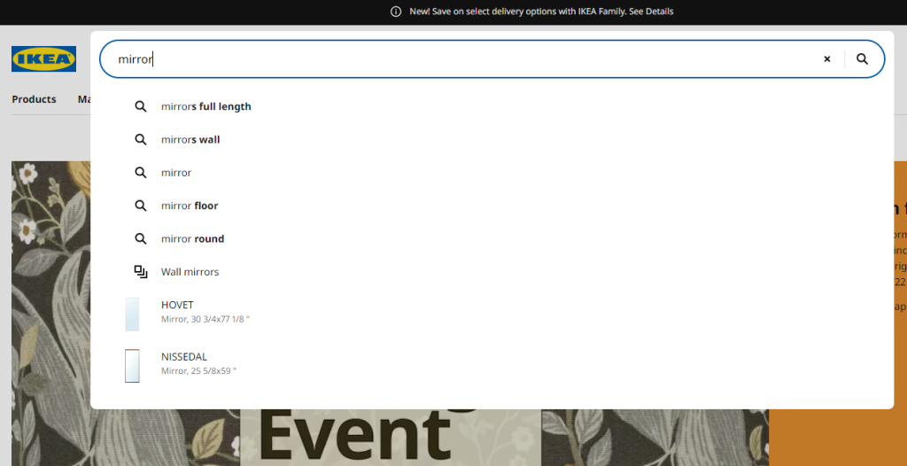
When a customer looks in their cart to check the items, overall price, shipping, and other details, eCommerce merchants have a unique opportunity to offer related, or complementary products, as you know in real-time from the contents of the cart what they are interested in.

When a customer looks in their cart to check the items, overall price, shipping, and other details, eCommerce merchants have a unique opportunity to offer related, or complementary products, as you know in real-time from the contents of the cart what they are interested in.

A good example here is Croniche – right after you put something in your cart, they offer relevant, similar products or accessories based on your choice.

Cross-Selling In the Shopping Cart Example as Digital Merchandising Strategy

10. Use Customer Data to Your Advantage


Customer data is the simple greatest asset for any company, and here, eCommerce stores have an advantage!

Your eCommerce site (and search) will likely be able to gather a lot of valuable data about customer behavior.

So, if you haven’t yet, enable Google Analytics on your site. The customer data you can gather will allow you to look at the paths your users and customers follow, so you can optimize your site to better guide them.

So, if you haven’t yet, enable Google Analytics on your site. The customer data you can gather will allow you to look at the paths your users and customers follow, so you can optimize your site to better guide them.

You will discover common exit pages, which you can optimize to boost sales.
Ecommerce merchandising, like most of eCommerce, is heavily based on data, so the more you can collect and analyze, the better you can optimize.

Use Customer Data for Digital Merchandising Strategy Example

11. Spark Loyalty in Return Customers


If you want your customers to make multiple purchases in your store, return often and check out your new products or reorder the ones they run out of, you have to focus on building loyalty.

The basics of loyalty have to do with the entire shopping experience: it should be fast, convenient, and with no unnecessary interruptions. This will make your customers love your store and continually return.
You can also encourage your existing customers to make more purchases if you implement loyalty programs – even simple ones, like point-based systems that can be redeemed for discounts or giving away one-time discount codes on birthdays. All of these can usually be done with a few simple add-ons.

You can also encourage your existing customers to make more purchases if you implement loyalty programs – even simple ones, like point-based systems that can be redeemed for discounts or giving away one-time discount codes on birthdays. All of these can usually be done with a few simple add-ons.

Also, look into creating special offers for products that are most often left in an abandoned cart, or the ones that are most prevalent on wish lists.

IKEA likes to really immerse you in its loyalty programs, giving you members-only offers. We borrowed this example from Antavo, where you can learn a lot more about customer loyalty.

12. Use as Many Decision Reinforcing Elements as You Can


Displaying products in an inviting way and providing discounts is not always enough to convince shoppers to make a purchasing decision.

You have to make sure that your would-be customers trust you with their money and that they feel good about their decision to make a purchase.

To do this, you can utilize a wide range of elements that encourage them, such as:

  • Product reviews, most importantly the ones that talk about the benefits of using your product.
  • User-generated content that shows actual people are using your product – and they are happy with it.
  • Ratings, preferably with some visual element, like five golden stars.
  • Expert proof: find some influencers in your niche, preferably professionals, who can test your product and give reviews.
  • Use numbers: show how many people have already bought this product, how many viewed it in the past few days, how many put it on their wish list and so on. Sometimes just displaying how many are in stock can incentivize a purchase.

Many of these can be displayed even on your search result pages – so go on and include them.

Reviews are used on a product page at Italic.com, making sure that you make the right decision.

13. Use Banners on Search Result Pages


Banners might not be the best form of advertising in a brick-and-mortar store, but they can be effectively used on your online store.

These enable you to highlight promotional periods or specific products or brands outside of the search results so that you can inform shoppers of certain messages without interrupting their searching journey.

This is, of course, best used when you display banners on relevant results pages, so make sure you use an on-site search solution that allows for this level of customization.

These are highly effective during seasonal sales or promotional periods like Black Friday to boost sales of certain products, highlight bundle offers, or inform shoppers of limited-time offers.

14. Redirecting Searches to Landing Pages


There can be certain situations in which a shopper searches for information about your store and not for a specific product. When this happens, you don’t want to take them to a no results page, but instead, redirect them to an informational page.

The most common example is if they search for opening times, contact information, or the location of the store. In these cases, you can redirect the users directly to the relevant page of your site containing the needed information.

Conclusion: What is the Best eCommerce Merchandising Strategy?


Modern eCommerce merchandising is complex to break down into specific strategies and techniques to use. The best thing for you, as a merchant, to do is to take a holistic view and try to implement various techniques that make sense for your brand and business strategy.

In regards to online merchandising, eCommerce businesses do have a few disadvantages compared to traditional brick and mortar stores – but you can rarely find anything that can’t be replaced with technology and some creativity.

Up- and cross-selling techniques, using customer data wisely, designing your category, product, and search result pages are all very important steps in even the simplest of online stores.

There is only one question: where will you start?

Paige TyrrellHead of Marketing – Prefixbox

Paige is the Head of Marketing at Prefixbox, a leading eCommerce site search solution. She’s an American who’s been living in Budapest since 2017 and loves giving #alwayslearning sessions to help people optimize their online stores.

Gartner Enterprise Search Solution Prefixbox Recognized in Gartner’s 2021 Market Guide for Digital Commerce Search

Gartner Enterprise Search Solution Prefixbox Recognized in Gartner’s 2021 Market Guide for Digital Commerce Search

Budapest, Hungary – 26 August 2021

Prefixbox Semantic Search Engine and product discovery modules are recognized in Gartner’s 2021 Market Guide for Digital Commerce Search; a guide highlighting trends and advancing innovations in the eCommerce search sector.

Gartner’s new report identifies personalization, AI-enhanced relevance and semantic search as key trends for eCommerce leaders to leverage in their site search – all of which are included in Prefixbox’s search modules: Autocomplete, Related Searches and the Semantic Search Engine.

Prefixbox’s Autocomplete leverages AI (NLP, NLU) and personalization in the suggestions, while the Semantic Search Engine enables retailers to further understand their clients and continually improve the relevance of suggestions by leveraging features like re-ranking and tuning, synonym mining and Speller. Additionally, it has Merchandising capabilities, a Brand Promotion platform to enhance retailer/brand collaboration to drive revenue, and visual product recommendations. All of the Prefixbox modules are backed by A/B testing and supported by a robust Search Analytics platform.

We are happy to be recognized by Gartner for our forward-thinking work. We aim to constantly meet retailers’ needs and exceed their expectations, which is why we’ve spent so much time developing our Semantic Search Engine to be one of the best in the industry” – summarizes Istvan Simon, Prefixbox CEO and Founder.

Subscribers can find a copy of Gartner’s 2021 Market Guide for Digital Commerce Search here.

About Prefixbox
Prefixbox provides easy-to-integrate AI-powered eCommerce search solutions to fit the needs of medium and enterprise eTailers. Their data-driven search modules learn from user behaviour and are proven to significantly improve user experience and increase revenue and conversion rates for retailers.

Headquartered in Budapest, Hungary, with regional offices in Poland, Germany, and Austria. Prefixbox operates in nine countries, providing search solutions for 60+ clients including Rossmann, Auchan, Bauhaus, MediaMarkt and Praktiker. For more information, please visit www.prefixbox.com.

Gartner Disclaimer
Gartner does not endorse any vendor, product or service depicted in its research publications, and does not advise technology users to select only those vendors with the highest ratings or other designation. Gartner research publications consist of the opinions of Gartner’s research organization and should not be construed as statements of fact. Gartner disclaims all warranties, expressed or implied, with respect to this research, including any warranties of merchantability or fitness for a particular purpose.

Learn more about the most important eCommerce search engine features to increase conversion rate by 15% & revenue by 47%.

15 Common Online Shopping Problems Causing Revenue Loss for Your Business (+ How To Fix or Avoid Them)

15 Common Online Shopping Problems Causing Revenue Loss for Your Business (+ How To Fix or Avoid Them)

There can be a million reasons why people don’t buy from a website, but statistically speaking, you only need to identify and fix a few of those reasons to get back most of the revenue you’re currently missing out on.

In this article, we are going to show you the most common mistakes, like

  • Not personalizing your site properly
  • Confusing product benefits with product features
  • Not trusting your own product
  • Hiding your real prices

Let us start!

If you take all of the steps we recommend, you will likely be able to cut your abandonment rates down to a fraction of what you’re currently experiencing.

The most important online shopping and eCommerce statistics for online retailers


There are hundreds of articles, research papers, and reports out there where you can find up-to-date statistics on eCommerce sites. But this isn’t one of them, so here we will only be focusing on a few universal, key stats that will help put the most common online shopping problems into context.

For starters, Forrester Research tells us that around 50%of potential sales are lost simply because visitors are unable to find what they are looking for on eCommerce sites. Also, at least 45% of US customers will abandon a purchase if they have a question about the product or the shopping process and aren’t able to easily find the answer.

What these numbers tell us is that it’s essential for online shoppers to find everything quickly and easily in order to enable them to make a purchase, and increase your sales and revenue.

We also know that, according to Business2Community, around 86% of online shoppers are willing to pay more for a smoother, better shopping experience, and 49% of them are likely to impulse buy when they receive one.

There are a lot of very simple ways to provide this, many of which we will be talking about in this article.

Let’s start by keeping these in mind – and the fact that a good user and customer, experience is probably the most important thing for online merchants.

Let’s see how most people fail.

Why Online Shoppers Don’t Buy From a Website: The 15 Most Common Online Shopping Problems


1. Unprofessional, Dated Design


Visuals always provide the first, and often most important impression, either when we see a person for the first time, or visit a website. A negative impression can often deter your customers from making a purchase, even if your store is completely legitimate otherwise.

And you don’t have much time to convince your potential customers: first visual impressions are formed in 0.05-0.1 seconds.

An online store with an appearance that is obviously unprofessional is not inviting to customers. If your design is clearly dated, falls apart, images are missing, buttons are nowhere to be found – customers will be reluctant to engage with your site.

Apart from negatively affecting user and customer experience, this kind of appearance also sends a message. It signals that you either can’t update or repair your site, which implies your business is struggling. This has its own implications for the customer, but the other option is way worse: you may just not care. And no one will be eager to buy from a business that doesn’t bother to appear trustworthy.

A clean, well-designed site rewards the customer with a sleek experience.

One of the most important places where a good design can make or break a sale is your results page, so make sure to check out the best practices in our Search Results Page Design guide!

The solution: pay attention to keeping your design up-to-date, user-friendly and easy to handle.

2. Having a Poor On-site Search Engine


This is probably one of the most overlooked features in the eCommerce customer experience, but has a huge impact on revenue. Check out some interesting statistics about E-commerce sites and search users in the US, proving the statement above:

Now, how can the site search experience be ruined?

No data-based product suggestions


A good site-search solution should be able to track customer behavior and adapt to it. If on-site behavior is not tracked, the customer will see irrelevant products in their searches, solely based on the provided keywords, not even taking popularity or current discounts into account.

Search Autocomplete is not typo tolerant


Typo-tolerance is increasingly important when more and more consumers are shopping online from their mobile devices – where typos are very common. Many times they don’t even realize their mistakes; they just take a quick look at the 0-result page they are presented with and conclude that the desired product is not in the store.

So, make sure your on-site search can tolerate typos and still yield relevant results! A good autocomplete solution can also prevent potential typos – on our blog, you can read about this and more search box optimization methods.

Autocomplete is too slow


As we have stated before on the blog, “by making search faster and ensuring relevant results, autocomplete will decrease exit rate, increase conversion rate and likely even your average order value.”

If you want to know how to achieve faster autocomplete results, check out our Autocomplete Search Best Practices guide.

No category suggestions, photos or prices during sales events


When there are discounts or other sales going on, the on-site search tool you use should be able to distinguish these items and not only rank them in better positions, but also highlight the fact that there is something special going on – for example with photos, badges or other eye-catching digital merchandising solutions.

Providing the right suggestions at the right time has proved to be invaluable for increasing conversion rate on one of the biggest European drug store chain’s Hungarian site (Rossmann.hu) as well. Watch our video with the full case study:

Wrong handling of singular/plural words


Just as with typos, singular and plural forms should be understood by the on-site search engine. Otherwise, you will lose customers who, after only one search will decide to look elsewhere while the product they want is right there – it’s just not displayed because the search solution is not “smart” enough.

Not handling zero results pages as opportunities


“No results found” pages are actually a great opportunity to impress your potential customers. There are many great things you can do when no product matches the search query: provide tips, suggest similar results, or provide alternative ways for them to engage with you.

Check out our full guide for zero result page optimization for a ton of best practices.

The solution: Treat your site search solution as a great opportunity for engaging with users and offering them relevant products,

Learn more about the most important search autocomplete features to decrease zero-result pages by 31% and increase cart value by 19%.

3. Bad User Experience


The deterioration of user experience is usually related to elements that shouldn’t be noticed by the user in the first place.

In design, this could mean that your site is not mobile-friendly and falls apart on a small screen. A quick glance at the stats: according to recent studies, in 2021 we will reach a point where 54% of all retail eCommerce will be conducted on mobile devices.

Or maybe your site is crammed with irrelevant pop-ups and automatic carousels that serve little purpose as they are not personalized, but instead, just distract the user.

Normally, navigation, up-sells, relevant product offers, and such should be presented to the user in a natural way; not by interrupting their experience, but enhancing it.

And then there are the potential technical issues like timeout errors and website crashes. There are very few more irritating experiences than a website breaking down in the middle of a check-out process.

According to statistics, 73% of mobile internet users are familiar with slow-loading websites – and 53% of the visitors are likely to just leave a page that takes more than 3 seconds to load.

This is especially bad news for two reasons. One is that the average website takes 8-11 seconds to load. The other: while visitors will have a bad experience, a slow website will also cause you to drop lower in Google’s rankings now that they introduced the Core Web Vitals as official ranking factors as of June 2021.

The solution: make sure that your hosting provider is up to the job and that you have the appropriate service for the number of visitors your site experiences at peak volume.

4. The Lack of Personalization


If you provide a personalized shopping experience, you have a much better chance of converting your visitors to customers, simply because you can show them products they are actually interested in instead of showcasing your entire product range.

There are many ways to go about this. Most sites that use personalization use data from a user’s previous behavior and offer them products that are similar, or relevant, to the ones they previously viewed or bought. Read more about AI-driven product recommendation.

An even better way is to use an on-site search solution that tracks the behavior of the customer in real-time, and ranks the search results according to their assumed needs.

If you don’t use personalization, you are giving the potential customer more tasks to complete, lengthening the shopping process, and even risk invoking the ‘paradox of choice’. All of which cause fewer users to reach their desired products and consequently the check-out; increasing cart abandonment rates.

The solution: personalize as much as you can – even on search result pages.

Learn more about the most important eCommerce search engine features to increase conversion rate by 15% & revenue by 47%.

5. Missing or Unclear Product Information


When you introduce a product to your would-be customers, you can break down the information into two basic categories: product features and product benefits.

We will deal with the benefits in the next point, so let’s start by looking at product features.

Product features include all the dry information about how the product works, looks, how big it is, how fast it is, warranties, and so on.

Forrester tells us that in the US, 45% of customers are likely to abandon a purchase if they are not able to find an answer for their questions immediately.

So it’s essential you pay attention to what your customers ask – either via chat, phone, in person, or by analyzing the search queries they execute on your site.

Make sure that all the attributes you display are clear and understandable: that values are spelled correctly can be easily understood and navigated. Regional preferences might also come into play, like the different spelling of ‘color’ in the US and UK, the imperial vs. metric systems, and so on.

The solution: make sure to include all available information on the product page, including frequently asked questions.

Now, onto the benefits…

6. Bad / No persuasive sales copy


How is your product going to make my life better?

Besides the numbers and attributes, shoppers want to know more about the product they’re considering purchasing: if it will provide more free time, alleviate pain, help me feel better in some way. They want to know how it will make them feel.

They also want to know why your solution is better than the other ones they could easily purchase on another site, and why they should buy it now instead of next month.

The solution: pay attention to your sales copy, even if you only use the most basic techniques. Think with the head of your customers.

7. Missing or fake product reviews


Besides the fact that fake product reviews are lazy and outright lies, they also tend to be very obvious. The reason for this is that they are written by you or your team, and not the customers, and more often than not they won’t sound genuine.

The solution: Let your customers review and rate your products – and if the reviews are bad, check what is wrong instead of covering it up, because they will quickly erode trust in your brand and become one of the reasons why customers don’t buy from you.

8. Too Complex Check-out process


In the past years, nearly all research into cart abandonment rates confirmed that the third most common reason – after high/unexpected prices and forced account creation – people abandon their cart is that the checkout process is too complex.

Most eTailers don’t take this essential fact into account: people are only willing to go through a complex process if the perceived value of the product they want to buy is very high.

In the case of complex products where the customer spends a great amount of time researching, comparing prices, finding the most suitable solution, a complex check-out can be fully warranted and in itself can serve as a catalyst for the IKEA effect.

But if they want to buy small appliances, food, clothes, or other relatively low-value, everyday products, they expect a very simple, very fast checkout.

The solution: tailor your check-out process for the needs of the customer – for simple products, provide simple check-out.

Payment failures (and uncertainty)


You have been entering your billing information after checking the 10 items in your cart, checking the shipping methods, and everything seems to be in order. You click on the check-out button – and nothing happens. The site crashes.

Is the order placed? Did your final click go through? Is the payment processed? Is it in limbo somewhere?

Has this ever happened to you?

If yes, you can quickly place yourself in the shoes of a customer who encounters payment failures.

The result is often confusion, frustration, angry emails in the support inbox, and abandonment of the purchase.

The solution: always make sure that online shoppers are able to pay safely and securely on your site – that the service doesn’t crash, payments are processed properly and orders are undoubtedly placed and can be tracked at the same time.

And while you are processing all of this data, make sure there is no…

10. Lack of Security and Privacy Leaks


There are few events that are more damaging to online retailers than data leaks. Every year there are thousands, if not millions of these, ranging from small eCommerce sites being hacked by backdoor-exploiting bots to large scandals. Within the first few months of 2021 there was information about hacks that leaked millions of user data from companies and services like Facebook, Instagram, LinkedIn, Parler, Pixlr, T-Mobile, Microsoft Exchange, ClubHouse, and GEICO – the list goes on.

The solution: never sell products without offering a guarantee – it will seem suspicious and plant uncertainty in the would-be customer’s mind.

12. Additional charges


I have already mentioned the first universal reason behind cart abandonment: it’s when users at the end of a check-out process are faced with unexpected, or unexpectedly high charges.

Not communicating your prices clearly can greatly diminish eCommerce sales. But the solution, luckily, is very simple.

The solution: Always display the full price, and include tax and all additional prices in it. Indicate the shipping prices throughout the process, not only at the check-out. And don’t have any hidden charges.

It’s that simple

(Of course, some regional factors may come into play if your online store markets to international customers – count shipping costs and customs accordingly.)

13. Poor Tracking, Logistics and Long Delivery


When we look at shipping, price is important (and communicating it properly is even more so), but logistics and shipping times are also a major concern.

Order tracking systems can solve issues with uncertainty most of the time, if they are accurate.

The solution: if a customer knows how many days are left until their package arrives when it will be delivered, where it currently is, they are much more likely to be satisfied with this purchase and become repeat customers.

14. Not having a flexible return policy


Just as with guarantees, the only reason for not making your return policies as flexible as they can be is if you don’t trust your own product.

But if you do, these policies build trust and make things much easier for those few customers who will actually return something – which means you have a better chance of retaining them as customers.

The solution: make your return policy as flexible as you can. If your product and services are reliably good, you will rarely ever have to handle returns.

15. Lack of Support and No Live Chat opportunity


If you don’t provide support for your customers, you are not only depriving help from those who already purchased something from you, but you could also be alienating would-be customers.

Would-be customers have a lot of questions, especially if your product descriptions and attributes are not properly provided. If they receive poor customer service, they will just turn away and not make the purchase in the first place.

It’s also worth noting that “57% of customers would rather contact companies via digital media such as email or social media rather than use voice-based customer support”, as per Ameyo’s study.

Check our blogposts on conversational commerce for diving deeper into this topic.

The solution: setting up a support email address and a live on-site/Messenger chat in your online store, which can be done in a few hours at most, will greatly enhance your user experience.

Conclusions: Make it Easy to Shop Online


Providing a better user, and customer, experience is the key to increasing sales volume and revenue – and most of it boils down to thinking like your customer.

You don’t even have to try hard, just look at the statistics of your own site, and the messages and questions you directly receive from customers.

With a little effort, you will have a complete picture of their needs, problems, and expectations.

The next step is just to act on these insights.

Paige TyrrellHead of Marketing – Prefixbox

Paige is the Head of Marketing at Prefixbox, a leading eCommerce site search solution. She’s an American who’s been living in Budapest since 2017 and loves giving #alwayslearning sessions to help people optimize their online stores.

10 Autocomplete Search Best Practices – How Predictive Search Will Generate More Revenue for Your Store

10 Autocomplete Search Best Practices – How Predictive Search Will Generate More Revenue for Your Store

One thing is certain: around 30% of your online store visitors will use your on-site search function – and 25% of them will click on a search suggestion.

If you provide suggestions, that is.

This is why predictive autocomplete search is an essential tool for any online retailer.

And we’re here to show you how to leverage it to maximize conversions and revenue.

We need something here that we want to clarify the basics first.

Chapter 1

What is Autocomplete Search?


Autocomplete is the function of search engines that displays keyword and product suggestions in real-time, based on what search query the user is typing into the search field.

The feature works in a very simple way: it detects what a customer is typing, and matches the query with data in the search index. If there are keywords or phrases stored in the index that matches what’s being typed in, it suggests those.

In reality, it’s a bit more complicated because they also take into consideration the popularity of different products and keywords when ranking suggestions.

For example: in an online store selling clothes, if you type in “sh”, it might suggest shoes or shirts. If the store is selling bathroom appliances, it might suggest shower curtains or shelves.

Chapter 2

How does Autocomplete Search work?


Apart from using your site’s search index, autocompletes also takes previous user behavior into account, as it keeps track of what queries were previously searched and clicked, and which led to a purchase.

There can be other factors that determine exactly which suggestions appear, and in what order, like the frequency certain terms are entered or click-through rates of individual suggestions.

Autocomplete Search takes previous user behavior into account

Autosuggest vs Autocomplete – What’s The Difference?

Autosuggest is an input field that suggests words based on what search term you have typed so far. Autocomplete is an input field (search box) that automatically completes your entry for you, based on its own internal dictionary.

Chapter 3

Achieve Better Sales via More Effective Autocomplete & Search Suggestions


There are many advantages of using autocomplete suggestion. If we want to summarize it, it helps shoppers make successful searches.

Here are some additional ways it improves the customer experience in your store:

  • It decreases search time, as the user is presented with relevant suggestions and quickly arrives at what they are searching for.
  • It makes the users more confident in the search and encourages them to add more details, leading to more precise matches.
  • It decreases the number of times a user arrives to a 0 result page, which provides a better experience overall. If relevant queries that are connected to existing product pages,are suggested, it effectively guarantees a successful search.
  • This also leads to the reduction in the number of people leaving your site, which means you have more time and opportunities to convert visitors to buyers.
  • It also educates potential customers about your product range, working as kind of a soft cross- or upsell opportunity.
List of autocomplete features that improve better search and UX

In short: by making search faster and ensuring relevant results, autocomplete will decrease exit rate, increase conversion rate and likely even your average order value.

We know from the B2C Retail Benchmark Report that

“Conversion rates are significantly higher where consumers have higher intent, i.e. they are searching for products.”

Now that we got through the basics, let’s dive into actual best practices to ensure those results we just talked about.

We included 10 of these with detailed descriptions here – let’s start with…

Chapter 4

10 Search Autocomplete Strategies


1. How Ranking the Suggestions Should Work


Even with the best autocomplete functionality, you have a very limited number of chances to show the user the right queries, which makes ranking essential.

As we mentioned before, there can be many factors influencing the ranking of suggestions. Based on user behavior you can show popular searches (queries that entered most frequently) first.

You can also opt for ranking queries that are more frequently purchased. Or you can rank queries and products related to ongoing promotions or special offers first. (Learn more about digital merchandising strategies if you want to boost your sales with product promotion.)

Prefixbox’s Re-Ranking AI can take weight off your shoulders, and automatically ensure that the most relevant results appear first for search queries, by taking numerous kinds of historical data into account. Check our video on the importance of dynamic re-ranking as well:

2. Personalization Makes Autocomplete Predictions More Effective


There are three basic ways you can personalize the autocomplete suggestion in on-site search:

  • Consider the location of the customer, and show them queries that are popular in their area – or exclude ones that are irrelevant.
  • Consider the language: if your online store is multilingual, show each user suggestions in their preferred language for a better user experience.
  • Include their search history: make suggestions that are relevant to what they previously searched for on the site.

3. Keep Search Suggestions Simple and Few


Your suggestions should not extend the available space or clutter it – which is even more important on a mobile screen, considering that keyboards usually take up 30% of the screen.

a. Keep the Autocomplete List Manageable


The best practice is keeping your suggestions at 10 items or less (and this is why raking them correctly is essential).

If your suggestion list is longer than that, a number of unpleasant things can happen:

  • It makes the search time longer, as the user scrolls through them.
    Suggestions that appear off-screen may be ignored altogether.
  • The paradox of choice might kick in, leading to choice paralysis. This basically means that if we are presented with too many options, our brains often choose to just opt out entirely instead of wasting energy on weighing all of them.
  • On a mobile screen, the preferred number of suggestions is 4-8, and may even be less if they include not only queries, but precise products with photos and descriptions.

If you want to display more keywords and products, consider a 2-column layout instead.

b. Avoid Scroll Bars


If your suggestions extend into an area accessible only by scrolling, again, there are many problems that can arise.

First, these initially hidden suggestions are likely to be ignored, but if they are not, search time increases again.

Also requiring an additional task from the user also deteriorates the experience. As does the fact that they can’t get a quick overview of their choices right away.

A search bar in the suggestion field can also cause technical problems with design, but we are not going to detail those here.

c. Reduce the Visual Noise


With modern on-site search solutions, the suggestion field can be filled with a large variety of elements like text, prices, photos, short descriptions etc.

While these can help shoppers, be careful not to include too many additional elements as it can drive the focus away from the actual suggestions and confuse the customers more than it helps them.

Our suggestion is to keep the visual noise to a minimum. Include both keyword and product suggestions, prices, and photos where relevant.

4. Highlighting Autocomplete Suggestions


Highlighting certain elements of your predictive suggestions helps the user keep their focus and use the feature more naturally. Here is what to keep an eye on.

a. Highlight the Differences


Instead of highlighting (which usually means bolding) what the customer already typed in, it’s much more effective to instead highlight the predictive part of the suggestions.

This way they can focus on that more easily and determine the difference between suggestions, leading them to a faster decision.

Don't highlight what customer already typed in, highlight the predictive part instead for better UX

b. Highlight the Active Suggestion


When choosing between suggestions, you should clearly indicate which one the users’ mouse is hovering over or which one is active for shoppers using keyboard navigation (which must be supported in your autocomplete feature).

This provides clarity and helps in eliminating mistakes: choosing the wrong suggestion and having to go back.

Also, the active suggestions should be copied into the search bar. This helps users understand how the autocomplete box works and makes it possible to expand upon the suggestion by providing more details, which leads to more precise results.

Highlighting the active suggestion is usually best done with a simple background shading.

c. Style Different Search Suggestions Differently


As we have discussed, multiple different suggestion types may appear in your field, and you must help the user understand the difference between them.

Let’s say that besides predictive queries you also include products and/or product categories. If you group these together, make sure to differentiate them. For example, style the text a differently. e.g. giving it another color.
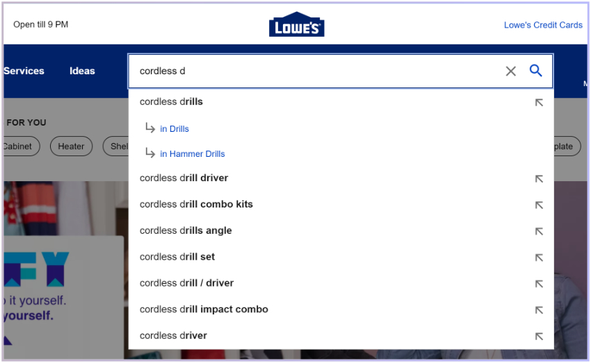
If all different types of suggestions are displayed as the same, the users might not understand the difference, and ignore them or choose ones that aren’t really relevant.

Small changes in style make it easier for the user to scan the presented suggestions, and focus on those they are interested in.

Help search users to understand the difference between the search results for example with styling and different colors.

d. Style for Readability


Especially on mobile devices, it’s very important shoppers can actually read the suggestions, and also easily select the ones they are interested in.

Keeping readability in mind, the suggestions should be presented in a large enough font size, and with enough spacing, maybe even with separators, so that tapping on them doesn’t lead to accidentally selecting another option.

5. Provide Clear Instructions


The exact functionality of an autocomplete feature may not be completely clear to users right away, especially considering how different on-site search solutions can be.

In order to help them use the feature, providing instructions and labels can be greatly useful. These may include headings in the list, e.g. separating “Search suggestions”, “Categories”, “Articles” and so on.

Provide instructions and labels in search autocomplete, like "categories" and "articles".

This will help users understand how the list is structured, scan it more easily and direct their attention to the ones that are relevant to them. Without clarifying these details, mixing the different suggestions into one list, the user may pick an article instead of a product, or go to a category page instead of a more general results page despite their initial intention.

6. Visual Focus and Simplicity


When the customer is using the search feature, the autocomplete field together with the search box should be given absolute priority in terms of visual attention.

a. Design for Visual Depth


Giving the autocomplete field priority can be easily achieved with darkening the rest of the site – the background in this case.

Help search user to focus on search results instead of other parts of the online store.

This will help fade the elements on the site that are fighting for shopper attention – CTA buttons, banners, product photos and so on. This way, the customer can easily keep their focus and not get distracted.

b. Reduce Visual Competition


On mobile, directive elements like navigation or shortcuts may appear beside or even above the autocomplete field, which actually ends up making navigation problematic and distracting.

Be careful where you place your live chat option, an icon for the shopping cart, or even sticky headers, to make sure it doesn’t detract from the search experience.

By minimizing these distracting elements, you can minimize mis-clicks and provide a much smoother experience.

7. Support Both Mouse Interaction and Keyboard Navigation


Customers should be able to see which suggestion they are hovering over. This can be done by highlighting the given row. You may also invoke the hand cursor to make it clear that they can click the suggestions and it will take them to a result page.

It’s important to provide keyboard navigation (especially since we mostly use Google for off-site search, and it has trained us to use this functionality).

Using the up and down arrows, customers should be able to switch between the suggestions, and select one by hitting Enter.

8. Mobile Specific Optimizations


There are a few things that are very, very important to keep an eye on when designing autocomplete for a small screen.

Here are the most important ones:

a. Use Text Wrapping


We already mentioned how you shouldn’t try to expand your suggestion field with a vertical scroll bar. We also recommend not using a horizontal one. Many suggestions, including long or multiple keywords, won’t be able to fit in their row, given the limited screen size and that you must use a big enough font for readability.

If you just shorten the suggestion by including “…” at the end, you confuse the customer who won’t know exactly what they might be clicking on as part of the info is missing.

So how do you solve this problem?

Use text wrapping and expand suggestions to multiple rows as needed, even if this means fewer will be visible.

Providing adequate information before the customer has to commit to a click is essential.

b. Partially Obscuring the Last Visible Suggestion


On mobile, scrolling is unavoidable in many cases, especially if you have to wrap search suggestions.

Instead of adding a scrollbar, there are a few other things you can do.

The best one is probably partially obscuring the last result – which is a clear indication that the list continues below.

Now, considering the different screen sizes, browsers, fonts etc. it’s nearly impossible to get this right every single time because there are just too many variables.
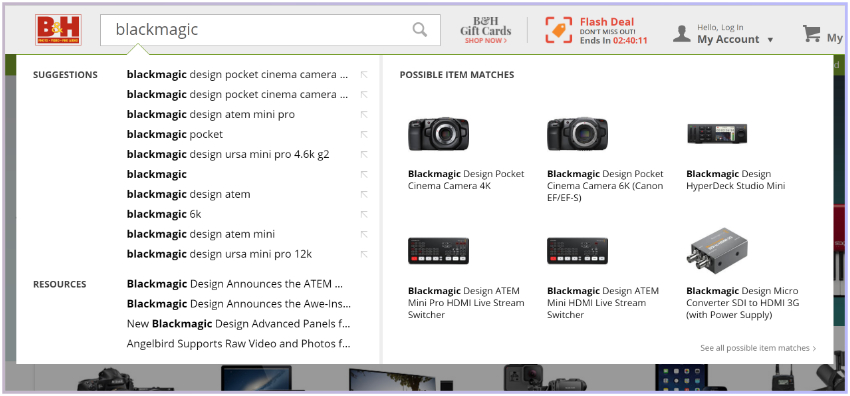
So what you might want to do is check your analytics, find out which devices are used the most to access your store, and optimize for those.

Most users will still be selecting one of the suggestions that are visible right away, but with this method, you can provide a smooth experience for those who want to explore the whole list.

c. Make it Easy to Exit Autocomplete (and Remove the Search Input)


If a customer decides they no longer want to use the search bar, and wants to return to browsing the site, it should be easy for them to do that.

Providing an “X” icon to delete the query and search bar suggestions instead of asking shoppers to do it manually, is a handy solution to enhancing shoppers browsing journey.

9. Provide Category Search Suggestions


When a customer starts to type a query in the search bar, they might just want to explore what you have in a given product category.

Providing them with category suggestions is a very convenient way to enable them to browse your products and find the one they want to buy.

This saves time for the customer and provides a clear path, making the user experience smoother.

However, you want to avoid visual clutter and confusion – as we have discussed before – clearly indicate that category suggestions are not keyword suggestions. Do this with a simple heading and/or by using a different style.
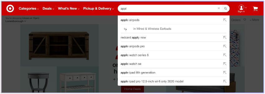
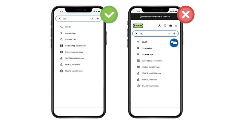
10. Speed is Essential: Real-Time Autocomplete


Your autocomplete should always provide suggestions in real time.

If it’s slower than that, it can be downright irritating for the user, as they can visually perceive the lag – like with a website slowly loading individual elements.

If the autocomplete is not real-time, all of the above best practices are worthless as no one will be using a search bar they perceive as not useful.

Suggestions have to appear right when the first character of the query is entered, and should change with every subsequent keystroke to be updated to show relevant options.

Summary


Providing the highest level of quality during a customer’s journey will help you directly increase your store revenue. A better search experience leads to higher satisfaction, better experience, and overall higher conversion rates and average order value.

By using the best practices in your store, you can achieve exactly that.

Provide the highest level of quality during customer's journey

Remember the most basic guidelines:

  • Autocomplete should work in real-time.
  • It should provide relevant results – which can be personalized.
  • It should provide clear visual guidance as to how to use it.
  • If it’s in use, all other site elements should be faded into the background.

Of course it can quickly get complicated, and fine-tuning can be time-consuming to keep up with. This is why, to achieve the best results, we recommend working with on-site search experts.

As always, if you have any questions, or suggestions for the expansion of this list, reach out to us!

Learn more about the most important search autocomplete features to decrease zero-result pages by 31% and increase cart value by 19%.

Paige TyrrellHead of Marketing – Prefixbox

Paige is the Head of Marketing at Prefixbox, a leading eCommerce site search solution. She’s an American who’s been living in Budapest since 2017 and loves giving #alwayslearning sessions to help people optimize their online stores.

How Data Integration Can Aid In Hyper-Personalized Ecommerce Site Search

How Data Integration Can Aid In Hyper-Personalized Ecommerce Site Search

In 2020 having a hyper-personalized site search is key for any eCommerce business. On its most basic level hyper personalization is defined by Business2Community as “the use of data to provide a more personalized and targeted products, services and content.

In today’s fast-paced and increasingly competitive eCommerce industry, having a strong targeted personalized site search will allow you to reach your customer base quickly and show them exactly what they are looking for.

Personalized eCommerce Site Search

But that just isn’t enough in today’s world, Merchants who are truly successful in the space are using data gained through personalization and using data integration to automate their applications together in a future-proof headless environment.

Let’s take a deeper dive into what types of hyper-personalization are available and how data integration in a headless environment can level up your eCommerce performance and compete with the best.

What is Hyper-Personalized Ecommerce Search?


With all ecommerce efforts, whether that be improving website design, personalization of eCommerce site search and even data integration of applications – the goal is to make business processes easier and efficient for Merchants and improve the overall customer experience. Some examples of website personalization that can help focus your customer experience journey can include increasing metrics like average order value, bounce rate, conversion rates, customer retention rates and overall profitability.

personalized customer experience journey in eCommerce

Shoppers increasingly expect merchants to deliver contextually-relevant experiences that take into account their past interactions with the brand. Every interaction a customer has with your brand is a data point that can be used to improve their customer experience. 74% of customers feel frustrated when website content is not personalized. Customers expect to be made to feel special and have thoughtful interactions with Brands.

Given that statistic, it’s clear that adding in site personalization applications like Nosto or Klaviyo to your eCommerce application mix will allow you to adapt product recommendations to every individual customer behavior level and create unique customer experiences for every customer and increase conversion rates, average order value etc.

How To Future Proof: Hyper-Personalization and Headless Commerce


There has been continuous focus on Headless Commerce this past year. Touted as the next stage in e-commerce, Headless Commerce is in essentials; API-driven. The main function is to remove the content management layer from the front-end of a website and it’s checkout. The content management system thus becomes hyper-personalized.

API-driven Headless Commerce

Having a headless system allows you to individualize every aspect of the content and products on the front-end of the site. This includes focused site search that can remind a previous customer of a past purchase, showing customers detailed relevant products similar to their past purchases as well as improving average cart value with individualized add-on products options.

Benefits of A Strategy Driven Hyper-Personalized Site


These are just a few simple examples of what is possible with a well rounded, strategy driven hyper-personalized site focused on customer experience. Remember,

People don’t buy objects, they buy experiences. Especially now because no one is shopping in-store anymore. Personalizing the experience, being everywhere your customer shops online from marketplaces, to your Shopify store is now more important than ever.

Merchants that are winning at the game of eCommerce are future-proofing their businesses by implementing headless technology that allows them to have a hyper-connected customer through implementing individualized customer experience across their e-commerce shopping journey.

Headless Commerce: The Future of Commerce


VL OMNI has written extensively on Headless in their latest Guide: Headless Commerce: The Complete Integration Guide This integration-first ebook looks at what it will take to make headless commerce a reality for many. From different ways to approach headless commerce, to major issues and implications a headless future will have on the ecommerce and commerce industries, readers will come away with a true technical understanding of what it takes to become headless.

Data Integration: Agile and Scalable Automation


So, with a hyper-personalized website and marketing processes, combined with headless technology that allows you to efficiently and effectively individualize products, orders and the overall customer experience for each customer. How on earth do you tie it all together?

Data integration and automation between applications is the easiest and most effective process for businesses at scale to eliminate costly and time consuming manual data entry and manual business processes.

But what is Data Integration and why is it important?


Data integration connects disparate applications together, allowing for consistent automated movement and delivery of data to create business processes across a wide range of applications.

Data integration plays an important role in the world of eCommerce because it provides users with a real-time outlook of business performance and transforms data into valuable, usable information by combining it from different sources.

As commerce in the physical world and online continues to evolve, your understanding of data integration can help inform your business’ ability to scale and build a more robust future for itself.

Data integration between different applications can be created in an agile and scalable manner, allowing you to automate hyper-personalized processes and individualized products at scale.

eCommerce Data integration between different applications

This allows you to focus on what’s most important to Merchants: creating a great customer experience. Data automation’s real value is connecting disparate systems together to eliminate manual processes.

In a hyper-personalized headless environment that can mean integrating your eCommerce store with your CRM, ERP, loyalty or personalization program.

This allows all the order and customer data collected from your eCommerce store, for example Shopify to be integrated into your CRM, allowing you to keep track of customers personal information and ordering habits.

This information can then be integrated into the content layer of a website in a headless environment to get specific personalized information and individualized offers to each and every valuable customer.

Hyper-Personalization in Site Search: The Role of Data Integration


Those who are succeeding in the ecommerce industry today are those who look at every aspect of their business, including their applications and business processes and look at how they can leverage all of their data into providing a better personalized experience for their customers.

Creating a hyper-personalized experience starts with the back-end data. The way that data is used and leveraged into providing valuable insights for your business will inform how successful your personalization targets perform.

By automating processes and integrating all applications together, your business can create a full picture of each customer, their habits and their shopping persona, allowing you to make educated decisions about how to personalize your website and site search for them. Ecommerce growth is truly open to those Merchants that take their data into their own hands and with it, create the best personalized shopping experience possible.

Vanessa MatosVanessa Matos, Marketing at VL OMNI

Vanessa is the marketing Coordinator at VL OMNI, a serverless platform for agile and scalable iPaaS ecommerce integration. From ecommerce platforms, ERPs, EDI, or marketplaces, we integrate your applications together to create a seamless experience at the operational level and enhance your business’ customer experience.”