[Webinar] Ecommerce Tech: 9 Tips on How to Build a High-Converting Stack in 2025
In this Webinar in 2025 July, moderator Raluca sat down with Paige (Prefixbox), Vlad (Ecommerce-Today), and Tudor (Aqurate) to map a practical path to a high-converting Ecommerce tech stack. The group covered platform choices, AI-driven product discovery, personalization, lifecycle marketing, analytics, and ROI methods store owners can start applying right away.
Your commerce platform shapes everything from release velocity to uptime. Weigh financial cost and time cost across two models:
Self-hosted (e.g., WooCommerce-type setups): often cheaper to launch and highly flexible, but ongoing maintenance (security patches, plugin conflicts, infrastructure downtime) becomes a hidden tax—especially on peak days like Black Friday.
Hosted (e.g., Shopify-style platforms): higher sticker price, but updates, compliance changes (e.g., Consent Mode v2), and scaling are handled centrally in minutes—not days.
Whatever you choose, insist on native integrations across payments, analytics, consent, ERP, and mobile. Native connectors reduce fragility and keep Ecommerce tech adaptable as your stack evolves.
2) Product discovery that actually converts
Search isn’t “just a feature.” It’s one of the largest revenue drivers because shoppers can’t buy what they can’t find.
AI-powered search only matters if it uses vector/semantic retrieval, not just keyword matching.
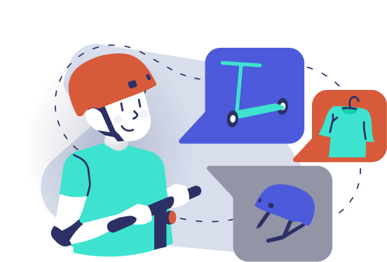
Vector search understands concepts like “flowy dress for a summer wedding under $150,” returning relevant options even when the exact words aren’t in the product title. Brands moving from text-match engines to true AI search typically see conversion and revenue lift, plus far less manual rule-tuning.
3) AI agents move from support to shopping
Agentic commerce isn’t five years out—it’s here. Train an AI agent on your catalog, FAQs, PDFs, and content to deliver a guided, associate-style experience 24/7. Early adopters report responses that match—or beat—human accuracy most of the time, with rapid time-to-value.
Practical tip: blend chat + results in one UI with rich product cards; customers want conversation and visuals.
4) Personalization that feels like a great salesperson
The goal is simple: show the right item to the right customer to lift conversion and AOV. Success depends on:
Sufficient volume (rule of thumb: 200–500+ orders/month) so models actually learn.
Smart placement (don’t show alternative couches in cart; do show complements and repeat-purchase staples where relevant).
When implemented well, personalization often delivers 10–40× ROI; sessions that engage with recommendations commonly show 30–50% higher conversion and AOV.
5) Lifecycle automation is better than paid re-acquisition
Email/SMS/push are your always-on associates. Choose platforms with native connectors to your stack and robust automation + A/B testing (subject, content, send time). Trigger browse/cart flows and education sequences to reclaim demand more efficiently than ads: critical as paid media costs rise.
6) Analytics you’ll actually use
Keep a small, durable KPI set visible weekly and monthly: conversion rate, AOV, revenue per user, CAC, LTV, and cart abandonment. Pair GA4 Enhanced Ecommerce with server-side tracking once you pass ~500–1,000 orders/month to see past cookie consent gaps. Dashboards (e.g., ecommerce-focused BI layers) are a later acceleration, not a prerequisite.
7) Proving ROI (without fooling yourself)
Define one primary metric per initiative (e.g., revenue per user for recommendations).
If you have volume, run a clean A/B test (aim for ~5,000 measured events/month for the layer you’re testing).
If you lack volume, use sequential testing only for big changes; seasonality can swamp small effects.
Instrument custom events (agent interactions, rec widget clicks) before you test. Calculate profit impact and compare to tool cost; buy what returns profitable lift, cut the rest.
8) A simple evaluation framework for Ecommerce tech
Use a FIRE-style lens: Flexible, Inexpensive, Rapid, Easy.
Prefer cloud-native, composable tools with native connectors, quick implementation, fast feature velocity, and everyday usability—so your team keeps shipping as the market shifts.
9) Operate like this: audit → outside eyes → gap plan
Run an honest audit of costs (money + time), have a third-party review for blind spots, then prioritize a gap plan toward your “castle.” The brands that move first on modern Ecommerce tech (semantic search, agents, clean data, native integrations) will widen the distance every month.
Bottom line: Customers now expect conversational, visual, and personalized journeys. Build your stack so discovery feels inevitable, data flows cleanly, and experiments answer one question: did this make us more money, reliably?
For even more details, watch the full recording of our webinar:
[Webinar] Agentic Commerce Is Here: How to Get Your Brand ‘AI Agent Ready’
Consumers don’t think in keywords anymore, they think in conversations. In our recent webinar, Prefixbox’s co-founder Paige and Conscia.ai‘s CEO Sana Remekie unpacked how the shift from keyword search to AI agent experiences is reshaping product discovery, loyalty, and revenue.
For years, Google trained shoppers to compress intent into three words. Now, tools like ChatGPT have flipped the script: a shopper types, “I need a flowy dress for a summer wedding under $150,” and expects a helpful, guided response. When sites still return literal, keyword-based results, shoppers bounce—to an AI agent that understands context.
What’s changing:
Natural-language queries replace rigid filters.
Expectations are set by AI assistants, not legacy site search.
Patience is thin—if the right result isn’t in the first screen, customers leave.
Why the AI agent wins
An effective AI agent interprets intent, clarifies details, blends content and products, and personalizes results—just like an in-store associate. It also supports multimodal interaction (text, images, and voice), meeting shoppers where they are and how they prefer to communicate.
Key capabilities:
Understands ambiguous requests (“guest dress for Spanish wedding”).
Personalizes with first-party data and loyalty context.
Presents rich, visual product cards, not just blue links.
Don’t just rank, be discoverable to AI agents
Discovery now starts beyond your domain. If your products aren’t understood by external AI agents (ChatGPT, Perplexity, voice assistants), you may never enter the consideration set.
Make products agent-discoverable:
Structure your product data (rich attributes, clean taxonomy).
Write conversational, FAQ-style copy that maps to questions an AI agent can summarize.
Establish authority signals through consistent, accurate content.
The infrastructure shift: vector search + MCP
Delivering conversational commerce isn’t a copy change: it’s an architecture change.
Vector search If your search returns literal matches, shoppers feel the gap immediately. That’s why traditional keyword search has started to lag behind lately. A modern stack uses semantic/vector retrieval to map “pretty summer wedding guest dress” to relevant results, even if those exact words aren’t in the title.
Model Context Protocol (MCP) To transact across a growing ecosystem of AI agents, expose commerce capabilities (search, cart, checkout, order history) through a standard interface. MCP acts like “USB-C for AI,” letting any compliantAI agent discover products and complete tasks. Major players are aligning around this approach, and brands that implement MCP-style endpoints will be easier for agents to work with—meaning more visibility and conversions.
Voice is next (and natural)
Conversational discovery will increasingly be spoken. Voice lowers friction and fits how people actually ask for help. Your AI agent experience should support voice input and responsive, visual output (cards, carousels, video) to keep the journey fluid.
Two places to win today
Off-site, via third-party ai agents: Ensure agents can understand, rank, and recommend your products.
On-site, via your own agent: Blend chat and search into a single, visual, guided experience that feels like a great store associate.
Your 90-day action plan
Upgrade search to a vector/semantic engine.
Restructure data and enrich product attributes.
Rewrite content in conversational, FAQ-friendly formats.
Expose APIs (search, cart, checkout, account) with MCP-style tooling.
Prototype an AI agent UI that merges chat, results, and product cards—desktop and mobile, text and voice.
Bottom line: Agentic commerce isn’t a future bet—it’s the current customer expectation. Brands that become AI-agent ready now will own discovery, loyalty, and growth as this shift accelerates.
For even more details, watch the full recording of our webinar:
Shopify Search Analytics Tips & Best Practices: How to Maximize Store Insights
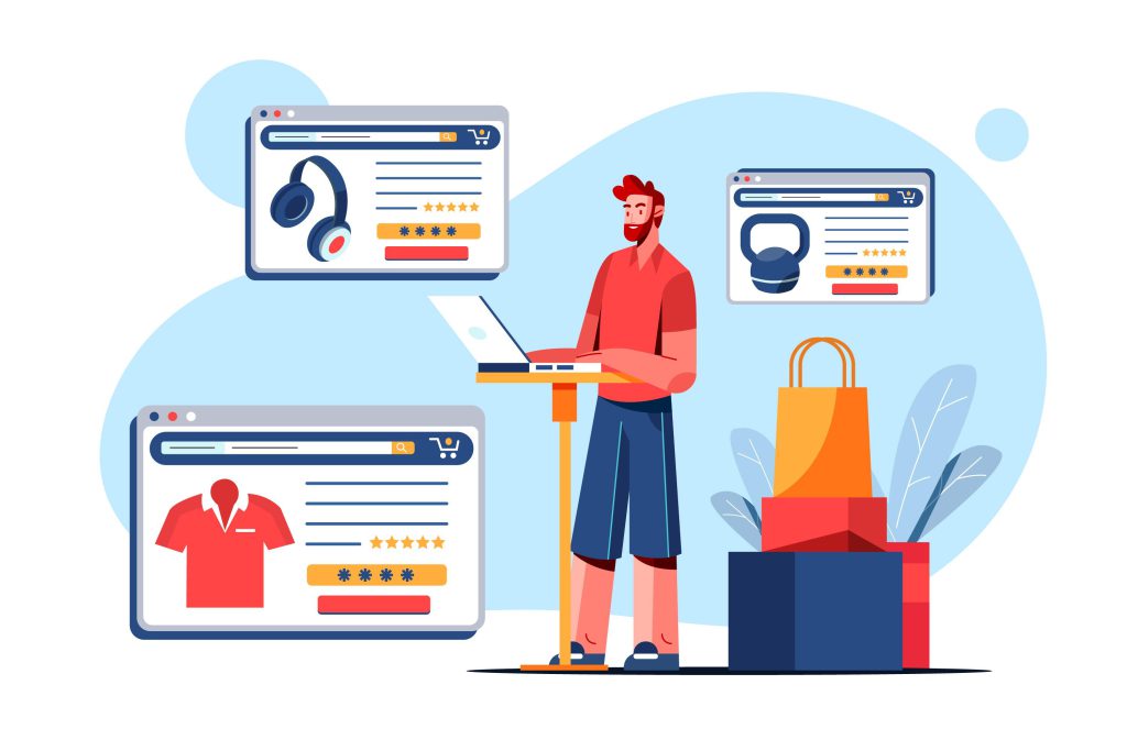
For Shopify store owners, mastering search analytics is one of the most powerful ways to uncover customer intent, improve conversions, and grow sales. By analyzing how shoppers use your search bar (what they type, how they engage, and where results fall short) you’ll gain direct insight into customer demand.
This guide covers the best practices for using Shopify search analytics effectively, with practical tips for analyzing daily trends, learning from popular searches, and transforming zero-result queries into revenue opportunities.
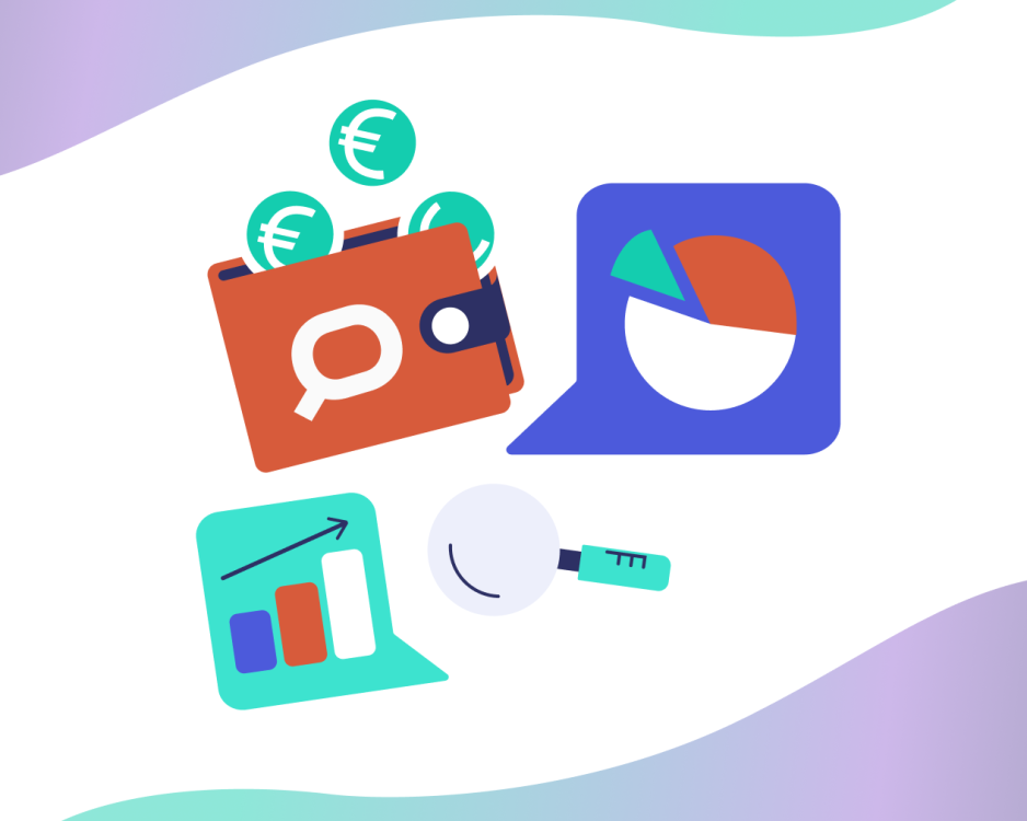
Search Analytics is the process of collecting, analyzing, and interpreting data from your store’s search activity. It shows what products customers want, which searches lead to sales, and where gaps in your catalog or UX exist.
Why are search analytics important for Shopify stores?
Because it provides demand-driven insights. While traffic analytics shows how visitors arrive, search analytics reveals what they’re looking for once they’re on your site: helping you optimize merchandising, marketing, and product availability.
Which search analytics are the most important?
The three main areas to focus on in Shopify search analytics are:
Daily charts (search and engagement metrics)
Popular searches
Zero result searches
These are covered in more detail later in the article.
Where to find search analytics in Shopify?
Shopify has some built in search reports under Shopify’s Admin Dashboard -> Analytics. Be aware that these reports only populate if you use Shopify’s native Search & Discovery app.
If you use a more specialized third-party solution, such as Prefixbox AI Search & Filter, you’ll also have access to a dedicated analytics section. These apps often provide more detailed metrics, and you can combine them with Shopify’s native sales and session reports for a complete picture of customer behavior.
How often should Shopify merchants review search analytics?
At least weekly. For stores with frequent promotions or seasonal demand, checking daily ensures you can quickly catch trends, stock issues, or technical problems.
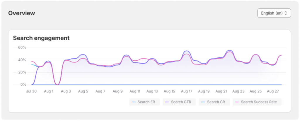
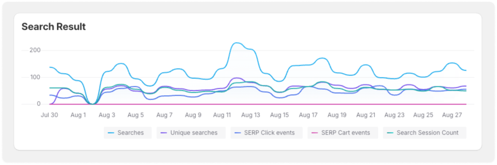
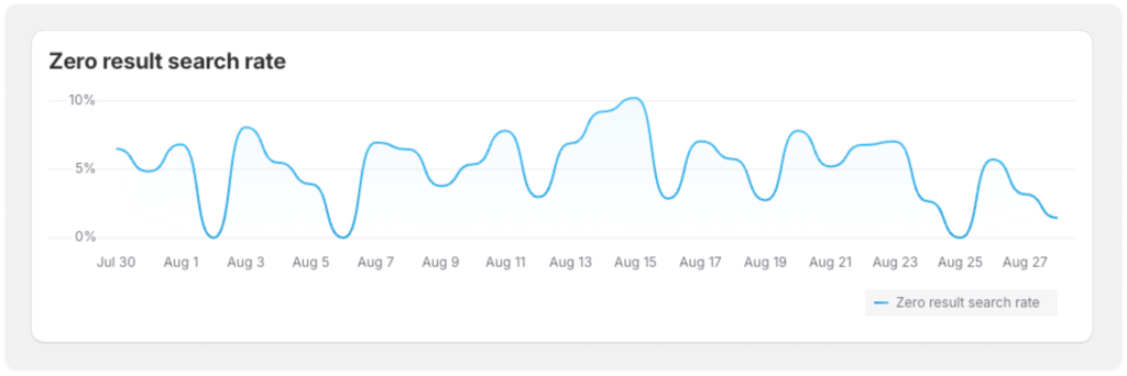
Daily Search and Engagement Trends on Shopify
Start with daily search and collection engagement charts available through your Shopify reports and analytics integrations. You’ll see something like this:
If you notice an upward or downward trend, you should check the following 5 factors:
Product Catalog or Site Changes – Did you update your Shopify catalog or change product visibility? Cross-check with Shopify’s built-in traffic reports or Google Analytics.
Seasonal / Calendar Effects – Holidays, back-to-school, and other recurring events impact search behavior.
Marketing & Campaigns – Shopify discount codes and promotions can spike interest in certain keywords.
Technical Issues – Ensure your search function, apps, and indexing are working properly.
User Behavior Shifts – Look for emerging keywords that reflect new customer preferences.
Similar to Search engagements and results, most apps offer a Category chart too, showing how shoppers interact with Category pages.
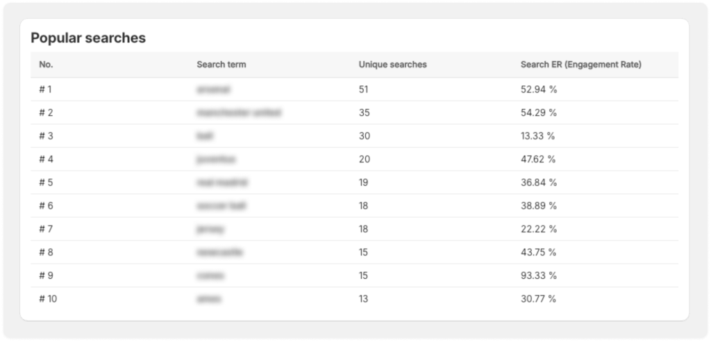
Learning from Popular Shopify Searches & Categories
Your Popular Searches and Categories report is one of the most powerful parts of Shopify’s search analytics.
Treat search volume as a leading indicator of demand.
Similarly, Popular Categories report shows the most visited product collections.
If a product is highly searched but not converting, investigate: stock availability, product description clarity, or checkout UX friction.
Compare this data to Shopify’s Most Sold Items report. If they don’t align, check these 4 factors:
Stock levels – Are top-searched items often out of stock?
Pricing – Compare searched product price points to your top sellers.
Product Data – Enrich product pages with attributes, images, and reviews.
Synonym & Typo Handling – Make sure common variations (e.g., “tshirt” vs. “t-shirt”) deliver relevant results.
Insights from Shopify search analytics should feed into your buying strategy, promotional campaigns, and content calendar.
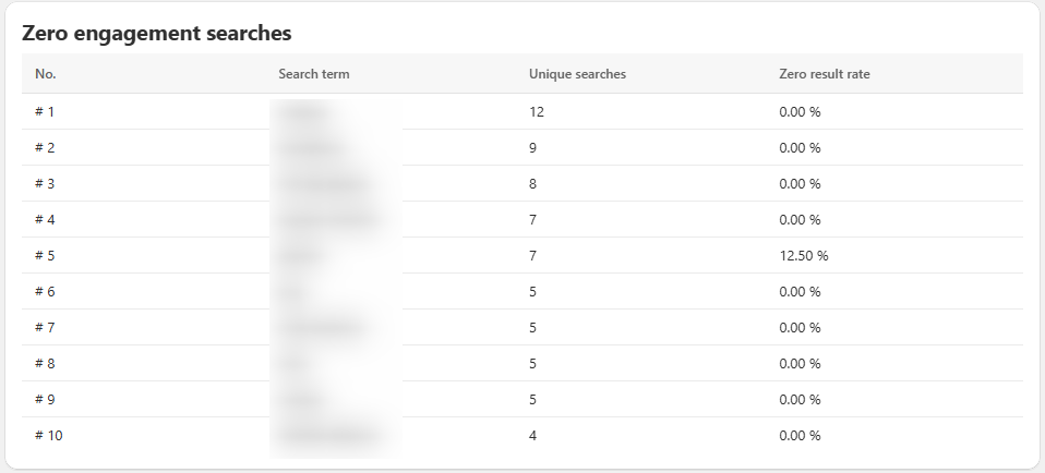
Zero-Result Searches: Fixing Search Gaps
The Zero Result Searches and Zero Engagement Searches reports highlight missed opportunities. They differ in:
Zero result searches – List of keywords that showed no results
Zero engagement searches – Searches where shoppers didn’t click or engage
How to handle zero result and zero engagement searches
Add synonyms for frequent zero-result queries.
Expand product metadata so Shopify indexes products under more search terms.
Spot catalog gaps: if customers search for products you don’t carry, it’s a signal for buying decisions.
Optimizing Shopify’s Zero Result Pages
Customize “no result” message to provide helpful search tips such as:
Check your spelling
Try fewer keywords
Browse related collections
Include contact options on zero result pages so customers can request help or products.
Showcase bestsellers or related products to keep shoppers engaged.
This ensures that even when Shopify can’t find a result, the customer still has a chance to convert.
Bonus: Advanced Analytics with Prefixbox AI Search & Filter
If you want to go beyond Shopify’s built-in reporting, the Prefixbox AI Search & Filter app provides a richer layer of search analytics designed for ecommerce growth.
With Prefixbox, you can track:
Search Volume & Engagement – Monitor how many searches take place and how shoppers interact with results.
Conversion Metrics – Understand how often searches lead to product views, add-to-carts, and purchases.
Zero-Result & Low-Engagement Queries – Pinpoint failed searches and fix them before they cost you sales.
Top Queries, Categories & Products – Identify customer intent and align your merchandising strategy.
Revenue Attribution – See how much revenue your search function directly generates.
These actionable insights give Shopify merchants the ability to continuously optimize product discovery, improve search relevance, and boost conversion rates. Prefixbox’s AI-powered search and advanced analytics work hand-in-hand to ensure you’re not just collecting data, but using it to grow!
Final Thoughts
For Shopify merchants, search analytics isn’t just a data point, it’s a roadmap to growth. By tracking daily trends, analyzing popular searches, and optimizing zero-result experiences, you can increase conversions, improve customer satisfaction, and stock smarter.
And with tools like Prefixbox AI Search & Filter, you can move beyond basic Shopify search analytics and unlock the full power of customer intent data.
Glossary
Find all the definitions for the shown metrics from the article:
Search engagement metric definitions
Metric
What it means
Search ER (Engagement Rate)
% of searches where the shopper clicked, added to cart, or converted
Search CTR (Click-through Rate)
% of searches that led to a product click
Search CR (Cart Rate)
% of searches that led to a cart event
Search Success Rate
% of searches that showed at least one relevant result
Search engagement metric definitions
Search result metric definitions
Metric
What it tracks
Searches
Total searches during the selected period
Unique searches
Number of unique search terms (excluding duplicates)
SERP (Search Engine Results Page) Click events
Product clicks from the search results page
SERP Cart events
Add-to-cart events from search results
Search session count
Count of individual search sessions (per user per visit)
Search metric definitions
Soma TóthDigital Marketing and Growth Manager – Prefixbox
Soma is managing wide aspects of Prefixbox’s online presence – let it be social media, content or paid ads. He’s a passionate online marketer based in Budapest, Hungary, with a keen interest in cutting-edge technologies and innovative solutions.
Prefixbox, a leading AI-powered product discovery platform is thrilled to announce its partnership with Antavo AI Loyalty Cloud, to bring a new level of personalization and engagement to online shopping experiences.
This collaboration merges Prefixbox’s advanced AI Search and Agents with Antavo’s robust AI-driven loyalty technology to help brands create more meaningful, conversion-boosting interactions across the customer journey.
With customer expectations at an all-time high, seamless product discovery is key to satisfaction and loyalty. Prefixbox enables retailers to deliver ultra-relevant product recommendations and intelligent search experiences in real time, tailored to individual preferences and behaviors. When combined with Antavo’s dynamic loyalty engine with agentic AI, brands can now reward and retain shoppers not only at checkout but from the very first click.
“Loyalty isn’t just about what customers earn, it’s about how they experience your brand at every touchpoint,” said Michelle Ellicott-Taylor, Global Head of Partnerships at Antavo. “Partnering with Prefixbox allows us to bring that philosophy to life, pairing smart search with strategic loyalty engagement to create smoother, more rewarding digital journeys.”
“At Prefixbox, we believe product discovery is a key driver of customer satisfaction and loyalty” said Paige Tyrell, Chief Growth Officer of Prefixbox. “Joining forces with Antavo lets us support brands in going one step further by turning helpful search experiences into personalised loyalty moments that drive deeper engagement and return visits.”
Together, Prefixbox and Antavo empower E-commerce businesses to build stronger emotional connections with their customers by integrating loyalty mechanics into every touchpoint, from product search to post-purchase engagement. The result? Smarter shopping journeys that increase conversion and foster brand advocacy.
About Antavo
Antavo is revolutionizing the customer loyalty landscape with its cutting-edge AI Loyalty Cloud. As the market’s most powerful pure-play loyalty technology, Antavo’s platform seamlessly combines advanced AI capabilities with effortless integration, setting a new standard in the industry.
Antavo’s innovative Loyalty Planner speeds up implementation by making program planning up to 10 times faster, while the flexible Loyalty Engine, featuring an intuitive Workflows editor, brings any loyalty concept to life. At the heart of the solution is Timi AI, a groundbreaking agentic AI that guides and enhances your work at every step.
This excellence has not gone unnoticed. Antavo is recognized by industry leaders such as Forrester, Gartner, and IDC, and it’s the preferred choice for global brands, loyalty consultants, and system integrators worldwide. Antavo’s diverse client portfolio, including household names like KFC, Skims, C&A, Flying Tiger, Notino, Scandic Hotels, Kathmandu, Brightline and Benefit Cosmetics, spans industries from fashion, beauty, retail, travel, and hospitality, showcasing the versatility and effectiveness of the platform.
Experience the future of customer loyalty with Antavo. Visit antavo.com to learn more.
About Prefixbox
Prefixbox is a leading AI-powered product search and discovery solution for E-commerce retailers.
Prefixbox’s powerful product discovery suite of AI Search, AI Agents, and Product Recommendation help retailers increase conversion rate by 45% without manual optimization.
Their robust product discovery solution is used by leading retailers like Carrefour, Leroy Merlin, and Bauhaus.
Prefixbox AI Search is now natively available in the Shopify app store and is the first of its kind to earn the ‘Built for Shopify’ badge. For more information visit: prefixbox.ai
Shopify Semantic Search: Why Merchants Are Frustrated & What to Do Instead?
From 2025 March 18, Shopify’s Semantic Search is no longer optional for merchants using the Shopify Search & Discovery app; it’s now a default feature that cannot be turned off. This means that Shopify’s semantic capabilities are universally applied to all merchants using their app.
While it promises smarter, more intuitive Shopify search results, many merchants have reported poor performance with irrelevant or inaccurate results, frustrating both store owners and shoppers.
In this article, we cover:
What Shopify Semantic Search is and its key features
Common issues reported by users
Why third-party search apps may be a better solution
Shopify describes Semantic Search as a major shift from traditional keyword-based search; instead of focusing on exact word matches, it understands the meaning behind a query by considering product descriptions, images, and contextual clues.
Semantic search contrasts with traditional keyword-based search by factoring in the meanings of words, relationships between concepts, image data, and other additional context surrounding a query.
In theory, it allows shoppers to use natural, everyday language when they search. For example, you can type ‘something to wear in the summer’, and still get relevant results like shorts, dresses, or sandals.
When this is true:
Shoppers use natural language queries instead of exact terms.
Products don’t always match literal keywords but share conceptual relevance.
When it’s false:
Search only needs simple keyword matches.
Shoppers use very precise search terms (e.g., exact model numbers).
Why Did Shopify Make Semantic Search Mandatory?
Answer: From March 18, 2025, Shopify made Semantic Search the default (and no longer optional) for all merchants using the Search & Discovery app. That means every store must use this AI-driven logic for search results instead of traditional keyword search.
Shopify’s intent was to improve result relevance and make search more intuitive. For example, letting customers type everyday phrases like “something to wear this summer” and still get appropriate products.
What Are the Claimed Benefits of Shopify Semantic Search?
Answer: Shopify positions semantic search as a contextual improvement over keyword matching, with features including:
More relevant results by focusing on underlying intent rather than exact words
Automatic synonym management (matching related terms without manual setup)
Smarter contextual understanding by analyzing product descriptions and other signals
These benefits are built on the idea that AI can interpret shopping intent, helping customers find items with natural language queries, e.g., typing “something to wear in the summer” can still return shorts, dresses, or sandals.
What Are Merchants Frustrated About?
Answer: While semantic search promises smarter results, many merchants have reported several limitations in real-world use:
It doesn’t power the predictive search bar: Semantic enhancements only apply after users hit Enter on the search results page — not in the predictive/autocomplete search field, creating inconsistent user experience.
Underwhelming image recognition: Although Shopify advertises image-based semantic capabilities, merchants have found these often prioritize image data over meaningful product attributes and return irrelevant items.
Decline in relevance quality: Some store owners feel search relevance has worsened compared with keyword search, yet there’s no way to disable semantic search and revert to the old logic.
These challenges can frustrate both merchants and shoppers when search results feel less accurate or predictable.
Why Do These Frustrations Matter for Stores?
Answer: Search is one of the highest-intent customer actions in eCommerce. When search doesn’t work predictably (whether in autocomplete or result relevance), customers can get stuck, abandon sessions, or fail to find products even when they should. For merchants, inconsistent search impacts UX, conversion, and overall discoverability.
Semantic search works differently from traditional keyword matching by interpreting context (e.g., recognizing synonyms and intent), but if the system doesn’t perform reliably, it undermines the very benefit it claims to provide
What’s the Alternative for Better Search?
Answer: Because Shopify’s built-in semantic search cannot be turned off, frustrated merchants often turn to third-party search apps that provide more consistency and control. These apps can deliver:
Semantic relevance in both predictive/search pages, not just after hitting Enter.
Hybrid or vector search that understands synonyms and intent while retaining control over relevance tuning.
Custom filters, merchandising, and performance controls that Shopify’s native solution lacks.
These solutions give merchants a way to optimize search behavior rather than rely solely on Shopify’s default implementation.
What Is a “Built for Shopify” Alternative?
Another extra feature tApps with the “Built for Shopify” badge meet Shopify’s highest standards for security, performance, and design.
One example is Prefixbox AI Search & Filter. It’s Built for Shopify and offers both Semantic and AI-powered search utilizing vector search. Prefixbox also offers Semantic search in its predictive search bar (autocomplete search bar), unlimited filters with mini search bar for filter values for both the search and collection pages, and many more features.
Summary
As of March 18, 2025, Shopify’s Semantic Search became a mandatory feature in the Search & Discovery app, aiming to improve results by understanding user intent and context.
While this shift promises more relevant search results and better search experience in general, many merchants report issues such as irrelevant results, underwhelming image recognition, and inconsistent behavior.
With no option to revert to traditional keyword search, frustrated store owners are turning to third-party solutions.
Apps like Prefixbox AI Search & Filter, a Built for Shopify solution, offer advanced features like vector-based AI search, semantic autocomplete, and customizable filters—providing a powerful and user-friendly alternative to Shopify’s built-in system.
Soma TóthDigital Marketing and Growth Manager – Prefixbox
Soma is managing wide aspects of Prefixbox’s online presence – let it be social media, content or paid ads. He’s a passionate online marketer based in Budapest, Hungary, with a keen interest in cutting-edge technologies and innovative solutions.
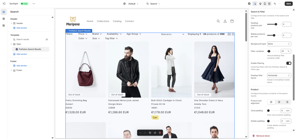
The Shopify Theme Editor is an intuitive, built-in tool that allows merchants to make real-time design and functionality changes to their store’s theme. It enables store owners to customize their store’s layout, colors, fonts, and other design elements without needing to code. You can think of it like WordPress’s Site Editor, for example.
This user-friendly editor helps businesses create a cohesive and on-brand shopping experience for their customers.
Shopify Theme Editor
Vintage Themes vs. Shopify Online Store 2.0: What Changed?
Shopify has come a long way in enhancing drag-and-drop store customization, and one of the biggest leaps forward was the transition fromVintage Themes to Online Store 2.0 in 2021.
Before this update, customizing a Shopify store required modifying Liquid templates, working with custom code, or using limited theme sections on the homepage. With Online Store 2.0, merchants now have far greater flexibility in designing their storefronts—without needing to touch a single line of code.
Key Differences in Customizability
Theme Editor Upgrades
Improved UI: The new Theme Editor provides a much smoother experience, with better organization and a preview panel for real-time edits.
Faster Performance: Online Store 2.0 themes load faster and handle customization more efficiently as compared to older themes.
More Sections Everywhere
Before (Vintage Themes): Merchants could only add sections (like banners or product lists) to the homepage, while other pages were static and required coding for modifications.
Now (Online Store 2.0): Sections can be added to any page, such as your Search page or Collection pages, giving merchants full control over their store layout.
Easier App Integration
Before: Apps would often inject their code into the theme files, making them harder to customize or remove.
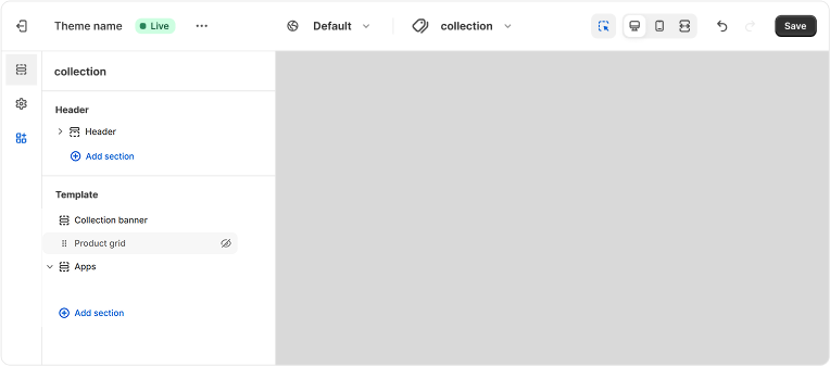
Now: Apps built for Online Store 2.0 integrate seamlessly within the Theme Editor, appearing as configurable App Blocks—just like built-in Shopify sections. These apps can be customized directly inside the Theme Editor with a drag-and-drop interface.
Third party app block added to the Search page in Shopify Theme Editor
Metafields for enriching product catalog
Before: Merchants had to rely on third-party apps or custom Liquid code to add extra product information.
Now: Shopify Metafields allow merchants to add custom data fields—such as size charts, care instructions, or product highlights—without extra apps or coding
Why Upgrade to Online Store 2.0?
If you’re still using a Vintage Theme, switching to Online Store 2.0 will unlock a much more customizable and app-friendly Shopify experience. Not only does it make store design more flexible, but it also ensures that third party apps work seamlessly within the Theme Editor.
By taking advantage of Online Store 2.0’s improved customizability, Shopify merchants can create more dynamic, conversion-optimized stores all while keeping the editing process simple and intuitive.
Key Features of the Shopify Theme Editor
Whether you’re using a free Shopify theme or a premium one, the Theme Editor allows you to modify your store’s layout, add dynamic elements, and now, even customize certain third-party apps (like Prefixbox AI Search & Filter) as if they were native Shopify sections.
Drag-and-drop customization
Arguably the greatest feature of Shopify’s Theme Editor is its intuitive drag-and-drop interface. This means that store owners can easily rearrange content, add new sections, and remove unwanted elements in real time. Unlike older Shopify versions, which required manual code changes, Online Store 2.0 themes support section-based editing on any page, giving merchants full control over their storefront’s design.
Example: Want to highlight a “Best Sellers” section on your product pages? Just add a Featured Collection block and drag it to the perfect spot.
Live preview on multiple devices
Shopify Theme Editor has a live preview panel, which allows users to see changes in real time before publishing them. This eliminates the guesswork of theme modifications and ensures that every adjustment aligns with the store’s branding and user experience.
Moreover, the editor lets users preview their store not only on desktop, but also on tablet and mobile as well – ensuring the layout and the design works on all platforms and screen sizes.
Merchants can experiment with different banner images, colors, or button placements and see how they look before saving changes.
App block integration
One of the biggest upgrades in Online Store 2.0 is the ability to integrate third-party apps directly into the Theme Editor. Instead of relying on complicated Liquid code or external app settings, supported apps now appear as App Blocks—making them as easy to customize as any native Shopify section.
This means that third party apps can be configured directly from the Theme Editor.
Think about wantingto add a predictive search bar to your homepage or collection pages. If you’re using Prefixbox AI Search & Filter, just add the Prefixbox App Block, customize its size, colors, and layout, and save the changes, all within the Theme Editor.
Merchants can:
Adjust search bar placement within their theme
Modify filter layouts for better product discovery
Customize search results to match their branding
Theme settings panel
The Theme Editor also includes global settings, allowing merchants to adjust store-wide elements such as:
Colors (buttons, background, text)
Fonts (headings, body text, product descriptions)
Image settings (logo size, banner styles)
This ensures that every page on your store maintains a consistent brand identity, making the shopping experience more professional and engaging.
Example: Want all your “Add to Cart” buttons to be a specific shade of blue? Simply update the primary button color in the Theme Settings, and it will apply across the entire store.
Summary
The Shopify Theme Editor is a game-changer for store customization, allowing merchants to design their storefronts effortlessly—without touching code. With the introduction of Online Store 2.0, Shopify has made it even easier to customize every page, integrate third-party apps, and create a seamless, branded shopping experience.
Mastering the Shopify Theme Editor—along with powerful app integrations like Prefixbox AI Search & Filter—empowers merchants to create a highly customizable, user-friendly, and conversion-optimized store. Whether you’re upgrading from a Vintage Theme or fine-tuning your Online Store 2.0 setup, these tools help you build a storefront that not only looks great but also drives sales and enhances customer experience.
One of the biggest advantages of this upgrade is the ability to embed and configure third-party apps—like Prefixbox AI Search & Filter—directly within the Theme Editor. This means that merchants installing Prefixbox can customize their search bar, product tiles, and filters with a simple drag-and-drop interface, ensuring that their store’s navigation is as intuitive and efficient as possible.
Soma TóthDigital Marketing and Growth Manager – Prefixbox
Soma is managing wide aspects of Prefixbox’s online presence – let it be social media, content or paid ads. He’s a passionate online marketer based in Budapest, Hungary, with a keen interest in cutting-edge technologies and innovative solutions.
Shopify Predictive Search vs. Prefixbox Autocomplete: Which Search Bar is Best for E-commerce?
Choosing the right search solution can make or break your e-commerce store’s success, because it directly impacts your revenue. Whether it is called Predictive Search, Autocomplete or Smart Search Bar—if shoppers can’t find the product they are looking for, they can’t buy it.
In this article, we compare Shopify’s Predictive Search to Prefixbox’s Rich Autocomplete to see which delivers a better shopping experience and has the greatest impact on revenue.
A quick spoiler: while Shopify offers basic real-time suggestions, Prefixbox provides advanced features like natural language-powered recommendations, search result previews, and full customization—leading to higher conversions and sales.
A search bar is the white search box at the top of an online E-commerce store and helps shoppers quickly find the products they are looking for. Instead of browsing through countless categories, customers can simply type a keyword or phrase into the search box and get relevant results (keyword and product suggestions) in milliseconds.
Behind the scenes, the way an E-commerce search bar works is quite complex. It relies on algorithms, indexing, and machine learning to deliver accurate results. When a user starts typing, the system processes their input in real time, compares it to a database of products and categories, and return relevant suggestions in the blink of an eye.
More advanced search solutions incorporate Natural Language Processing (NLP) to understand intent, typo tolerance to correct errors, and AI-driven personalization to tailor results based on user behavior. The more intelligent and intuitive the search bar, the easier it is for shoppers to find what they need—leading to higher engagement and increased sales.
When users hit ‘Enter’, or click on the search button at the side of the search bar, they are taken to the Search Engine Result Page (SERP), where they sees a thorough list of relevant products, advanced filters to narrow down results, sorting options and often product recommendations. Learn more about Shopify Search pages in this article.
The Impact of a Search Bar
Search users generate six times more revenue compared to non-search users, according to our data, because they have a high purchase intent.
Additionally, among search users, 60% click on predictive search suggestions, whether they are products or keywords.
Encouraging more shoppers to engage with you search functionality—which always begins with the search bar—is one of the easiest and most effective ways to boost revenue.
Shopify calls their own smart search bar ‘Predictive Search’ in their Search & Discovery app. Predictive Search provides real-time suggestions as users type, helping them refine their search without navigating away from the current page.
Predictive Search suggests products, collections, pages, and blog posts based on the user’s input. By default, Shopify’s search bar displays up to 10 relevant results, drawing from searchable properties such as product titles, types, variant titles, and vendors.
Customization of these suggestions is possible through the Search & Discovery app.
Limitations of Shopify’s Predictive Search
While functional, Shopify’s Predictive Search some issues:
Only English language support: Query suggestions are exclusively available in English, limiting accessibility for non-English speaking users.
Limited customization: Altering the default behavior, such as changing the number of displayed results or modifying searchable properties, requires advanced theme customization using Shopify’s Predictive Search API.
Issues with relevance: Large product catalogs lead to slower response times and less accurate results.
Limited customer support: Shopify’s customer support is often slow to respond, and the answers provided are too generic.
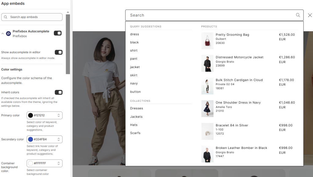
Prefixbox Rich Autocompletesearch bar
Prefixbox’s AI Search & Filter app calls its smart search bar solution ‘Rich Autocomplete’, aligning with the search industry’s standard naming. It is designed to accelerate the shopping journey by offering intuitive recommendations and easy paths to purchase as soon as shoppers focus in the search box. It deciphers user intent and immediately offers search query, category, and product suggestions.
When a user clicks into the search bar, a dialog box pops up and automatically populates with the most popular products and keywords (and collections) by default. As shoppers start typing, the results update with each keystroke to show the most relevant matches to the query typed.
Prefixbox’s predictive search bar can be enhanced with customizable product tiles that include pricing, discounts, add-to-cart buttons, and other relevant information to help shoppers jump-start their shopping journey. Some of the design settings can be customized natively inside Shopify’s Theme Editor, just like any other Shopify element. Advanced design customizations may require custom CSS coding.
The layout of the search bar can also be customized, allowing you to set the number of columns, products, and suggestions displayed, as well as customize all labels.
Search Results Preview: As shoppers hover over autocomplete query suggestions on desktop, product suggestions dynamically change to preview search engine results pages (SERP), providing an interactive and seamless experience.
Language Processing (NLP): Prefixbox’s NLP features understand natural language, ensuring relevant results every time. It supports typo-tolerance, multi-language support, suggestion removal, and manual suggestion blocking, enhancing the overall search experience.
Merchandizing capabilities: Set up promotions under Merchandizing menu to override product results in autocomplete and showcase the products you want at the top – whether for a sale period or to clear out excess stock.
Wrap-up
A well-optimized search bar is no longer a luxury—it’s a necessity for an e-commerce store’s success. According to Prefixbox data, search users generate more than six times the revenue compared to non-search users. Additionally, among those who do use search, 60% click on predictive search suggestions. That means that retailers need to ensure they’re using a solution that consistently returns highly relevant results.
While Shopify’s Predictive Search offers a basic solution, it has notable limitations, including restricted customization, English-only support, and relevance issues for large catalogs.
Prefixbox’s own predictive search solution, Rich Autocomplete, on the other hand, delivers a superior shopping experience with NLP-powered recommendations, real-time search result previews, advanced merchandising controls, and fully customizable layouts. By providing smarter, faster, and more relevant search results, Prefixbox helps online retailers increase search adoption, boost conversion rates, and maximize revenue.
Soma TóthDigital Marketing and Growth Manager – Prefixbox
Soma is managing wide aspects of Prefixbox’s online presence – let it be social media, content or paid ads. He’s a passionate online marketer based in Budapest, Hungary, with a keen interest in cutting-edge technologies and innovative solutions.
How to Scale a Shopify Store with Complementary Products and Smart Curation
As the e-commerce landscape continues to evolve in 2025, Shopify merchants are finding themselves navigating an extremely competitive environment. With thousands of online stores racing for attention, standing out and scaling a Shopify store successfully requires more than just offering great products.
It’s about strategically selecting the right products, creating an exceptional customer experience, and encouraging repeat purchases.
In this article, we will explore how complementary products and smart curation can help Shopify merchants:
One effective way to achieve sustainable growth is through the strategic use of complementary products and smart curation. By offering products that naturally align with each other and cater to customer needs, Shopify merchants can boost sales, improve the shopping experience, and increase customer loyalty; all key factors when considering how to scale a Shopify store.
Let’s dive into how identifying the right products and curating them thoughtfully can lead to long-term success.
Identifying and Adding Complementary Products
When you are ready to scale your Shopify store, offering complementary products is an excellent strategy. Complementary products are items that pair well together and enhance each other’s value. For example, selling a phone case with a matching charger or offering a skincare set with all the necessary products for a full routine makes shopping easier for customers and increases the chance of additional sales.
To scale a Shopify store successfully, you must first understand your customer base. What do they need alongside your main products? For instance, if you sell yoga mats, consider offering complementary products like yoga blocks, straps, or water bottles. Understanding your customers’ behavior is crucial for selecting the right complementary products that will help you scale a Shopify store.
Using Data to Drive Decisions
Data analytics is a powerful tool when you wish to scale a Shopify store. By analyzing your store’s sales data, you can uncover trends and patterns in customer buying behavior. If you notice that customers often purchase a particular product along with another, it’s a good indication that these items complement each other. This insight allows you to create strategic product bundles, increasing both sales volume and average order value.
If you’re looking for an even smarter approach, consider using the AI-powered Syncee GPT for dropshipping product discovery. This tool helps merchants identify trending and relevant complementary products that align with their brand and customer preferences. With these insights, you can effectively scale a Shopify store by curating a thoughtful and relevant product lineup.
Leveraging Customer Feedback for Product Selection
Another critical aspect of identifying complementary products is actively seeking customer feedback. Understanding what your customers think about your existing products and what they feel is missing can provide valuable insights. By using customer reviews, surveys, and social media interactions, you can discover new complementary products that align with customer needs.
For instance, if customers frequently mention the need for a compatible accessory or express interest in a product bundle, consider adding those to your store. Customer feedback not only helps you refine your product selection but also fosters a sense of community and loyalty by showing that you care about their needs. This approach contributes significantly to scale a Shopify store by creating a customer-centric shopping experience.
Tips for Selecting Products that Enhance the Overall Shopping Experience
Curating the right set of complementary products isn’t just about increasing sales; it’s about creating a positive shopping journey that helps you scale a Shopify store by attracting loyal customers. Here are some tips to help you select products that enhance the overall shopping experience:
Brand Consistency: It’s important that complementary products align with your brand’s identity. Whether you sell high-quality luxury products or eco-friendly goods, the items you choose to pair together should reflect the same brand values. This maintains a cohesive shopping experience and strengthens brand loyalty.
Avoid Overloading Customers: While offering complementary products is great, avoid overwhelming customers with too many options. Too much choice can lead to decision fatigue, which may cause customers to abandon their carts. Focus on a few well-chosen, high-quality products that are highly relevant to your core offerings.
Seasonal Collections: Another effective strategy is to curate seasonal collections of complementary products. For example, offering summer-themed accessories or holiday-specific products can create a sense of urgency and drive seasonal sales. This can encourage customers to make purchases they wouldn’t have otherwise, capitalizing on limited-time offers.
By carefully selecting complementary products, you not only increase average order value but also enhance the overall shopping experience. This approach helps you scale a Shopify store by making it easier for customers to find exactly what they need and encouraging repeat purchases. Platforms like Syncee can help you easily find the perfect complementary products from reliable suppliers, ensuring you’re offering items that align with your store’s goals and values.
Creating a User-Friendly Store Experience
A seamless and intuitive shopping experience is indispensable if you want to scale a Shopify store. Here’s how you can create a user-friendly store that converts visitors into loyal customers:
Effective Product Organization and Navigation
Organizing products logically and clearly makes it easier for customers to find what they’re looking for. Group complementary products together in a “Related Items” section or create bundled product pages. Use categories like “Best Sellers,” “New Arrivals,” and “Recommended for You” to guide customers through the buying journey. A well-organized store helps you scale a Shopify store by maximizing user engagement and reducing cart abandonment.
Utilizing Smart Search Solutions
Smart search solutions like Prefixbox are essential tools for enhancing a store’s user experience. A search bar that understands natural language and provides highly relevant results based on customer queries can drastically improve the shopping experience. Prefixbox, for example, helps customers find complementary products and related items quickly, making it easier to add more to their cart.
An intelligent search system can also boost your chances of cross-selling by showing products that customers might not have thought of but would likely be interested in. With the right search solution in place, your customers will have a smoother path to purchase, and you’ll increase the probability of additional sales.
Optimizing Mobile User Experience
In 2025, mobile commerce continues to grow, and optimizing the mobile shopping experience is crucial to scale a Shopify store. Ensure your store is fully responsive and loads quickly on mobile devices. Simplify the navigation, minimize pop-ups, and streamline the checkout process to reduce friction for mobile shoppers.
Also, consider using mobile-specific features like swipeable product galleries, click-to-call customer support, and mobile payment options such as Apple Pay and Google Pay. A seamless mobile experience enhances customer satisfaction, reduces bounce rates, and increases conversion rates, contributing significantly to scale a Shopify store.
The Power of Social Proof and Customer Reviews
Social proof plays a crucial role in influencing purchase decisions. Displaying customer reviews, ratings, and user-generated content builds trust and credibility. Implementing review widgets, showcasing testimonials, and encouraging satisfied customers to share their experiences on social media helps establish your brand’s authority.
Positive reviews on complementary products also act as persuasive selling points, convincing new visitors to try out the bundled items. This strategy not only boosts conversion rates but also enhances brand loyalty, ultimately helping you scale a Shopify store effectively.
Social media platforms play a vital role in driving traffic and promoting complementary products. By leveraging platforms like Instagram, TikTok, and Pinterest, Shopify merchants can showcase how products work together, inspire purchase decisions, and create a lifestyle narrative around their brand. User-generated content, influencer collaborations, and strategic hashtags increase product visibility and attract potential customers who resonate with the brand’s identity.
For instance, a fashion store can showcase a complete outfit, including accessories, shoes, and bags, allowing customers to purchase the entire look effortlessly. By integrating social commerce features and engaging storytelling, you can enhance the shopping experience and effectively scale a Shopify store.
Best Practices for Product Recommendations and Upselling
Once a customer adds an item to their cart, this is the perfect time to upsell or cross-sell complementary products. Using personalized product recommendations based on browsing history or previous purchases can help guide customers toward items they might need or want.
For example, if a customer is purchasing a camera, suggest a camera bag, lens filters, or a tripod—products that complement their original selection. Upselling and cross-selling not only increase AOV but also enhance the overall shopping experience by helping customers find items that will improve their use of the original product.
Encouraging Repeat Purchases and Building Customer Loyalty
If you want to scale a Shopify store, it does not just mean increasing your customer base—it also involves ensuring that your existing customers keep coming back. One of the best ways to encourage repeat purchases is through the strategic use of complementary products.
How Complementary Products Increase Repeat Purchases
When customers have a positive experience with your store and find products that work well together, they are more likely to return for more. For example, offering refills, accessories, or new seasonal versions of the products they previously purchased encourages them to come back. Complementary products also help increase the chances of multiple purchases in one shopping session, making it more likely for customers to complete their orders.
Personalized Recommendations
Personalization is key when it comes to encouraging repeat sales. Use customer purchase history to provide personalized product recommendations. A customer who bought a pair of headphones, for instance, might appreciate a recommendation for a carrying case or replacement ear pads. Personalized recommendations show that you understand the customer’s needs, which strengthens the relationship and encourages future sales.
Email Marketing and Retargeting Campaigns
Email marketing remains one of the most powerful tools for driving sales and nurturing customer relationships. Personalized email campaigns highlighting complementary products based on previous purchases can significantly increase repeat sales. For example, if a customer bought a camera, sending an email featuring compatible lenses, tripods, or carrying cases is an effective cross-selling strategy.
Segmentation is key to maximizing email marketing’s impact. Divide your email list based on purchase history, browsing behavior, and customer preferences to deliver targeted recommendations. Including dynamic product recommendations, limited-time offers, and personalized discounts encourages customers to explore new products, boosting average order value and customer lifetime value.
Additionally, abandoned cart emails with strategically suggested complementary products can encourage customers to complete their purchases. Offering a discount on bundled items or showcasing customer reviews for related products helps alleviate purchase hesitation, leading to increased conversions and sustainable store growth.
Loyalty Programs and Subscription Models
Another effective strategy is creating a loyalty program or subscription model for ongoing engagement. Offering customers rewards for repeat purchases or allowing them to subscribe to receive complementary products on a regular basis ensures that they stay engaged with your brand.
Conclusion
To scale a Shopify store in today’s competitive e-commerce landscape requires more than just offering great products—it’s about offering the right products in the right way. By strategically selecting complementary products and curating them thoughtfully, Shopify merchants can boost sales, enhance the shopping experience, and encourage repeat purchases.
Remember, the key to scaling is not just in attracting new customers, but in retaining them and ensuring they return for more. Tools like the AI-powered Syncee GPT for product discovery and Prefixbox’s AI search can make the process of curating and discovering complementary products much easier.
By adopting these strategies, Shopify merchants can set themselves up for sustainable growth, making their stores more customer-centric and profitable in the long run. If you’re looking to scale a Shopify store, start by focusing on the right products, the right experience, and the right customer relationships.
Six Times the Revenue? How to Get More Out of Your Site Search on Shopify
Many believe that a well SEO-d product catalog and is enough to ensure product visibility, as Google or ChatGPT bots will handle the rest for the major search engines.
However, the real-world data tells a completely different story. Users who utilize an online store’s site search engine generate more than six times the revenue compared to those who do not.
In this article we will discuss:
– why site search is a game-changer for Ecommerce, – data about site search usage and revenue by industry, – why AI search is not just hype, but already a proven solution, and – how to get all this for your Shopify store!
Site Search – A Key Element of the Customer Journey
Search is one of the most critical elements of the conversion pathway. When properly configured, it can significantly increase sales and conversion rates while reducing dropouts.
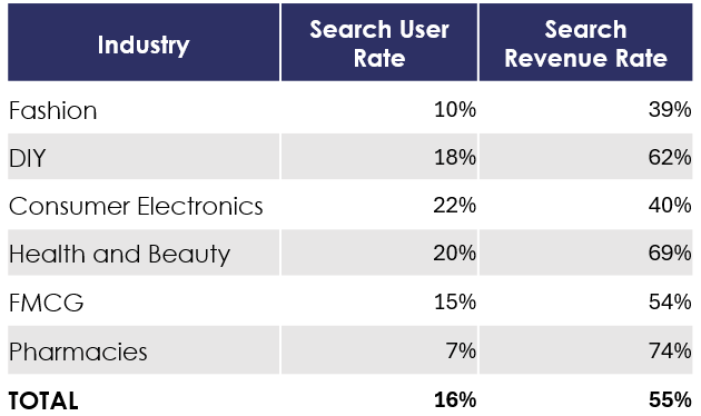
Despite this, analytics from Prefixbox reveal that only 10–30% of site visitors use the search function. The following table shows the ratios by industry, highlighting significant variation across different sectors:
The search function in online stores typically consists of the search bar in the site’s header and the corresponding search engine results page (SERP). Results can be refined with filters, and similar functionalities may appear on other pages, such as cart or category pages.
In summary, optimizing your online store’s search function is an obvious step for increasing revenue and improving conversion rates.
AI Search – a proven solution, not just some hype
The rapid advancement of artificial intelligence technologies further enhances the added value of site search engines.
You may think, “Oh, another story with the AI bullshit.” However, I will easily prove you wrong. AI Search is not a vague potential theory – these solutions are already implemented on live sites, generating revenue.
How AI Search works
Artificial Intelligence solutions enhance search engines in two main areas currently:
Automation: AI minimizes the need for manual optimization and setup.
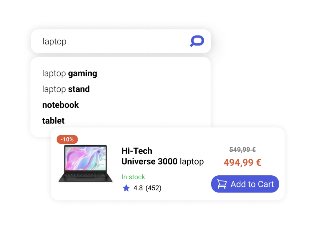
Understanding User Intent: AI interprets conversational queries like, ‘I’m looking for a gaming laptop that can run GTA6.’
Most AI search solutions combine vector database technologies with large language models (LLMs). This approach significantly improves the relevance of search results compared to traditional keyword-based engines, providing more accurate and meaningful results for the shoppers
How does Vector search work? It converts products into mathematical objects (vectors) and places them in a vector space. Consequently, similar products naturally cluster together. Then, the same transformation is applied to search queries. the results closest to the query vector are displayed.
When combined with traditional keyword-based methods, vector search ensures users always get the best possible results.
Additionally, AI and LLM technologies address other challenges, such as:
Managing Synonyms: Automatically recognizes different terms for the same product (e.g., “notebook” and “laptop”), eliminating the need for manual rules.
Enhancing Product Descriptions: Makes them clearer and more informative.
Chat-Like Search Support: AI-powered agents help users find what they’re looking for faster.
Case Study – 45% Increase in Revenue with AI Search
The success of AI-driven search engines is exemplified by the Prefixbox AI Search Engine, which generated a remarkable 45% increase in revenue for the Bauhaus Czech online store during the testing phase compared to a traditional keyword-based engine. Impressed by these results, the client requested an early activation of the AI Search, which has been operating successfully ever since.
Elevating Search Functionality for Shopify Stores
In mid-2021, Shopify introduced “Online Store 2.0” themes, significantly simplifying the use of third-party apps. Since then, apps can be enabled or disabled with a simple toggle within the theme editor. This eliminates the need for code injections or custom integrations, which previously made installing and removing apps more complicated.
Despite this, many stores still use outdated “vintage” themes. The issue with these themes isn’t just that apps are harder (or impossible) to install on them, but also that they’re no longer available in the official Shopify store. As a result, they don’t receive functional or security updates, making them increasingly risky to use. Transitioning from vintage themes is therefore not only strongly recommended but becoming increasingly urgent.
In the modern Shopify environment, installing third-party apps from the official Shopify App Store has become incredibly easy. These apps are excellent for enhancing store functionality with solutions developed by specialized providers. Furthermore, most apps offer free plans, allowing you to test them completely risk-free before making a long-term commitment.
The best third-party Shopify search apps
Search apps available in the Shopify App Store allow you to optimize the search bar, search results page tiles, and filters. Some applications also manage the tiles and filters on collection pages, further enhancing the overall shopping journey.
Issues with the default Shopify Search & Discovery app
The simplest choice is Shopify’s own Search & Discovery app. It’s intuitive to set up since it looks and works just like any other menu in the admin panel. Another key advantage of the Search and Discovery app is that any changes to the products are reflected instantly in the search app as well, as it pulls data directly from Shopify’s database.
However, its simplicity is also a drawback, as some of its features are quite limited. For example:
The number of filters is limited: You can create up to 25 filters per store.
No pagination after applying filters: the filtered results aren’t continuously loaded onto a single page.
No search within filter values: For instance, if a store sells phone cases and creates a filter based on phone models, it will generate a long, scrollable list—but customers can’t search within it.
Limited customization options.
Restricted customer support: The official Shopify support team doesn’t always provide sufficiently helpful solutions.
Specialized third-party apps
This is why external, specialized site search apps come in handy. These solutions offer advanced features, full customization, and dedicated customer support to enhance the search experience.
Previously, Prefixbox focused on custom enterprise solutions for mainly mid- and large-sized businesses. However, a few months ago, Prefixbox made the site search technology available for all Shopify merchants in the App store.
With the Prefixbox AI Search & Filter app, the search bar, the search page and collection pages can all be customized directly within Shopify’s theme editor. Filters (on both the search and collection pages) can also include a mini search bar, allowing customers to search within filter values. Additionally, the system automatically displays only relevant filters based on the search query, eliminating the need for manual setup for each collection.
Optimizing an online store’s site search functionality is crucial for boosting conversions, increasing revenue and minimizing churn. Data shows that shoppers who use search generate over 6 times more revenue than those who don’t.
AI-powered search solutions, such as vector search and large language models, further enhance search performance and the user experience throughout the customer journey. These technologies not only reduce the need for manual configurations, but also make search results better and more relevant.
On Shopify, installing third-party search apps has become easier than ever with app embeds in Online Store 2.0 themes. These specialized apps allow merchants to fine-tune and customize their site search and filters, offering advanced features and dedicated customer support for a superior shopping experience.
Soma TóthDigital Marketing and Growth Manager – Prefixbox
Soma is managing wide aspects of Prefixbox’s online presence – let it be social media, content or paid ads. He’s a passionate online marketer based in Budapest, Hungary, with a keen interest in cutting-edge technologies and innovative solutions.
How to Align Merchandising and Brand Identity for Increased Sales
In the fast-paced world of retail, aligning your merchandising strategy with your brand identity is not just a smart move—it’s a necessity.
A brand that resonates with customers on an emotional level can build lasting loyalty and differentiate itself in a crowded marketplace. When merchandising and brand identity work together seamlessly, they create an immersive customer experience that drives sales and fosters brand loyalty.
But how exactly can businesses align these two critical elements? Let’s explore the key steps to integrate merchandising and brand identity, ensuring that your business stands out and connects meaningfully with customers.
Before diving into how merchandising can reflect brand identity, it’s important to understand what brand identity really means. At its core, branding is the process of creating a unique identity that communicates who you are, what you stand for, and why customers should choose you over your competitors.
It’s not just about logos or catchy slogans—it’s the entire experience your business delivers.
Brand identity includes the following components:
Brand Vision: The clear, overarching purpose behind your brand—what you hope to achieve and how you want to impact your customers and the world.
Brand Culture: This reflects the values and principles that guide your business, which should be felt at every touchpoint with your customers.
Brand Personality: The emotional traits associated with your brand—whether it’s fun, trustworthy, sophisticated, or adventurous.
Brand Presentation: This includes everything from your visual design (logos, colors, packaging) to how your store or website looks. It’s how your brand is experienced in the physical or digital world. This is exactly why testing is so important – it helps you ensure that every visual element stays true to your brand, no matter the platform. By choosing reliable visual testing tools from Functionize’s list, you can quickly spot any inconsistencies and fix them, so your brand consistently delivers a seamless and engaging experience.
In addition to visual consistency, protecting your branded assets online is just as critical to maintaining trust and credibility. Using a reliable content protection platform can help monitor unauthorized use of your logos, product images, and marketing materials across digital channels. This added layer of protection ensures your brand identity remains intact and reinforces a consistent experience wherever customers encounter your business.
At its best, a strong brand identity creates an emotional connection with customers, offering more than just functional benefits. It evokes trust, reliability, and loyalty. Once your brand identity is clearly defined, the next step is ensuring that merchandising supports and amplifies it.
What is Merchandising?
Merchandising is the art of presenting and promoting products to drive customer engagement and sales. It involves the strategic placement, display, and pricing of products to make them appealing and easy to buy.
Effective merchandising is not just about showcasing products; it’s about creating a shopping experience that is consistent with your brand’s identity.
Whether in a physical store or online, merchandising involves multiple elements, such as:
Product Assortment: The range of products you offer should align with your brand’s values and appeal to your target audience’s needs.
Visual Displays: This includes the design of store displays, window visuals, or online layouts. The way products are presented should tell your brand story and create a visual experience that draws customers in.
Signage and Communication: Clear, consistent messaging that reinforces your brand identity through slogans, price tags, or online banners.
Successful merchandising extends beyond simply putting products on a shelf. It is about creating an immersive experience that showcases your brand’s unique characteristics. The goal is to build a connection with your customers that goes beyond the transaction, encouraging loyalty and repeat business.
Aligning Merchandising with Brand Identity
To truly align your merchandising strategy with your brand identity, every element of your merchandising efforts must reflect the core values and personality of your brand. Here’s how you can do it:
1. Know Your Brand’s Essence
Before you can align merchandising with your brand identity, you must have a clear understanding of your brand’s core values, personality, and vision. Ask yourself:
What emotions do we want customers to associate with our brand?
How do we want to present our brand to the world?
What story does our brand tell, and how can merchandising bring this story to life?
Your brand’s essence should inform every decision about how products are displayed and presented. For example, if your brand promotes sustainability, durable custom poly mailing bags, eco-friendly packaging and products placed in natural, earthy displays can reinforce this commitment. If your brand is all about luxury, high-end materials, sophisticated lighting, and elegant displays should reflect that premium experience.
2.Consistency Across All Touchpoints
Consistency is key when aligning merchandising with brand identity. Every touchpoint—whether in-store, online, or on social media—should reflect the same brand values, language, and visual style. From your store’s layout to your product packaging, consistency fosters trust and ensures that customers know what to expect.
For example, if your brand’s visual identity includes a minimalist design with a monochrome color palette, ensure that this aesthetic carries over into your product displays, online store, and even your social media presence. When everything aligns, customers immediately recognize your brand, which builds loyalty and trust.
3.Create Immersive Experiences
Effective merchandising goes beyond physical displays. It’s about creating an experience that allows customers to engage with your brand on an emotional level. For example, Apple’s retail stores are designed to feel open, clean, and interactive, aligning with their brand identity as a cutting-edge, user-friendly tech company. Their displays encourage customers to touch and engage with products in a way that reflects the brand’s innovation and simplicity.
Similarly, in online merchandising, brands like Glossier have built success through immersive, aesthetically pleasing visuals and an easy-to-navigate website that aligns with their minimalist, modern brand personality.
4. Highlight Your Value Proposition
Your value proposition is the unique combination of functional, emotional, and self-expressive benefits that your products offer to customers. When merchandising, ensure that your products not only align with your brand’s personality but also communicate the value they provide. Whether it’s through product placement, signage, or promotional offers, highlight what makes your brand special and why customers should care.
If your brand stands for high-quality, organic beauty products, ensure that the display communicates the purity and effectiveness of the product. This could be achieved through natural materials in your displays, informative product descriptions, and clear messaging that communicates the health benefits of using your products.
5. Leverage Services for Personalized Experiences
Personalized shopping experiences—such as customized product recommendations, tailored offers, or augmented reality (AR) displays—can make your brand feel more relatable and relevant to your customers. These personalized interactions help customers feel seen and valued, which enhances their emotional connection to your brand. In a crowded market, providing a unique, tailored experience can set your business apart and encourage loyalty. For example, by using custom packaging provided by Arka, businesses can elevate their branding efforts by offering personalized touches that resonate with individual customers. Custom packaging not only reflects the brand’s identity but also creates a memorable unboxing experience, which has been shown to increase customer satisfaction and drive repeat purchases. By aligning these personalized elements with your brand’s core values and aesthetics, you can craft a shopping experience that feels more intimate and thoughtful, ultimately encouraging deeper customer engagement and increasing sales.
The Bottom Line: Drive Sales Through Aligned Branding and Merchandising
Aligning your merchandising efforts with your brand identity is not just about creating attractive product displays. It’s about crafting a cohesive, immersive experience that resonates with your customers and drives long-term loyalty. By ensuring that your brand’s values, personality, and visual style are reflected in every aspect of your merchandising—from product assortment to store design—you create a unified, memorable experience that increases sales and builds lasting connections with your audience.
![[Webinar] Ecommerce Tech: Build a High-Converting Stack in 2025](https://www.prefixbox.com/blog/wp-content/uploads/2025/09/Ecommerce-Tech-Stack-thumb-938x750.png)

![[Webinar] Agentic Commerce Is Here: How to Get Your Brand ‘AI Agent Ready’](https://www.prefixbox.com/blog/wp-content/uploads/2025/09/blog-thumbnail-template-webinar-conscia-938x750.png)