What Ecommerce Brands Often Get Wrong about Site Search

What eCommerce Brands Often Get Wrong about Site Search

In my life so far, I must have visited thousands of ecommerce sites, ranging massively in quality. And while the worst offenders have found countless different ways in which to take up far too much of my time and raise my stress levels, few things infuriate me more than a site with weak on-site search.

Imagine finding yourself at a loss trying to locate a particular product in a grocery store and flagging down a store assistant, only for them to stare at you blankly and sullenly refuse to provide you with any help. You’re trying to buy from them — why won’t they help you?!

So whether you’re a customer looking to codify why exactly some stores annoy you so much, or you’re a store owner looking for some direction on how to improve, this piece can help. Let’s go ahead and run through the main things that ecommerce brands get wrong about site search.

They Don’t Present It Clearly


The whole point of a search system is to help you find things that you might otherwise have missed (or taken a prohibitive amount of time to happen upon). As such, having the search system itself be tricky to find is a colossal design failure, yet some ecommerce stores do this — some intentionally (not considering search important) and some unknowingly.

There are two major ways in which stores fail to present their search functions clearly:

  • The search box is not in a prominent areas. In almost all cases, a search bar should be shown above the fold and helped to stand out through contrast and spacing. Adding a small link to a dedicated search page in an otherwise-uninteresting corner of the screen will ensure that very few people ever discover its existence.
  • They don’t make reference to them. At a minimum, a site with internal search should mention it in a help section of some kind, and there should be occasional prompts for the user to return to the search function if uncertain about where to go. If there’s no reference to a search option, people will assume it doesn’t exist.

The failure to prominently display a search bar is particularly frustrating from sites that actually have robust search functionality, because it ensures a near-total waste of effort.

They don’t tag products WELL


A search facility is only as useful as the product database into which it provides a window, and incompetence or apathy on the part of eCommerce retailers can lead to product tagging that is bland at best and utterly incomprehensible at worst. Good product tags are:

  • Worth including. The quantity of product tags isn’t inherently important, and loading a product description with fifty distinct tags is only going to cause confusion. Most of them will invariably be insignificant, and thus serve to distract from the tags users care about.
  • Implemented consistently. If you’ve ever used a marketplace such as Ebay, you’ll know how tough it can be to narrow down a search when sellers use different tags to communicate the same things. Cases for the iPhone 6 might be tagged as “Compatible with iPhone 6” by one seller, “iPhone 6 Compatible” by another, and just “iPhone” by a third — how do you get a full list of all relevant cases?
  • In line with user expectations. The terminology you use for tagging also matters, because you’ll want to mirror the phrasing used by the searchers. Tagging a phone for “NFC” might be accurate, but if searchers are looking for “contactless”, you should adjust your phrasing to suit.

An eCommerce store with a solid search system can entirely undermine it by failing to achieve any degree of consistency or sense with its product tagging, and it’s relatively common because product tagging is an arduous and boring task that can’t meaningfully be sped up — but it has to be done for search to be maximally useful.

They stick with default systems


In many cases, eCommerce brands never even think to make any changes from whatever default systems are present on their stores. Whether because it’s most cost-effective or because of a lack of technical expertise, the average store today is the product of a user-friendly storefront creation tool, and goes largely untouched from a technical standpoint (beyond some basic setup work and template tweaking).

And while using DIY software is likely to ensure a basic search facility, it’s going to be a big disappointment relative to a smarter solution by doing the following:

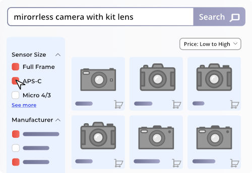
  • Providing no product filtering. The larger a product range is, the more important a filtering system becomes. Relying on tags, a good filter system allows you to incrementally narrow down a search instead of repeatedly searching, checking the results, and revising the search from the beginning.
  • Missing valuable data. Any search feature that doesn’t properly segment sequences of search strings is wasting valuable data, because knowing how users step-by-step alter their searches gives you tremendous insight into how they think — insight that you can use to improve your UX and drive more conversions.
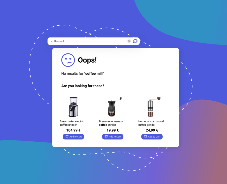
  • Overlooking rhetorical potential. Through autocomplete terms, related products, and recommended items, a high-quality search window goes a long way to provide the user with value, saving them time and helping them expand their order.
  • Giving generic results. Personalization is increasingly key, as we expect the search engines we use to have some awareness of context when interpreting our searches. Implemented well, it raises the value of a search function for any given user over time, something very important for customer retention.

Any ecommerce brand that wants to maximize its profits (so every eCommerce brand) should explore using integrated search services to provide stronger functionality.

Conclusion


To briefly recap, ecommerce brands get three major things wrong about site search:

  • They don’t give it the prominence it deserves.
  • They don’t tag their products to be search-optimized.
  • They don’t make any effort to customize it.

Where this is the result of indifference, it’s hard to know what to say to the offending companies other than to ask them about how they use ecommerce sites in an effort to have them realize why search is so important. Where it’s a matter of ignorance, though, it’s really a matter of making them aware of how incredibly transformative an exceptional search tool can be.

Patrick FosterWriter and eCommerce Expert – Ecommerce Tips

On a regular basis, Patrick blogs about the latest developments from the ecommerce world. For updates on new activity when it happens, head to the ET Twitter @myecommercetips.

How to Increase Revenue with B2B Search

How to Increase Revenue with B2B Search

While eCommerce search function is important for every webstore, it plays a different role on B2B shops than it does on B2C. In order to fully optimize your site for conversions and revenue, it’s important to understand the function of search on your site and how you can leverage its full potential.

Differences between B2B and B2C search


When outlining the differences between B2B and B2C search, it’s important to start by thinking about each site’s customer profile.

People shopping on B2C websites are shopping for themselves or for friends. They’ve either arrived to your site with an idea of what they’re looking for or are happy to just browse around.

The browser
the "browser" type of online store visitors
The searcher
the "searcher" type of online store visitors

If they’re using your search function, they’re looking for something particular although it could be something vague like ‘black shoes’. These shoppers are often open to seeing different/related product suggestions and will frequently order something they didn’t initially intend to purchase.

On B2B sites, people aren’t necessarily browsing as much as they are placing an order. They’re often re-ordering something they’ve already purchased for their company or want to stock in their shop. They know the brand, product SKU number, and exact items to buy.

They aren’t usually open to browsing around and will almost never buy something they didn’t initially intend to. They order about 4X as many products as B2C shoppers.

In this way, due to the high number of different products and shopper’s specific needs, search on a B2B site is incredibly important as it plays an integral part in quickly (and accurately) directing shoppers to the product(s) they’re looking to buy.

That’s why 95% of B2B shoppers use the search function, while only 20% of B2C shoppers doThe intent to purchase for users who use the search function is 3-4x higher than users who just browse. This explains the huge difference between B2B and B2C sites.

B2B product catalogues are also significantly larger than B2C product catalogues. For example, an average product catalog for a large B2C site contains around 10,000X products, while a B2B product catalog contains 100,000X products.

With such a wide range of products, it’s virtually impossible for a shopper to navigate to products on a B2B site without the use of search and oftentimes, category navigation is not a viable solution for product discovery.

Search on a B2B site is a key driver in providing shoppers with a great and efficient experience.

With the wide volume of available products and the predictability of shopper orders, search gets shoppers to where they want to go. The importance of B2B search is clearly visible in the 95% use rate. If your B2B search isn’t optimized, you could be missing out on a lot of revenue.

So let’s dive into some best practices on how to properly optimize your search.

B2B Search Best Practices


Now that you see how important search is on a B2B site, let’s dive into some of the best practices. By optimizing your search accordingly, you can effectively increase your conversion rate and online revenue.

Focus on accuracy


The B2B shopper is on a mission to complete an order. They have their shopping list ready and want to get in and out as fast as possible; so accurate results from the beginning are critical to providing a great experience.

Your Autocomplete makes the first impression and can save a shopper a lot of time, so it’s important it’s optimized for speed and accuracy.

In order to meet customer expectations, you need a strong Autocomplete with a deep understanding of natural language that can accurately decipher typos.

  • Your Autocomplete needs to follow the general guidelines: Be prominently featured at the top of the page and be wide enough to support your typical search queries.
  • It should recommend popular keywords and products as soon as someone focuses in and it should never suggest products or keywords that you don’t carry or are out of stock.

To further improve accuracy, your Autocomplete needs to be able to understand and process all the ways your shoppers search. Some people will search by brand name, some by product specifications, and others by product ID number – your Autocomplete needs to be able to understand all of this and provide meaningful results.

You need a Search Engine that can accurately display search results based on accuracy and popularity. In order to stay up to date, it should update these rankings at least daily, with more frequent catalog updates.

In order to get amazing accuracy, it’s important to leverage the latest search technologies. As they become more widely adopted, it helps your store stay relevant and provide a better user experience than your competitors.

Leverage ML and NLP


Machine Learning and Natural Language Processing, while buzzwords, are essential in adding value to your search results. When leveraged correctly, these technologies will increase the number of accurate search results, which enable more shoppers to find the products they’re looking for.

Natural Language Processing technology enables search engines to deeply understanding search queries and user intent, which ultimately provides shoppers with more, and more relevant search results.

A great way to bolster your NLP search is by adding relevant synonyms to keywords and products or to leverage a synonym database, which does this automatically.

A search leveraging Machine Learning continually optimizes search results based on executed queries and aggregated user behavior.

With this, search results are updated frequently (or in real time) based on how people are interacting with them (e.g.: search result clicks, add to basket and order actions). For example, products that are often purchased in after a certain executed query will become more closely related and will show up higher on the Search Engine Results Page when the query is executed in the future.

Machine Learning algorithms are an effective way to mine through a complex amount of data to add coherence to search patterns.

These are incredibly effective ways of reducing the 0-result rate on your site. Landing on a 0-results page is one of the worst experiences a shopper can have as you’re telling them you don’t carry the product they want to purchase. They, therefore, will take their business elsewhere and you miss out on an extra sale.

By leveraging NLP and ML, you’re able to significantly reduce your 0-result rate and increase your online revenue (by increasing the average order value for the B2B shopper), all while providing your customers with a better shopping experience.

Improve product findability


While strong merchandising features and dependence on search filters come to mind when thinking about optimizing a B2C webshop, they also play an important role in B2B webshops due to the immense size of product catalogues. Improving product findability allows shoppers to quickly make a purchase and thus increases your online revenue.

Filters are an essential way shoppers sort through products on the search results page to find what they’re looking to buy.

You should leverage dynamic filtering, filters that change based on product results shown, to allow shoppers to narrow down a wide range of results. For example, someone shopping for laptops may want to filter by brand, size, processing power; while someone shopping for printer ink would need to filter results based on printer type.

Since shoppers aren’t able to effectively navigate your store manually, it’s important that you have the ability to promote products on sale.

If you’re looking for an enterprise eCommerce search provider, make sure you select one that allows you to set rules to boost specific products, keywords, or even categories (depending on your business, you may also want to be able to do this based on different geographic locations).

By providing intuitive filters and leveraging merchandising, shoppers are better able to find the products they’re looking to buy and will be more likely to make a purchase; increasing your bottom line.

Leverage data


While all of the previously mentioned tactics are important to use in your B2B shop, the most important thing you can do is utilize data.

Monitoring the performance of your b2b search with detailed analytics, is one of the most essential things you can do to optimize it.

When looking to implement an analytics tool – you need something that tracks search metrics more in-depth than Google Analytics. Oftentimes, site search providers will offer these tools for free, so do a basic Google search and evaluate offers.

The benefits of frequently checking your b2b search analytics isn’t just better for improving your bottom line.

This insight also benefits other departments. For example, marketing can get insight into customer language by checking the words they use when searching for products. This can then be used in newsletters or in PPC campaigns to make marketing more effective.

Analytics is the basis for a strong b2b search and shouldn’t be something you overlook.

Get Personal


When optimizing your B2B search, think about adding some elements of personalization. Frequently, B2B shoppers return to the same site to place the same order monthly or quarterly. In the B2B industry, the rate of return customers is high, so you should consider personalizing your search by recommending previously searched/purchased products in the Autocomplete or saving previous orders.

You could also customize product recommendations on 0-results pages. You could do this by suggesting other previously purchased products or highlight related (or complementary) products/keywords, so they can navigate to a product page with just a click.

This makes the shopping journey even easier and faster for your customers and provides them with a seamless shopping experience that boosts your online revenue.

Summary


Search on a B2B website is critically important as more than 90% of shoppers interact with it at some point during their shopping journey.

In order to provide your customers with the best experience possible, you need to focus on a few key areas. Most importantly, your b2b search should be accurate and typo-tolerant, you should leverage the latest technologies, implement dynamic filtering and personalization, and monitor results and adjust accordingly based on detailed analytics.

While it can seem overwhelming to optimize the nuances of search, site search providers are able to help and are often happy to suggest some best practices or ways to improve your existing store.

Paige TyrrellHead of Marketing – Prefixbox

Paige is the Head of Marketing at Prefixbox, a leading eCommerce site search solution. She’s an American who’s been living in Budapest since 2017 and loves giving #alwayslearning sessions to help people optimize their online stores.

12 Awesome No Results Page Examples (+6 UI Design Best Practices)

12 Awesome No Results Page Examples
(+6 UI Design Best Practices)

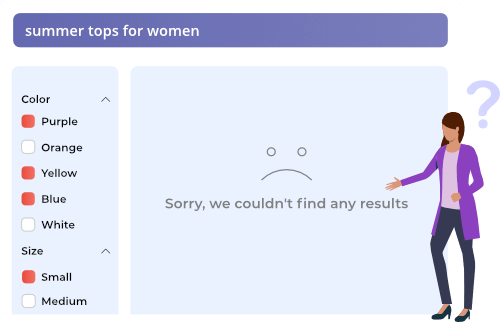
No matter how much optimization you do, it’s inevitable that some searches on your online store will lead to no-results found pages. Planning for these inevitable dead-ends should be an integral part of your UX design from the start. Search is the most important tool in guiding shoppers to products, but even if you follow all of the most important eCommerce search best practices, “no results found” pages still happen.

Contents

Chapter 1

No results, no control

Chapter 2

The Best No Search Results Found UI Design Guidelines

Chapter 3

The Best eCommerce No Results Page Examples

Chapter 4

No Search Results Found UI Design Best Practices

Having a great “no results found” page design is an enormous opportunity for you to build trust with your customers, but you can only do that if you design these pages consciously.

Even though these pages are critical to a online store, according to Baymard, “68% of e-commerce sites have a “No Results Page” implementation that is essentially a dead-end for users, offering no more than a generic set of search tips.” Which also means that customizing your page in a user-friendly way is an opportunity to do get ahead of your competitors. And it only takes minimal effort.

Why are these pages so important?

It’s because these pages keep shoppers on your site even though they can’t immediately find what they’re looking for. If you have a great “no results found” page, you can effectively re-route the shoppers and help them make another purchase. Whereas, with a bad “no results found” page, the shopper will most likely leave your site and go to your competition instead.  

This is a big deal. You can avoid this by thinking of the following:

Chapter 1

No results, no control


It’s important to note that while you should aim to guide shoppers with a search bar, this also gives them a sense of confidence and control over their shopping experience. This sense of control is important in creating a good user experience and building brand loyalty with your customers.

Landing on a “No Results Found” page that doesn’t provide alternate products or information on what to do next, can easily make shoppers feel like they’ve lost control over their shopping experience.

Why does this happen?

As Nielsen states, shoppers don’t always realize that they arrive at a “no results found” page, simply because conducting searches on the web is such an integral part of our daily lives – we are wired to expect certain results within a certain structure. That is: some information on the top about the search that was just performed, which could usually be skipped over, and the relevant results below.

In case of a “no results found” page, information about what happened is usually included in the spot that people often skip over, so they don’t realize they search didn’t return any relevant results. Shoppers are often surprised when they see other webpages or products where they expect the results to be. This often confuses shoppers and leads to a negative experience on your website.
This is why providing tips and alternative products, in a way that the user actually reads them, is very important.

In this article we are going to look at some awesome examples of “no result found” pages.

But first, we have to talk about the basic guidelines of how these pages should be designed.

Chapter 2

The Best No Search Results Found UI Design Guidelines


Now that you see why “no results” pages are so important, let’s check out the best practices for designing pages that help reduce your site-abandonment rate.

Clearly explain what happened


Clear up any potential confusion at the first opportunity to do so.

And be sure to do it in a way in which the shopper actually sees your message – otherwise it’s pointless.

To figure this out, do a heat map analysis of your search results pages, and put the information about the failed search in the place shoppers instinctively look first.

You don’t have to over-complicate this: just tell them the search term they entered yielded no results, but they shouldn’t just stop searching. It often happens that the product they’re looking for is in-stock, it just didn’t turn up due to a typo or a difference in naming.

Always take the blame


Always start these messages with an apology.

Even if you just include something like “our bad”, “sorry”, “apologies for this” in the text, it eases the frustration the shopper might feel, and will help keep them on the site and take the alternative routes you provide.

Speaking of which…

Provide alternatives


Never leave the user with just a notice and apology: always engage them, urge them to try again, or to take further action on the site.

Keep in mind, your site is likely not the only one they are browsing: if their search ends in no results found in your online store, chances are, they’ll leave and go to one of your competitors.

Check their spelling


Actively provide tips if the shopper misspells a word.

Instead of simply informing them that they misspelled a word, you should provide a clickable version of the right spelling that will immediately direct them to the results page (yes, like Google and other search engines).

Suggest similar results


You can do this in a number of ways:

  • Suggest similar keywords and products based on their initial search term with Related Searches
  • Make personalized product and keyword suggestions based on their previous shopping behavior on your site
  • If you can’t track their behavior, at least offer products that are popular among your other customers.

And if this is not enough…

Engage


Even if they can’t reach the product they’re looking for, provide some alternatives for staying in touch.

Include your contact information (email, phone number etc.), or valuable content, links to your social channels, or a newsletter sign-up form that asks for their email address.

The goal is to not let go of their hand, in hopes that later they will return and make a purchase.

And now, let’s check out how some of the best websites out there make use of these best practices in their search results page design

Chapter 3

The Best eCommerce no Results Page Examples


We covered all the best practices, so are you ready to see them in action?
Get some inspiration for your “no results found” pages from the following examples!

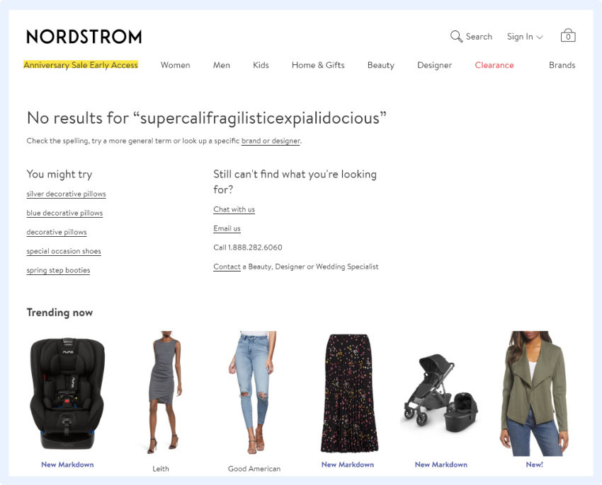
Nordstrom


The two basic things that Nordstrom does right here are:

  • They provide clickable, relevant alternatives based on the keyword provided.
  • They provide an alternative way of finding the desired product via direct contact.
    Note: they don’t only suggest contacting themselves, but also recommend a relevant specialist to contact if you’re not sure what you’re looking for (and provide you a direct path for doing so).

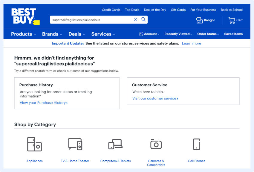
Best Buy


What they do well is that:

  • They offer a way to circle back to your history on their site: view and track previous orders
  • They provide an option for easily contacting their customer service in case you need more help.

Walgreens


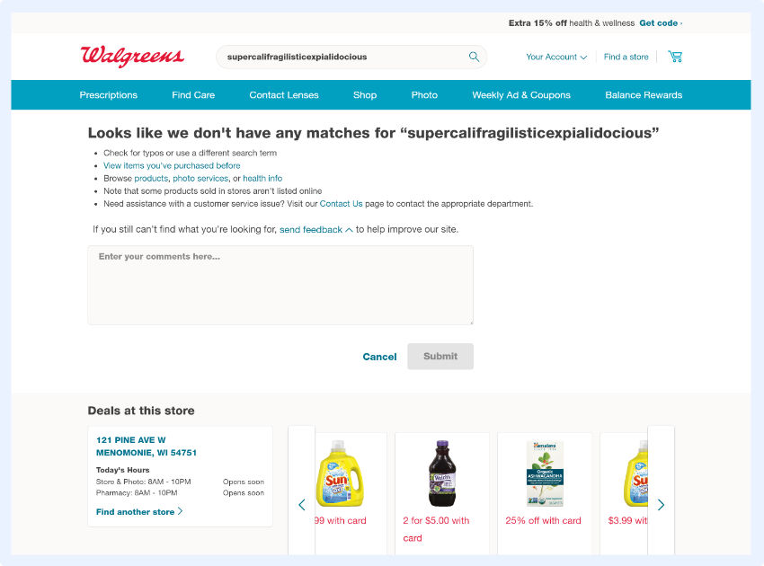
Walgreens excels at helping shoppers retry or refine their search, by giving clear tips and instructions:

  • Directing you to a log of your history on their site
  • Informing shoppers that not all of their products might be on the site
  • Providing shoppers with a chance to contact customer service

They also provide a feedback field, which could collect valuable user information they could leverage to further improve.

Build.com


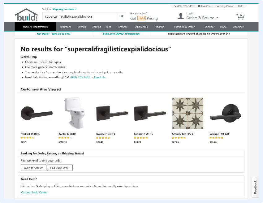
The search results page at Build.com, even with no results, is informative and offers several ways to proceed, including:

  • Multiple suggestions on how to fix the search query
  • Logging in to check your order history
  • Suggesting alternative, popular products

Sears


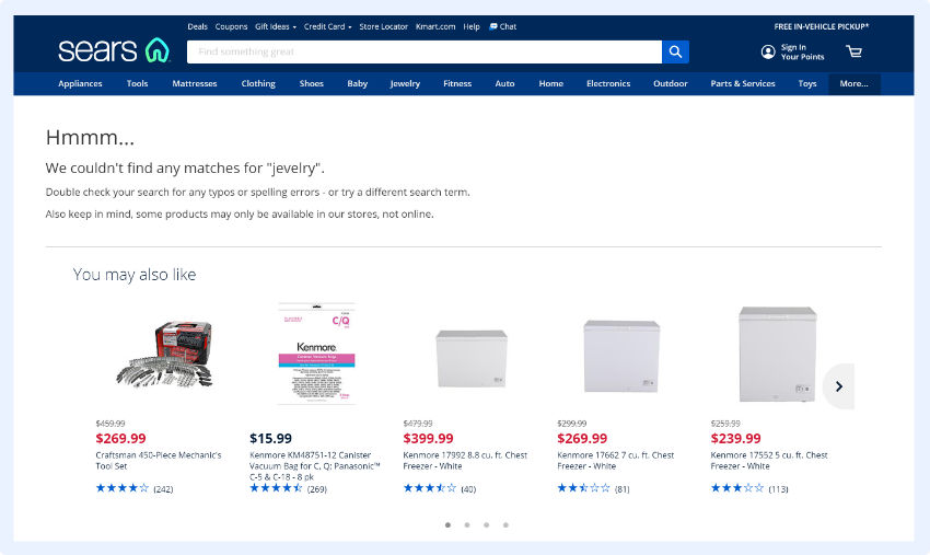
At Sears, they not only explain what happened, but they also suggest other, relevant products based on your previous activity.

Costco


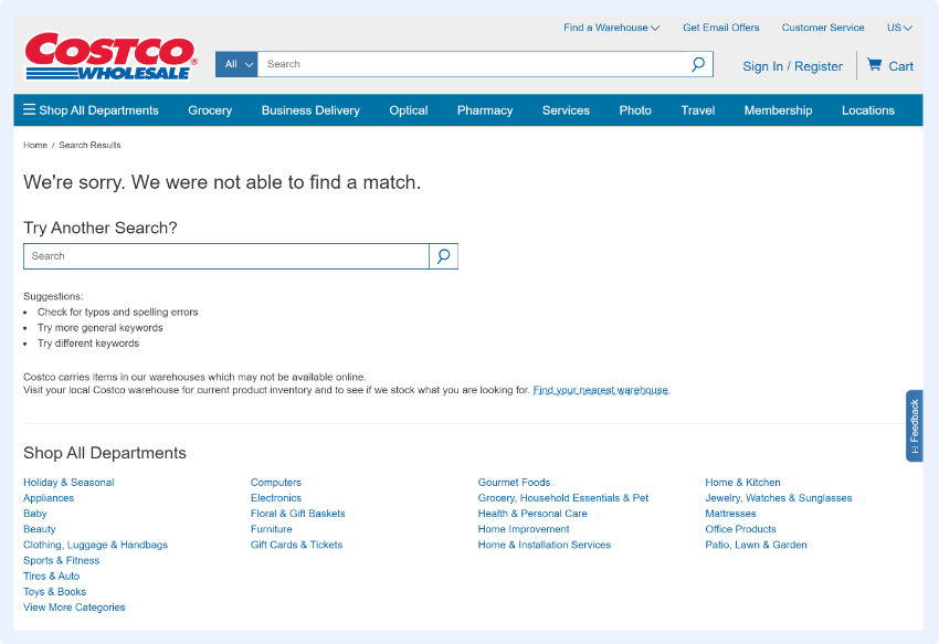
Take note how Costco designed their “no results found” page:

  • They apologize
  • They provide an easy way for shoppers to execute another search and even include an extra field for doing so where the results should be (where shoppers instinctively look first).
  • They provide suggestions on how to re-execute the query, as in: check your spelling, try more general or different keywords.

Although, they miss an opportunity by not offering alternative results based on popularity or user behavior.

Ikea


The main reason their “no results found: page is user friendly is because they immediately show the search query, which is a great way to enable shoppers to identify and fix typos.

This comes along with an apology, to take away some of the frustration. And to alleviate the rest, they also offer alternative, personalized product suggestions.

GAP


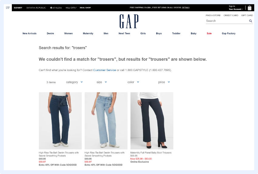
GAP is great because they actively identify typos.

And just like Google, they immediately show results for the keyword you might have misspelled.

Learn more about the tpyical challanges in eCommerce and important search features to increase conversion rate & revenue by 6%

eBay


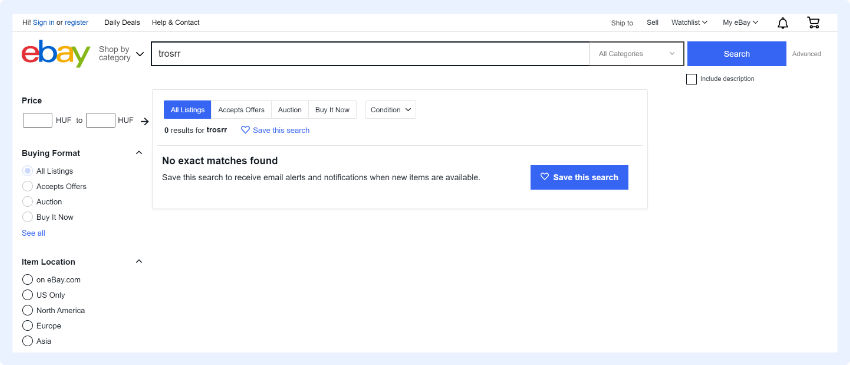
eBay has a unique, highly effective tactic on their “no results found” pages – they enable shoppers to save their search and set alerts for when the desired product becomes available.

This is the best idea for a zero results page I can think of.

Wayfair


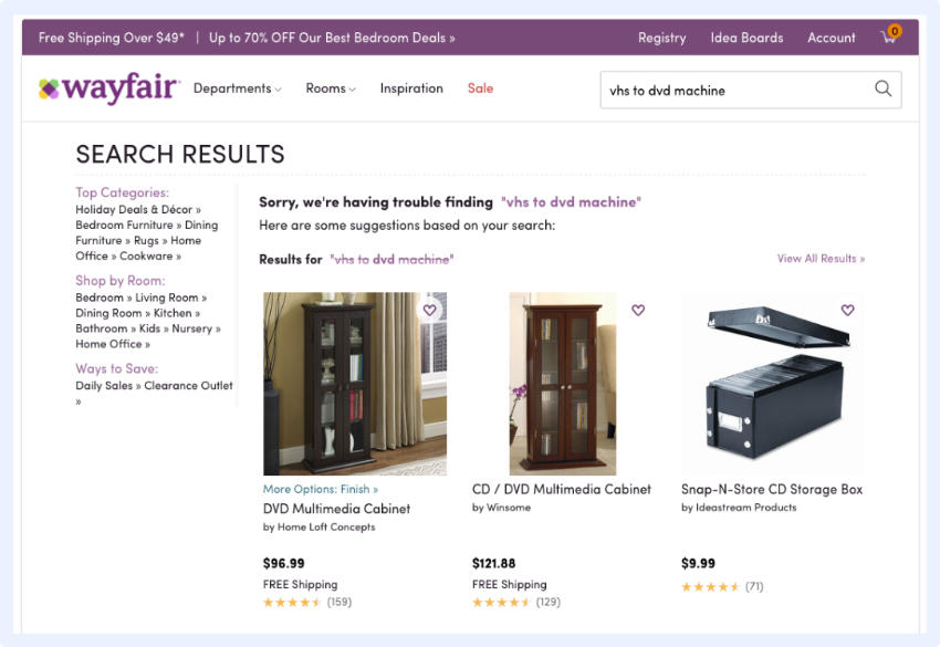
Here, you can see a great example of how search result page design can be user-friendly: shoppers are not only given information on what went wrong with the search, but the search engine actually takes that search query and uses the individual keywords to provide other relevant result suggestions.

Debenhams


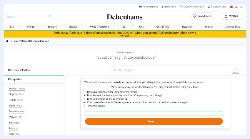
Again, the focus here is on immediately providing help: by placing a search bar in a shopper’s line of sight increases the chance they’ll stay on your site and make a purchase.

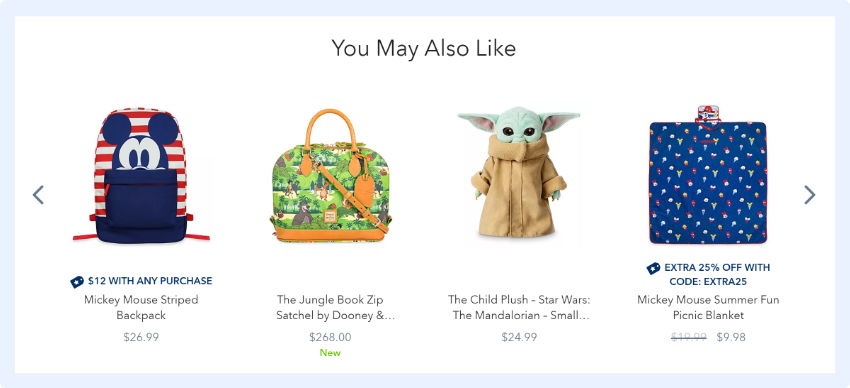
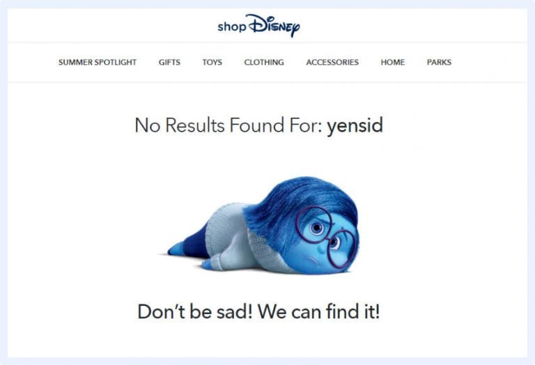
Disney Store


Finally, a unique example.

This “no results page” design isn’t very helpful, but it’s still user-friendly.

Disney simply uses some humor to ease possible tension for hitting a dead end and urges shoppers to continue.

You should consider using cute or funny images or language as part of your “no results page” design as it can make your online store more relatable and memorable. By creating an enjoyable shopping experience for your customers, you’re more likely to generate brand loyalty.

Chapter 4

No Search Results Found UI Design Best Practices


A shopper who uses the search function on your online store has a strong purchase intent. According to the Demac Media’s Q3 2016 Benchmark Report, users who use the site search are 216% more likely to convert than those who don’t.

No matter how much you optimize your site search, “no search results” pages are inevitable. So it’s essential you spend some time optimizing these to help shoppers continue on their buying journey.

You’ll provide your customers with a better user experience and see an increase in your conversion rate and a decrease in your site abandonment rate.

When designing these pages, the main things to keep in mind are:

  • Be helpful
  • Always provide a way for the shopper to immediately continue shopping
  • Don’t leave shoppers staring at dead ends without offering help

Learn more about the most important related search features to increase conversion rates & revenue by 6%.

Paige TyrrellHead of Marketing – Prefixbox

Paige is the Head of Marketing at Prefixbox, a leading eCommerce site search solution. She’s an American who’s been living in Budapest since 2017 and loves giving #alwayslearning sessions to help people optimize their online stores.

Why eCommerce Software is the Future of Business?

Why eCommerce Software is the Future of Business?

The era of the internet is here. More and more aspects of people’s lives are now tied into the digital space.

This makes it the perfect place for businesses to tap into a wider market and audience. With the right tools, you may just be able to unlock new potentials for your business.

In fact, a study by Statista says that global e-retail sales have reached over $3.5 trillion in 2019. This is expected to grow even more in 2020. These figures show that more companies are beginning to see the benefits of going digital with their transactions.

With that in mind, you will need the best eCommerce software to leverage against your competitors in the digital market. These are solutions that enable you to sell products and services online. It assists you in overseeing your eCommerce operations by managing inventory, optimizing your online stores, calculating taxes, handling customers, and others. 

By finding the right eCommerce software for your company, you may just be able to boost your eCommerce sales.

So, here’s why eCommerce software is the future of businesses.

Shift in demographics


As the world changes, a newer generation rises above the older. This means your target audience has also moved over from Gen X and Boomers to Millennials and Gen Z. These are the generation who grew up with technology and have relied on it their whole lives.

This just shows where the trend for marketing and selling is headed. Most of your target market are now used to getting the things they need and want with a few clicks of their fingers. Businesses are now scrambling to find ways to meet such demands from their new generation of customers.

This is where eCommerce software platforms come in. These software solutions will bring your products and services closer to your customers by connecting your business to the internet. This will make your goods and services more accessible and convenient to reach. Likewise, it will encourage more people to avail from you.

Unified platform for all your eCommerce needs


Back in the day, businesses had to use different software to be able to sell online. These software solutions would manage different aspects of their operations from front-end to back-end. This makes it too costly to sustain in the long run. Likewise, it makes it difficult to transition from one task to another.

Fortunately, the advancement of technology has produced a new breed of eCommerce platforms. These new platforms can easily integrate with other types of e-commerce software to create a unified avenue for all your online operations’ needs.

Nowadays, eCommerce platforms have the potential to expand their tools and features. They do not only handle the front-end part, where the customers can access your company’s services and products. They can also manage your inventory, restock them for you, handle accountancy tasks, and gather analytics. This gives you the ability to personalize your software to cater to your every need while keeping everything within a unified platform.

Intelligent automations


One huge benefit of using eCommerce software is that it automates recurring tasks. This lessens the workload on your part, cuts the cost in the long term, and hastens processes on your end. It also reduces the risks of errors.

eCommerce platforms, nowadays, have smarter automations to manage your online business without your further interference. This lets you do more while working less It oversees operations, manages them, and records them for you.

Likewise, it can notify you of issues, billing payments, shipping orders, and many others. This ensures that you are continuously updated on how your business is faring without having to constantly check up on it. With this, you can even run your store all day and night without needing to close it down.

Have access to the global market


The rise of the internet has blurred geographical boundaries. Everyone can connect with anyone around the globe. This is also true for eCommerce. Through the internet, businesses can now expand their reach for their customers.
eCommerce software solutions will make your products and services available to anyone and anywhere in the world. You are no longer restricted within your local areas. You can expand your horizon to make your business grow faster.

Nowadays, distance is no problem with online shopping. Delivery is made easy with recent innovations in travel technology. This makes shipping services accessible and cheaper as well. With these, you can sell to customers regardless of distance and time zones.

Gather analytics and insights


In this data-driven world, information is power. By arming yourself with the right information, you can identify areas where your business needs to improve and develop better customer service. This can also help you create smarter and more effective decisions on your business planning and strategies.

Some eCommerce software, nowadays, makes use of artificial intelligence to help gather insightful data. Its learning capabilities make them adaptable to the ever-changing behaviours of your customers, market trends, and your business’ sales and performance.One such software that uses artificial intelligence is Prefixbox. This eCommerce software is powered by an AI to help improve searches in your eCommerce platform. It does so by tracking user behaviours and learning from them to come up with better user experiences within your systems. You can easily integrate Prefixbox in any software in the e-commerce platforms list.

Compatibility across devices


Everyone is with their gadgets nowadays. In fact, a study by Reviews.org says more than 65% of the population are constantly on their mobile devices – as much as 160 times in a day. This means your eCommerce platforms should be flexible enough to be accessible in any kinds of devices in the future.

Thanks to technology, almost all kinds of devices can be connected to the internet. Users can visit any website they choose in their smaller, more portable devices. This means you must optimize your online shops so that it can still work on smaller screens.

As more and more eCommerce software platforms are connected to the internet, this makes it easier to leverage your brand across various devices. They can ensure that they are accessible to any types of screen and maintain a positive experience for your customers.

Increase in remote interactions


Almost everything is online nowadays. In fact, a survey by Statista shows that 59% of the global population are active users of the internet as of April 2020. The digital space has become a new avenue where they can interact with the outside world. This is where they connect with other people, work, order food, shop for new items, pay their bills and so many others.

Retail, for one, is part of the list of 20 biggest work from home companies from FinancesOnline. Business owners can now easily set up stores and run their operations online. This is mainly thanks to the different eCommerce software out there.

With the right software, you can maintain a connection with your customers. They can still browse through your catalogues or check out your services without having to go out of their homes. They can do away with travel time and costs, making your products and services more accessible and convenient to avail.

The future is now


Ecommerce is the future for businesses. As technology continues to advance, the digital space evolves into something more than just an avenue for communication. It has become a minefield of potentials and opportunities for businesses as well.

The world is gradually becoming more digital and global. Don’t let your company lose the race towards the future. Go ahead and check out the top eCommerce software. Explore which ones will help you navigate whatever lies ahead for your company. The future is now so you better keep up.

Paige TyrrellHead of Marketing – Prefixbox

Paige is the Head of Marketing at Prefixbox, a leading eCommerce site search solution. She’s an American who’s been living in Budapest since 2017 and loves giving #alwayslearning sessions to help people optimize their online stores.

11 Ways to Optimize Your eCommerce Search Results Page Design (SERP)

11 Ways to Optimize Your eCommerce Search Results Page Design (SERP)

You might be thinking “Ok this seems like it could be helpful, but what’s a SERP?”. The Search Engine Results Page (SERP) is the page that displays the query results. Aka, where customers find products to buy.

So it makes sense that the results should be listed in a logical order, with the first 5 products as the most relevant, but that doesn’t always happen.

Check out the 11 tips below to get started. 

Pages that aren’t optimized, can have some pretty bad results – if customers aren’t able to quickly find what they’re looking for on the SERP, they’ll abandon the site and take their business elsewhere. Optimizing your SERP is critical to increasing sales.

Generate SERP Pages Quickly


Users aren’t likely to wait long for the SERP to be generated, in order to prevent them from leaving your site (which hurts your SEO), be sure to have SERPs that load quickly. In addition to creating a bad user experience, slow pages also harm your company’s reputation.

Consider using AJAX to increase the speed of your search engine. AJAX provides a quicker, better search experience for users since only essential data is sent to the browser. It removes the need for a full refresh after users filter results, change views, or go to the next page – so your search is much faster.

Show a Breadcrumb Trail


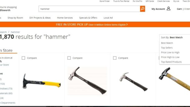
Sort of like the one Hansel and Gretel left. A breadcrumb trail is the list at the top of the SERP that shows the searched term and any refinements made to it- basically, it shows users how they got to where they are.

If a user decides they want to change a refinement, this trail helps them navigate backward without needing the back button on the browser, which could delete the search and make them start from scratch, which no one wants.

Show Related Searches


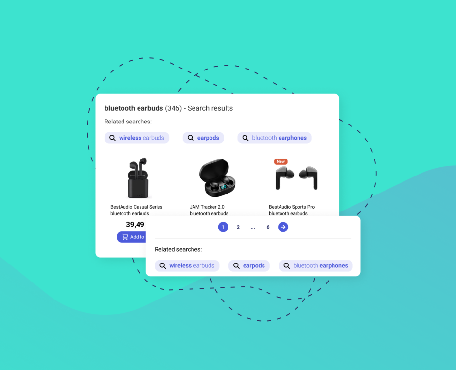
Related searches are search keyword suggestions that appear at the top and/or bottom of the SERP. These help users navigate to other products with just one click.

By recommending products similar to the initial search helps users quickly find what they’re looking for and by providing complimentary suggestions, you increase average order values. A win-win situation.

Learn more about the most important related search features to increase conversion rates & revenue by 6%.

Allow Result Sorting


You should automatically sort your results by an algorithm that puts the most relevant and popular first.

However, your web visitors might want to sort products in a different way, so be sure to give them options. Include search filters that allow sorting by price, new additions, brand, or most relevant.

Don’t Place Search Results in Alphabetical Order


Users want to find the most relevant and most popular products, not a product that starts with a certain letter, so alphabetical sorting isn’t usually helpful.

The first results should be the products that receive the most clicks – the ones that provide the most value to the web visitor, not the ones that start with “A”.

Employ Delayed Loading of Images and Infinite Scrolling


Users prefer to scroll indefinitely, so infinite scrolling increases the likelihood that users will browse through your inventory.

Some users may be overwhelmed with all the results infinite scrolling provides, so it’s a good idea to implement delayed loading as a way to limit the number of results shown at once.It also increases the speed of your site.

If you decide to use infinite scrolling, this means that links commonly found at the bottom of pages can no longer be placed there. Adding another menu on the side or top panel is an easy way to relocate those items.

If you don’t want to use infinite scrolling, make sure you include a moderate amount of results per page (25 or 50), include an option to change the number of results shown, your paging options are clearly visible, and that you display the total number of results pages.

Use Fluid Filtering


If you decide to use infinite scrolling, you will need a search filter menu that stays visible on the page no matter how far people scroll down.

The filter refinements should float alongside the product results while the shopper scrolls, so they stay continually available.

Format Your SERP


Have a cohesive theme for your results pages – all images should be the same size, fonts should match, don’t show product URLs, and decide if you’ll display results in a list or a grid.

Provide clear titles, use large images of good quality, and consider implementing quick view windows with add to cart options. Showing item prices and sale prices can also be a good idea if you offer discounts. Lots of things go into ensuring your SERP is beautiful.

It is a good idea to provide an option that lets users toggle between list and grid views or to change the number of option in rows or columns. Be sure to test these variables, so you can find what your users respond to best.

Have Dynamic Thumbnails


If users search for a black jacket, the jackets shown on the SERP should be shown in black – not another colour with black as an option. If users come looking for a specific item, you should show exactly that, so they don’t have to imagine how it would look or navigate to another page to find out.

According to Baymard, 54% of web shops don’t do this, so if you only implement one thing, let it be this and you’ll already get a leg up on your competition.

Have Alternatives when a Search Displays No Results


0-results pages are one of the worst experiences search users can have on your site. There are multiple ways to subvert this.

1. Place related keywords and products on the 0-result page so users can easily navigate to other products.

It’s helpful to style the text of these suggestions differently from the initial query, so the user can easily see it is not part of the original search. Simply bolding the original search term or using different colour can serve as a big enough differentiator. Make sure the “No Results” text is large and visible, so the users know you’re showing other related searches.

2. If you display results for some of the words in a multi-word query instead of the full term, but be sure to notify the user what you are doing.

Show a message that says “Your search returned no results, but here are some products for ____” or “Showing results for _____”.

3. Have a spell-check function that suggests correct spellings and provide a link that re-directs users to the appropriate products.

Learn more about the most important search autocomplete features to decrease zero-result pages by 31% and increase cart value by 19%.

Analyze User Behaviour to Improve Results


People who use your search box provide a wealth of information, which you can use to improve the relevance of search results. That’s why having site search analytics is critical.

By analysing this data, you can see that users who search a specific term are more likely to click on a certain product – which becomes valuable when deciding how to rank products.

If your SERP is good to go, check out a few ways to optimize your search box.

Paige TyrrellHead of Marketing – Prefixbox

Paige is the Head of Marketing at Prefixbox, a leading eCommerce site search solution. She’s an American who’s been living in Budapest since 2017 and loves giving #alwayslearning sessions to help people optimize their online stores.

Mobile Search Box Optimization – 8 Strategies to Implement

Mobile Search Box Optimization- 8 Strategies to Implement

Mobile is increasingly important, which means people are shopping on their phones more than ever (1/3 of all eCommerce purchases in the holiday season were made on smartphones).

Having a responsive website with an optimized mobile search box is critical to your online store’s success.

Since mobile pages are much smaller than their desktop counterparts, the placement of the mobile search, the format of the SERP, and the information you choose to provide all have a huge impact on mobile performance.

Check out the best practices below.

Make the Mobile Search Box Prominent


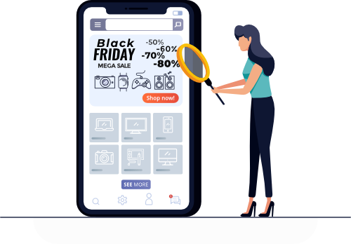
Mobile search box optimization illustration

Search, in general, is important. But search on mobile is critical. Since there aren’t many navigation options on phones, the search box is the main way people find the products they’re looking for.

Whether your eCommerce store is an app or website, be sure to put the mobile search box prominently located at the top of the page.Your paragraph goes here.

Understand Users on Your Site


In order to create a great user experience on your site, you need to understand how people come across and use it. It’s important to track how long users stay on your site, how they navigate/which pages they visit, which features they use (your search?), and how they arrived to your site.

Be sure that your mobile site can also collect this data, so you can get a holistic picture of your customers. Once you have gathered enough data, use it for optimization so visitors can easily navigate and find what they’re looking for on a mobile device.

When collecting and analyzing this data, look to see if/how visitors use your sites differently. The behaviour of mobile users can be very different from those who visit the desktop version. 

Optimize Site Speed


More broadly, it’s also key to ensure your website is optimized for mobile so the pages and products people are searching for load quickly. After putting the effort into improving the search experience for your users, you don’t want them to leave your site due to poor loading times.

There are ways that you can audit and improve site speed for ecommerce stores on Shopify and other platforms, such as using AMP (accelerated mobile pages) to improve page loading speed on mobile devices.

The premise is to serve the web pages in a standard format (defined by Google) to reduce the page size and loading time. For example, all of the page’s content is loaded at once, and browsers know the layout of AMP pages beforehand.

Optimize Search Result Relevance


Mobile screens are small. We all know that, but in terms of eCommerce this means you don’t get as much space to show relevant products to users as you do on the web.

People, in general, are unlikely to click to the second page of search results and even less likely to do so on mobile, so you have to be sure that the products you display first are the most relevant and the most popular.

If you find that users are clicking on the 7th or 8th product after executing a search, you should change your ranking until the first product is clicked most.

Clarify Misspellings


People mistype words frequently on mobile devices, so it’s important for your mobile search function to be able to decipher or automatically correct typos.

One way to address this problem is by creating synonym rules, which link words to show the correct products in case a word is misspelled.

Incorporate Autocomplete


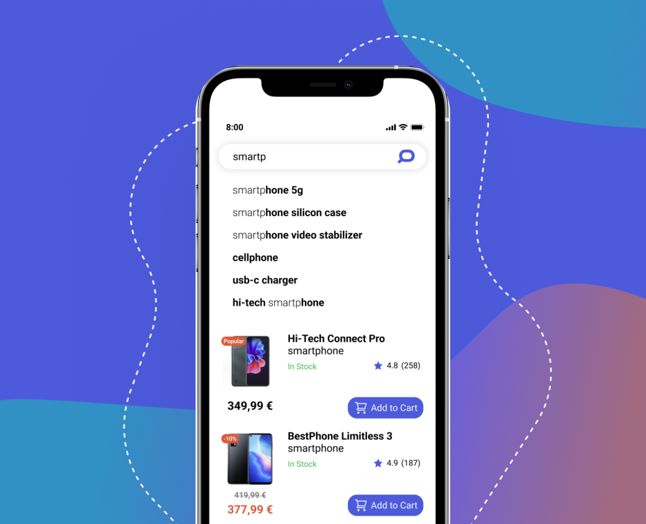
Autocomplete suggests products that match users’ searches – it recommends products and keywords either immediately when someone clicks in the search box or after they type a few characters.

We recommend this full feature on desktop sites, but only recommend showing keywords on mobile sites/apps as there isn’t much screen space and product recommendations use too much of that valuable real estate.

By quickly recommending accurate keywords, Autocomplete lets users navigate easily to the product they’re searching for. It also drastically decreases the rate of typos on phones and tablets.

Show Succinct Content


Mobile screen sizes don’t allow for many visuals, text, or for navigation links common on websites, so make sure the text and images you use add value to your shop. You should limit the content on mobile-friendly websites to only the essentials to ensure quick page-load times and uncluttered pages.

Try to keep the information for each product limited to a photo, the product name, and the price. Discounts and product descriptions can also be added, but keep the descriptions as short as possible. In order to have quick loading times, keep your product images small.

Have a Responsive Website Template


Responsive templates automatically reformat your website to fit whatever screen your visitors are using – including tablets and cell phones. Building a responsive website is a big task, but it has a big payoff.

Before you begin, be sure to think about all the specific requirements your site has and what you need to change for your mobile site.

Having a good mobile site is increasingly important, so be sure to spend time building and optimizing yours. A bad mobile experience can turn users away from your brand or make it seem like you aren’t technologically savvy.

Simply by having a good, responsive site you can avoid all this negativity and guide people easily to the products they’re looking to buy — which increases your revenue!

If you’re looking for other eCommerce site search tips, check out our post on optimizing your eCommerce search box or your SERP.

Balazs Vekony profile picture - Prefixbox
Balazs VekonyOnline Marketing Manager – Prefixbox

Balazs is an Online Marketing Manager at Prefixbox, a leading AI search solution provider for E-commerce sites. He is a marketing enthusiast from Budapest, who is interested in new technologies and solutions and believes in the power of search.

Ecommerce Site Search Solution Comparison

Ecommerce Site Search Solution Comparison

The search function on an eCommerce site is incredibly important because it directs shoppers to the products they want to purchase.

A great search engine will also reduce the amount of times a shoppers ends on a 0-results page When someone lands on a 0-results page, you’re telling them you don’t sell the product they want to buy.

Contents

Chapter 1

Ecommerce Search Terminology

Chapter 2

Basic Considerations

Chapter 3

Operational Details Explained

Chapter 4

Technical Details Explained

Chapter 5

Conclusion

Introduction


Having a great search is fundamental to a great webshop, but finding one that fits your needs can be difficult. 

With a host of different providers, unique terminology, and features to compare, picking an eCommerce site search solution can be a daunting task.  

In order to make the decision a bit easier, we compared some of the most popular operational details and technical details, so you can focus on what your site needs.

Chapter 1

eCommerce Search Terminology


eCommerce terminology can be a bit tricky, especially when different providers compare the same features using different names.  

Here, we’ve broken down the key features to look for, what they do, and why they’re important to your online store. 

Chapter 2

Basic Considerations


When you look at providers, you need to consider multiple things. 

Basic Considerations

  • How the solution leverages data
  • How it processes languages
  • How easy it is to implement

All solutions use data differently. You should look for an eCommerce site search solution that uses data immediately from an existing product feed and search user behavior, so it can start improving quality from day one. Most solutions need to work for a few weeks before they start learning.

It’s critical that a search can process language – otherwise it won’t show relevant results! 

There are multiple ways search functions can understand language – through synonym matching or Natural Language Processing. 

However, when you choose a solution, make sure it can understand you customers’ native language!

Dev teams are often busy, with multiple projects already lined up in a  backlog, so adding another initiative can be a point of contention. 

Make sure you find a solution with a light on-boarding workload, so you can get up and running in no time.

Chapter 3

Operational Detail Explanations


Here are a few operational details to think about when you compare providers.

Integration Support


Most site search solutions claim they are easy to integrate, but they can still be a bit complicated.

When integrating a new solution, small details are important and there’s nothing more frustrating than spending time implementing a new solution only to find out it doesn’t work because of a small mistake.

By choosing a provider that offers integration support, you ensure your site search will be up and running in no time. 

The provider’s integration team is experienced and can help you integrate faster than if you were doing it on your own.

SaaS Solution


A SaaS solution is a software as a service solution. This means that the software is licensed on a subscription basis and is hosted by the provider. This is an alternative to an on-premise solution.

With a SaaS solution, you don’t have to worry about hosting costs. maintenance, or fixing the solution if there’s downtime, which makes your life easier. 

However, if you choose a SaaS provider, you need to consider a few additional things:

How many and where are the data centers?


Your site search provider should have multiple data centers spread across different continents.

Be sure to check that they have a data center located in the same continent or a time zone away – this helps reduce any latency in your search function.

What is their SLA?


SLA stands for service level agreement and is a commitment between and service provider and the end user that outlines the level of service the end user can expect.

An SLA will outline the availability of a certain provider; most companies have 99%+ availability, so use this as a bench mark. This availability refers to how often a solution is up and working throughout the month or year.

Multiple data centers help reduce the risk of downtime (when a solution is not up and running). Minimizing downtime is important so that shoppers on your site will always have the same experience.

Chapter 4

Technical Detail Explanations


It can be overwhelming once you start looking at providers, so here’s some deeper explanations on key features to look for.

Detailed Search Analytics


It’s critical you choose a site search solution that has analytics. Analyticsgive you critical insight into important business functions such as:

  • If your new site search function has improved shoppers’ experience on your site
  • Search user engagement: whether users click on search results
  • What people on your site are looking for (popular keywords)
  • The language (keywords) your customers use (this can later be used in PPC campaigns)
  • 0-result search keywords and 0-result search rate

Customizable


Purchasing an eCommerce site search solution is a big investment, so you should get one you can customize. 

This means, it should be easily editable to fit with the look and feel of your webshop. 

You should also be able to mix and match different product modules (e.g.: autocomplete), so you can get exactly what you need without paying for what you don’t.

Language Independent


What good is a search box if it can’t process the language your customers’ search in? 

Nothing! 

It’s important your search can process your local language in addition to any other language your customers might search in. 

This is a basic function and nearly all major providers have this capability.  

There are some more nuanced language processing features related to how a search interprets and predicts queries.  For example, some platforms use Natural Language Processing while other solutions also have in-depth synonym management tools.

Synonym Management


Synonym management is a major problem in webshops. It’s rare that shoppers search the same terms you use to name your products. 

This is where synonym management comes in. Imagine someone comes to your shop and searches for “notebook” with the intention of buying a laptop, but all the laptops on your site are tagged as “laptop”.  

This customer will end up on a 0-results page and assume you don’t sell the product they want to buy, which means they’ll take their business elsewhere.

Imagine the frustration of losing money on products you sell, but people think you don’t! This whole problem could be avoided with synonym management. 

Synonym management allows you to tag products and keywords with relevant (synonymous) keywords and vice versa. This improves the search experience on your site.

While this makes a huge difference to user experience and your bottom line, it’s a lot of labor intensive work.

It’s something that needs to be done, so in order to get it done in a timely fashion (and not cause someone to hate their job), look for a site search solution that has sophisticated synonym management tools.

This might be one of the most important features to look for.

Autocomplete


Autocomplete is one of the most noticeable and important search functions. You should be sure your provider offers this! If not, they probably aren’t someone you want to go with.

Autocomplete is present in the search box and works to predict a shopper’s intent and recommends relevant and popular keywords and products.  Keyword, product, and category suggestions should all be present in your Autocomplete to provide shoppers with the best experience possible.

Autocomplete is just one way to optimize your search box. There are plenty of other best practices out there that can help you increase your search user rate and, in turn, your sales.

Related Keywords and Products


Related keywords appear above the products on the SERP and help shoppers refine their initial query with just a click and recommend additional products.

Related products can appear on the SERP, but should always be present on 0-results pages in order to suggest other relevant products to shoppers.

This feature is fairly common and is important in upselling and redirecting shoppers in case they end up on 0-results pages.

When looking at this feature (and Autocomplete), you should investigate how the solution provider determines which products to suggest.  For example, product popularity and relevance should be taken into consideration. 

2-Step Instant Search


This refers to how Autocomplete processes search queries. 

First, the user intent is predicted based on the most relevant matching keyword. Second, keyword and product suggestions are displayed. 

A search that functions this way shows more relevant suggestions. 

The alternative to a 2-step instant search is a search that simply looks in the prefixes of products without narrowing results down by relevancy, which often leads to a lot of irrelevant suggestions.

Chapter 5

Conclusion


Choosing an enterprise eCommerce search provider can be hard, especially with all the different features and terminology out there. We hope our comparison guide and list of features and what to look for help you in your selection process!

If you have any comments or questions feel free to contact us at sales@prefixbox.com

Paige TyrrellHead of Marketing – Prefixbox

Paige is the Head of Marketing at Prefixbox, a leading eCommerce site search solution. She’s an American who’s been living in Budapest since 2017 and loves giving #alwayslearning sessions to help people optimize their online stores.

Can Shopper Searches Help You Write Sales Copy?

Can Shopper Searches Help You Write Sales Copy?

If you work in the eCommerce industry, you should be familiar with the value of reviewing user searches when it comes to adapting your store’s UI.

Find out what shoppers are searching for and you can put the most profitable in-demand products front and center, save people time, drive more conversions, and generally improve store performance for a negligible time and design investment.

Let’s go

And of course there’s clear value in determining your product range, too.

If your prospective customers are heatedly clamoring for an item that you don’t have in stock (or don’t stock at all), then you can take action to meet those needs.

But what else can you achieve by looking at how shoppers are searching for things? Can you, for instance, use that information to improve your product copywriting?

That’s what we’re going to investigate in this piece. Let’s review the kinds of things you can glean from searches, and consider to what extent you can use them to boost your writing.

The Complexity of a Search String


What’s in a search string? As it happens, quite a lot. Search engines have long struggled to parse searcher intent for a reason: it’s very complicated and much of the information is unavailable (and thus can only be guessed).

Just think about the factors that can affect how a search string is composed:

  • The brand awareness of the searcher
  • The vocabulary of the searcher
  • The presence of autocomplete or autosuggest options
  • The existence of products with similar presentations
  • The context of the search
  • The device being used
  • The input method

And that’s just a basic list — I’m sure I could drum up some more. Regardless, there’s clearly a lot to unpack.

If you approach your search analytics with a keyword-obsessed mindset, you’ll end up missing a lot of nuanced details that can give you meaningful pointers.

Let’s look at an example search to see how we can interpret it.

Suppose that you look into your store’s search records and find that someone searched for “buy book store”.

What could that mean? Well, let’s break it down. Buy has imminent purchase intent, so that part is entirely clear.

The next part is more ambiguous, though, because there are several possible readings:

  • They want to buy a book from a store (ideally yours).
  • They want to buy a book about stores, or about a particular store.
  • They want to buy a book about storage, or how to store things.
  • They want to actually buy a store that sells books.

These aren’t equally likely, of course.

Anyone interested in a book about a particular store would name it, someone interested in buying a business would be looking into businesses for sale through dedicated marketplaces, not eCommerce stores, and I don’t imagine many people would think to refer to bookcases as “book stores” — but the point is that they’re possible.

Here are some to get us started:


Are more of your searches very succinct, the kinds of search strings that you’d tend to get from savvy internet users? Think of bare-bones searches reduced to keywords.

“Buy pizza two toppings dessert” might be how someone would search for a place to buy pizza with two toppings and a dessert, for example. Alternatively, are your searches closer to natural English?

The less artificial the phrasing, the more likely you are to be dealing with people who aren’t all that comfortable with online searching.

There are places in the world where a pizza can be referred to as a pie and other places where the two are viewed as completely different.

By looking at your searches, you can get a comprehensive view of the terms your visitors are favoring, and discern patterns and relations. 

Your primary keyword for a page might not be the most common term — which would be a problem.

When searchers feel the need to narrow down their searches, they add to the strings, and the way they do this can tell you a lot about what they prioritize, and in what order.

For instance, “buy pizza within 30 minutes three toppings money back guarantee” says something slightly different from “buy pizza money back guarantee three toppings within 30 minutes”, because people will generally place important things first — though be sure to take standard adjective ordering into account, because it plays a huge role.

For instance: “buy pizza within 30 minutes three toppings money back guarantee” says something slightly different from “buy pizza money back guarantee three toppings within 30 minutes”, because people will generally place important things first — though be sure to take standard adjective ordering into account, because it plays a huge role.

Each one of these things requires no additional context to be useful and can be looked at quickly and easily (provided you have the right kind of search system in place). Now, onwards to the titular question — how can this help?

How Site-search Info Can Improve Your Sales Copy


Your sales copy is anything you write for the prospective customer during the sales funnel, created to drive them towards the next step: one step closer to making a purchase.

In the case of organic traffic, it starts in earnest the moment someone reaches your website — if you’re running PPC campaigns, it starts with the ads.

And while there’s a lot of room for creativity with sales copy (though adhering to the classic formulas, since concepts like selling benefits instead of features have been successful for a long, long time), there are certain things you must do, such as ensure that you make your best effort to match the language of your users.

After all, it doesn’t really matter how you prefer to talk or refer to your products — you’re not the prospective buyer, and your opinion isn’t significant.

People like their specific needs and styles to be catered to, particularly when it comes to search.

If someone is going to sell you something, then they should at the very least understand some basic things about you.

When the time comes to freshen up one of your product pages, take a close look at the search history for it, and compare that information to the existing copy.

When the time comes to freshen up one of your product pages, take a close look at the search history for it, and compare that information to the existing copy.

Are there keywords in there that don’t exist in your copy?

Descriptors that you never mention, even if you can actually adhere to them? Terms, explanations and tips likely to go over the heads of your searchers?

This isn’t about thinking less of your prospective customers. In the end, it’s about making sure that as few people as possible are driven from your sales funnel by a style of writing lacking appeal.

You’re never going to have copy that’s perfect for everyone, but you can flesh it out to the extent that no buyer-intent searches go wasted.

Patrick FostereCommerce Consultant

Patrick is a writer and eCommerce expert from Ecommerce Tips. Much of his time goes towards blogging about the latest developments from the eCommerce world. For updates on the latest events, head to the ET Twitter @myecommercetip

10 Easy Search Box Optimization Methods for eCommerce Sites

10 Easy Search Box Optimization Methods for eCommerce Sites

The search box has a big impact. It generates 50% of eCommerce stores’ revenue. Even though it’s important, it’s often overlooked. People implement an open source search box on their website and don’t think about it again, but this can lead to missed revenue opportunities.

By spending a bit more time optimizing your search function, you will see a measurable increase in revenue.

search box optimization for eCommerce

If you’re ready to start increasing your online revenue, start by making these 10 changes to your site search function.

The strategies listed below are incredibly powerful in enhancing your customers’ experience and improving your conversion rate.

So, let’s get started!

1. Position Your Search Box at the Top of The Page (Be Sure to Test the Placement)


Your website visitors should be able to find your search box easily; they don’t have the patience to scour your website in order to find it. The website search bar should be the first thing they see, so those who come to buy a specific product can easily express their buying intent by typing in exactly what they want to purchase.

Be sure to test the placement of your search box to ensure it’s optimized to get the most use! If top of page placement isn’t getting much use, try placing it in the middle or on the left, if this makes it more noticeable.

You can monitor your search box usage by checking the On Site Search Report in Google Analytics. Be sure to collect data for each change you make to ensure you’re continually improving.

2. Make the Search Bar Large and Distinctive


Your search box should be large and distinctive so it’s easy to find — when more people use the search box, browsers are more likely to become customers. Make sure users can tell your search box is a search box (don’t place it near other input boxes) and include some text in the field like “Search” or “Enter products here”.

large and distinctive search bar on Sears

A large search box means that users can see long search queries as they type. Short search boxes often eclipse the full text as there isn’t space to display all the characters, which increases the rate of misspellings and the frequency of 0-results pages.

Search boxes are usually about 245 pixels wide, but for those with a small display, we recommend you implement a search box that expands to contain user’s full queries.

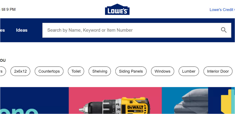
3. Include Text Such as “Product Search” “Type search and click Enter” in The Search Box


Provide prompts in the search box so users can easily recognize which fields are acceptable for search. Most search engines allow you to search by item number, so text saying “Search by item number” can be helpful.

Placing text in the website search bar, can also be a way to express your company’s personality or to make the online shopping experience more personal.

"Search by name, keyword" text included in the search box of Lowe's

Lowe’s places a handful of hints (see above) in the search bar, which is placed prominently on their site.

Make sure your text prompts are in a large, clear font so people can easily read them. While it’s good to include these prompts, they should disappear when users click in the search box so it won’t interfere with their search terms.

This is usually dictated by a piece of JavaScript, so once you implement it, make sure to test it works correctly

4. Have Autocomplete in Your Search Box


Autocomplete suggests products and keywords to users as soon as they begin typing. It completes the user’s thoughts by finding the right keyword before they finish typing and can be exceptionally helpful for hard-to-spell search terms.

It helps users save and effort, since they can navigate to a product with just a few keystrokes and a click. Autocomplete also helps prevent typos.

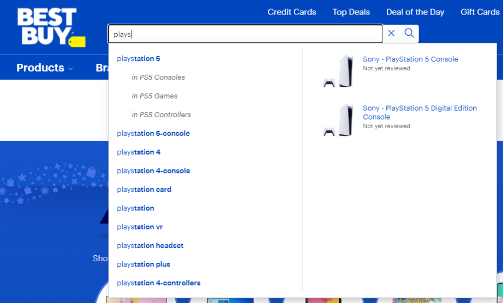
Search Autocomplete on Best Buy

Autocomplete can either recommend keywords or specific products that take users directly to that product page (skipping the Search Engine Results Page). In order to do this, Autocomplete must be enhanced with data from your site.

With this data, it can recommend popular products as soon as users click in the search box as well as display product titles, images, descriptions, and price (including sale price).

Learn more about the most important search autocomplete features to decrease zero-result pages by 31% and increase cart value by 19%.

5. Have More Keyword Than Product Suggestions


Simply because keywords suggestions are more important than product suggestions. Users are more likely to click on keyword suggestions since these will direct them to a SERP with many relevant results where they can browse to find something they want.

Product suggestions are almost too specific for most people because it takes them directly to a product’s page. These are especially helpful when people know exactly what they want to purchase.

For example, if someone searches “outdoor paint”, keyword suggestions will take users to a SERP for outdoor paints, where they can browse through colours and brands. While if they select a product recommendation that states the brand, colour, etc. they will be directed to that one page. Keyword suggestions appeal to a wider audience, thus it is more useful.

Autocomplete can also suggest categories, but this is usually not very helpful (you can find more nuanced best practices and explanations like this here). When you set up your web shop, you probably nested products under different categories and the chance that a search user could accurately guess the name of one of your categories to find a is slim.

For example, if you have an “iPhone 7” listed under “technology” and a user searches the category “cell phones” on your site, the phone won’t appear, which could cause the user to leave your site.

6. Label the Search Button and Allow the “Enter” Key to be Used to Execute the Search


Clearly label the search button with text like “Search”, “Find”, “Go”, or with an icon of a magnifying glass, which has become synonymous with search.

In addition to clearly labelling the search button, let the “Enter” key serve the same function. Many people use the “Enter” key to execute commands, so it’s best to accommodate this expectation. Since search user’s hands are already on the keyboard, this is faster and easier for them.

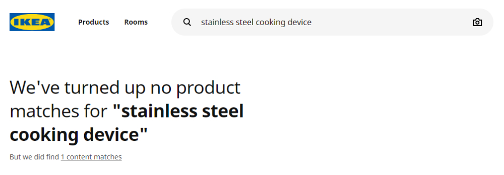
7. Keep the searched term in the box


Once a user has executed a search, keep their query visible in the search box so they can easily edit it. Sometimes people like to add a few terms in order to specify the initial query or correct a typo.

This is especially important for searches that end up on “no-results found” pages. Instead of forcing shoppers to re-type a query (oftentimes they don’t remember the initial search that lead to the “no results” page), keeping the keyterm in the search box enables them to easily make edits or finetune their search to help them quickly navigate away from the “no results” pages.

Search term fits in search bar on Ikea Online Store

Even in the cases the executed search yields results, keeping the search term in the box helps shoppers refine their query to find exactly what they’re looking for.

8. Place a Search Box on Every Page


By placing your search box on every page, you increase search usage since web visitors won’t have to navigate back to the home page to use it. Be sure to keep it in the same place on each page, so users know where to find it.

This means that it should be prominent on your homepage and should stay in the same place on your category pages, Search Engine Results page, and even on product pages.

By keeping the website search bar on every page, you gives shoppers the opportunity to quickly (and easily) refine their search, so they can find what they’re looking for.

9. Place a Search Box at the Bottom of The SERP


By placing your search box on every page, you increase search usage since web visitors won’t have to navigate back to the home page to use it. As we said, keeping it in the same place on every page is beneficial so shoppers don’t have to look for it.

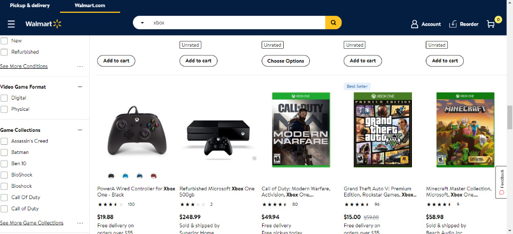
But in addition to that, place it at the bottom of the SERP as well – or make it “sticky”. This way, shoppers who land on the SERP, but realize they need to refine their query after looking through the results page – can easily update their query without spending time scrolling back to the top.

Sticky search bar on Walmart.com

10. Show Search History


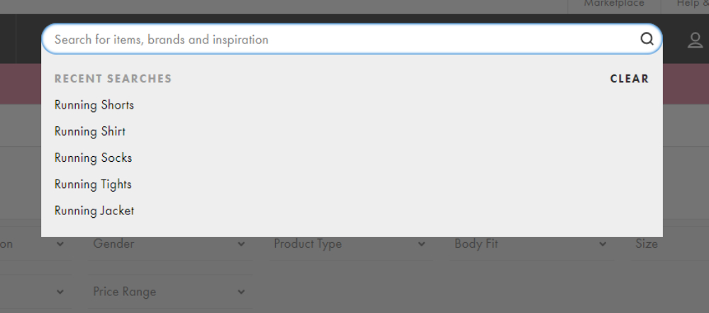
Personalize your online store by storing visitors’ previous searches and using them as recommendations when they revisit your site. Previously searched query prompts help them pick up where they left off. Asos does this nicely and in general has a great search function.

Search history in search bar is the part of the personalization

If you do add this feature, include simple controls so users can delete previous searches if they wish. Be sure to put previously searched terms in a colour different to regular suggestions, so users can quickly discern what’s what.

By increasing your search box’s visibility and making it more user friendly, people will be more likely to use the search box, which takes them directly to the product they’re looking for, so conversion rates will increase.

If your search box is up to date, here are a few tips to optimize your search results page.

Learn more about the most important eCommerce search engine features to increase conversion rate by 15% & revenue by 47%.

Paige TyrrellHead of Marketing – Prefixbox

Paige is the Head of Marketing at Prefixbox, a leading eCommerce site search solution. She’s an American who’s been living in Budapest since 2017 and loves giving #alwayslearning sessions to help people optimize their online stores.

Choosing the Right Ecommerce Template to Boost Sales

Choosing the Right Ecommerce Template
to Boost Sales

Creating a high-converting website is not always smooth sailing and if the website you create is an e-store, it can be even more complicated and time consuming.

That’s why so many people choose to use eCommerce templates as this cuts down the time and cost associated with e-store creation.

But are templates really good to get you on the right track?

We’ll look into this in our article by examining the ways you benefit from using a website template.

What’s more, we’ll see what features make a good modern e-commerce theme that really takes your business up a notch.

Are you ready for the journey? Then, let’s get started!

How E-Commerce Templates Help Boost Sales?


If you want to run an e-store, the first and foremost thing you care about is conversions, i.e. sales.

So you’re probably wondering, can a template help in this regard?

The answer is ‘Yes’!

Adopting a high-quality template for your e-commerce site is one of the fireproof ways to boost sales for a number of reasons. We list the most prominent of them below:

Impressive UI


With a modern e-commerce template, your store will nudge the competition aside and impress your client pool with its inimitable present-day UI. Nobody likes shopping within the crammed, obsolete or impersonal interfaces that you end up with without a good theme. On the contrary, with a top-notch e-commerce template, you create a memorable interface that goes in line with your brand identity and distinguishes your website among the others.

UX boost


Provided strong competition on the market, where do people choose to shop? Of course, where it is convenient to shop! A well-thought template comes with a pre-built extension pack that takes shopping experience up a notch. A theme can deliver you extended catalog filtering, sorting and categorization options out of the box. What’s more, such features as 360 degree product presentation, smart product image zoom and lookbook functionality create an unparalleled experience that would be hard to foster without a template.

Conversion boosting


Conversion optimization is a tricky matter that takes a lot of time and effort. With a conversion-optimized template you get half of the job done. CTAs and CTA buttons are smartly placed and shaped within such themes, driving more sales and getting more income for your business.

SEO optimization


If you go without a template, you’ll have to master SEO optimization from ground zero. On the contrary, with a SEO-optimized e-commerce theme, you start out with a sound basis that helps your website thrive on SERPs and get discovered by more online shoppers.

Shopper-on-the-go friendly


The audience of mobile shoppers grows exponentially. You’ve got to either take care of mobile optimization yourself, or, again, simply go for a modern, mobile-ready theme. Such a template would deliver a lightning-fast, comfortable shopping experience on handheld devices, getting you more loyal shoppers and sales.

These are just the core ways, in which adopting an e-commerce theme boosts sales on your website and saves you tons of effort. However, to tap into the largest sales boost with your theme, you’ve got to make a well-informed template choice. Let us share some tips and best practices of choosing a template with you to ensure that you get the most out of using it for your e-store.

Best Practices for Choosing a Trendy Template


Web design does not stand still. The features that were the greatest novelties a couple of years ago are currently deemed the must-haves that your store just can’t leave without. At the same time, the new advances take your online store and the experience it delivers even further, ensuring that you wade through the competition delivering more than others.

First of all, let’s see the features that have become the must-haves of a modern and successful e-store. These features are as follows:

  • Responsiveness and a well-thought mobile experience.
  • Clean, valid and well-commented template coding that minimizes vulnerabilities and positively affects SEO.
  • High-quality SEO optimization of the template.
  • Multiple currencies; configurable taxing, payment and delivery methods.

On top of these must-haves, there are modern features that can make trendy and flagship templates superior in many ways to other themes. A list of the cutting-edge features that you may want to see in your e-commerce template comes below:

1# AMP-Ready Mobile Pages


AMP-ready mobile pages get your site pages loading in a snap on mobile. They consist of Google-devised lightweight coding that decreases page loading speed to a couple of milliseconds.

EVA: AMP FASHION STORE MAGENTO TEMPLATE

Eva is one of the freshest Magento templates for clothing, accessories and cosmetics stores. It’s pre-packed with a zillion of extensions to align your e-tore with the latest web-design trends and deliver an incredible user experience thanks to latest technological advances. Thanks to AMP, your e-store will perform stellar on mobile. Learn how fast the template performs with the screenshot below:

#2: Wysiwyg Editing Experience


In the past, e-commerce store owners often had to edit code to change the designs of the template pages. To save you from this headache, the latest trendsetting e-commerce themes bring you visual editors that let you simply move page blocks around and resize them up to your liking.

EVEPREST: FLAGSHIP MULTIPURPOSE PRESTASHOP THEME

Want to edit your store pages with no hassle? With this purpose in mind, the flagship Eveprest theme brings you Mega Layout Builder that lets you refurbish your homepage or store pages as simple as ABC.

#3: Multiple Ready-Made Designs


In the past, one template equaled one ready-made design. Recently, this rule has been broken by the companies ready to deliver more for less. Currently, it’s a smart strategy to hunt for a template that brings you a number of homepage skins and different variations for other store pages. Why is it good? You don’t have to spend time rebuilding the theme to get it look the way you want. Instead, you keep calm and choose the variation that matches your vision.

STYLER 2 MULTI-SKIN PRESTASHOP TEMPLATE

Styler 2 roots for freedom of choice with its 6 classy homepage variations that skillfully play with the grid. Moreover, the theme brings you 4 ready-made product pages and 4 stunning listing pages that are all enhanced with unparalleled functionality.

#4: Megamenu Panels


If you run a store, you’re likely to have a lot to include in your top navigation. However, multi-tier navigations often get users lost on their way to the needed category or product. Alternatively, you can use MegaMenu panels that are large enough to fit all the pages and categories that you have in.

Each MagaMenu panel gives you full freedom to add literally any elements that you need there. Add pages, single products, promotional banners and whatever you need to the MegaMenu of your store. With minor tuning required, tons of options to choose from and the ability to showcase categories, subcategories and posts, MegaMenu is a must-have feature that can easily boost your sales and user engagement. An example of a MegaMenu-enhanced template comes below:

MULTIFLY: MULTIPURPOSE SHOPIFY E-STORE DESIGN

#5: Lookbook Functionality


With lookbook functionality you can serve your customers the most appealing ready-made looks with the items you sell marked on them. For example, you can show products on models or furniture in the interior. This is an effective present-day way to ignite customers’ desire to buy that drives even more sales! See how lookbook functionality is implemented in the StoreFlex OpenCart template below:

STOREFLEX – RESPONSIVE MULTIPURPOSE OPENCART TEMPLATE

Details | Demo

So, these are the features to look after when hunting for a present-day sales-boosting e-commerce template. The last thing that we haven’t covered yet is which e-commerce engine is optimal for running a website and has many feature-rich templates crafted for it. Let’s see!

What Types of E-Commerce Platforms Sell the Most?


Above you can see a pie chart that shows the most popular e-commerce platforms in 2018 and their market share. For a number of these platforms you can swiftly find high-quality themes over the web. The most popular e-commerce platforms for which you can find awesome templates are as follows:

  • WooCommerce
  • Magento
  • PrestaShop
  • OpenCart
  • Shopify

The Future of E-Commerce and Final Thoughts


In 2018, the high-quality e-commerce themes deliver your shoppers a stunning shopping experience. They constantly evolve and, in future, they’ll bring you even more. It’s predicted that developers will keep improving mobile shopping experience and the speed of shopping on mobile. Moreover, you’re likely to see a wider embracement of SaaS platforms, as well as the larger embracement of AI (especially, the smart chatbots) and augmented reality. Moreover, you’re likely to see voice search and photo-shopping making strides and becoming and intrinsic part of the future online shopping experience.

We hope that you’ve enjoyed reading this post and now have a better idea what e-commerce template would be ideal for you.

If you have any questions or comments, drop a line in the Comments section below. We’ll be back with you!

Stay tuned!

Paige TyrrellHead of Marketing – Prefixbox

Paige is the Head of Marketing at Prefixbox, a leading eCommerce site search solution. She’s an American who’s been living in Budapest since 2017 and loves giving #alwayslearning sessions to help people optimize their online stores.