6 Ways to Improve Product Findability in eCommerce Stores

6 Ways to Improve Product Findability in eCommerce Stores

Wouldn’t it be great if your customers always find the product they’re looking for on your website?

And wouldn’t it be excellent if your online store was so easy-to-navigate that your clients recommended it to everyone they know?

To achieve this, you have to improve the Product Findability and this article will help you do just that.

To improve Product Findability, you should focus on specific elements of visual sorting. There is a long list, but every aspect is important:

  • Applicable product filters in the menu
  • The search function
  • Friendly URLs
  • New arrivals, discounts, and featured products
  • Related products
  • Alternative Products
  • Product comparison

Some of these may seem obvious, but many online retailer don’t know how to optimize them in order to improve product discovery experience.

Now, let’s take a closer look at all these features!

1. Applicable Product Filters in the Menu


Not all shoppers know what they want; many just browse an eCommerce website to find if a certain type of product is sold there.

So, why not help them narrow their search with product filtering according to what they’re searching for?

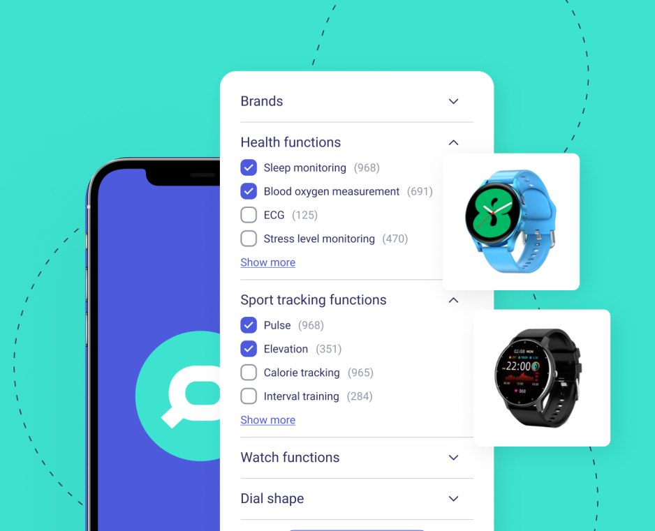
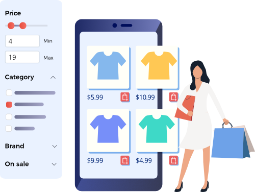
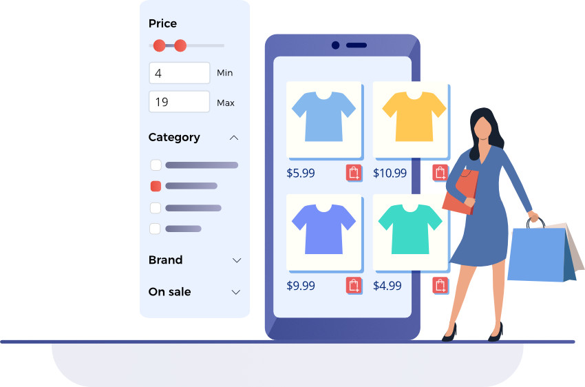
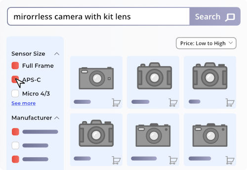
A faceted filtering system that offers specific options on the Search Engine Results Page will help your customers easily find what they want.

Another issue is category-specific filters. Most online retailers don’t use them and thus they end up restricting their customers’ choices.

Applying these search filters will show your customers that you know your product and think about what interests your clients, which results in a higher conversion rate.

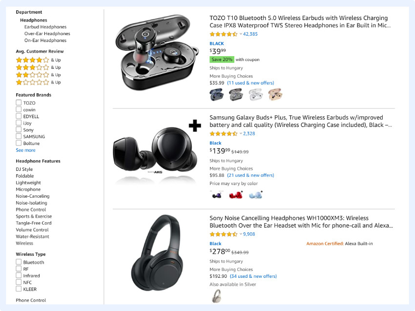
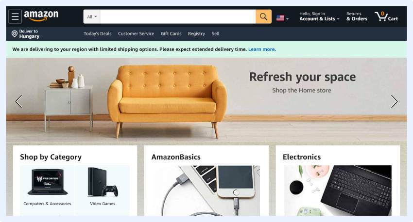
Amazon's Product category filters in site search

Here’s another tip.

If you have thousands of products for sale, it can be a real pain for you to check how they display on your site.

2. The Search Function


Nearly a third of all online shoppers prefer to use direct search instead of just browsing. So, it is vital to create a well-functioning search bar with autocomplete to help users find what they want without the unnecessary surfing.

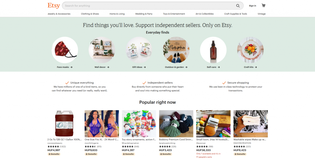
Etsy has a full width site search bar

But just creating a smart search is not enough. The bar itself must be visible and easy-to-use; put it on the top of the page and highlight it, so users can easily find it!

3. Friendly URLs


Some visitors use URLs to understand their location, so if the product URLs on your site consist of masses of strange symbols, you will quickly confuse shoppers.

In order to make your web addresses friendly be sure to describe the essence of a page or product.

Break the URLs down into easily understandable sections so shoppers can use it to navigate.

Navigation friendly URL structure for eCommerce sites

4. New Arrivals, Discounts, and Featured Products


People don’t always search for a specific product, sometimes they want a special offer.

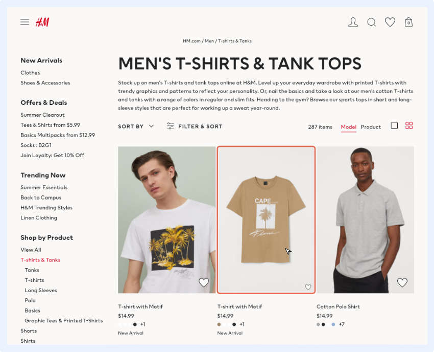
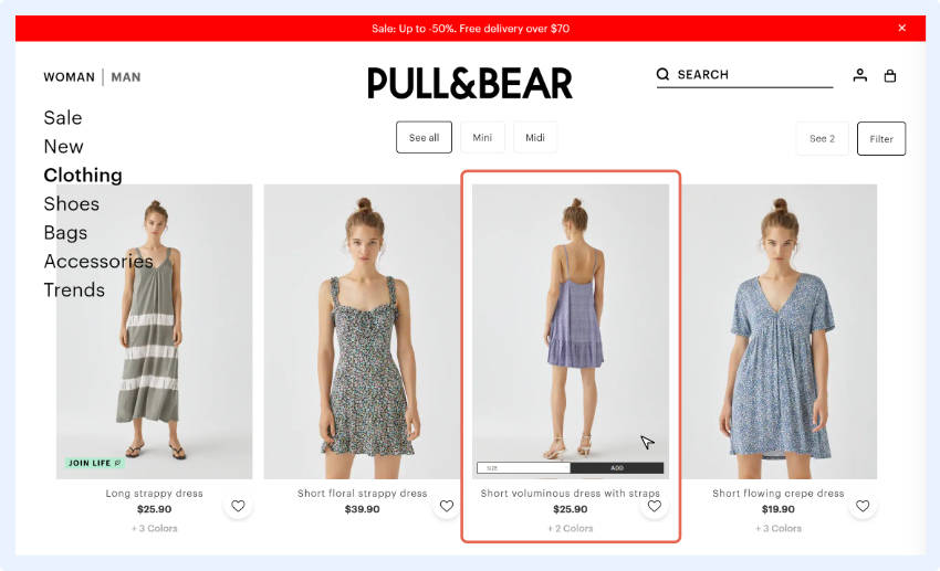
For example, “New Arrivals” and “Discounts” sections show your site’s visitors what is new in your store and what’s being sold at the best price.

A “Featured Products” section will drag the clients’ attention to various offers like the products on sale, “back-in-stock”, seasonal products, or just show the most popular goods. If you have an item with a large profit margin, that can be good candidate too as a featured product.

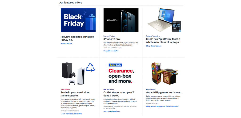
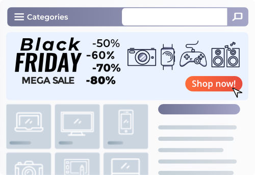
New Arrivals, Featured Products and Discounts on homepage

The number of possibilities is endless and you can create your own categories. When doing this, be sure to think about how to improve your customers’ experience.

For example, you may use a “Most Viewed” widget to display a page with the most popular items. Or you can create a “Most Wanted” widget where you display the products most frequently added to carts. You can choose what your customers see first and second.

5. Related Products


If your client is already interested in buying a product, why not offer something that goes well with the item they’ve chosen?

A Related Products feature will do just that!

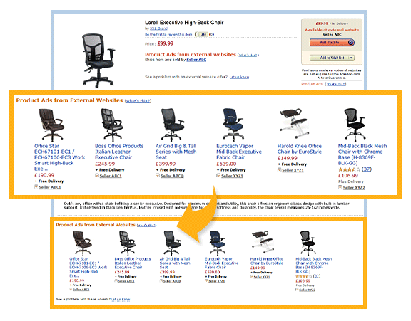
Related products on Amazon

A client’s search history will tell you what they like, which you can use to offer them suitable complementary goods, supplementary or compatible products. 

A Related Products section provides many opportunities for cross-selling, so products, based on personal preferences, listed here are more likely to be bought.

But don’t be too persistent – you should help shoppers make a decision, not choose for them.

6. Product Comparison


Shoppers love to compare products and prices because this helps them make an informed buying decision.

Having comparison tools will positively influence the user experience and help shoppers decide what to purchase, which increases your conversion rates!

Similar to the situation with the search box, simply implementing a comparison tool is not enough.

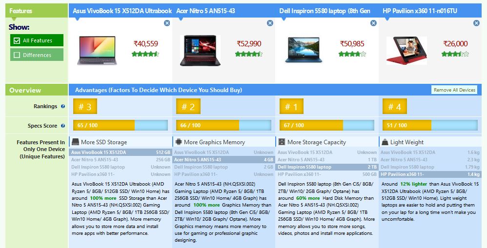
Detailed Product Comparison on eCommerce Sites

You need to make it easy to see and use. The following tips may help you:

  • Make the compare button noticeable
  • Display customer reviews and ratings
  • Allow comparison on search pages
  • Thumbnails should be clickable and large when they are being compared
  • Make editing and removing products intuitive

Offer Shoppers Alternative Products


If a product is unavailable, some clients may leave before buying anything. Use tools that offer your customers alternate products to consider. 

If you offer alternative products, your customers know that you care about their online shopping experience. Hopefully, they will keep shopping on your site instead of going elsewhere when an item is out-of-stock.

If your potential customer places items in their cart and then discovers what they intended to buy is out of stock, this can frustrate shoppers and lead to big revenue losses. While these shoppers might have a full cart, they may leave your site and try to find a competitor where they can buy all the desired list of products in one place.

In conclusion


Visual sorting plays a crucial role in eCommerce since products that are presented well have a higher selling rate.

Visual sorting helps you direct your clients’ attention and gives you the opportunity to show them products you think will satisfy their needs.

Just don’t be overly assertive and be sure to respect your clients!

Let them decide what to buy – your task is just to help them.

Balazs Vekony profile picture - Prefixbox
Balazs VekonyOnline Marketing Manager – Prefixbox

Balazs is an Online Marketing Manager at Prefixbox, a leading AI search solution provider for E-commerce sites. He is a marketing enthusiast from Budapest, who is interested in new technologies and solutions and believes in the power of search.

How to Speed up Your Online Store

How to Speed up Your Online Store

Every e-commerce merchant knows that a second of delay in load time can lead to an instant drop of conversions.

Users do not want to wait for the site to load – it’s either 3 seconds or they leave. So speeding up your online store becomes a matter of revenue and customer satisfaction.

Even though there is a variety of e-commerce platforms and each has its own intricacies, there are some common issues that they share. In this article, we’ll provide you with tips on fixing these issues and shall use Magento, Shopify, and WooCommerce as examples.

Get Rid of Useless Stuff


Extensions are awesome as they expand the store’s functionality, optimize its performance, and contribute to better customer experience.

But with time, some of these extensions may become outdated or useless. And while you don’t even remember about having them, they keep dragging the speed of your site down, causing delays in load time.

So the first step in optimizing your store is identifying and uninstalling this dead weight. Here is how you will do it for every platform.

Magento


Go to /app/etc/modules to check if there are any extensions that you don’t need. If you detect an extension that you want to delete, use SSH with the following command (for developer’s mode):

bin/magento module:disable TestExtension –clear-static-content
bin/magento setup:upgrade
cd app/code/TestExtension/
rm – rf TestExtension

But in order to make sure you don’t delete any useful extensions, double-check the user guide or ask your developers to help you.

Shopify


In Shopify, the process of app (an extension in Shopify language) uninstallment is a piece of cake.

From the Shopify Admin, go to Apps. There, look for the extensions that you don’t need and simply click on the bin icon.

WooCommerce


The plugin uninstallment in WooCommerce is also quite tricky.

Most users simply go to Plugins from the Dashboard, click on “Deactivate” and then “Delete”.

What they don’t know is that these deactivated plugins are just hanging in there, slowing the system down. So in order to properly delete a useless extension in WooCommerce, do the following.

First, check for the user guides for this plugin online – most of them have well-written guides on their treatment. Second, check if the plugin has an option of complete uninstall. In this case, you will delete both the plugin and data (and that’s what you aim for!). Finally, if you have any shortcodes left from the old plugin, you can either temporarily disable them with this code:

add_shortcode( ‘pluginshortcode’, ‘__return_false’ );

Or replace with the shortcodes for the new plugin.

Integrate CDN


CDN stands for Content Delivery Network and can boost your performance significantly.

A CDN is a distributed network of servers that uses the location of the user to spot the nearest server and thus, increase the speed of content delivery. The closer the server is to the user, the faster the content delivery is – and this is a big advantage for e-commerce stores.

By integrating a CDN into your store, you will also get a bunch of awesome features that come by default in most CDNs, like image optimization or code restructuring. And they also have a significant impact on the store performance.

Optimize Images


Images are an essential part of any e-commerce store. Unfortunately, the high quality of these images often comes with their massive weight. This is another common issue that most online stores share – the overwhelming number of heavy and non-optimized images.

Luckily, you can fix the problem in a few easy steps:

  • Choose the corresponding file type (PNG, JPEG, or other)
  • Resize the image but retain the quality 
  • Optimize the thumbnails too

After that, test how the image looks. It may happen that after a few alterations, something goes wrong so you will need to fix it before the customer sees the image.

Use Optimization Extensions


Note: optimization extensions can be used for minor issues only as their functionality is rather limited. 

Optimization extensions do exactly what their name states – they optimize the performance of your store. 

These patches of code can be purchased in a marketplace of your platform and are installed in a few clicks. After that, you can use them for:

  • Optimizing images
  • Applying Lazy Load
  • Optimizing browser caching
  • Minifying CSS/JS

However, such extensions are not capable of installing server tools, optimizing SQL queries from other third-party extensions, or optimizing CSS delivery. So if your store has some complex issues, the use of optimization extensions will simply not be enough and you will need to hire expert Magento developers to help you anyway.

Use Lazy Loading


Lazy loading lets the browser load the content at a time when it enters the user’s viewpoint and not all at once. Such an approach helps reduce the load time and, at the same time, does not hurt the performance.

For the users, the content will load faster and will provide a smooth user experience. For store owners, lazy loading is an awesome way to save bandwidth and, at the same time, retain the image quality on the same level.

Here is how you can apply lazy loading for different platforms.

Magento


Use extensions available in the marketplace:

Shopify


Shopify recommends using Slate which is a Shopify’s toolkit for theme development. Slate has a theme called Starter Theme and it has the necessary snippets to configure lazy loading. Check out this guide on lazy loading for Shopify to learn more.

WooCommerce


Same as for Magento, there are available plugins for optimizing WooCommerce store:

Summary


In this article, we have covered the most common ways to speed up an e-commerce store. But because every store is unique, it may have all sorts of issues that slow it down, from poor code to inadequate hosting solution.

In order to correcrly identify the problem and come up with the best way to solve it, you need to run a performance audit or use PageSpeed Insights by Google to learn what exactly is wrong with your store. After that, you can take action and decide whether you can deal with the problem independently or need a development agency to help you.

Mary HilkoHead of Marketing at Onilab – a Magento optimization company

Faceted Filtering: The Ultimate Guide For eCommerce Sites

Faceted Filtering: The Ultimate Guide For eCommerce Sites

Providing an easy and practical way for shoppers to search for products is of critical importance in an online shop because if people can’t find it, they can’t buy it!

If you’re looking to increase your online revenue while giving your shoppers a better experience, check out this guide to:

  • Discover what faceted search is
  • Learn about best practices
  • See how it can impact your shop

Let’s dive in!

Faceted Filtering Guide for eCommerce Sites

Contents

Chapter 1

What is Faceted Search and how it works?

Chapter 2

Common problems and best practices for faceted search

Chapter 3

Faceted Search and SEO

Chapter 4

Faceted Search examples

Chapter 5

Summary

Introduction


If your customer can’t find exactly what they’re searching for, they can quickly become frustrated. Even if you have exactly what they want, if they can’t easily find it (usually due to a complicated interface) they’re simply going to buy it from a competitor that has a better-built site.

Even if you don’t have what they’re looking for, it’s better they find this out as quickly as possible, so they won’t associate the feeling of wasted time with your store. (If you don’t have what they’re looking for, you can always recommend similar products on the 0-results page.)

Shoppers are never going to make perfect searches: their queries will be more like educated guesses as most times they aren’t sure exactly what they’re looking for. Oftentimes, they will only know a few parameters and execute a query in order to get a list of products to look through. Your search and ranking algorithm must be good enough to help them.

Using search filters is the most basic, and efficient, way to do this. A more advanced method encompasses using faceted navigation and faceted search (more on the distinction shortly) together with a user-friendly, not overly complicated interface.

Chapter 1

What is Faceted Search and how it works?


Faceted search definition: Faceted search, or guided navigation as it’s sometimes referred to, is a search method that utilizes the metadata attributed to a product in a store, providing visitors an opportunity to filter and refine their search queries when looking for specific products.

Faceted search or navigation is related to filters, but the phrases are not interchangeable as the former is a more flexible and efficient solution. Faceting means creating a complex structure in which shoppers are presented with a smart, logical interface that makes it easier for them to get to the desired products.

Making search easier and faster, multi-faceted search also helps enforce purchase decisions and lower site abandonment rates, leading to higher conversion rates and overall profit.

Learn more about the most important semantic search engine features to increase conversion rates by 15% & boost online revenue by 45%.

How faceted search works


A faceted search software offers a chance to use filters in a smart way. Traditionally, simple filters are used for site-wide searches: to narrow down results to a certain category, brand etc.

With faceted search, you can actually recommend even more relevant filters to users.

If you have thousands of products in your store, you most likely have tens of thousands of individual attributes associated with them. It would be counterproductive (and impossible) to provide them all as filter options. But based on queries and results, you can help shoppers narrow down their scope by providing relevant filters.

For example, if a shopper runs a site-wide search and 8 out of the 10 most relevant results are in the same category, you can provide a filter that focuses on that category and add additional ones for the most common attributes (acting here as product-specific filters) in that category.

if a shopper runs a site-wide search, you can provide a filter that focuses on that category and add additional ones for the most common attributes

This can significantly improve user experience as it gets as close to actually reading their thoughts as search technology can get today.

We can’t really say that it saves time or clicks for the user because it’s fundamentally different from the most simple search methods.

The point is to provide a better shopping experience. One where the user actually knows they’re getting closer to the product they’re looking for because, with each step, the results and filters become more relevant.

It also provides the user with a sense of control without making the shopping experience too difficult. Shoppers can narrow down search results based on their needs, while not being faced with too many choices (and thus becoming overwhelmed because of the ‘paradox of choice’).

Differences between filters and facets


So let’s have a look at the specific differences between filters, faceted navigation, and search.

It’s good to think of the three methods as adding layers of complexity.

Faceted Filters, Faceted Navigation and Faceted Search Comparison

Filters allow shoppers to narrow down the search results, so they can look at products in specific categories like kitchen appliances or cookbooks. However, only one generic filter can be applied at a time.

Faceted navigation uses multiple filters at the same time, which can be applied to specific product attributes. This means the shopper can locate the exact product they’re looking for more easily.

Faceted search allows you to create filters based on keywords. You can provide shoppers with multiple filters, which makes the experience similar to one with faceted navigation, but faceted search provides more accurate results. This is also a smarter way to search as the search engine itself refines filters based on query results that are most likely to match with user intent.

For one thing, faceted search prevents users from getting lost in your product catalog. If your store offers hundreds or thousands of products, especially similar ones (car parts for example), then it’s important to give shoppers a frame of reference – exactly what faceted search provides.

It also gives them a chance to find exactly what they’re looking for even more quickly as only the most relevant filters are shown. These filters are based on the executed query and the displayed results – more on this later.

How widespread are facets?


In their 2018 research, the Nielsen Norman Group (NNG) concluded that “eCommerce sites without faceted search are the exception, rather than the rule”.

In other words, it’s extremely common.

They also noted that while testing the success rate of searches, 27% of failures were caused by not being able to locate suitable items on the sites, even though at least one matching product available in each case.

Faceted search solves this problem and thus is no longer an optional, nice-to-have function on an eCommerce site, but rather a must-have solution.

The widespread adoption of faceted search contributes to the fact that, in the last two decades, average search success on eCommerce sites has greatly improved.

According to NNG, in 2000 only 64% of all searches were ultimately successful, meaning the user actually found the product they were looking for. In 2011, the rate was 74% and in 2017 it reached 92%.

When to use (and not use) faceted search


Faceted search undeniably makes finding products easier – but that doesn’t necessarily mean that your site needs it. If you have just a few hundred products, you can most likely use a few filters and with that, your customers can successfully navigate to exactly where they want to be.

As we have mentioned, faceted such is a more complex solution, which means it requires more investment in your interface development. It will take time and money to implement.

It is a must-have for most eCommerce sites – but not all of them.

Chapter 2

Common problems and best practices for faceted search


In this chapter, we’re going to provide you with basic examples of how faceted search should look and work in order to best help your customers.

Let’s start with the basic types of filters you should always include, as your customers will be actively looking for them since they’re universally common.

Offer all the basic filter types


This section is partly based on the 2017 E-Commerce Search Usability report by Baymard Institute, which we strongly recommend reading. It has a lot of great data and examples that can help you with eCommerce search in general – beyond just faceted search.

Price


Shoppers generally use price as a secondary or tertiary filter. If they don’t exactly know what they’re looking for, they most likely will want to compare the possibilities and price is the most common attribute they’ll look at.

It’s important to note that when shoppers sort products by low to high, they aren’t necessarily looking for the cheapest option. Instead, this method gives them a solid frame of reference where they can easily find the product that gives them the most value for their money. Similarly, sorting results in a descending order can also be used for finding a value-price sweet spot for those looking for high-end products.

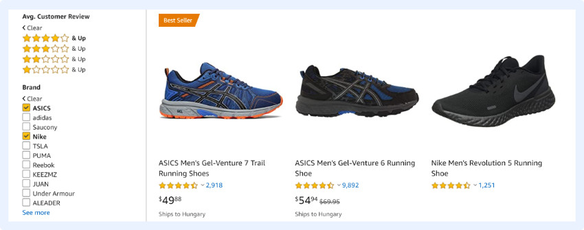
It is best if you not only offer the chance to order the products in ascending or descending order, but also allow the user to set a minimum and maximum price, so they can more effectively narrow the price range.

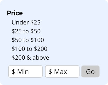
There are multiple ways to allow the shopper to set the price range. You can offer pre-set ranges like Amazon does:

pre-set price range filter for online stores

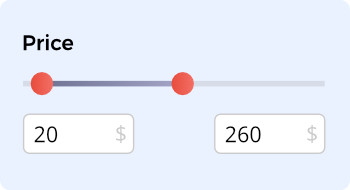
Or you can choose to give full control to the user, and give them an opportunity to define their preferred price range freely using a slider (optimally the maximum price on the scale correlates to the most expensive available product). This is an example from the store of one of our clients, Praktiker:

price range slider for online stores

Quality


Quality isn’t easily quantifiable, so it isn’t a good attribute to use for filters. There are a number of problems with applying qualitative filters; most importantly, quality means something different for stores, customers, and quality must be measured differently for all products.

In order to display quality, the best solution is to use social proof and allow shoppers to filter product by ratings and reviews. As a secondary or tertiary filter, this allows them to find products with higher ratings. If shoppers are unable to distinguish between nearly identical products, higher ratings and informative reviews can affirm their purchase decision.

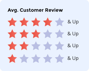
Amazon allows people to shop by average customer review score, which also strengthens trust towards the site as the potential customers feels nothing is hidden from them. People appreciate when the site clearly tells them what the previous customers liked and what they didn’t, so this acts as social proof both for a particular products and for the brand.

shop by average customer review score

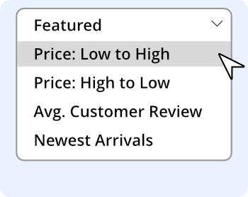
It’s important to note that even after applying this filter you can still sort by the average customer review score, so you can still find the “highest quality” items amongst the best.

faceted filter example: by price(low-high,high-low),average customer review and newest products

Finally, in the infobox that pops up you can also see the distribution of ratings and continue directly to read the reviews themselves.

product rating distribution infobox example for online stores

Vintage


For many products, time can be a very important factor, and not just for perishables. Certain types of products are quickly outdated while others are worth more if they are older.

In some cases, providing an option to filter by release or production date can greatly improve UX – especially if there are multiple dates associated with a certain type of product (for example in case of electronic devices when a model was issued and when the exact device was manufactured).

It probably goes without saying, but we also have to note that a vintage filter means that you have to display the date when the product was created, issued, manufactured, etc., and not the date when it was made available on the site.

Category-specific attributes


For most products, a series of category-specific attributes can be very important in helping shoppers determine the quality, performance, and suitability of a product.

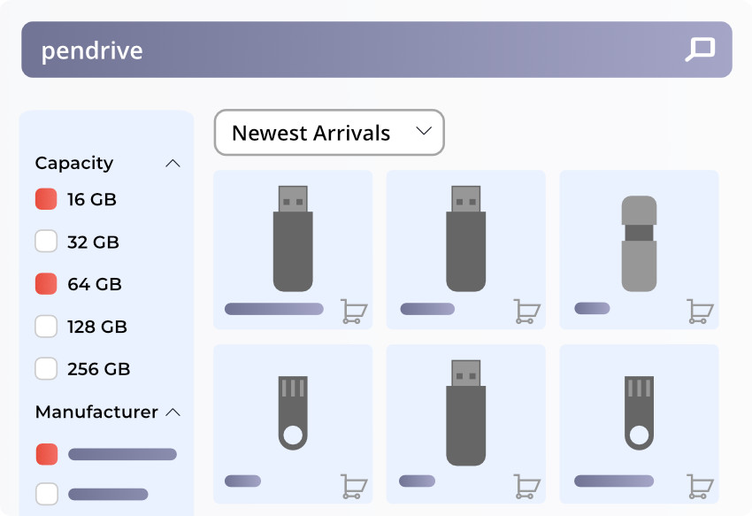
These attributes are quantifiable, but can be very different from category to category: for hard drives, there is storage capacity, for laptop bags, the exact sizes and the type of material and so on. These will often determine if a certain product is compatible with another (if the laptop the customer has will fit in the bag for example) and thus have a direct effect on the purchase decision.

category-specific attribute filters for eCommerce stores

These details, which the Baymard Institute calls this “compatibility information”, should always be easily searchable. In an online store, you don’t have the option to simply ask an assistant, so you need to be able to instantly determine compatibility.

Category-specific attributes are also important when a product has to function under special circumstances or perform specific tasks. For example, there are many kinds of sports shoes, but choosing the perfect one depends on a great number of individual attributes, like the specific sport, if it is done indoors or outdoors, if the user has some kind of medical condition related to their feet and so on.

Or just think about food: if a shopper wants to buy a number of multiple products, but needs them to be prepared in a specific way (kosher or vegan) they have to check every product in each main category to find the right one if proper filters are not present.

Category-specific filters are most important because while users tend to search for specific items, their queries rarely include all the attributes that are necessary for them to make a purchase decision (in part because they might not even be aware of what kind of attributes are available).

Thematic filters


Defining a thematic filter is difficult. Basically, these are unique filters that include a number of products that are otherwise unrelated. Seasonal offers, “best value”, and “casual style” are some examples of filters that can include products in all categories with a wide range of individual attributes.

These can greatly help with refining searches, but they aren’t just a convenience – the lack of thematic filters directly contributes to site abandonment.

Applying these filters can be time-consuming as products have to be tagged individually. However, the extra time it takes to create your own thematic filters will be worth it.

Allow multi-selection


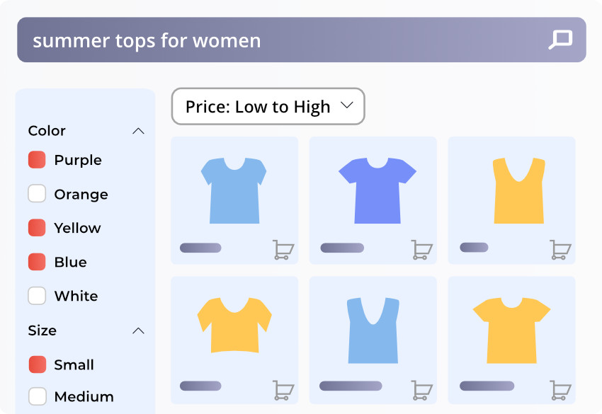
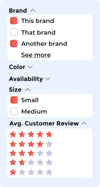
It’s usually a good idea to allow your users to select multiple filters at the same time, so they can see a wider range of available products. For example, they might be searching for clothing in multiple colors while only wanting to see items that come in a specific size.

multiple faceted filter selection box for online stores

This allows them to create a personalized catalog based on their specific criteria, so they can browse the most relevant clothes available and select the ones they want from a dozen options (as opposed to thousands), which greatly improves customer experience.

Use the language of your customers


Many stores fall into the trap of using made-up names as filters. You might have a creative name for a line of party dresses or a specific type of jackets – but your customers won’t be looking for that. And if they are, they can easily find and browse them with a simple search query.

Always make sure that you actually help your customers find what they’re looking for by using the words and phrases they do. Have a look at what kind of queries people usually make on your site, check their comments, and talk to your sales team if they have any insight into the wording your customers use. This will not only help you come up with useful filters, but also provide insight into how to name them in the most useful way.

Know how much is enough


This might sound like very basic advice, but you always have to ensure your filters are balanced. If you offer too few facets, you’ll frustrate your customers as they’ll be less likely to get closer to the product they want. If, by applying all the filters available, they still have to sort through hundreds of products, it might be a good idea to expand your set of searchable attributes.

However, if you use too many another kind of frustration will kick in: instead of browsing too many products, your potential customers will have to make too many decisions and use a huge number of filters. This can be particularly problematic if they are not familiar with your brand, site, and products as they will be uncertain what to do and will most likely abandon your site before making a purchase.

No empty results


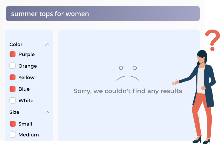
As facets are offered based on product results and attributes, additional selectable facets should update when a user clicks on them. A good faceted search will never lead a shopper to a 0-results page, there should always be at least one product that matches the selected criteria.

faceted search never lead a shopper to a 0-results page

Be user-friendly


There are a number of ways you can offer faceted filtering options to your users. The most common, and simple, way is to provide links for the filter options like in the example below.

links for the faceted filtering options

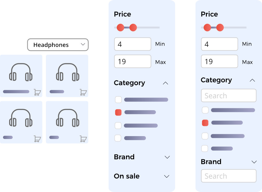
You can add additional facets for them to narrow down results in case they feel the provided results are not sufficient. It’s a good idea to provide some filters where shoppers can directly enter text themselves – it’s easy to do this by allowing them to create a price range as shown below.

price range faceted filter

Or place sliders in the faceted search box. These are most commonly used as a way to filter price.

price range slider

You can also include checkboxes, which is necessary if you want to allow shoppers to select multiple filters at the same time.

If you find there are too many facets (even if you only display the most relevant ones), you can use collapsible or expandable menus, so shoppers can decide if they want to see more options.

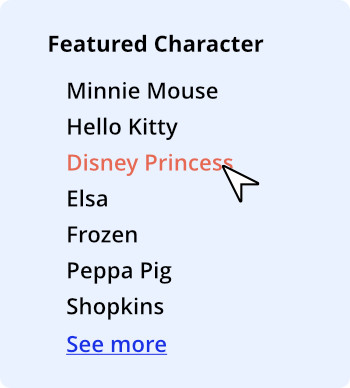
You can do something similar to Amazon, and simply include a “See more” link after the first few facets, which takes the customer to a landing page with all the relevant filters for that particular product.

collapsible or expandable faceted filters

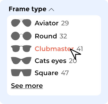
In some cases, it also makes sense to include images along with the filters. For example, if someone is shopping for sunglasses online, they naturally can’t try them on (only you offer an AR tool that allows people to upload a picture, but that’s another topic).

So the store might offer the shopper the chance to filter the glasses by shape – so the customer can be more certain they will fit.

In this case, providing a filter with style names names is not enough as every glasses company names their products differently. To make the filters clear and relevant, pictures of each style must be included along with the style name.

faceted filter with style names names and pictures
Chapter 3

Faceted search and SEO


It’s very important to classify all internal facet links as nofollowOtherwise Google will crawl all the pages that are generated based on the various search criteria, which would end up being hundreds of thousands or millions of pages.

This is bad for multiple reasons, firstly this means that your ‘crawl budget’ will be wasted on useless pages, and secondly, the mere existence of these pages negatively impacts your profile.

The pages generated by the faceted search have the same weak content (essentially they are duplicated pages full of product details). These pages don’t have organic traffic and the time spent on each page is low, so if there are hundreds of thousands of them, they can decrease the value and authority of your entire site, which lowers your rankings on Google.

Don’t let this scare you from using faceted search on your site as there are a number of ways to implement it without wrecking your site’s SEO rakings.

Disallow in robots.txt


In the Robots.txt you’re able to set which URL subsets you don’t want Google to index. You should be sure to add all pages that are automatically created by the search on your site here.

Paths (clean URLs)
Disallow: /catalog/product_compare/
Disallow: /catalog/category/view/
Disallow: /catalog/product/view/
Disallow: /catalog/product/gallery/
Disallow: /catalogsearch/
Disallow: /checkout/
Disallow: /control/
Disallow: /contacts/
Disallow: /customer/
Disallow: /customize/
Disallow: /newsletter/
Disallow: /poll/
Disallow: /review/
Disallow: /sendfriend/
Disallow: /tag/
Disallow: /wishlist/

However, technically the pages that are disallowed in the Robotos.txt can still be indexed, so just this isn’t enough.

In addition to being indexed, these pages still receive link equity (this is a huge waste) and will still be crawled.

So the next step is…

Nofollow internal links


Be sure all internal links that might lead to a search result page have the nofollow attribute, so Google’s crawlers won’t process and add them to your internal link profile (making it a mess).

This solves both the link equity and crawl budget problems.

Canonicalization


Using canonical tags is a common way to prevent Google from devaluing your site due to duplicate content. In a set of identical or similar pages, the one with the canonical tag will be considered the preferred and/or original version. This tells Google that you aren’t trying to manipulate the algorithm.

This doesn’t solve the crawl budget problem, but it ensures link equity flows to your preferred page, which is a great plus.

Javascript


You can also avoid these issues with JavaScript. You can create your faceted search system in a way that URL changes are limited, which makes browsing easier and shows fewer automatically generated pages to Google.

Make sure that category, sub-category, and product pages are all still indexed and have unique and easily readable URLs. Be sure to exclude the faceted search result pages.

Chapter 4

Faceted search examples


In this chapter, we’re going to show you some of the best faceted navigation examples out there and highlight the features and best practices you can and should implement on your site.

We’ll start with the most obvious example. One we’ve already used in this article…

Amazon


Amazon leverages all the best UX practices for filtering and displays facets right away after you select a category or run a search. All facet options, from the first step, are relevant to the products you’re browsing. For example, if you select the Electronics/Headphones category, these are some of the facet options you get:

Amazon's faceted filter options are relevant to the products

The same applies if you execute a search query. For example, if you search for science-fiction author, Isaac Asimov, the system will understand that your query matches the name of an author in a certain genre and will offer further facet options accordingly:

Amazon's faceted filter options after you execute a search query

You can also see that they allow the shopper to select multiple facets (e.g. multiple brands) at once.

It would be even more useful if they displayed the number of products under each attribute; this is what most online retailers do.

faceted filter with multiple brands

Zappos


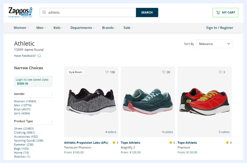
Zappos is a great example of how faceted search should work. Relevant filters appear after you select one of the categories:

relevant filters with faceted search after category selection

Or after searching for something via the search box:

relevant filters with faceted search after search query

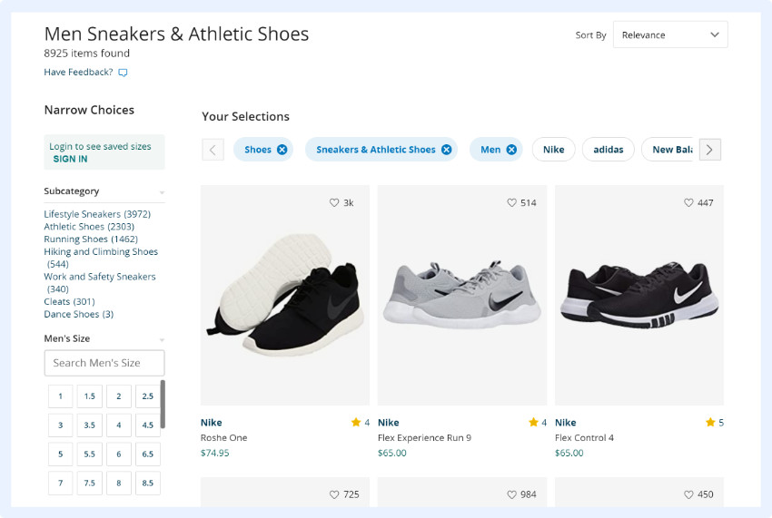
As you can see, there are multiple options that help shoppers narrow their search. As a best practice, all of the filters also inform shoppers about how many products have the specific attributes, providing a scope the number of options there are to choose from.

As you narrow your search and apply more filters, additional filter suggestions appear horizontally on the top of the results page:

 faceted search with additional filter suggestions horizontally on product serp page

These are based on the previously applied filters and are updated with the most relevant products every step of the way.

There are multiple options here to find the product in question:

  • You can start with a simple search query
  • You can select the category you want to start with
  • You can filter results with the vertical faceted search options
  • You can also sort by a number of criteria, including New Arrivals, Customer Rating and Best Sellers.

Note that, in addition to selecting criteria from the offered facets, there is also an option in the vertical search box to enter additional criteria in text format. Shoppers can use this to search for specific brands, for example.

This is a good solution if your store has thousands of products and consequently hundreds or thousands of different attributes: the faceted search engine may offer the most relevant ones, but if the user is searching for something that is not there they don’t have to abandon the store, they can just quickly add their own preferred attribute.

faceted filter where customers can just quickly add their own preferred attribute

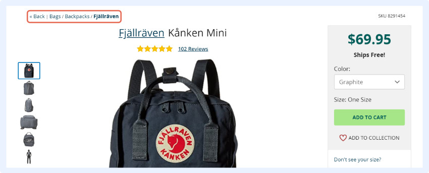
You can improve navigation by including a breadcrumb menu on your site. After a shopper selects a certain product, they will be able to see exactly which category they’re in, which gives them a chance to browse similar products by simply going to a different ‘level’, instead of running another search.

breadcrumb menu on product pages
Chapter 5

Summary


Having a simple input field as a search option isn’t enough to provide your customers with a great search experience. Shoppers rarely know exactly what they’re looking for, so even if you provide detailed categories and sub-categories, product descriptions, and info boxes on the result pages, it won’t be enough to provide a stellar user experience (especially if you have a larger number of products in your shop).

If you’re looking to improve your customers’ shopping experience the solution, of course, is faceted search. By displaying filtering options, facets, based on search queries and results, you allow potential customers to easily narrow down the search results to find the product they’re looking to buy.

This gives the users more control over the way they browse and mitigates the number of decisions they need to make to find the product they want. Facets effectively narrow the scope of products, step-by-step, until shoppers only have to choose from a few dozen or a hundred products as opposed to thousands.

And this is exactly how you can decide if you truly need faceted search. It’s true that by 2019, it’s a basic eCommerce feature, but it’s not necessary for everyone. If your shop only has a small number of available products, shoppers won’t have a hard time sorting through them to find what they’re looking for. In this case, faceted search probably isn’t necessary for you.

If you do need facets, follow the advice in this article when planning your enterprise eCommerce search engine, and you’ll provide shoppers with an even better experience than if they were talking to a salesperson directly!

This better user experience will decrease site abandonment, reinforce purchase decisions, and build trust towards with your customers.

And ultimately make your store more successful.

Final thoughts

Having a simple input field as a search option isn’t enough to provide your customers with the awesome shopping experience they’ve come to expect.
In order to do that and increase your revenue, you need to leverage faceted search:

  • Display filtering options based on queries
  • Include all basic and category filtering options
  • Allow for multi-selection
  • Use proper terminology

If you have any questions regarding faceted search, feel free to ask us any time – we’ve already built a number of search engines for our clients and are always happy to share our knowledge!

Paige TyrrellHead of Marketing – Prefixbox

Paige is the Head of Marketing at Prefixbox, a leading eCommerce site search solution. She’s an American who’s been living in Budapest since 2017 and loves giving #alwayslearning sessions to help people optimize their online stores.

Top 25 Best Practices For Ecommerce Site Search [2024]

Top 25 Best Practices For
Ecommerce Site Search [2024]

We all struggle to keep up with the latest CRO trends and practices. It takes EFFORT and TIME to optimize eCommerce site search. After all, 72% of eCommerce sites fail to deliver on site search expectations.

But what if you had all the tools to be in that 28% who meet or even exceed these expectations?

Well, I worked hard to save you time and money and listed the hottest 25 best practices for optimizing site search design and results pages. So let’s dive in.

Contents

Chapter 1

What is an eCommerce site search solution?

Chapter 2

Why does site search matter in eComerce?

Chapter 3

How to improve and optimize your solution

Chapter 4

Summary

Chapter 1

What Is An Ecommerce Site Search Solution? (Definition, Facts, Examples)


Those of you who are not familiar with the concept yet may ask: Paige, what do you mean by Site Search?

If you already know the basics, click here to skip to the juicy part to learn about:

Definition: an eCommerce site search solution is a search engine that is either built-in or integrated into your online store, and its job is to find the products the user is looking for by matching the user’s search keywords with the products in your store. Site search encompasses more than just the search box; it also refers to faceted search, product ranking, and synonym management.

It filters your products based on user queries. All input is matched with product recommendations; be it product name, color, size or product code.

eCommerce search engines have some similarities with Google search. The difference is that Google does content, text search while eCommerce search does structured attribute search where filtering and sorting are key features.

A Few Ecommerce Site Search Best Practices:

  • Make the search box easy to spot
  • Make the search box big enough for typical queries
  • Personalize search suggestions with the use of machine learning
  • Strong error tolerance for an uninterrupted user journey
  • Search query autocomplete
  • Natural Language Processing for better results
  • Comprehensive search analytics for easy improvements and reporting

Know the Facts, Numbers Never Lie.


Some exciting stats:

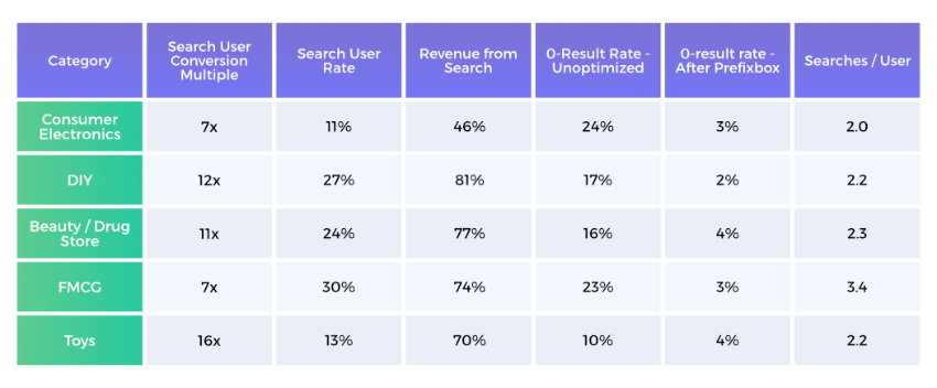
  • Search users are much more likely to convert. In fact, on average they are 7-10 times more likely to convert than regular webpage visitors.
  • Based on Prefixbox’s own data, in certain product categories, on-site search users convert 16x better.
  • The second part of the equation is the ratio of search users among all users. Search users make up about 10-40% of all the users on your eCommerce site.
  • Which means that 40% to 80% of your online revenue is generated by these search users. Mind blowing, right?
  • Still 70% of (desktop) eCommerce search implementations are unable to return relevant results for product-type synonyms.
  • What’s even worse is that on average, 10%-25% of all searches end on a 0-results page because most often, search engines aren’t able to process language – this means that shoppers have to search using the exact same jargon as the site does. When shoppers end up on a 0-results page, you’re essentially telling them you don’t carry the product they want to buy, which means they’ll purchase the produce elsewhere.
Just imagine the advantage you would gain by fixing these issues.
By lowering the rate of 0-result searches (you can easily decrease it to 3-5%) you immediately boost your chance of selling more.
Learn more about the most important autocomplete features needed to decrease 0-result searches and increase the shopping cart value by about 19% or more.

Overall, your job is to remove any obstacle that hinders a shopper during the buying journey. Encourage visitors on your site to use the search options in order to provide them with a seamless experience.

Know the users for whom you need to optimize the search.

eCommerce Site Search Stats per industries

There Are 2 Types of Visitors


1. The browser: This person is midway through the buying funnel. They’ve already heard about your product and have a vague idea about what they are looking for. Guidance is needed here, so automatic recommendations and prefilling the search bar help them get good results. You can set rules for this, but more on that later.

2. The searcher: This person is almost at the end of the buying funnel – they already know what they want from your catalogue. They are looking for something specific and are ready to type the brand, product name, color, size or even product code into the search bar. All they need is a good e-commerce search engine to pull up relevant products.

The browser
the "browser" type of online store visitors
The searcher
the "searcher" type of online store visitors

Beware: People who use the search already have a specific product in mind to buy when they visit a store – an accurate, fast search is necessay to direct these shoppers to the right products. Don’t count on users giving you a second chance.

Chapter 2

Why Does Site Search Matter in Ecommerce


Site search is often thought of as just the small bar where shoppers type in their searches, but it’s so much more than that.

It encompasses Autocomplete, Related Searches, the Search Engine, and Analytics. Together, these things transform your online store and can provide you with detailed insight into your customer behaviour that can be used in departments throughout the company.

It Saves You Tons of Money by Helping Your Users Find What They Are Looking for


Look: Visitors’ expectations change.

If you don’t meet their needs head on, they’ll leave your shop on the spot for your competitors who give them what they want.

Shoppers expect comfort, ease, and rapid results. Google search has conditioned people about what to expect from a search box.

What does this mean for you?

If you can’t deliver great experiences, you’ll lose customers to your competitors who can. Technology comes with a price, but more often than not, it’s worth the investment. The better the Site Search experience you offer, the more time and money shoppers will spend on your site. It’s as simple as this – all your visitors want is a more responsive site search experience.

Sure, sure, but what does it cost: eCommerce site search solutions range from as little as $200 to $600 a month.

This affordable price range has led to a huge surge in search popularity and usage.

Need some proof?

study examining 21 eCommerce websites concluded the following: user-friendly site search experiences lead to higher conversion rates. When site search was used, conversion rate increased from the websites’ average of 2.77% to 4.63%. That’s an 80% increase.

Do this easy math for your own site and you’ll immediately see how impactful search is.

Make Better Business Decisions with Insights about Your Users’ Needs and Preferences


If the numbers above don’t convince you of the importance of search, here’s another thing.

A really good site search solution will collect valuable data about what your visitors want and how they interact with your site.

With this data, you can create analytics reports that provide you and your colleagues with the insight you need to make data-driven business decisions.

Would you like to see some examples?

Let’s pick a few.

For one, you will have concrete data about which products are becoming more (or less) popular so you can adjust your focus accordingly. You will also gain insight into what your customers wish you sold. If there are enough searches for a specific brand or product you don’t carry, you should consider adding it to your inventory – especially since you have assurance that it will sell.

What better way is there to introduce new products?

Last, but not least, you can see the language your customers use.

Don’t get me started on how useful this knowledge is for PPC campaigns, just imagine how much more accurate your targeting will become.

Who would have thought that site search data could tell you all this?

Chapter 3

Improve, Optimize, and Earn More by Using These Ecommerce Site Search Best Practices


That being said, there is always room for improvement.

When it comes to site search, it isn’t enough to simply have a solution, you also need to focus on staying ahead of your competitors.

20% of search users submit another query after their initial search and 21% simply leave the website on the spot out of frustration.

20% of search users submit another query after their initial search and 21% simply leave the website on the spot out of frustration.

To make sure your site brings better results, we have gathered all the industry best practices and are sharing them with you here.

Learn about the Latest 11 Best Practices to Improve Your Search Box and Its Functionality


Just having a search bar isn’t enough to gain the benefits of a fully optimized search. Check out these easy best practices that will transform your online store.

Make the Search Box Easy to Spot


Content heavy websites need a clearly identifiable search box.

clearly identifiable site search input box

Whenever you encounter a fairly complex site, you always look for the search button first – take this into consideration when designing your site and pay attention to where you place your search box.

eCommerce product search engines need to have an easy-to-spot search box because users will always want to search whenever they feel like they need some direction.

Some Best Practices when Designing
Your Search Box Are to:

  • Give it extra space. Your search box should be clearly visible and placed in its own space – for example, not right beside a newsletter sign up.
  • Use a magnifying-glass icon to signify search as it is a universally recognizable symbol for search.
  • If you don’t want to use the magnifying glass, another common option is the placement of a ‘GO’ button next to the search box in color. This adds a certain dynamic to the look of the search box and the message is straightforward.
  • Make sure that the search box has a full open text field next to it. Users will have a sense of safety knowing that they can always click in the search box to be able to navigate.
  • Some users prefer pressing ‘Enter’ while others prefer clicking on the search button to submit their query. It is a good idea to provide several options so everyone can search the way they please.
  • The simpler the better. Place your search box in a central location on the page, or on the right side. These are the conventional locations, so people are used to looking for search here

Place Text in Search Box to Encourage Searches


Simply designing and placing a search box isn’t enough. Adding some text to the box is essential for eCommerce.

Adding a prompt like „search here” would be a start in guiding the shopper.

It is equally important to make sure that the text disappears from the search box when the visitor clicks in it.

Do NOT force them to delete the text before they can begin as this gets annoying.

There is more: You can even provide extra information for the visitor within the search-box. If your search can process product codes and catalogue numbers you should highlight thatfrom the start. This will speed up the search process and enhance the UX. For example, you could include something like ‘Enter product, code, or brand.

Make the Search Box Big Enough for Typical Queries


shorter text box leads to confusion and forces people to shorten their queries because they aren’t able to see the full search, nor are they able to edit or change it.

So how long should the search box be?

Well, it turns out… Most queries would fit into a 27-character-long search-box.

So we would recommend applying the same rule; this is especially vital for retailers with a wide product range. Since clarity is the most important, a growing/expandable search box would be the ideal solution to accommodate any query.

Browsing shoppers will notice this feature and might be more likely to use the search box – this is great because, as you know, search users are much more likely to convert than regular users.

Place a Search Box on Each Page


Visitors can easily lose their sense of direction on a first visit to a webshop. Once they start feeling uncomfortable they might hit the dreaded ‘back’ button, which erases their search results.

You can easily prevent this by displaying the search-box on each page. The most common placement of an onsite search-box is on the top of the page either in the center or on the right. We strongly recommend checking where your top competitors placed their search box. This gives you insight into where shoppers look for the search box.

The only exception to this rule is on a checkout page. Here, a search box can distract shoppers from completing a purchase, so we recommend excluding it.

Strong Error Tolerance for an Uninterrupted User Journey


A prerequisite for site search usability is a strong error tolerance for typos.

If someone searches for a brand name (even if misspelled), they should never end up on a 0-results page. Brand names like “blackberrie” for Blackberry, “nice” instead of Nike, or product names like “games board” instead of “board games”, colors like “balck” or “wite” instead of “black” and “white” should not result in 0-search results.

It happens every now and then, right?

The Baymard Institute found some pretty startling stats about this. “34% of the top 50 e-commerce sites, don’t return useful results when users misspell a single character during search for a model number in the product title.”

Phonetic misspellings need to be handled with equal care. The user may have only heard about your product from a friend or the news and is thus unsure how to correctly spell it.

By adding to the list of possible words with alternative spellings you can start to see a new light.

34% of searches don’t return relevant results… just think about it. Your business’ success relies a lot on whether users find the product they are searching for or not. If they can’t find it they can’t buy it. It is as simple as that.

Lower sales hurt, but 0-results pages might affect your site’s traffic in other major ways:

  • Users will be less likely to return to a shop where they can’t find what they want to buy. It’s simply frustrating.
  • They will also spend less time on your site and might have a higher bounce rate, which can decrease your overall site stats which negatively affects your Google ranking.

Losing money in so many different ways is mind blowing, don’t let it happen!

Search Query Autocomplete


How does it work?

Search engines predict search queries as they are typed. By providing auto-complete versions for specific queries you manage to guide the visitor to the most in-demand and relevant products.

If submitted queries don’t have an exact match, the least you can do is show potential matches. This may well be what the user was looking for.

Site search tools solve all these problems.

With a good autocomplete solution, your site can be improved. You can add different ”boosts” to suggestions in order to promote keywords that serve the same intent, but have better conversion rates. A good auto-complete will list the most relevant products first.

You need to be careful – choose a quality solution

Autocomplete suggestions are found on 82% of the TOP 50 e-commerce websites, but 36% of them do more harm than good.

So, you see it can be quite tricky.

Autocomplete suggestions are about guiding users and helping them construct a search query that will get them the products they are looking for.

Many perceive these suggestions as “recommendations” and use them instead of sticking with their own initial idea.

Some users go father and if they like the suggestions, they will experiment by adding more details to the query as long as the suggestions continue being relevant.

According to the Baymard Institute, testing the autocomplete suggestions can often slow down the search process, although users don’t view this as such.

In the long run, search autocomplete solutions not only increase the relevancy of results, but also increase your users time on-site, which help with SEO.

Allow Visitors to Search within Particular Departments


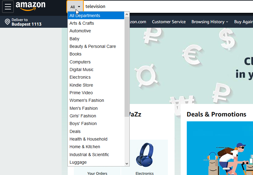
Here’s the deal: By adding options such as an ‘all departments’ filter to the left side of the search-box you can help the shopper save time and produce more relevant search results.

This is a great way for sites with a wide variety of products to help shoppers search. If you provide handy filter options from the get-go you can ensure more relevant and accurate results for the visitor.

It’s a simple helping hand, but the improvement in your conversion rate will show you how much it really matters.

Comprehensive Analytics and Reporting for Optimization


Implementing comprehensive search analytics is incredibly important for optimizing your site. You can set all sorts of tracking in Google Analytics.

To Name the Most Important:

  1. Top performing queries
  2. Top performing products based on clicks
  3. Top performing products based on conversions
  4. No search results
  5. Number of filters used

Based on these findings you can implement changes where you see fit.

High-volume search with incredibly low conversions? Probably stock issues.

Queries with no results? This can serve as valuable information about products customers are looking for, but you don’t currently stock.

This can provide you tips on what products to add to your catalogue, or at the very least, give you ideas on what other products you could suggest for the queries that repeatedly return no results.

Some site search tools include built-in analytics which usually provide much more in-depth information than Google Analytics. This way, you kill two birds with one stone.

Simple Integration for Faster Time to Market


There are some alternative solutions for complex integrations, but these are only worth implementing if your store has a lot of products.

quick, cost-effective solution is better for smaller and medium eCommerce businesses. Lots of third-party eCommerce site search solutions have integrations with Shopify, Woocommerce, Magento, and other open source platforms.

Either way, by now you must have realized how much money you are leaving on the table due to an un-optimized site search solution.

So, you also realize the sooner you optimize your site search, the sooner you will earn more money. Still, we recommend you choose providers who can prove the effectiveness of their tool within a short period of time. One month should be enough.

Focus on Mobile Search to Turn Browsers into Buyers


Search drives higher conversion rates on mobile and desktop sites.

A well-optimized search has even more significance for mobile users – it is a good idea to have a version of your site solely dedicated to mobile.

On mobile, a shopper’s view: is limited to 1, maximum 2, products per screen. Whereas on a laptop: dozens of products are visible at once.

On mobile, shopping quickly becomes tedious and visitors lose interest.

This is how a sale is lost.

However, making the search bar visible as a default, you can experience a higher conversion rate and an accelerated path to purchase.

Faceted search leads to a 20% increase in conversion rates “when compared to hierarchy style and pull-down refinement style navigation systems.” Better filters with facets, a quicker interface, and a well-optimized search all contribute to increased conversion rates.

Find more tips to optimize your mobile shop here.

Natural Language Processing for Better Results


Natural Language Processing (NLP) is already used by the biggest companies (Apple, Facebook, Amazon, etc.).

Yet many eCommerce search solutions have difficulty interpreting natural language queries.

The premise is simple: users type a search query in the same way they would say it aloud to a friend or salesman and get a relevant answer.

If you can submit a question or product request and get a relevant answer straight away, then why bother going to the physical store?

Let’s say a search user submits an NLP-based query for ‘red women shoes size 9 under 20 dollars’ and she gets exactly the list of products she wanted.

This saves a lot of time and effort for the visitor and speeds up the buying process.

Checkboxes and lots of clicking?… not needed here. An NLP interface produces breathtaking results.

The 14 Hottest Site Search Best Practices to Create Search Result Pages that Sell


Provide Accurate and Relevant Results


Products should be ranked according to the query.

With NLP queries, a simple feature query such as the word ‘green’ should only lead to results that are green-colored.

The interface should list the top 5 relevant results based on the query and rank these based on the amount of clicks each receives.

product search results need to be based on query and past clicks each receives by the site search users

Knowing your best performing products comes handy when setting up product ranking rules.

If you check your data and see lower positions are clicked more frequently, then you know you need to adjust your ranking criteria.

People don’t want to scroll through multiple pages nor do they want to see irrelevant results. If the product they’re searching for is not at the top of the SERP, they will (rightly) be frustrated and take their business elsewhere.

Simply having a search box isn’t enough to reap the business rewards. It has to be well-functioning.

Avoid Zero Search Results


It is a real pain when people leave your site due to issues that could easily be optimized such as irrelevant search results or ending up on a 0-results page when a simple query is executed.

Feelings of frustration can quickly escalate into site abandonment. It gets worse:

Only 34% of site search tools allow users to easily iterate on their query by prefilling it in the on the results page, despite the fact that, according to tests, users frequently need to iterate on their query — on average, 65% of test subjects required two or more query attempts during testing.

Turn these issues into opportunities: if you examine your 0-results pages, you can get insight into what people search for.

When analyzing this data, expect to see seasonal trends and get insights into user vernacular.

Even if you don’t offer autocompletedead ends like 0-result pages should still be avoided.

In place of a 0-results page with no valuable insight, provide tips such as: ‘Check your spelling’, ‘Try searching for one or two words’ or ‘Try looking within other departments’ on the page.

Speaking of which: You can list all your departments on the 0-results page along with your phone number.

Why this is awesome: You can transform problems into opportunities.

As a last resort, you can always promote some of your most popular products on a 0-results page or display the products that match most closely to the searched term.

Include Reviews as Filters


Reviews give credibility to your product; they are based on mutual trust.

A study from 2013 confirms that “88% of consumers (…) trust online reviews as much as personal recommendations.

People who make purchasing decisions based on reviews are almost split down the middle by what they’re looking for.

One half: will make a decision based on quantity – so here, having a high number of reviews helps. The other half: will make a decision based on the quality of the reviews – here, authentic reviews are important.

User generated reviews are tremendously influential in persuading people to buy because they remove the doubts people have about the product or service in question.

The bottom line is: Reviews are critical.

Most people check reviews before deciding what specific products to purchase, so by including these, you’re standing behind your product, displaying the quality, and allowing users to speak for you – this all builds trust.

Reviews show the true quality of a product, not self-promotion.

If your products get enough reviews, you should consider implementing review filtering so that new customers can see your best performing and most appreciated products.

Use Different Filtering Options, Your Users Will Be Grateful


Including reviews as a filtering option is important, but so is including these other categories:

  • Product category
  • Price range
  • Brand
  • Color
  • Size
  • User ratings

Depending on the range of products and the size of the shop, more search filters could be added. However, for a start, these 6 would be enough.

Use the Power of Social Proof


Social proof is a great asset to leverage on eCommerce sites since we, as people, are social animals and follow examples that lead to success.

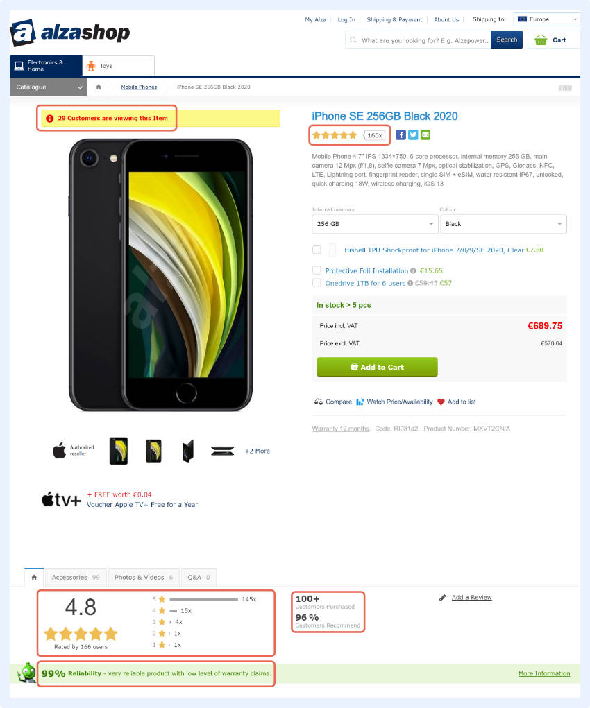
One shop that uses social proof in a great way is Alza shop. They display the number of times the given product has been bought during that particular week or particular day. An ‘i’, symbolizing information, is displayed in red ink right above the product and shows you the stats.

use valid social proof on your online store

high-end example would be FraserHouse, where this idea is more subtle; they only display this information for a few seconds.

Here’s the kicker: You can use this same idea, but display other details which might add a sense of urgency to the buying process. People tend to fear missing out on something, which makes adding the number of items available or the number of customers viewing the product a successful way to boost sales.

Show Non-Product Results


Sometimes when people use your search, they may be looking for how-to’s or for customer service.

By having a search function that can display these results, you set your shop apart from your competitors.

Shoppers appreciate this as help is always welcome. If nothing else, the average time spent on a page would increase, which helps with SEO and PPC.

Allow Users to Tailor Results


Make sure that different views are available for the shopper to tailor the appearance of the SERP.

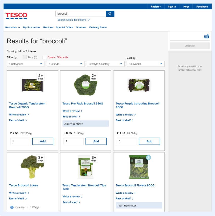
Tesco does a great job of this. Their product range is huge and a simple search like “broccoli” returns many different brands, price ranges, lifestyle & dietary options. So, here, having options that allow a shopper to tailor results is an important step to personalizing the buying experience. This is called Faceted Search.

different views are available for the shopper to tailor the appearance of the SERP

While Faceted Search is important, only 40% of eCommerce sites offer it. Filtering and sorting are essential tools that help users find the right products amongst the alternatives.

Since this technology isn’t widely embraced, this is a great way to get an edge on your competition. Don’t wait too long though, otherwise your competitors might get ahead of you.

Sorting Options


Sorting options are not as common as you might think, even though they’re important.

A Few Ecommerce Site Search Best Practices:

  • Price: lowest first
  • Price: highest first
  • Sale
  • Relevance
  • New items

You can always set one of these that is most beneficial to your business as a default.

Optimize Synonym Search


This helps reduce the 0-result page rate.

By optimizing synonym search, you can get rid of 0-result pages and gain conversions. This can be quite nuanced, so be sure to check out some synonym management best practices before getting started.

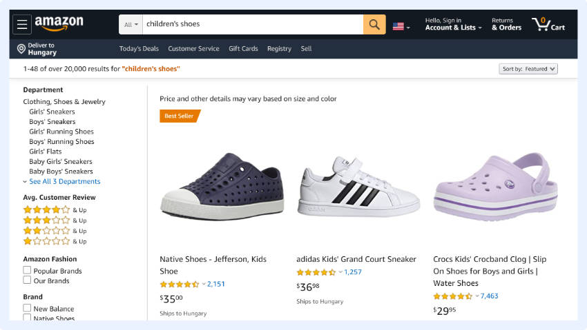
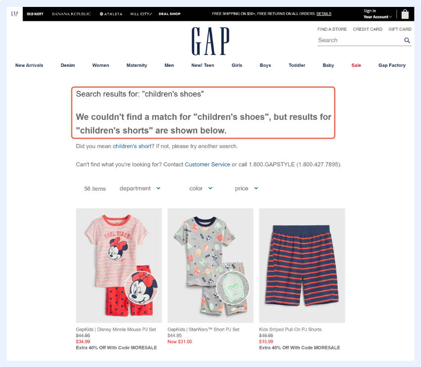
Taking two random examples for the query ‘male shoes’: Amazon displayed results, whereas GAP only did when the query was changed to ‘men’s shoes’.

optimizing synonym search to get rid of 0-result pages and gain conversions
example of not perfectly optimized synonym search

These dead end searches may be a result of a shopper searching for a certain brand you don’t stock or a common misspelling. Instead of not showing any results at all, you can show similar products from similar brands.

According to Baymard, more than 50% of the eCommerce sites surveyed only supported basic keyword matching against product title and description. This makes it extremely hard for users to find a product on a site whose jargon they barely know.

Let’s think about it.

For any business whose vocabulary is not well-known or where there are many synonyms for their products, synonym handling can be a real game changer.

Think about elderly people who aren’t familiar with the tech industry who are trying to buy electronics or for young adults who are trying to buy cleaning products for the first time.

These people don’t know what exactly to search for and are unlikely to correctly guess the site’s jargon, so by adding synonyms, you help these people find the products they’re looking for.

Show Product Images when People Mouse-over


‘Lightbox’ or quick view displays show a mini-image when visitors linger over the product.

On Wolf & Badger products can easily be viewed from different angles, so users can get a better idea of the products without having to load each individual product page. This is a faster and more effective way for shoppers to view products.

product quick view on category pages improves user expience

A simple, but certainly effective way to improve user experience.

Use Dynamic Thumbnails that Actually Resonate with the Query


This is incredibly important and not frequently done.

If a user searches for “red coat”, all the thumbnail images should be shown in red.

According to Baymard, 54% of web shops do NOT use dynamic thumbnails.

I bet by now you know it by heart that search users convert better than the average visitor because they already know what they want to buy.

Your job is to make the buying process as easy as possible by removing any obstacles. One such obstacle is our own senses. If we are looking for a red coat and the thumbnail shows a blue one, we are less likely to click on it. This is an easy obstacle to overcome.

Provide Quick View Options that Actually Resonate with the Query


This isn’t easy, but you and your customers will love it.

Quick View windows show a mini version of the product page with an “add to basket button”. Since the shopper never has to leave the SERP, this speeds up the buying process.

Provide an “add to basket button” on quick view windows for faster buying process

Quick View windows can show more than images and the add-to-cart button. Usually, shops display most of the product details here so that users can select the size and color of the item they want and add it to their basket.

Show the Search Query on the Results Page


By keeping the search term displayed, you remind the shopper what they were searching for and, at the same time, provide them a chance to iterate on the query or add an additional feature.

This yields more accurate search results.

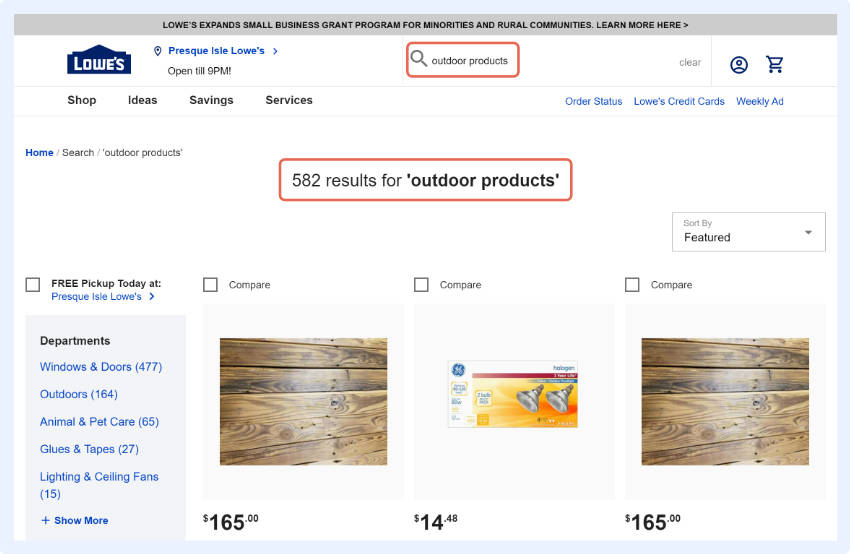
One good example is Lowe’s eCommerce website where I was looking for ‘outdoor’ products but did not specify exactly what I wanted.

keep the search term displayed for the shopper and provide them a chance to iterate on the query

However, since my query was still displayed in the search box I was able to clarify my request based on the search autocomplete suggestions.

Compare this to the time I was searching for “books” on a bookstore page and they did not provide the same option. My query disappeared and I had to start typing all over again.

It is much better for the customer when you keep the query in the search box until a shopper checks out.

Show Technical Description


Dell shows a product’s technical details under the names, which speeds up the purchase journey.

Shoppers don’t have to use different features to compare similar products, they can do it right on the search result page.

With this, users can see what they want within a product range and click accordingly.

This is especially relevant for high-tech eCommerce businesses, but any business can benefit from this. Any shop that offers products where the features are easy to compare (such as: cars, bicycles, instruments, hair extensions, etc.) can use this.

Summary


Whether you have read the whole article or just skipped to the summary, here is the juice of our guide in 1 minute.

Let’s Recap Some of the Amazing Numbers We Talked about


Search users are at least 4-6 times more likely to convert than the average webpage visitor.

In certain industries, search users can convert 1873% better.

And that’s not all.

Search users can make up 10-40% of all the users on your eCommerce website, which means that 40% to 80% of your online revenue could be generated by search users.

How Can You Boost Your Revenue with Search, You Might Ask


Usually these users already have a clear idea about what they want to buy. Your job is to remove all the obstacles that could hinder them from finding it.

Encourage shoppers to use the search options and provide them with a seamless experience. In this article, we gathered the latest trends and eCommerce search best practices to help you achieve these goals.

To have a good eCommerce search solution you certainly need to capitalize on these opportunities, but to be able to stay ahead of your competitors you need to excel at using and optimizing your search. Whatever decision you make, you need to move forward.

Paige TyrrellHead of Marketing – Prefixbox

Paige is the Head of Marketing at Prefixbox, a leading eCommerce site search solution. She’s an American who’s been living in Budapest since 2017 and loves giving #alwayslearning sessions to help people optimize their online stores.