14 eCommerce Merchandising Strategies You Can Implement in 2025 (+ Examples)
Traditional retailers (brick and mortar stores) have used digital merchandising strategies for ages, and eCommerce seems to be at a disadvantage. But you can actually learn how to implement their strategic techniques into your eCommerce store – with the help of technology and a little creativity.
In this guide to eCommerce merchandising, you will learn:
- how to convince visitors to make multiple purchases
- how to guide shoppers to the products you want them to see
- offer them exactly what they want at exactly the right moment
Let’s get into it!
First, you have to understand the importance of these strategies. Millennials, the most important age group for most eCommerce sites, say they make 60% of their purchase online.
Additionally, 44% of all consumers say they will become repeat buyers if they have a personalized shopping experience. And of course, the pandemic only accelerated the shift to online retail – a trend that is here to stay.
This only makes the competition stronger, so you need to use the right techniques to engage your customers.
- What Is eCommerce Merchandising?
- How to Successfully Cross-Sell
- The Basics of eCommerce Merchandising
- eCommerce Merchandising Strategies and Visual Merchandising tips for Your Online Store
- 1. Home Page Merchandising
- 2. Site-Search Merchandising
- 3. Category Based Merchandising
- 4. Product Page Merchandising (With Visual Details)
- 5. Collection-Based Merchandising
- 6. Featured Products and Collection-Based Merchandising
- 7. Simple Product Merchandising Focus
- Rotate Your Highlighted Products for Returning Visitors
- 9. Cross-Selling In the Shopping Cart
- 10. Use Customer Data to Your Advantage
- 11. Spark Loyalty in Return Customers
- 12. Use as Many Decision Reinforcing Elements as You Can
- 13. Use Banners on Search Result Pages
- 14. Redirecting Searches to Landing Pages
- Conclusion: What is the Best eCommerce Merchandising Strategy?
As always, we will start at the basics – then rapidly dive into methods you can implement right away.
Let’s start with the question…
What Is eCommerce Merchandising?
We can find a nice, basic definition from PracticalEcommerce, where they say
Ecommerce merchandising is the art and science of displaying products or offers on a website with the goal of increasing sales
This is a solid definition, but in order to make use of it, we will have to refine it and focus on the differences between offline and online merchandising in more depth than just that the latter is done on a website.
More specifically, in our opinion, eCommerce merchandising is a process of effectively highlighting the products you want shoppers to see and purchase without interfering, or interrupting, their shopping journey.
Ecommerce merchandising is a complex field of eCommerce itself, incorporating many methods, best practices, and strategies from marketing, UX, website design, sales, automation, and more.
In this article, we aim to gather the most important ones in one place for you; to create a guide that you can come back to and use as a sort of cheat sheet that answers the important questions: “what is product merchandising?” and “how can I use it to boost revenue in my online store?”
But first, there is a very important aspect we need to tackle…
How to Successfully Cross-Sell
Digital Merchandising can be used to cross-sell, so let’s first take a look at the difference between cross-selling and upselling.
Take the classic example:
- “Would you like larger fries?” – This is upselling.
- “Do you want fries with that?” – This is cross-selling.

With upselling, you simply take a product the customer already committed to and offer a bigger, more complex, more expensive version of it.
However, with cross-selling, you take the chosen product into consideration, and offer the customer something else that they are likely to buy in addition.
The key here is to consider the original intent.
In this case, this means products that the customer searched for on the site.
To make relevant suggestions and seamlessly guide shoppers, you can leverage many different strategies in addition to a “recommended products” section. We will cover many of these strategies right here if you scroll down.
Without wasting any more words, let’s dive into the basics.
This is where you have to start.
The Basics of eCommerce Merchandising
Before we get into the online merchandising strategies that you can use, here we will go through a few of the basic concepts.
Without wasting words, let’s start with…
Design Your Store Layout Wisely
First impressions have lasting effects – and in the case of websites, you only have a fraction of a second to make them. Somewhere between 0.05 and 0.1 seconds to be exact.
In order to make the best impression, and guide the user from the start, you must design your site with a merchandising focus.
Some of the essentials:
Some of the essentials:
- Use large imagery with contrasting colors, high resolution and clear purpose.
- Make navigation instinctive: put it where they would look for it, and make it very easy to use.
- Make your search bar noticeable and make sure it has predictive search.
- Make the layout simple
- Promote the best-selling products.
- Promote your current discounts, sales, campaigns.
- Promote the highest-rated products.
- Make content personalized if you can.
- Avoid automated carousels (but use non-automated ones wisely).
- Make sure your website displays properly across all screens and mobile devices.
Remember: with visual content, you have to replace the feeling of in-person shopping,
where customers can wander around a store, pick up the products, feel their texture, smell them and so on. You have one sense to use instead of four.
Product Grouping
The best place for product groupings are on custom search result landing pages, which you can leverage in marketing campaigns.
Keep in mind that if you are using faceted search, your customer will be quickly able to create custom groupings on the search results page based on all of the available attributes, like features, size, color, brand, and so on.
Suggesting related products
If you’re looking for further ways to cross-sell, suggesting related products or other popular products is a great option.
It is reasonable to assume that people shopping for certain products are more likely to take a certain cross-sell. For example, those looking for headphones will be more open to headphone chargers and cases.
These are best placed at the bottom of the search results page so that you don’t interfere in the buying journey, but instead complement it.
Branding with visuals
Visuals are of course very important in guiding the attention of your customers, and they also have to be consistent across your entire site and with your established brand.
This means that you have to find visuals that represent your brand identity and at the same time not only catch the eyes of visitors but also accomplish the task of presenting your products and offers in an easily comprehensible way.
Depending on the type of product you sell, you can implement a bunch of different approaches to visual merchandising.
- You can use demos if you have a virtual product.
- Or 360-degree photography to showcase your products better.
- You can also include your social media channels, including posts with branded hashtags to show your customers what others think and how they use your product.
Personalization and Online Merchandising
Personalizing what a visitor sees on your site offers a huge opportunity to increase your average order value (AOV).
As a first step, you can customize their experience based on simple demographic information, location, and season.
You can also recommend products and offers based on their history on your site, their previous purchases. Even better if they can create wish lists and if you are paying attention to abandoned carts – and the items in them.
Based on this information you can also create great personalized automated e-mail and advertising campaigns, but we will talk about those in another article.
By changing what your visitors and customers actually see on your site based on what you know about them you are likely to elevate their overall shopping experience.
eCommerce Merchandising Strategies and Visual Merchandising tips for Your Online Store
It is time to have a look at some online merchandising strategies using the basic techniques mentioned above and see how to apply them.
Here are 15 digital merchandising strategies for retail stores, with examples…
1. Home Page Merchandising
Your home page is one of the most important pages on your site and deserves special care.
Most shoppers will land here first, so it doesn’t just make a first impression, but it also gives you a great opportunity to guide your potential customers from the very beginning of their shopping journey.
Include your most important offer at the top.
One of the most effective strategies to go by – which is also easy to do – is to pick an offer that the majority of your potential customers would find attractive, and include it right there, above the fold on the first page.
This could be a seasonal offering, your all-time most popular product, or the highest-rated one.
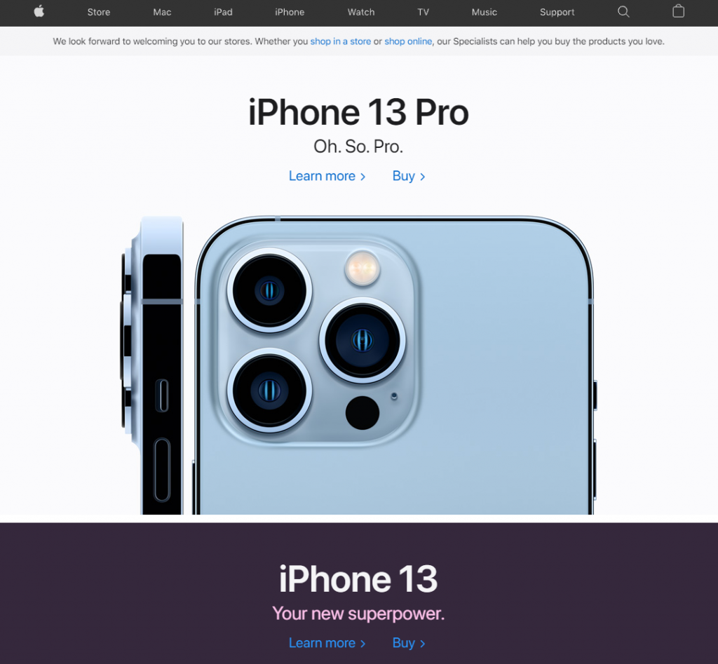
For Apple, it is usually their latest product:
Basically, use your home page as brick and mortar stores use their windows to showcase their best products and invite in would-be customers.
Personalize the products you feature.
Below the single most important offer, you can start showcasing individual products – and as we have already talked about this, you should always personalize what you show.
Based on information about your users, set different criteria on what to display there to increase your chances of offering something truly personally relevant.
If you offer free shipping, show it right away.
Shipping costs are among the most common causes of shopping cart abandonment. Thus offering free shipping is a great strategy to convince more visitors to convert into customers – given that you can integrate the cost of shipping into the products anyway.
But it is also important to actually tell your customers that their orders are shipped free. One way you can do this is by placing a banner on your home page, so it can be one of the first things they notice.
Homepage Storytelling
Overall it is a good idea to give your homepage a structure, and for that, you can use the basics of storytelling.
- First, tell the most important information, with text and also visually. Make your brand clear: show who you are, what kind of products you sell, and what solutions you offer.
- Then comes the more specific information, like free shipping, your current special offers. As they scroll down, the information can get more detailed and guide them to specific categories, offers, or discounts even.
- Then, you have to reinforce why they should trust you – include testimonials, ratings, user product reviews, user-generated content as social proof, important badges, and so on.
Treat your homepage the same way you would introduce your brand to anyone if you wanted to make it extremely appealing. This is one of the most important rules of visual merchandising.
2. Site-Search Merchandising
We have already talked much about searchandising, i.e. using your site search engine for merchandising.
To recap some of the most important lessons from our previous guide:
- Boost the products that bring you the most revenue: it makes sense to include products on the top of the results that are the most popular, the highest-rated, or simply the highest margin.
- Optimize your no results pages by including some information on how the user might find what they are looking for, and also some personalizefild recommendations.
- Personalize the search results: based on user history, you can place products at the top that are more likely to be relevant for them.
- Use images: instead of just text results, display the most important information on the search result page, including visuals.
- Use NLP search autocomplete – and if you can, include visuals right there, even before they hit enter.
- Use promotional badges on your results to highlight ongoing promotions, offers, discounts.
- And if you can, use faceted search, which greatly improves the shopping experience and makes the entire process faster.
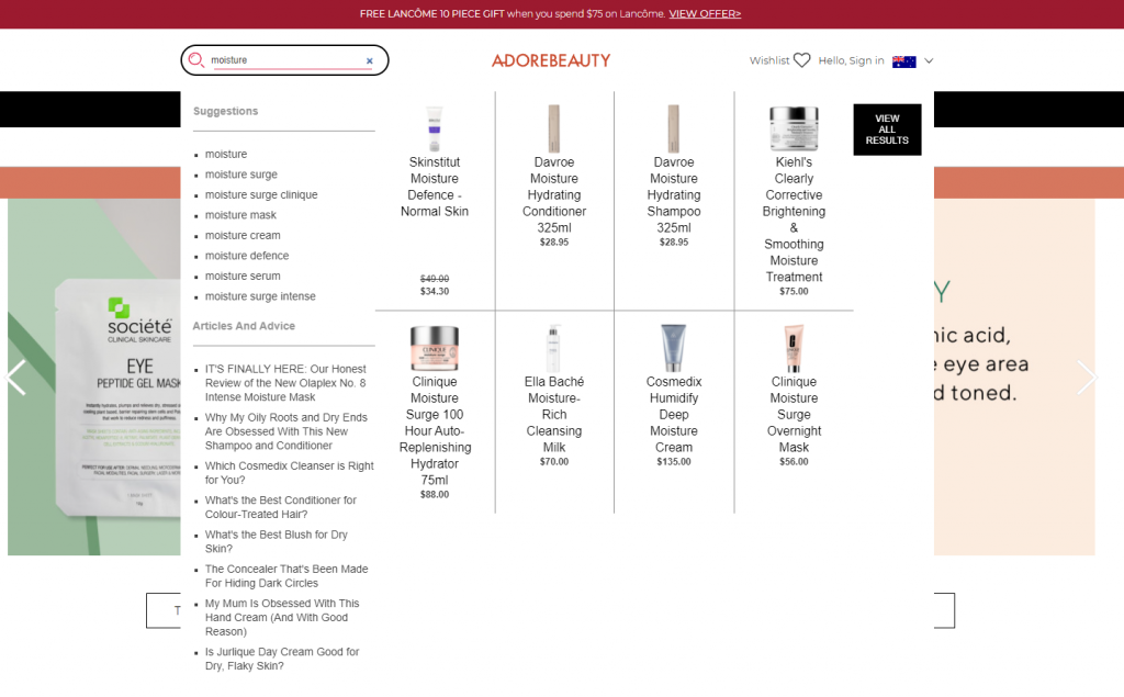
Take a look at the Adore Beauty website, giving you instant results with visuals using autocomplete:
Also, intent clarification can be a great way to guide users to relevant offerings when their entered terms are too broad.
For example, if they search for headphones, there might be hundreds in this category, so you can offer them subsets of results like “Bluetooth” or “wireless” to narrow down the search.
3. Category Based Merchandising
Before setting out to design your category pages, take a moment and investigate how the most popular stores in your niche do theirs.
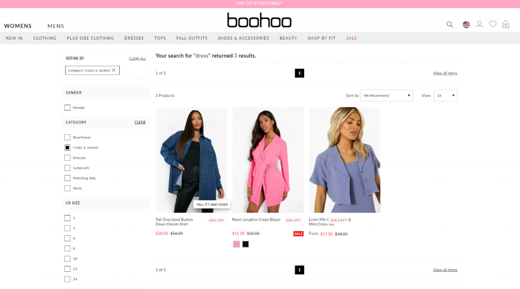
Best practices are always good to follow, and in most cases, you will find that category pages are informative. They display not only product names and images, but also some of the most basic information that could be deal-breakers for the customers, like the price, shipping information, and some of the most important attributes.
To make it easier to find specific products, if you have a wider range of offerings, include faceted search options on the category pages. Make sure that these options match the attributes in that specific category – this could be anything like brand, size, price range, release date, and so on.
4. Product Page Merchandising (With Visual Details)
Brick and mortar stores have a major advantage compared to online retailers. If you personally visit a store, you can see the products better, and you can touch, hold, and even smell them. You get a much more personal, immersive shopping experience, which in turn gives you more confidence to actually make a purchase.
There are a few ways you can allow your customers to inspect the products more closely on an eCommerce website:
- One is using 360-degree product photos, so the customers can look at your products from every angle.
- Using very high-quality zoomable photos allows for a closer inspection of the details.
- Close-ups of the most important features help with answering some of the questions they might have about the product, like what features or accessories it has.
- Photos depicting the products in use help with reinforcing the mental image they create, imagining how they will use it. (Best if you have user-generated content for this!)
- Product videos are even better at this as they are more immersing, and can showcase the product in use and in a variety of ways.
At the Milk Bar, even for simple cakes, they include a large number of high-quality and close-up photos with many angles to awaken your appetite:

5. Collection-Based Merchandising
Grouping relevant products on a custom landing page is always a good way to cross-sell your offerings.
Let’s say you have an eCommerce business that sells clothes. Most people will of course search by categories and attributes – for shoes to wear in the fall that are waterproof or hoodies that are a certain size and color, and so on.
But many of them will look for certain styles. If there are clothes in your store displaying, for example, pop culture themes, this is a great opportunity to create collections. This way fans of a franchise like Star Wars or Marvel can browse these themed products together.
Also, if you feature multiple collections, make sure you create a category page for them, where people can easily browse through them.
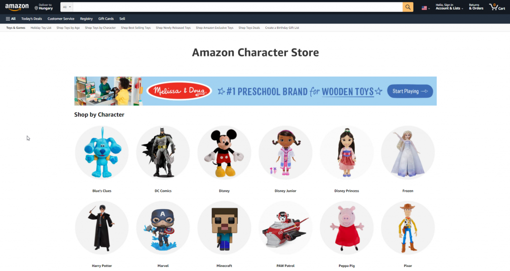
A great and simple example could be Amazon, where if you go to the toys section, you can find the products grouped by the characters or brands they are based on:
6. Featured Products and Collection-Based Merchandising
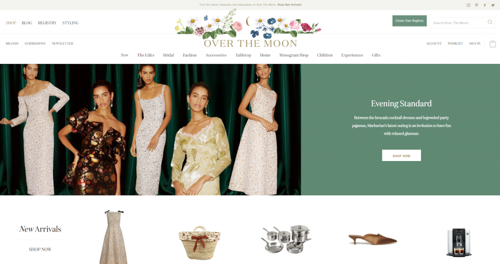
To tie into homepage merchandising: besides personalized products, you can also display your most popular collection on your home page.
The top of the page should in general be a hero shot of one specific offering, however, if you want to display multiple products and collections above the fold, you can do that.
A slider, especially an automatic slider, is something in this case that you should avoid: they generally perform poorly and are frustrating for the users. But you can make use of tiles, for example, and display collections in addition to your top products.
This way you can trigger multiple different selling points, aimed at different segments and likely have a greater chance of showing the new visitors something they might be interested in right at the start.
7. Simple Product Merchandising Focus
If you have a smaller range of offerings, you might want to opt for focusing on a single one on your homepage. This is also a good strategy if your eCommerce business is new and you have a limited budget to publicize them.
Luckily focusing on a single product or unique type of product also means that you can use a website design that is much simpler.
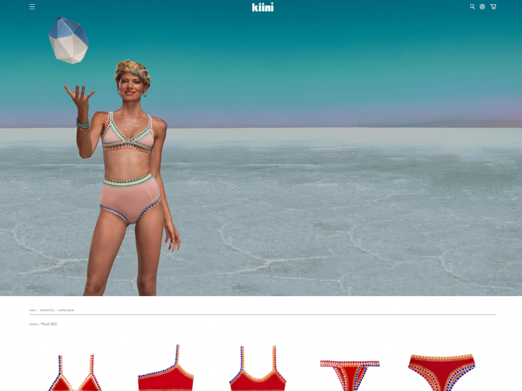
A great example is the swimwear company KIINI. They have a very limited number of products, all in the same style. On the site, you are greeted simply by a hero image, and clicking through that you get to the single category page, showcasing their swimwear in different colors. It’s very simple – and very effective, useful for maintaining a consistent brand image.
Rotate Your Highlighted Products for Returning Visitors
If you have a high number of repeat customers and a wide product range, a basic eCommerce merchandising strategy is to simply rotate your homepage visuals and highlighted products (if you don’t use personalization).
This can of course be simply automated: you just have to set the parameter for how often you want to show returning visitors different content on your site.
This can of course be simply automated: you just have to set the parameter for how often you want to show returning visitors different content on your site.
Just consider that even traditional stores use this technique. Not just by simply changing what is in the window – grocery stores sometimes switch up rows or change the location of sections to force their customers to look at more products while they search for what they originally wanted.
9. Cross-Selling In the Shopping Cart
Your shopping cart is an ideal place for cross-selling products. This works especially well with accessories. (Remember the “do you want fries with that?” method).
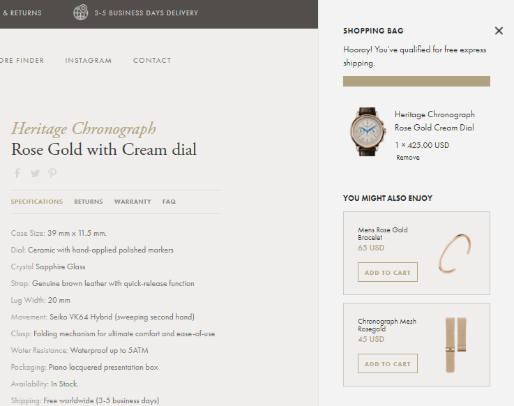
When a customer looks in their cart to check the items, overall price, shipping, and other details, eCommerce merchants have a unique opportunity to offer related, or complementary products, as you know in real-time from the contents of the cart what they are interested in.
When a customer looks in their cart to check the items, overall price, shipping, and other details, eCommerce merchants have a unique opportunity to offer related, or complementary products, as you know in real-time from the contents of the cart what they are interested in.
A good example here is Croniche – right after you put something in your cart, they offer relevant, similar products or accessories based on your choice.
10. Use Customer Data to Your Advantage
Customer data is the simple greatest asset for any company, and here, eCommerce stores have an advantage!
Your eCommerce site (and search) will likely be able to gather a lot of valuable data about customer behavior.
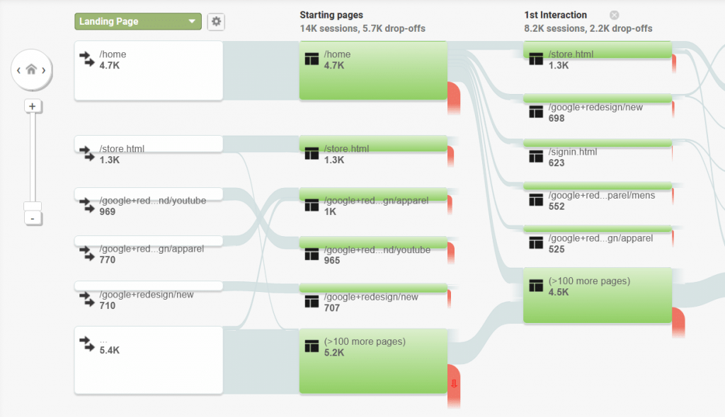
So, if you haven’t yet, enable Google Analytics on your site. The customer data you can gather will allow you to look at the paths your users and customers follow, so you can optimize your site to better guide them.
So, if you haven’t yet, enable Google Analytics on your site. The customer data you can gather will allow you to look at the paths your users and customers follow, so you can optimize your site to better guide them.
You will discover common exit pages, which you can optimize to boost sales.
Ecommerce merchandising, like most of eCommerce, is heavily based on data, so the more you can collect and analyze, the better you can optimize.
11. Spark Loyalty in Return Customers
If you want your customers to make multiple purchases in your store, return often and check out your new products or reorder the ones they run out of, you have to focus on building loyalty.
The basics of loyalty have to do with the entire shopping experience: it should be fast, convenient, and with no unnecessary interruptions. This will make your customers love your store and continually return.
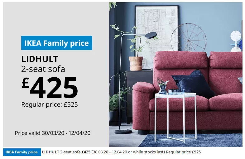
You can also encourage your existing customers to make more purchases if you implement loyalty programs – even simple ones, like point-based systems that can be redeemed for discounts or giving away one-time discount codes on birthdays. All of these can usually be done with a few simple add-ons.
You can also encourage your existing customers to make more purchases if you implement loyalty programs – even simple ones, like point-based systems that can be redeemed for discounts or giving away one-time discount codes on birthdays. All of these can usually be done with a few simple add-ons.
Also, look into creating special offers for products that are most often left in an abandoned cart, or the ones that are most prevalent on wish lists.
12. Use as Many Decision Reinforcing Elements as You Can
Displaying products in an inviting way and providing discounts is not always enough to convince shoppers to make a purchasing decision.
You have to make sure that your would-be customers trust you with their money and that they feel good about their decision to make a purchase.
To do this, you can utilize a wide range of elements that encourage them, such as:
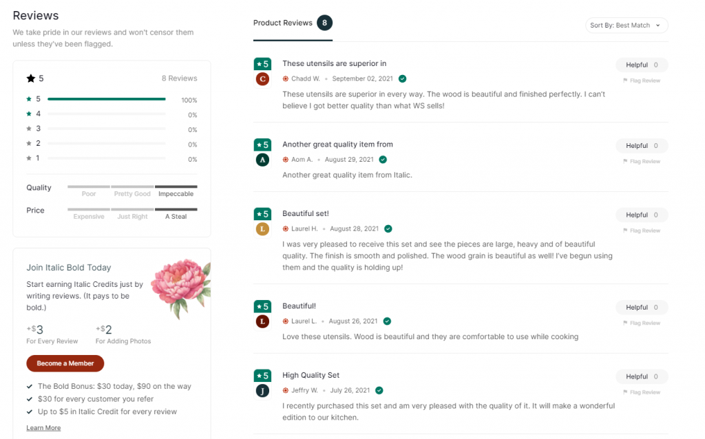
- Product reviews, most importantly the ones that talk about the benefits of using your product.
- User-generated content that shows actual people are using your product – and they are happy with it.
- Ratings, preferably with some visual element, like five golden stars.
- Expert proof: find some influencers in your niche, preferably professionals, who can test your product and give reviews.
- Use numbers: show how many people have already bought this product, how many viewed it in the past few days, how many put it on their wish list and so on. Sometimes just displaying how many are in stock can incentivize a purchase.
Many of these can be displayed even on your search result pages – so go on and include them.
13. Use Banners on Search Result Pages
Banners might not be the best form of advertising in a brick-and-mortar store, but they can be effectively used on your online store.
These enable you to highlight promotional periods or specific products or brands outside of the search results so that you can inform shoppers of certain messages without interrupting their searching journey.
This is, of course, best used when you display banners on relevant results pages, so make sure you use an on-site search solution that allows for this level of customization.
These are highly effective during seasonal sales or promotional periods like Black Friday to boost sales of certain products, highlight bundle offers, or inform shoppers of limited-time offers.
14. Redirecting Searches to Landing Pages
There can be certain situations in which a shopper searches for information about your store and not for a specific product. When this happens, you don’t want to take them to a no results page, but instead, redirect them to an informational page.
The most common example is if they search for opening times, contact information, or the location of the store. In these cases, you can redirect the users directly to the relevant page of your site containing the needed information.
Conclusion: What is the Best eCommerce Merchandising Strategy?
Modern eCommerce merchandising is complex to break down into specific strategies and techniques to use. The best thing for you, as a merchant, to do is to take a holistic view and try to implement various techniques that make sense for your brand and business strategy.
In regards to online merchandising, eCommerce businesses do have a few disadvantages compared to traditional brick and mortar stores – but you can rarely find anything that can’t be replaced with technology and some creativity.
Up- and cross-selling techniques, using customer data wisely, designing your category, product, and search result pages are all very important steps in even the simplest of online stores.
There is only one question: where will you start?


