11 Ways to Optimize Your eCommerce Search Results Page Design (SERP)
You might be thinking “Ok this seems like it could be helpful, but what’s a SERP?”. The Search Engine Results Page (SERP) is the page that displays the query results. Aka, where customers find products to buy.
So it makes sense that the results should be listed in a logical order, with the first 5 products as the most relevant, but that doesn’t always happen.
Check out the 11 tips below to get started.

Pages that aren’t optimized, can have some pretty bad results – if customers aren’t able to quickly find what they’re looking for on the SERP, they’ll abandon the site and take their business elsewhere. Optimizing your SERP is critical to increasing sales.
Generate SERP Pages Quickly
Users aren’t likely to wait long for the SERP to be generated, in order to prevent them from leaving your site (which hurts your SEO), be sure to have SERPs that load quickly. In addition to creating a bad user experience, slow pages also harm your company’s reputation.
Consider using AJAX to increase the speed of your search engine. AJAX provides a quicker, better search experience for users since only essential data is sent to the browser. It removes the need for a full refresh after users filter results, change views, or go to the next page – so your search is much faster.
Show a Breadcrumb Trail
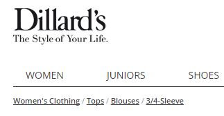
Sort of like the one Hansel and Gretel left. A breadcrumb trail is the list at the top of the SERP that shows the searched term and any refinements made to it- basically, it shows users how they got to where they are.

If a user decides they want to change a refinement, this trail helps them navigate backward without needing the back button on the browser, which could delete the search and make them start from scratch, which no one wants.
Show Related Searches
Related searches are search keyword suggestions that appear at the top and/or bottom of the SERP. These help users navigate to other products with just one click.
By recommending products similar to the initial search helps users quickly find what they’re looking for and by providing complimentary suggestions, you increase average order values. A win-win situation.
Allow Result Sorting
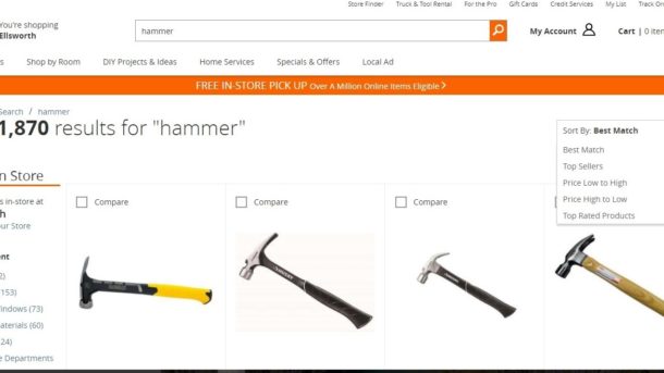
You should automatically sort your results by an algorithm that puts the most relevant and popular first.

However, your web visitors might want to sort products in a different way, so be sure to give them options. Include search filters that allow sorting by price, new additions, brand, or most relevant.
Don’t Place Search Results in Alphabetical Order
Users want to find the most relevant and most popular products, not a product that starts with a certain letter, so alphabetical sorting isn’t usually helpful.
The first results should be the products that receive the most clicks – the ones that provide the most value to the web visitor, not the ones that start with “A”.
Employ Delayed Loading of Images and Infinite Scrolling
Users prefer to scroll indefinitely, so infinite scrolling increases the likelihood that users will browse through your inventory.
Some users may be overwhelmed with all the results infinite scrolling provides, so it’s a good idea to implement delayed loading as a way to limit the number of results shown at once.It also increases the speed of your site.
If you decide to use infinite scrolling, this means that links commonly found at the bottom of pages can no longer be placed there. Adding another menu on the side or top panel is an easy way to relocate those items.
If you don’t want to use infinite scrolling, make sure you include a moderate amount of results per page (25 or 50), include an option to change the number of results shown, your paging options are clearly visible, and that you display the total number of results pages.
Use Fluid Filtering
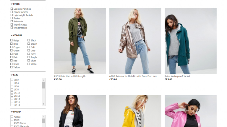
If you decide to use infinite scrolling, you will need a search filter menu that stays visible on the page no matter how far people scroll down.

The filter refinements should float alongside the product results while the shopper scrolls, so they stay continually available.
Format Your SERP
Have a cohesive theme for your results pages – all images should be the same size, fonts should match, don’t show product URLs, and decide if you’ll display results in a list or a grid.
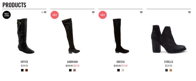
Provide clear titles, use large images of good quality, and consider implementing quick view windows with add to cart options. Showing item prices and sale prices can also be a good idea if you offer discounts. Lots of things go into ensuring your SERP is beautiful.
It is a good idea to provide an option that lets users toggle between list and grid views or to change the number of option in rows or columns. Be sure to test these variables, so you can find what your users respond to best.
Have Dynamic Thumbnails
If users search for a black jacket, the jackets shown on the SERP should be shown in black – not another colour with black as an option. If users come looking for a specific item, you should show exactly that, so they don’t have to imagine how it would look or navigate to another page to find out.

According to Baymard, 54% of web shops don’t do this, so if you only implement one thing, let it be this and you’ll already get a leg up on your competition.
Have Alternatives when a Search Displays No Results
0-results pages are one of the worst experiences search users can have on your site. There are multiple ways to subvert this.
1. Place related keywords and products on the 0-result page so users can easily navigate to other products.
It’s helpful to style the text of these suggestions differently from the initial query, so the user can easily see it is not part of the original search. Simply bolding the original search term or using different colour can serve as a big enough differentiator. Make sure the “No Results” text is large and visible, so the users know you’re showing other related searches.

2. If you display results for some of the words in a multi-word query instead of the full term, but be sure to notify the user what you are doing.
Show a message that says “Your search returned no results, but here are some products for ____” or “Showing results for _____”.
3. Have a spell-check function that suggests correct spellings and provide a link that re-directs users to the appropriate products.
Analyze User Behaviour to Improve Results
People who use your search box provide a wealth of information, which you can use to improve the relevance of search results. That’s why having site search analytics is critical.
By analysing this data, you can see that users who search a specific term are more likely to click on a certain product – which becomes valuable when deciding how to rank products.
If your SERP is good to go, check out a few ways to optimize your search box.


