15 Common Online Shopping Problems Causing Revenue Loss for Your Business (+ How To Fix or Avoid Them)
There can be a million reasons why people don’t buy from a website, but statistically speaking, you only need to identify and fix a few of those reasons to get back most of the revenue you’re currently missing out on.
In this article, we are going to show you the most common mistakes, like
- Not personalizing your site properly
- Confusing product benefits with product features
- Not trusting your own product
- Hiding your real prices
Let us start!
If you take all of the steps we recommend, you will likely be able to cut your abandonment rates down to a fraction of what you’re currently experiencing.
- The most important online shopping and eCommerce statistics for online retailers
- Why Online Shoppers Don’t Buy From a Website: The 15 Most Common Online Shopping Problems
- 1. Unprofessional, Dated Design
- 2. Having a Poor On-site Search Engine
- 3. Bad User Experience
- 4. The Lack of Personalization
- 5. Missing or Unclear Product Information
- 6. Bad / No persuasive sales copy
- 7. Missing or fake product reviews
- 8. Too Complex Check-out process
- Payment failures (and uncertainty)
- 10. Lack of Security and Privacy Leaks
- 12. Additional charges
- 13. Poor Tracking, Logistics and Long Delivery
- 14. Not having a flexible return policy
- 15. Lack of Support and No Live Chat opportunity
- Conclusions: Make it Easy to Shop Online
The most important online shopping and eCommerce statistics for online retailers
There are hundreds of articles, research papers, and reports out there where you can find up-to-date statistics on eCommerce sites. But this isn’t one of them, so here we will only be focusing on a few universal, key stats that will help put the most common online shopping problems into context.
For starters, Forrester Research tells us that around 50%of potential sales are lost simply because visitors are unable to find what they are looking for on eCommerce sites. Also, at least 45% of US customers will abandon a purchase if they have a question about the product or the shopping process and aren’t able to easily find the answer.
What these numbers tell us is that it’s essential for online shoppers to find everything quickly and easily in order to enable them to make a purchase, and increase your sales and revenue.
We also know that, according to Business2Community, around 86% of online shoppers are willing to pay more for a smoother, better shopping experience, and 49% of them are likely to impulse buy when they receive one.
There are a lot of very simple ways to provide this, many of which we will be talking about in this article.
Let’s start by keeping these in mind – and the fact that a good user and customer, experience is probably the most important thing for online merchants.
Let’s see how most people fail.
Why Online Shoppers Don’t Buy From a Website: The 15 Most Common Online Shopping Problems
1. Unprofessional, Dated Design
Visuals always provide the first, and often most important impression, either when we see a person for the first time, or visit a website. A negative impression can often deter your customers from making a purchase, even if your store is completely legitimate otherwise.
And you don’t have much time to convince your potential customers: first visual impressions are formed in 0.05-0.1 seconds.
An online store with an appearance that is obviously unprofessional is not inviting to customers. If your design is clearly dated, falls apart, images are missing, buttons are nowhere to be found – customers will be reluctant to engage with your site.
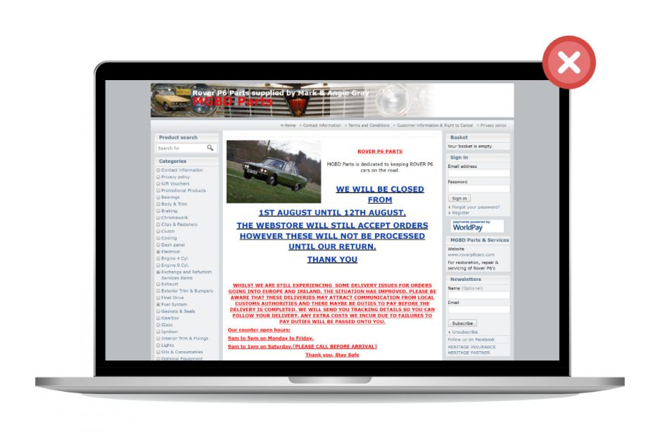
Apart from negatively affecting user and customer experience, this kind of appearance also sends a message. It signals that you either can’t update or repair your site, which implies your business is struggling. This has its own implications for the customer, but the other option is way worse: you may just not care. And no one will be eager to buy from a business that doesn’t bother to appear trustworthy.
A clean, well-designed site rewards the customer with a sleek experience.
One of the most important places where a good design can make or break a sale is your results page, so make sure to check out the best practices in our Search Results Page Design guide!
The solution: pay attention to keeping your design up-to-date, user-friendly and easy to handle.
2. Having a Poor On-site Search Engine
This is probably one of the most overlooked features in the eCommerce customer experience, but has a huge impact on revenue. Check out some interesting statistics about E-commerce sites and search users in the US, proving the statement above:
Now, how can the site search experience be ruined?
No data-based product suggestions
A good site-search solution should be able to track customer behavior and adapt to it. If on-site behavior is not tracked, the customer will see irrelevant products in their searches, solely based on the provided keywords, not even taking popularity or current discounts into account.
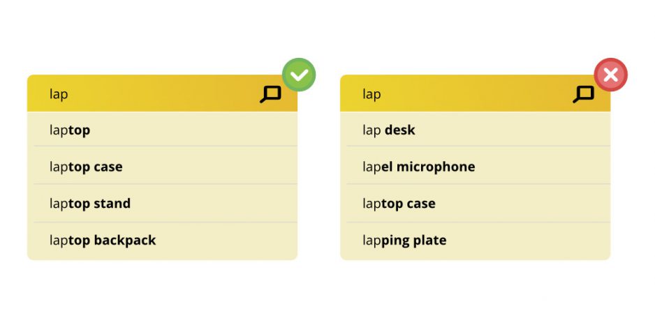
Search Autocomplete is not typo tolerant
Typo-tolerance is increasingly important when more and more consumers are shopping online from their mobile devices – where typos are very common. Many times they don’t even realize their mistakes; they just take a quick look at the 0-result page they are presented with and conclude that the desired product is not in the store.
So, make sure your on-site search can tolerate typos and still yield relevant results! A good autocomplete solution can also prevent potential typos – on our blog, you can read about this and more search box optimization methods.
Autocomplete is too slow
As we have stated before on the blog, “by making search faster and ensuring relevant results, autocomplete will decrease exit rate, increase conversion rate and likely even your average order value.”
If you want to know how to achieve faster autocomplete results, check out our Autocomplete Search Best Practices guide.
No category suggestions, photos or prices during sales events
When there are discounts or other sales going on, the on-site search tool you use should be able to distinguish these items and not only rank them in better positions, but also highlight the fact that there is something special going on – for example with photos, badges or other eye-catching digital merchandising solutions.
Providing the right suggestions at the right time has proved to be invaluable for increasing conversion rate on one of the biggest European drug store chain’s Hungarian site (Rossmann.hu) as well. Watch our video with the full case study:
Wrong handling of singular/plural words
Just as with typos, singular and plural forms should be understood by the on-site search engine. Otherwise, you will lose customers who, after only one search will decide to look elsewhere while the product they want is right there – it’s just not displayed because the search solution is not “smart” enough.
Not handling zero results pages as opportunities
“No results found” pages are actually a great opportunity to impress your potential customers. There are many great things you can do when no product matches the search query: provide tips, suggest similar results, or provide alternative ways for them to engage with you.
Check out our full guide for zero result page optimization for a ton of best practices.
The solution: Treat your site search solution as a great opportunity for engaging with users and offering them relevant products,
3. Bad User Experience
The deterioration of user experience is usually related to elements that shouldn’t be noticed by the user in the first place.
In design, this could mean that your site is not mobile-friendly and falls apart on a small screen. A quick glance at the stats: according to recent studies, in 2021 we will reach a point where 54% of all retail eCommerce will be conducted on mobile devices.
Or maybe your site is crammed with irrelevant pop-ups and automatic carousels that serve little purpose as they are not personalized, but instead, just distract the user.
Normally, navigation, up-sells, relevant product offers, and such should be presented to the user in a natural way; not by interrupting their experience, but enhancing it.
And then there are the potential technical issues like timeout errors and website crashes. There are very few more irritating experiences than a website breaking down in the middle of a check-out process.
According to statistics, 73% of mobile internet users are familiar with slow-loading websites – and 53% of the visitors are likely to just leave a page that takes more than 3 seconds to load.
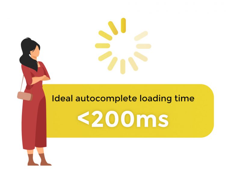
This is especially bad news for two reasons. One is that the average website takes 8-11 seconds to load. The other: while visitors will have a bad experience, a slow website will also cause you to drop lower in Google’s rankings now that they introduced the Core Web Vitals as official ranking factors as of June 2021.
The solution: make sure that your hosting provider is up to the job and that you have the appropriate service for the number of visitors your site experiences at peak volume.
4. The Lack of Personalization
If you provide a personalized shopping experience, you have a much better chance of converting your visitors to customers, simply because you can show them products they are actually interested in instead of showcasing your entire product range.
There are many ways to go about this. Most sites that use personalization use data from a user’s previous behavior and offer them products that are similar, or relevant, to the ones they previously viewed or bought. Read more about AI-driven product recommendation.
An even better way is to use an on-site search solution that tracks the behavior of the customer in real-time, and ranks the search results according to their assumed needs.
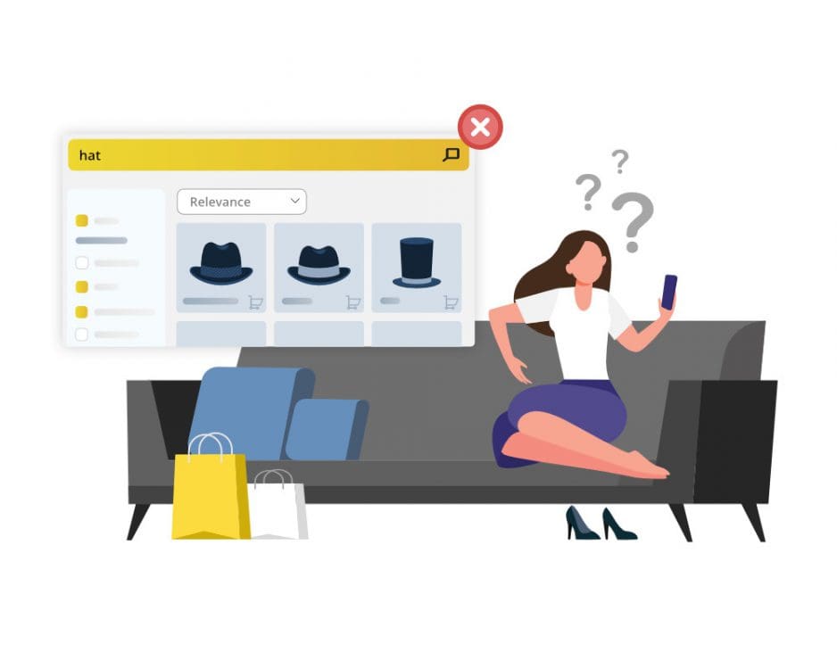
If you don’t use personalization, you are giving the potential customer more tasks to complete, lengthening the shopping process, and even risk invoking the ‘paradox of choice’. All of which cause fewer users to reach their desired products and consequently the check-out; increasing cart abandonment rates.
The solution: personalize as much as you can – even on search result pages.
5. Missing or Unclear Product Information
When you introduce a product to your would-be customers, you can break down the information into two basic categories: product features and product benefits.
We will deal with the benefits in the next point, so let’s start by looking at product features.
Product features include all the dry information about how the product works, looks, how big it is, how fast it is, warranties, and so on.
Forrester tells us that in the US, 45% of customers are likely to abandon a purchase if they are not able to find an answer for their questions immediately.
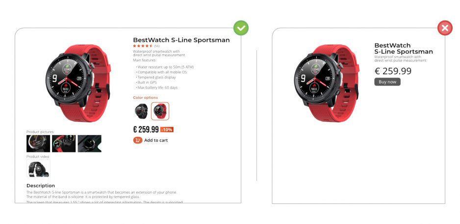
So it’s essential you pay attention to what your customers ask – either via chat, phone, in person, or by analyzing the search queries they execute on your site.
Make sure that all the attributes you display are clear and understandable: that values are spelled correctly can be easily understood and navigated. Regional preferences might also come into play, like the different spelling of ‘color’ in the US and UK, the imperial vs. metric systems, and so on.
The solution: make sure to include all available information on the product page, including frequently asked questions.
Now, onto the benefits…
6. Bad / No persuasive sales copy
How is your product going to make my life better?
Besides the numbers and attributes, shoppers want to know more about the product they’re considering purchasing: if it will provide more free time, alleviate pain, help me feel better in some way. They want to know how it will make them feel.
They also want to know why your solution is better than the other ones they could easily purchase on another site, and why they should buy it now instead of next month.
The solution: pay attention to your sales copy, even if you only use the most basic techniques. Think with the head of your customers.
7. Missing or fake product reviews
Besides the fact that fake product reviews are lazy and outright lies, they also tend to be very obvious. The reason for this is that they are written by you or your team, and not the customers, and more often than not they won’t sound genuine.
The solution: Let your customers review and rate your products – and if the reviews are bad, check what is wrong instead of covering it up, because they will quickly erode trust in your brand and become one of the reasons why customers don’t buy from you.
8. Too Complex Check-out process
In the past years, nearly all research into cart abandonment rates confirmed that the third most common reason – after high/unexpected prices and forced account creation – people abandon their cart is that the checkout process is too complex.
Most eTailers don’t take this essential fact into account: people are only willing to go through a complex process if the perceived value of the product they want to buy is very high.
In the case of complex products where the customer spends a great amount of time researching, comparing prices, finding the most suitable solution, a complex check-out can be fully warranted and in itself can serve as a catalyst for the IKEA effect.
But if they want to buy small appliances, food, clothes, or other relatively low-value, everyday products, they expect a very simple, very fast checkout.
The solution: tailor your check-out process for the needs of the customer – for simple products, provide simple check-out.
Payment failures (and uncertainty)
You have been entering your billing information after checking the 10 items in your cart, checking the shipping methods, and everything seems to be in order. You click on the check-out button – and nothing happens. The site crashes.
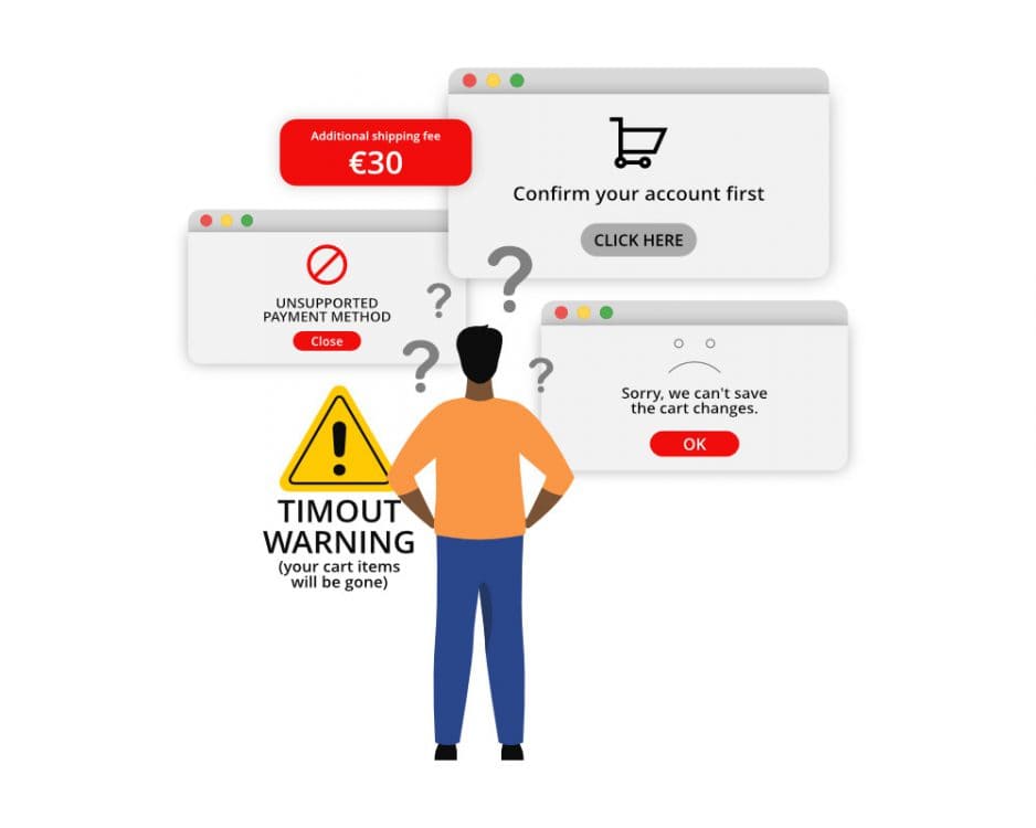
Is the order placed? Did your final click go through? Is the payment processed? Is it in limbo somewhere?
Has this ever happened to you?
If yes, you can quickly place yourself in the shoes of a customer who encounters payment failures.
The result is often confusion, frustration, angry emails in the support inbox, and abandonment of the purchase.
The solution: always make sure that online shoppers are able to pay safely and securely on your site – that the service doesn’t crash, payments are processed properly and orders are undoubtedly placed and can be tracked at the same time.
And while you are processing all of this data, make sure there is no…
10. Lack of Security and Privacy Leaks
There are few events that are more damaging to online retailers than data leaks. Every year there are thousands, if not millions of these, ranging from small eCommerce sites being hacked by backdoor-exploiting bots to large scandals. Within the first few months of 2021 there was information about hacks that leaked millions of user data from companies and services like Facebook, Instagram, LinkedIn, Parler, Pixlr, T-Mobile, Microsoft Exchange, ClubHouse, and GEICO – the list goes on.
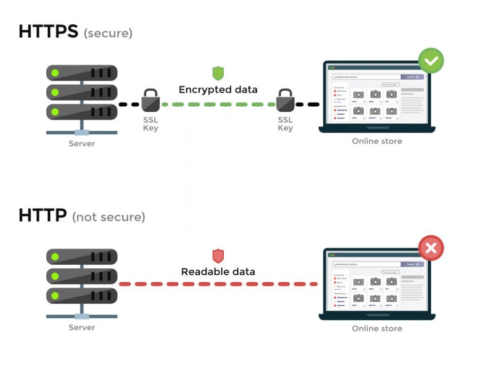
The solution: never sell products without offering a guarantee – it will seem suspicious and plant uncertainty in the would-be customer’s mind.
12. Additional charges
I have already mentioned the first universal reason behind cart abandonment: it’s when users at the end of a check-out process are faced with unexpected, or unexpectedly high charges.
Not communicating your prices clearly can greatly diminish eCommerce sales. But the solution, luckily, is very simple.
The solution: Always display the full price, and include tax and all additional prices in it. Indicate the shipping prices throughout the process, not only at the check-out. And don’t have any hidden charges.
It’s that simple
(Of course, some regional factors may come into play if your online store markets to international customers – count shipping costs and customs accordingly.)
13. Poor Tracking, Logistics and Long Delivery
When we look at shipping, price is important (and communicating it properly is even more so), but logistics and shipping times are also a major concern.
Order tracking systems can solve issues with uncertainty most of the time, if they are accurate.
The solution: if a customer knows how many days are left until their package arrives when it will be delivered, where it currently is, they are much more likely to be satisfied with this purchase and become repeat customers.
14. Not having a flexible return policy
Just as with guarantees, the only reason for not making your return policies as flexible as they can be is if you don’t trust your own product.
But if you do, these policies build trust and make things much easier for those few customers who will actually return something – which means you have a better chance of retaining them as customers.
The solution: make your return policy as flexible as you can. If your product and services are reliably good, you will rarely ever have to handle returns.
15. Lack of Support and No Live Chat opportunity
If you don’t provide support for your customers, you are not only depriving help from those who already purchased something from you, but you could also be alienating would-be customers.
Would-be customers have a lot of questions, especially if your product descriptions and attributes are not properly provided. If they receive poor customer service, they will just turn away and not make the purchase in the first place.
It’s also worth noting that “57% of customers would rather contact companies via digital media such as email or social media rather than use voice-based customer support”, as per Ameyo’s study.
Check our blogposts on conversational commerce for diving deeper into this topic.
The solution: setting up a support email address and a live on-site/Messenger chat in your online store, which can be done in a few hours at most, will greatly enhance your user experience.
Conclusions: Make it Easy to Shop Online
Providing a better user, and customer, experience is the key to increasing sales volume and revenue – and most of it boils down to thinking like your customer.
You don’t even have to try hard, just look at the statistics of your own site, and the messages and questions you directly receive from customers.
With a little effort, you will have a complete picture of their needs, problems, and expectations.
The next step is just to act on these insights.


