10 Easy Search Box Optimization Methods for eCommerce Sites
The search box has a big impact. It generates 50% of eCommerce stores’ revenue. Even though it’s important, it’s often overlooked. People implement an open source search box on their website and don’t think about it again, but this can lead to missed revenue opportunities.
By spending a bit more time optimizing your search function, you will see a measurable increase in revenue.

If you’re ready to start increasing your online revenue, start by making these 10 changes to your site search function.
The strategies listed below are incredibly powerful in enhancing your customers’ experience and improving your conversion rate.
So, let’s get started!
1. Position Your Search Box at the Top of The Page (Be Sure to Test the Placement)
Your website visitors should be able to find your search box easily; they don’t have the patience to scour your website in order to find it. The website search bar should be the first thing they see, so those who come to buy a specific product can easily express their buying intent by typing in exactly what they want to purchase.
Be sure to test the placement of your search box to ensure it’s optimized to get the most use! If top of page placement isn’t getting much use, try placing it in the middle or on the left, if this makes it more noticeable.
You can monitor your search box usage by checking the On Site Search Report in Google Analytics. Be sure to collect data for each change you make to ensure you’re continually improving.
2. Make the Search Bar Large and Distinctive
Your search box should be large and distinctive so it’s easy to find — when more people use the search box, browsers are more likely to become customers. Make sure users can tell your search box is a search box (don’t place it near other input boxes) and include some text in the field like “Search” or “Enter products here”.

A large search box means that users can see long search queries as they type. Short search boxes often eclipse the full text as there isn’t space to display all the characters, which increases the rate of misspellings and the frequency of 0-results pages.
Search boxes are usually about 245 pixels wide, but for those with a small display, we recommend you implement a search box that expands to contain user’s full queries.
3. Include Text Such as “Product Search” “Type search and click Enter” in The Search Box
Provide prompts in the search box so users can easily recognize which fields are acceptable for search. Most search engines allow you to search by item number, so text saying “Search by item number” can be helpful.
Placing text in the website search bar, can also be a way to express your company’s personality or to make the online shopping experience more personal.
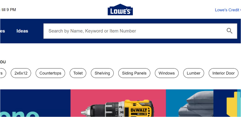
Lowe’s places a handful of hints (see above) in the search bar, which is placed prominently on their site.
Make sure your text prompts are in a large, clear font so people can easily read them. While it’s good to include these prompts, they should disappear when users click in the search box so it won’t interfere with their search terms.
This is usually dictated by a piece of JavaScript, so once you implement it, make sure to test it works correctly
4. Have Autocomplete in Your Search Box
Autocomplete suggests products and keywords to users as soon as they begin typing. It completes the user’s thoughts by finding the right keyword before they finish typing and can be exceptionally helpful for hard-to-spell search terms.
It helps users save and effort, since they can navigate to a product with just a few keystrokes and a click. Autocomplete also helps prevent typos.
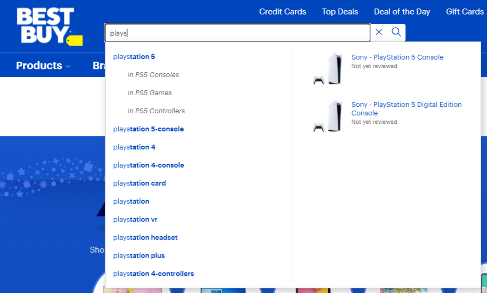
Autocomplete can either recommend keywords or specific products that take users directly to that product page (skipping the Search Engine Results Page). In order to do this, Autocomplete must be enhanced with data from your site.
With this data, it can recommend popular products as soon as users click in the search box as well as display product titles, images, descriptions, and price (including sale price).
5. Have More Keyword Than Product Suggestions
Simply because keywords suggestions are more important than product suggestions. Users are more likely to click on keyword suggestions since these will direct them to a SERP with many relevant results where they can browse to find something they want.
Product suggestions are almost too specific for most people because it takes them directly to a product’s page. These are especially helpful when people know exactly what they want to purchase.
For example, if someone searches “outdoor paint”, keyword suggestions will take users to a SERP for outdoor paints, where they can browse through colours and brands. While if they select a product recommendation that states the brand, colour, etc. they will be directed to that one page. Keyword suggestions appeal to a wider audience, thus it is more useful.
Autocomplete can also suggest categories, but this is usually not very helpful (you can find more nuanced best practices and explanations like this here). When you set up your web shop, you probably nested products under different categories and the chance that a search user could accurately guess the name of one of your categories to find a is slim.
For example, if you have an “iPhone 7” listed under “technology” and a user searches the category “cell phones” on your site, the phone won’t appear, which could cause the user to leave your site.
6. Label the Search Button and Allow the “Enter” Key to be Used to Execute the Search
Clearly label the search button with text like “Search”, “Find”, “Go”, or with an icon of a magnifying glass, which has become synonymous with search.
In addition to clearly labelling the search button, let the “Enter” key serve the same function. Many people use the “Enter” key to execute commands, so it’s best to accommodate this expectation. Since search user’s hands are already on the keyboard, this is faster and easier for them.
7. Keep the searched term in the box
Once a user has executed a search, keep their query visible in the search box so they can easily edit it. Sometimes people like to add a few terms in order to specify the initial query or correct a typo.
This is especially important for searches that end up on “no-results found” pages. Instead of forcing shoppers to re-type a query (oftentimes they don’t remember the initial search that lead to the “no results” page), keeping the keyterm in the search box enables them to easily make edits or finetune their search to help them quickly navigate away from the “no results” pages.
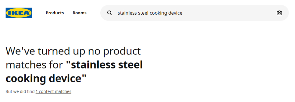
Even in the cases the executed search yields results, keeping the search term in the box helps shoppers refine their query to find exactly what they’re looking for.
8. Place a Search Box on Every Page
By placing your search box on every page, you increase search usage since web visitors won’t have to navigate back to the home page to use it. Be sure to keep it in the same place on each page, so users know where to find it.
This means that it should be prominent on your homepage and should stay in the same place on your category pages, Search Engine Results page, and even on product pages.
By keeping the website search bar on every page, you gives shoppers the opportunity to quickly (and easily) refine their search, so they can find what they’re looking for.
9. Place a Search Box at the Bottom of The SERP
By placing your search box on every page, you increase search usage since web visitors won’t have to navigate back to the home page to use it. As we said, keeping it in the same place on every page is beneficial so shoppers don’t have to look for it.
But in addition to that, place it at the bottom of the SERP as well – or make it “sticky”. This way, shoppers who land on the SERP, but realize they need to refine their query after looking through the results page – can easily update their query without spending time scrolling back to the top.
10. Show Search History
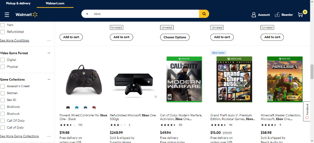
Personalize your online store by storing visitors’ previous searches and using them as recommendations when they revisit your site. Previously searched query prompts help them pick up where they left off. Asos does this nicely and in general has a great search function.
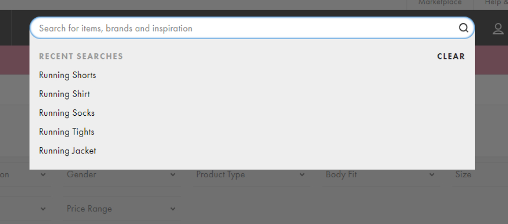
If you do add this feature, include simple controls so users can delete previous searches if they wish. Be sure to put previously searched terms in a colour different to regular suggestions, so users can quickly discern what’s what.
By increasing your search box’s visibility and making it more user friendly, people will be more likely to use the search box, which takes them directly to the product they’re looking for, so conversion rates will increase.
If your search box is up to date, here are a few tips to optimize your search results page.


